


UIのビジュアルデザインにおけるちょっとしたコツをまとめた「Little UI Details」
TightenやLaravelのデザインを担当したSteve Schoger(@steveschoger)さんによる、ビジュアルデザインにおけるコツをまとめたモーメント「Little UI Details」が公開されています。
Little UI Details
https://twitter.com/i/moments/880688233641848832
明るい背景色上に白色のテキストを追加する場合、微妙に影を付けると、文字が見えやすくなるだけでなくよりポップになります。
Adding a subtle shadow to white text when on a bright background not only makes it more legible but helps it 'pop' more. pic.twitter.com/p9rudeFxvP
— Steve Schoger (@steveschoger) 2017年6月29日
色相を両方向に10度から20度程度調整することで、グラデーションがより鮮やかに見えるようになります。
Make your gradients appear more vibrant by adjusting the hue by a few degrees (10º or 20º max) in either direction. pic.twitter.com/Op8Wrme3V4
— Steve Schoger (@steveschoger) 2017年6月26日
Stripeのサイト上のボタンにマウスオーバーするとボタンが少しだけホバーするのが本当に好き、というものも。ボタンにマウスオーバーすると、ボタンは1ピクセルだけ上方向に移動し、ドロップシャドウが負荷されます。
Really love the hover state on Stripe's website. 1px shift up with the increased drop shadow spread. Details like this go a long way pic.twitter.com/bC7y6pji23
— Steve Schoger (@steveschoger) 2017年6月23日
ボックスシャドウにわずかな垂直オフセットを加えると、より自然に見えるようになります。
Giving your box shadows a slight, vertical offset helps to make them look more natural. pic.twitter.com/WcPsK8yFwu
— Steve Schoger (@steveschoger) 2017年6月20日
テキストを揃えることは、デザインをきれいにし、コンテンツを見やすくするための簡単な方法です。
Aligning text is an easy way to clean up your design and make your content much more scannable. pic.twitter.com/KhUT5l0kW1
— Steve Schoger (@steveschoger) 2017年6月15日
純粋な灰色のテキストは、色のついた背景では常に見えづらくなります。簡単な修正方法は、背景色の色相をテキストに加えることです。
Pure grey text always looks "off" on a colored background. A quick fix is to saturate your text with a bit of the background hue. pic.twitter.com/eKxW4jSSs8
— Steve Schoger (@steveschoger) 2017年6月12日
テキストより目立つアイコンを使用している場合は、アイコンが非アクティブ状態の場合はテキストよりもわずかに明るくなるように設定します。
If I am using icons that have more weight than the text, I typically make the icons slightly lighter than the text for inactive states pic.twitter.com/nlqB3Q2uNg
— Steve Schoger (@steveschoger) 2017年6月8日
標準的な箇条書きではなく、矢印やチェックマークのようなアイコンを使用すると、順序付けられていないリストに視覚的な興味を持たせることができます。
Using a generic icon like an arrow or a checkmark instead of the standard bullet is a great way to add visual interest to unordered lists. pic.twitter.com/hE5BEKEpqh
— Steve Schoger (@steveschoger) 2017年6月7日
サイトの一番上に4~6ピクセルほどの太さの線を追加することで、デザインに活気を加えることができます。
Adding a hint of color (4 to 6px) to the top of your hero is a simple trick to bring more liveliness to your design. pic.twitter.com/cdwzjRh5NN
— Steve Schoger (@steveschoger) 2017年6月6日
2色のグラデーションを使うことで素敵な見た目に変化します。
This trick also works great on modals and, in some cases, panels. Using a 2 color gradient also adds a nice touch pic.twitter.com/4EVxntQoq5
— Steve Schoger (@steveschoger) 2017年6月6日
タイトルと本文の間にキーラインを引くのではなく、微妙に背景色のコントラストを変えることでこれを示しています。
A technique I've been using lately on panels to distinguish the titles instead of a keyline is using subtle contrast: pic.twitter.com/RWOcPZR8Xh
— Steve Schoger (@steveschoger) 2017年6月5日
サイズと太さに加えて、色とコントラストを使用することが、活字体の階層を作成するのに最適な方法です。
Along with size and weight, using color and contrast is a great way to create typographic hierarchy. pic.twitter.com/TkIMj39Urj
— Steve Schoger (@steveschoger) 2017年6月2日
決まっていない場合、1.5行の高さの16pxのフォントをボディコピーに使用することが最適です。
If in doubt, 16px font with 1.5 line height is pretty good safe for body copy. pic.twitter.com/s2opWaBT0l
— Steve Schoger (@steveschoger) 2017年6月1日
全てが太字のテキストは時には読みにくく感じることがあります。文章に少しでも呼吸する余地を与えるために、文字間隔を調整することを検討してみてください。
Quick tip: All-caps can sometimes be difficult to read. Consider using letter-spacing to give your text a little more room to breathe pic.twitter.com/FCQk0vrZE9
— Steve Schoger (@steveschoger) 2017年5月31日
グラフィックデザインのスキルがなくてもスタイリッシュな地図を作るテクニック。
How to make a stylish map with no graphic design skills pic.twitter.com/CluMrSpSSX
— Steve Schoger (@steveschoger) 2017年7月6日
キーラインはコンテンツを分割するだけでなく、分断されたコンテンツをよりつながりやすくすることもできます。
Keylines are not only great for dividing content but also making disconnected content feel more connected. pic.twitter.com/Hdx8gTJbJf
— Steve Schoger (@steveschoger) 2017年7月5日
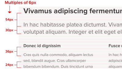
倍数を使ってスペーシングを定義することは、縦方向のリズムを得るための優れた方法です。
Using multiples to define your spacing is a great way to achieve vertical rhythm and provides a formula to justify your choices pic.twitter.com/0MCNFaZVrS
— Steve Schoger (@steveschoger) 2017年7月13日
彩度を落とした写真+大胆な配色+CSSのブレンドモード(blend-mode: multiply)は、ヒーローバナーとテキストのコントラストを高めるのに最適です。
Desaturated photo + bold color + blend-mode: multiply. Great for hero banners and creating high contrast for text. pic.twitter.com/1BqHw5oyKL
— Steve Schoger (@steveschoger) 2017年7月20日
ページ上の要素の重なりは、深みを作り、ユーザーにスクロールを促す素晴らしい方法です
Overlapping elements on a page is a great way to create depth and encourage users to scroll pic.twitter.com/kD9gGUDH5y
— Steve Schoger (@steveschoger) 2017年7月31日
ネガティブセカンダリアクションボタンは、通常のボタンよりもよく機能します。
A subtle link for negative secondary actions often works better than a big bold button.
— Steve Schoger (@steveschoger) 2017年8月2日
(Just make sure you have a confirmation step!) pic.twitter.com/lqjBovKA1z
ボタンに階層を作ることで押してもらいたいボタンをより目立たせることが可能。
It's all about creating hierarchy. You want your primary button to stand out much more than your secondary/danger actions. pic.twitter.com/H3pPzWt7fo
— Steve Schoger (@steveschoger) 2017年8月2日
境界線が多すぎるとデザインが忙しく見えることがあります。
Too many borders can make a design look really busy. Here's a few ideas that are a bit more subtle: pic.twitter.com/JEIrjAS5YL
— Steve Schoger (@steveschoger) 2017年8月16日
2列のフォームレイアウトは、無意味に長いフォームを整理したり、広い画面を適したサイズのフォームやテキストで埋めるのに最適です
This two-column form layout is great for organizing long forms and filling wider screens without using awkward long form fields. pic.twitter.com/KbErS8hJHM
— Steve Schoger (@steveschoger) 2017年9月7日
・関連記事
実例とユーザーテストからわかってきたよりよいUIのデザインとUXの条件 - GIGAZINE
マルチプレイヤーゲームのレベルデザインの基礎を誰にでも理解できるように説明するとこうなる - GIGAZINE
無料で商用利用も可能なシンプルなデザインのアイコンセット「Feather」 - GIGAZINE
Appleが過去20年のデザインを振り返る写真集「Designed by Apple in California」を発表、アイブ氏が語るそこに込められた意味とは? - GIGAZINE
・関連コンテンツ


in デザイン, Posted by logu_ii
You can read the machine translated English article "Little UI Details" summarizing some tip….