


無料でTwitterに投稿できる表やグラフを作成可能な「Tweetable Charts」
Twitterで何かを分かりやすく伝える時に棒グラフや表があると便利ですが、わざわざ画像データとしてグラフを作成するのは大変です。そんな時に「Tweetable Charts」を使うと、入力欄にテキストと数字を入れるだけで簡単にグラフや表を作ることができます。
Tweetable Charts - Create Text based Charts and Visuals you can embed on Twitter
https://tweetable-charts.agiliq.com/
・Tweetable Chartsで作れるもの
◆1:ヒストグラム
◆2:スパークライン
◆3:プログレスバー
◆4:表
◆1:ヒストグラム
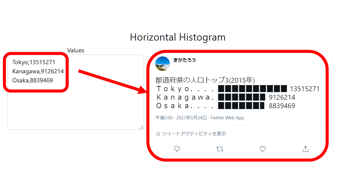
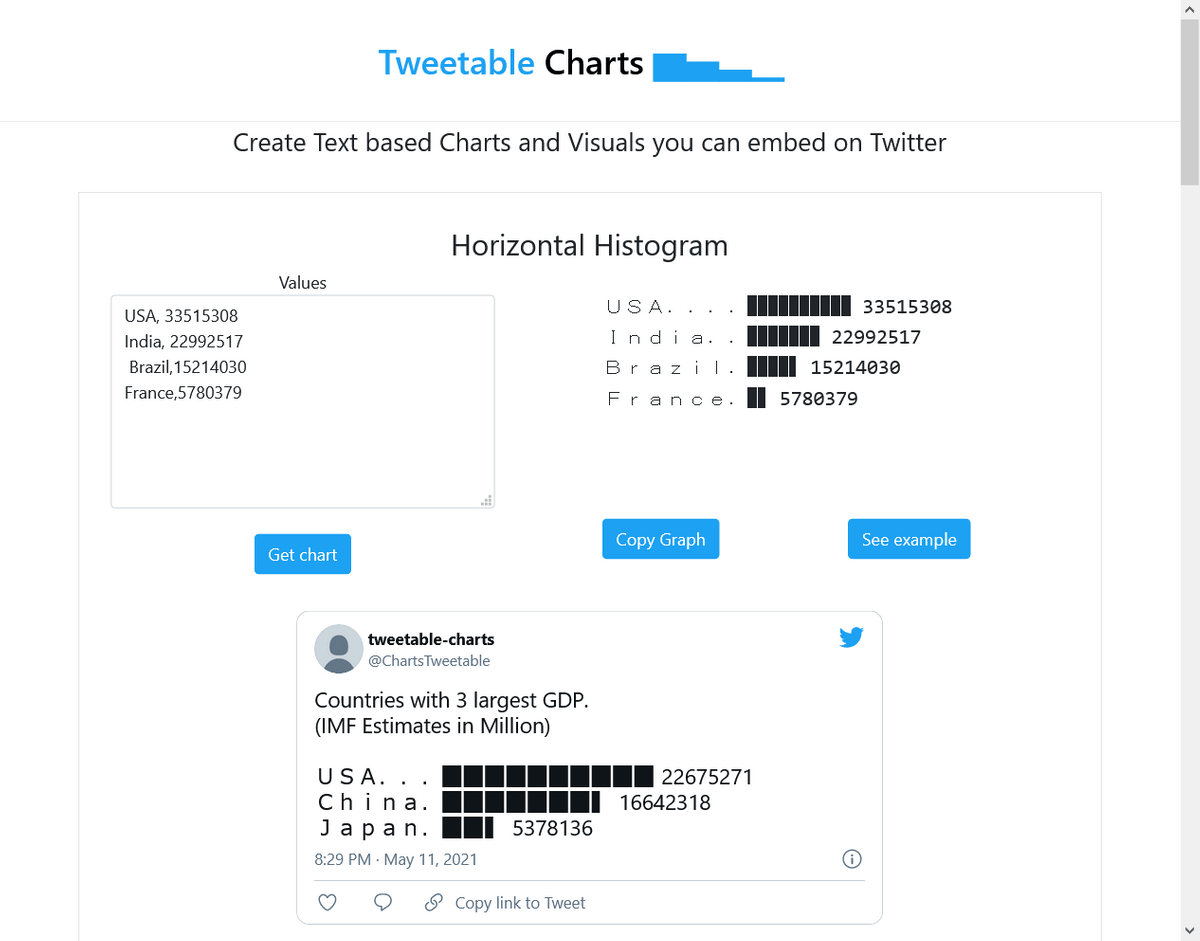
Tweetable Chartsのページにアクセスしてみたのが以下。水平ヒストグラムの作成に必要な値(左上)とグラフ(右上)、それをツイートした時のどう見えるかのサンプル(下)が掲載されています。
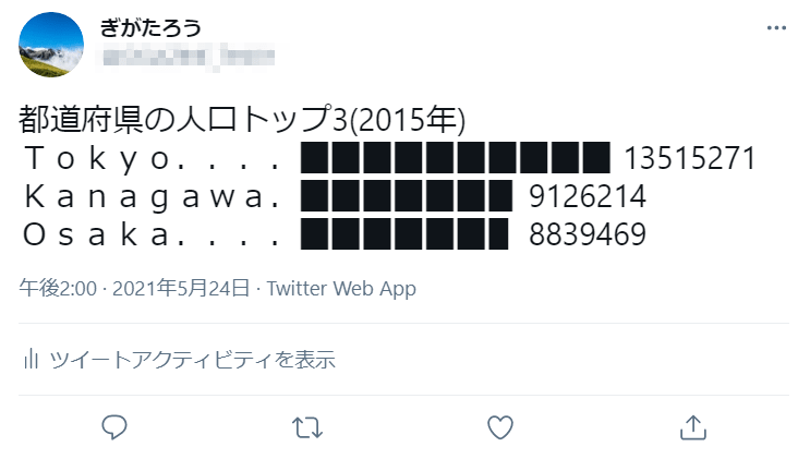
さっそくグラフを作るため、値(Values)の欄に「項目名,数値」の形式で都道府県別の人口トップ3のデータを入力して「Get chart」をクリックすると、数値が棒グラフとなって出力されました。項目の文字数が違っても、自動で割付してくれるので見やすいグラフになっています。ただし、日本語など全角文字は使用できませんでした。
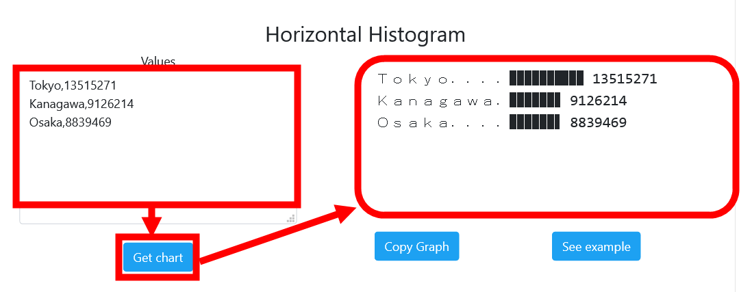
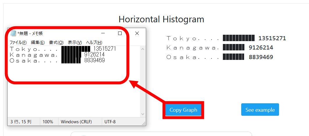
「Copy Graph」をクリックすると、グラフをクリップボードにコピーできます。試しにメモ帳に貼り付けてみると若干表示が崩れていて少し心配になりますが……
実際にツイートしてみると、問題なく表示されました。
なお、以下はTweetable Chartsの公式Twitterアカウントが投稿したGDPトップ3カ国の水平ヒストグラムのサンプルです。
Countries with 3 largest GDP.
— tweetable-charts (@ChartsTweetable) May 11, 2021
(IMF Estimates in Million)
USA...▉▉▉▉▉▉▉▉▉▉ 22675271
China.▉▉▉▉▉▉▉▍ 16642318
Japan.▉▉▍ 5378136
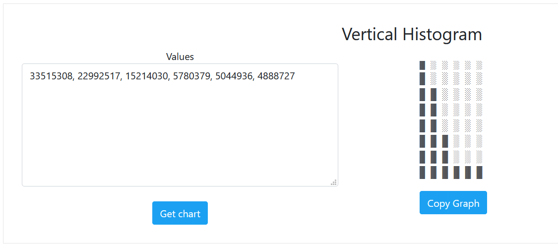
Tweetable Chartsでは他にも、水平ヒストグラムの縦軸と横軸を入れ替えた垂直ヒストグラムを作ることができます。垂直ヒストグラムは数値を「,」で区切るだけで作成可能。項目名を入れることはできません。
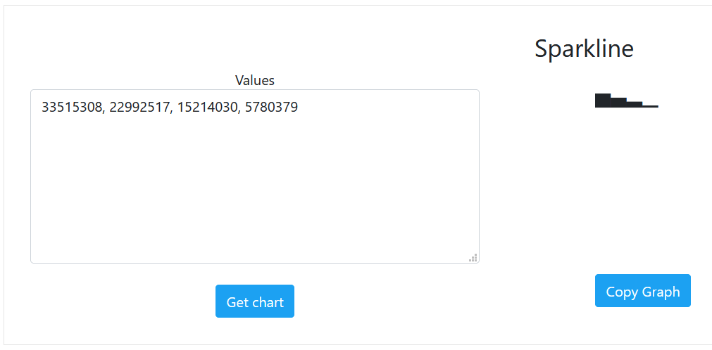
◆2:スパークライン
Sparklineでは、データの大まかな推移などを表す際に用いられるスパークラインを作成できます。
複数項目から成るスパークラインも作成可能です。
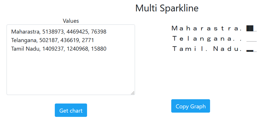
実際のツイートはこんな感じ。
Maharastra.▇▇▁
— tweetable-charts (@ChartsTweetable) May 13, 2021
Telangana..▁▁▁
Tamil.Nadu.▂▂▁
◆3:プログレスバー
Progress Barでは、進捗(しんちょく)率を表すのに用いるプログレスバーが数字を入力するだけで作成可能です。
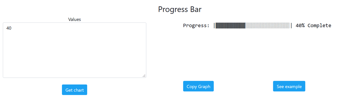
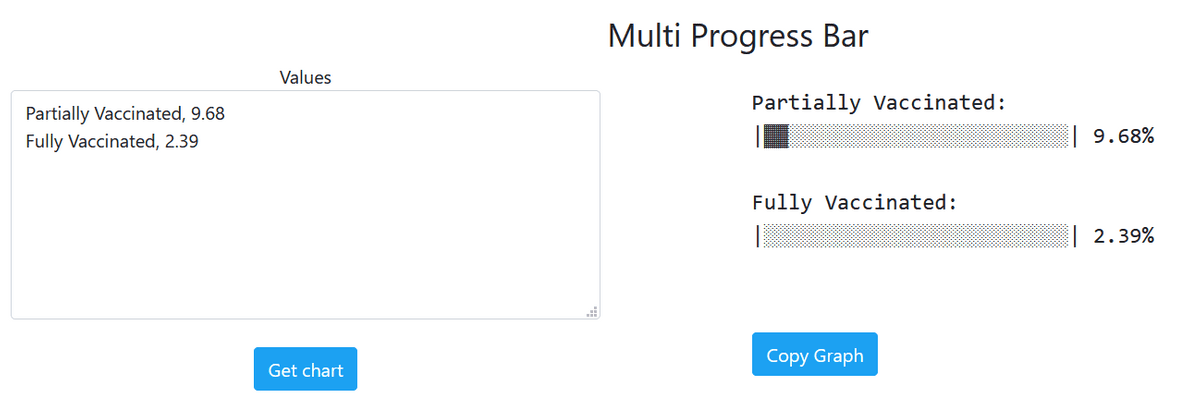
複数の項目の進捗率を比較するプログレスバーも作れます。
サンプルは以下。
Fully vaccinated citizens. (11 May)
— tweetable-charts (@ChartsTweetable) May 11, 2021
Seychelles:
|▓▓▓▓▓▓▓▓▓▓▓▓▓▓▓░░░░░░░░░░| 60%
Israel:
|▓▓▓▓▓▓▓▓▓▓▓▓▓▓░░░░░░░░░░░| 56%
San.Marino:
|▓▓▓▓▓▓▓▓▓░░░░░░░░░░░░░░░░| 37%
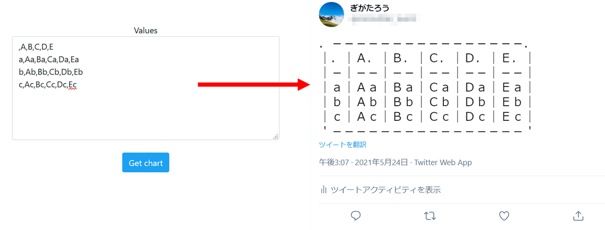
◆4:表
Tableでは表を作れます。
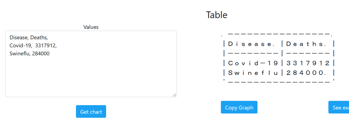
改行で行数を、「,」で列数をそれぞれ増やすことができますが、あまり増やすと文字数制限にひっかかります。
・関連記事
Twitterがお気に入りのユーザーにお金を払える投げ銭機能「Tip Jar」をテスト実装中 - GIGAZINE
Twitterがついに「認証済みバッジ」の申請プロセス再開を発表 - GIGAZINE
簡単にTwitterやFacebookで飾りテキストを使えるようになる「YayText」 - GIGAZINE
・関連コンテンツ


in ネットサービス, レビュー, Posted by darkhorse_log
You can read the machine translated English article 'Tweetable Charts' that allows you to cr….