'Tweetable Charts' that allows you to create tables and graphs that you can post to Twitter for free
It is convenient to have a bar graph or table when communicating something on Twitter in an easy-to-understand manner, but it is difficult to create a graph as image data. In such a case, you can use 'Tweetable Charts ' to easily create graphs and tables simply by entering text and numbers in the input fields.
Tweetable Charts --Create Text based Charts and Visuals you can embed on Twitter
・ What can be made with Tweetable Charts
◆ 1: Histogram
◆ 2: Sparkline
◆ 3: Progress bar
◆ 4: Table
◆ 1: Histogram
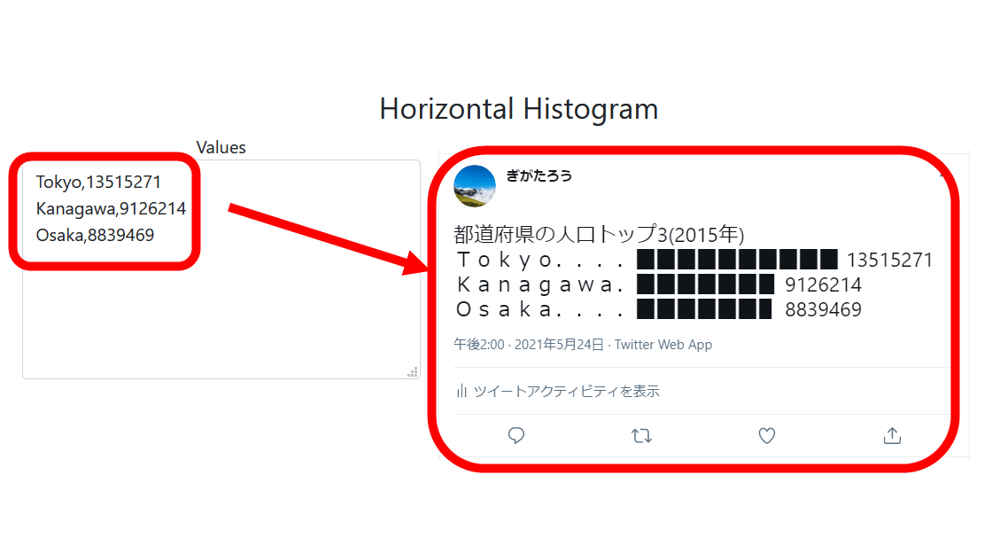
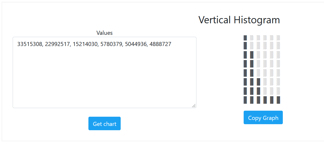
I tried to access the Tweetable Charts page below. The values required to create a horizontal histogram (upper left), the graph (upper right), and a sample of what it looks like when tweeted (lower) are posted.
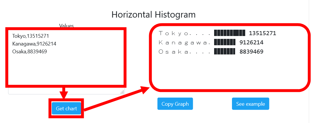
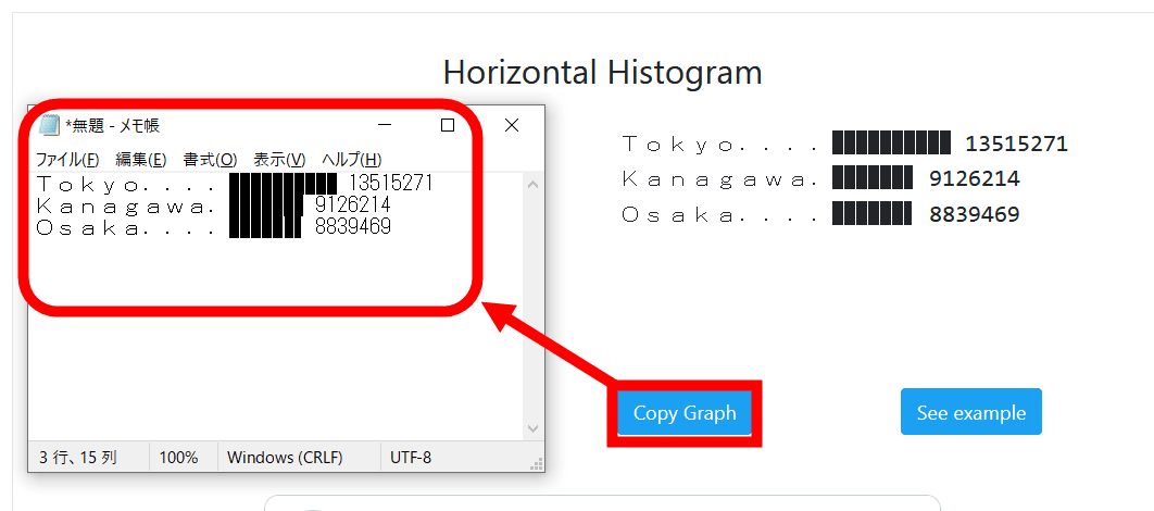
You can copy the graph to the clipboard by clicking Copy Graph. When I try pasting it on Notepad, the display is a little broken and I'm a little worried ...
When I actually tweeted it, it was displayed without any problem.
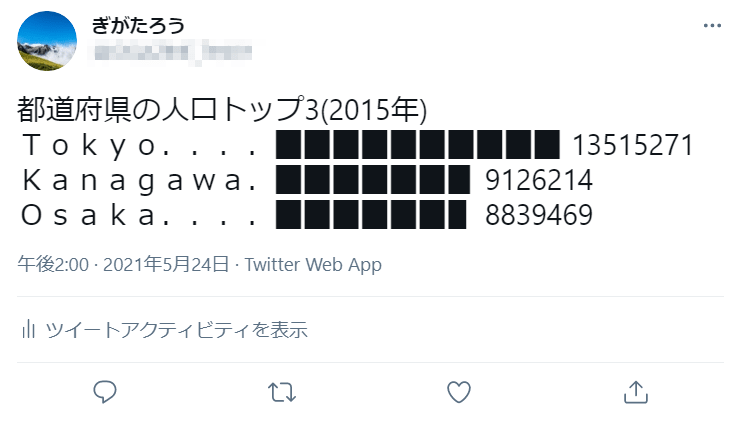
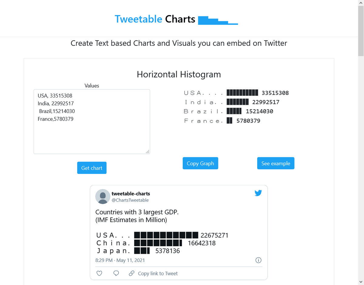
Below is a sample horizontal histogram of the top three GDP countries posted by the official Twitter account of Tweetable Charts.
Countries with 3large GDP.
— Tweetable-charts (@ChartsTweetable) May 11, 2021
(IMF Estimates in Million)
USA. .. .. ▉▉▉▉▉▉▉▉▉▉ 22675271
China. ▉▉▉▉▉▉▉▍ 16642318
Japan. ▉▉▍ 5378136
Tweetable Charts also allows you to create vertical histograms with the vertical and horizontal axes of the horizontal histogram swapped. A vertical histogram can be created simply by separating the numerical values with ','. You cannot enter the item name.
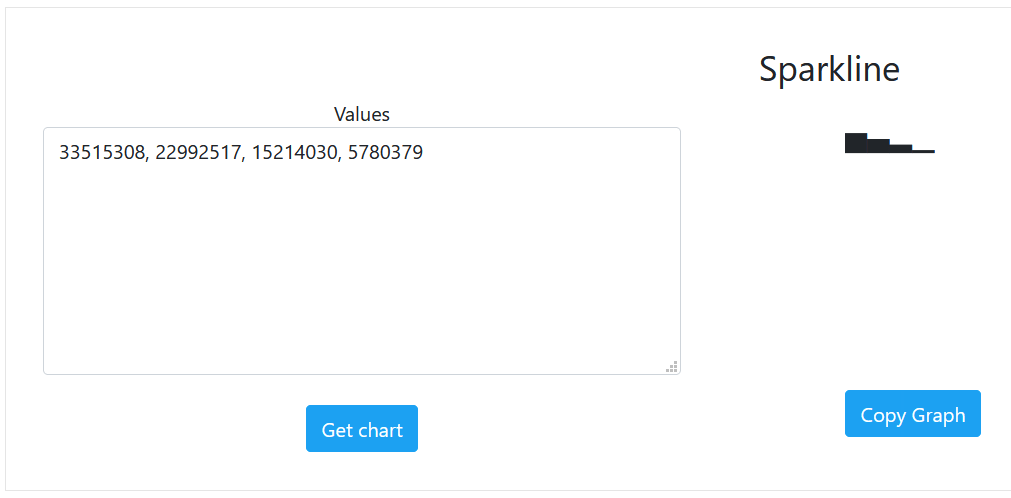
◆ 2: Sparkline
Sparkline allows you to create
You can also create a sparkline consisting of multiple items.
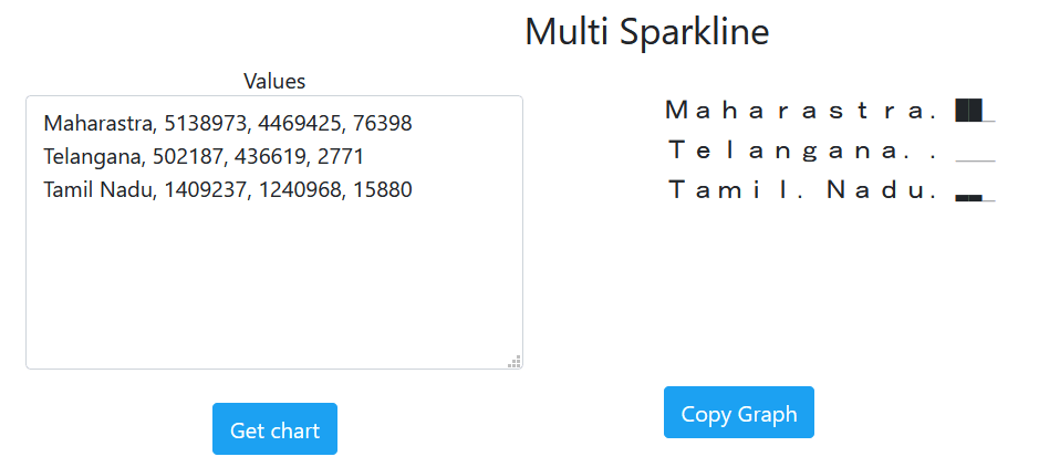
The actual tweet looks like this.
Maharashtra. ▇▇
— Tweetable-charts (@ChartsTweetable) May 13, 2021
Telangana. .. .
Tamil. Nadu. ▂▂
◆ 3: Progress bar
In the Progress Bar, you can create a progress bar that is used to show the progress rate just by entering a number.
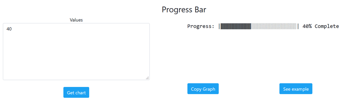
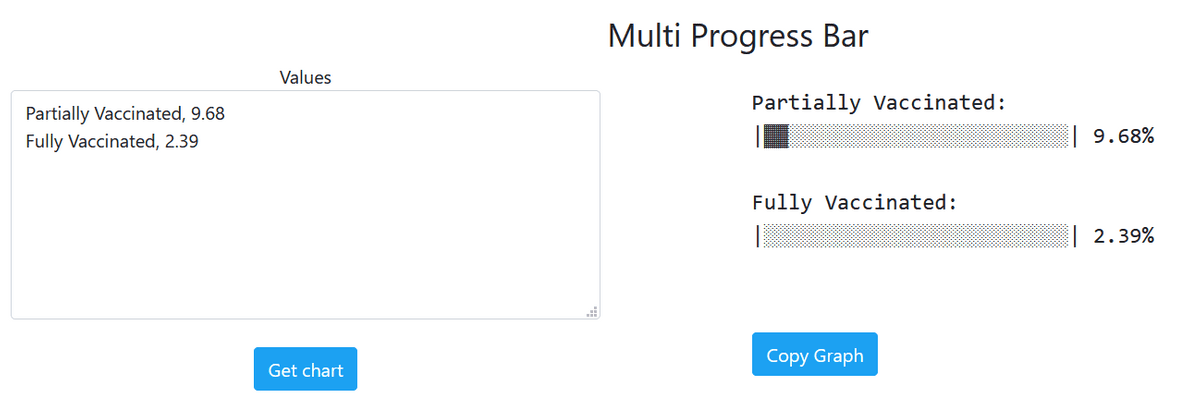
You can also create a progress bar that compares the progress rate of multiple items.
The sample is below.
Fully vaccinated citizens. (11 May)
— Tweetable-charts (@ChartsTweetable) May 11, 2021
Seychelles:
| ▓▓▓▓▓▓▓▓▓▓▓▓▓▓▓░░░░░░░░░░ | 60%
Israel:
| ▓▓▓▓▓▓▓▓▓▓▓▓▓▓░░░░░░░░░░░ | 56%
San. Marino:
| ▓▓▓▓▓▓▓▓▓░░░░░░░░░░░░░░░░ | 37%
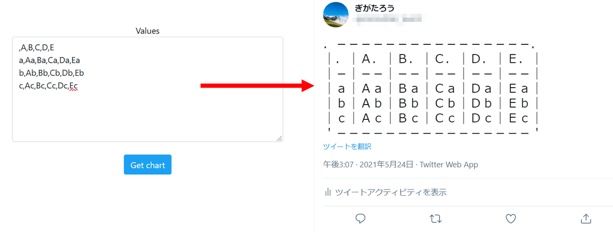
◆ 4: Table
You can create a table in Table.
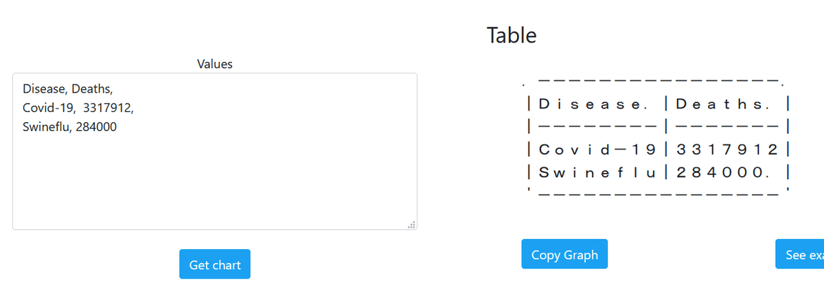
You can increase the number of rows with line breaks and the number of columns with ',', but if you increase it too much, you will be caught in the character limit.
Related Posts:


in Web Service, Review, Posted by darkhorse_log