'Bank failures' that can understand banks that have failed in the past 20 years or more and their asset size in one shot
Visualization toolmaker
Bank failures / Mike Bostock | Observable
https://observablehq.com/@mbostock/bank-failures
A couple variants of my plot of FDIC-reported bank failures, now adjusted for inflation (using CPI): left is sorted by date to better show the sequence of events; right is sorted by assets for a more compact layout. See notebook for source & to compare. https://t.co/atlFhzIMKY pic.twitter.com/XE3CFKoSbQ
— Mike Bostock (@mbostock) May 3, 2023
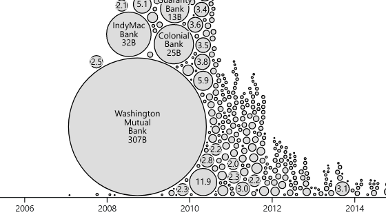
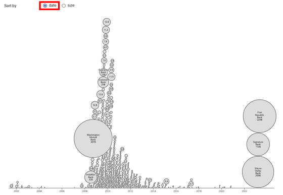
If you access Bank failures, you will see a diagram like the one below. The size of the circle is the size of the failed bank, and the larger the circle, the lower it is placed. In addition, the positions of the centers of the circles are arranged according to the time of bankruptcy (horizontal axis).
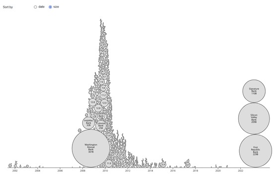
The largest circle belongs to

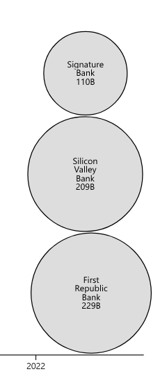
And the circles of
You can switch the arrangement on the figure, and if you ignore the size and prioritize the time when it collapsed, it looks like the following.
Below the figure is the code for illustration.

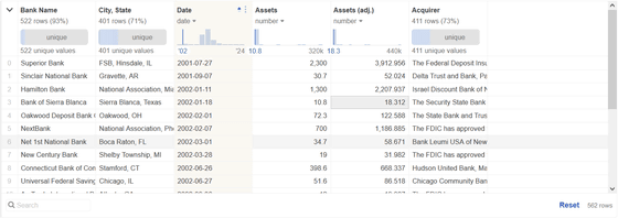
It also showed the data table used.
Related Posts:
in Note, Software, Web Service, Review, Posted by log1i_yk


