25 useful advice when thinking about website design etc.

When creating websites and software, high quality design is required in addition to functionality. There are many good and bad things about design, but product designer Anthony Hobday explained the rules of design that ``if you follow, you won't have any problems.''
Visual design rules you can safely follow every time
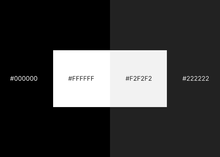
◆01: Avoid pure black and pure white
According to Hobday, pure black looks unnatural on screen, and pure white is too bright. Instead, it is recommended to use a gray that is close to pure black or pure white.
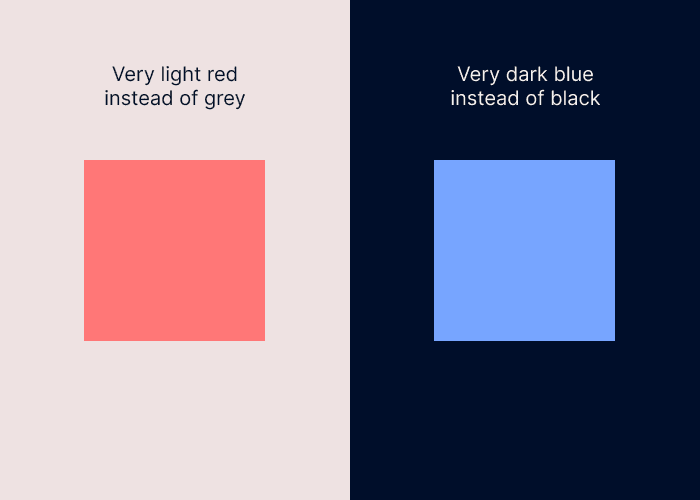
◆02: Add to the neutral color (achromatic color)
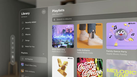
Neutral colors generally refer to black, white, and gray. If you use some color in the interface, it will be more cohesive if you use that color in addition to neutral colors. Below, the colors gray plus red and black plus blue are shown as examples.
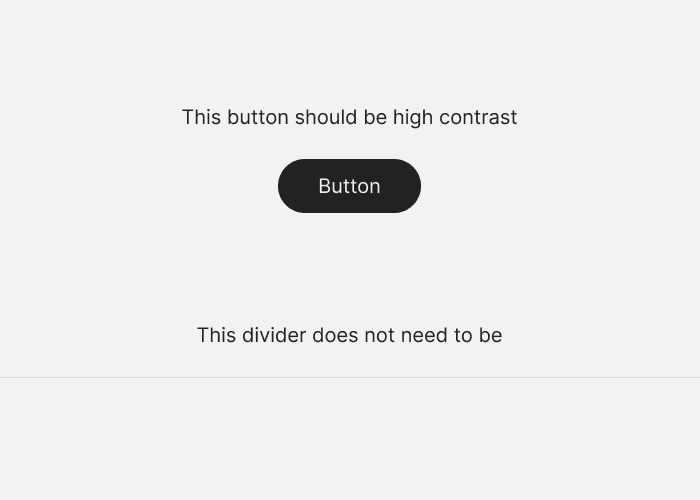
◆03: Use high contrast for important elements
Key elements are buttons, content, and anything else that users focus on. High contrast is useful for important elements because the higher the contrast, the more attention the element will attract. On the other hand, it is also effective to reduce the contrast as much as possible for elements that do not require the user's attention.
◆04: All designs should be intentional
Hobday points out that all design should be intentional. When someone asks you why you chose a certain design, such as white space, placement, size, spacing, color, shadow, etc., you have to be able to answer correctly. Otherwise, the design will not feel consistent.
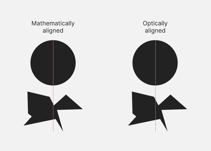
◆05: Visual alignment is often better than mathematical alignment
Even if the design is placed in a mathematically correct position (left), it may actually be biased to the left or right or up and down, making it look unbalanced. In such cases, it is important to create a visually balanced design (right).
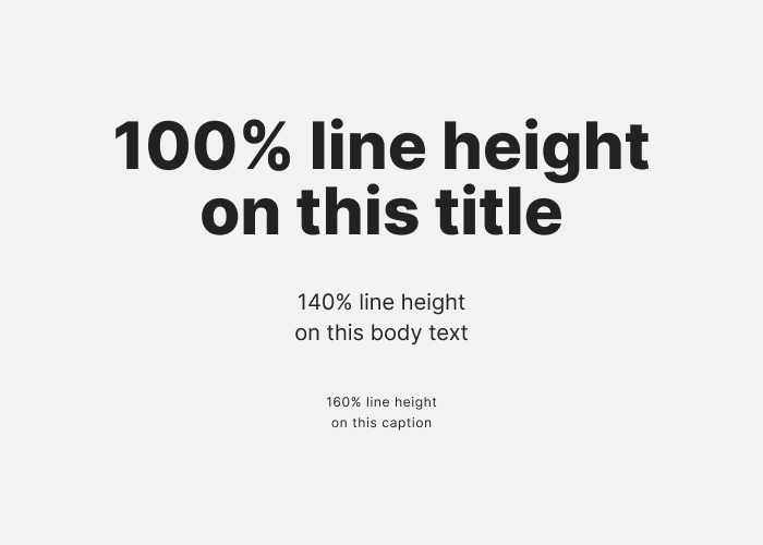
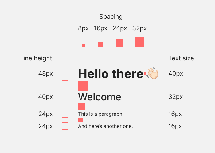
◆06: Narrow the character spacing and line spacing when the characters are large, and widen them when the characters are small.
A rule that applies to all text: the larger the letters, the less space you should have between each letter and each line. The reverse is also true; if you don't do this, large letters may appear spread out, and small letters may appear too close together.
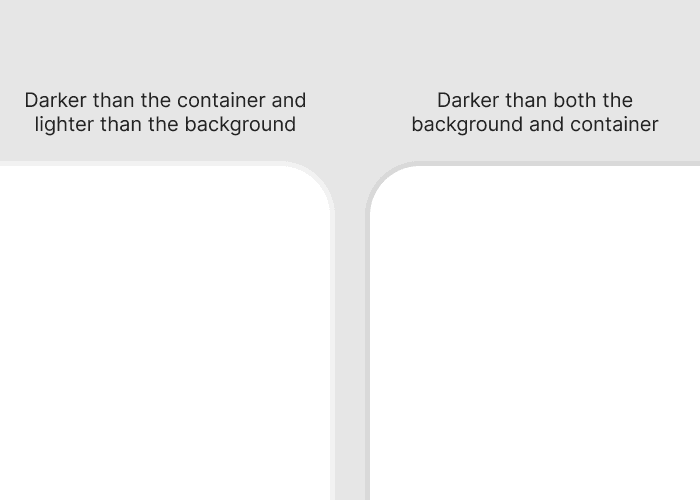
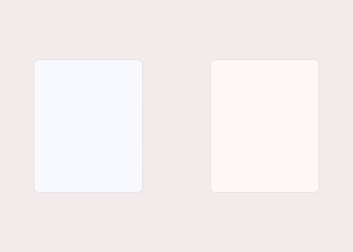
◆07: Container borders should contrast with both the container and the background
As you can see at once by looking at the image below, if the border between the container and the background is ambiguous (left), it will look quite blurry. The border should be a different color from the container and background, and the border between the container and background should be clear.
◆08: Arrange all elements in a straight line
Hobday points out that if an element doesn't line up with other elements, it feels like it doesn't belong in the design. I mentioned that ideally each element should be aligned with the others based on some logic

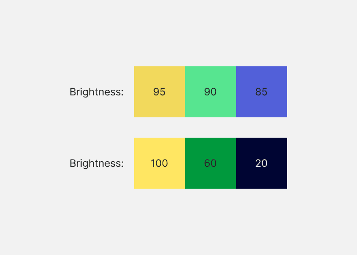
◆09: Change the brightness of the color
Setting different lightness levels for colors gives the impression that not only the hue but also the lightness has character, which reduces the conflicts between the colors and creates a better color scheme.
◆10: If you want to modify neutral colors, use only warm or cool colors.
Using both warm and cool colors to play around with neutrals can create a disorganized color scheme. In the example below, the background on the left is a warm color, and the foreground is a cool color. On the right, warm colors are used for the background and foreground. The left side looks a little floating, and the right side looks subdued.
◆11: Make it mathematically relevant
Spacing between elements and element sizes should be determined by some kind of scale to ensure consistency in the design, Hobday says. In the example below, all elements are multiples of 8.
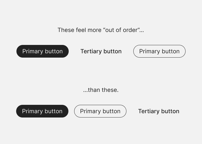
◆12: Arrange elements in order of visual weight
If you have several elements in rows or columns that are visually heavy, place the heaviest elements first and the lightest elements last. One thing to keep in mind is to place heavy elements on the outer edges. For example, if you want to line up some elements on the right edge of a web page, make sure the heaviest elements are on the right edge.
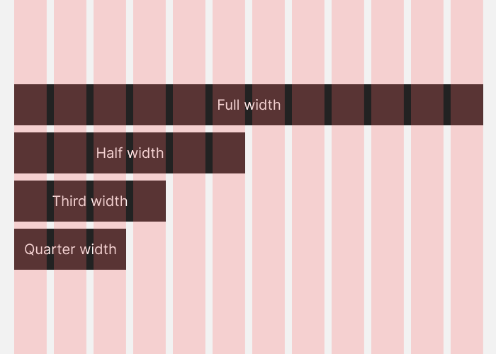
◆13: If you want to divide the design vertically, arrange it in 12 columns.
The 12-column grid can be divided into halves, thirds, and quarters, so it has a high degree of freedom.
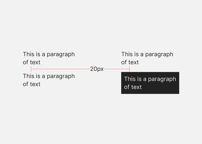
◆14: Place margins between points with high contrast
If you have a black paragraph of text on a white background (left), the point of high contrast is between the end of one paragraph and the beginning of the next. On the other hand, if you have a white paragraph on a black background (right), the points of high contrast are from the end of the paragraph to the beginning of the black background, and from the beginning of the black background to the beginning of the paragraph. There must be appropriate spacing between these points.
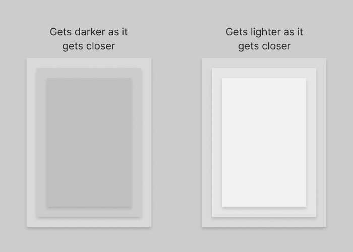
◆15: Make the elements closer to the front brighter
Make the elements on the screen brighter as they get closer to the user.
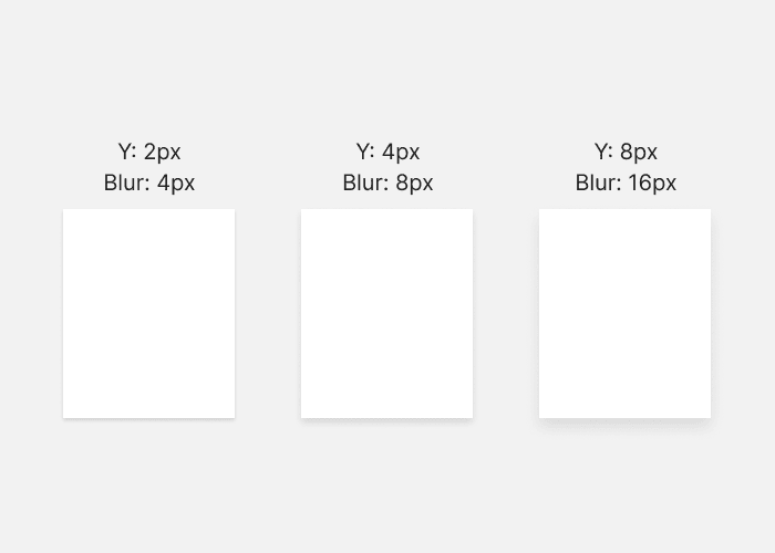
◆16: Drop shadow blur value is twice the distance value
For drop shadows that cast shadows on elements such as text, set a blur value of 8 pixels to create a shadow that stretches 4 pixels on the Y axis as shown below. Hobday also says it's a good idea to reduce the opacity of the shadow as the element appears to come closer.
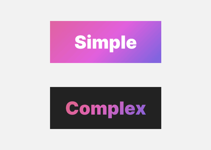
◆17: Put something simple on top of something complex, something complex on top of something simple.
If the foreground, such as text, has a simple color scheme, it is most effective to have a background with a complex color scheme. Conversely, complex foregrounds work best when placed on top of a simple background. If you don't do this, it will look plain or cluttered.
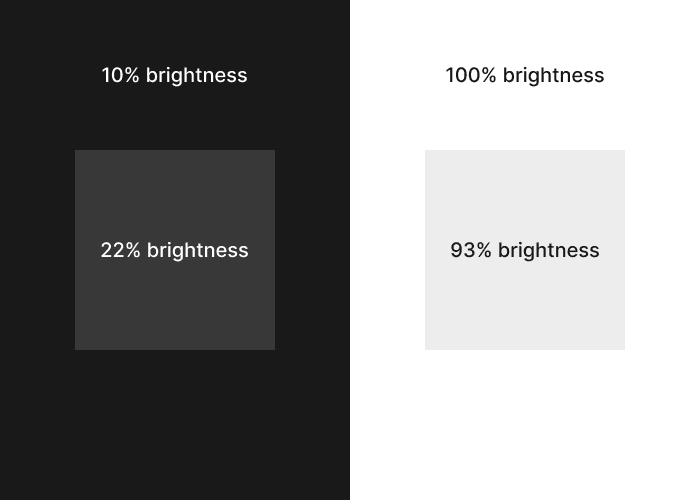
◆18: Reduce the brightness difference between the background and container
It is recommended that the brightness difference between the background and the container be within 12% for dark interfaces and 7% for bright interfaces. This ratio is said to refer to the brightness value in the HSB color system.
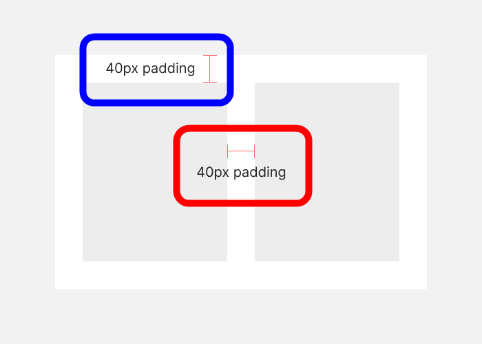
◆19: Make the outer padding (margin) width the same as or greater than the inner padding.
In the image below, the inner padding is the part surrounded by a red frame. If there are elements B and C in container A, this is the margin between B and C. The outer padding is the area surrounded by a blue frame, which is the space between container A and element B or element C. This outer padding must be as wide or wider than the inner padding.
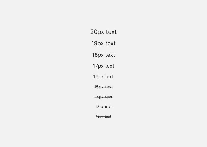
◆20: Body text should be at least 16 pixels
16 pixels is the default text size for most browsers. Text smaller than this size will be difficult to read, so it is best to avoid it in the main text.
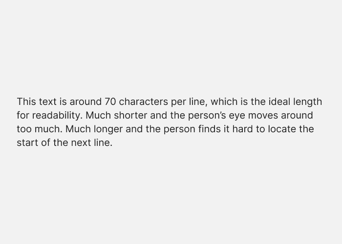
◆21: Line length should be around 70 characters
It doesn't really matter whether the line length is 60 or 80 characters, but having it too far in either direction can cause subtle readability problems.
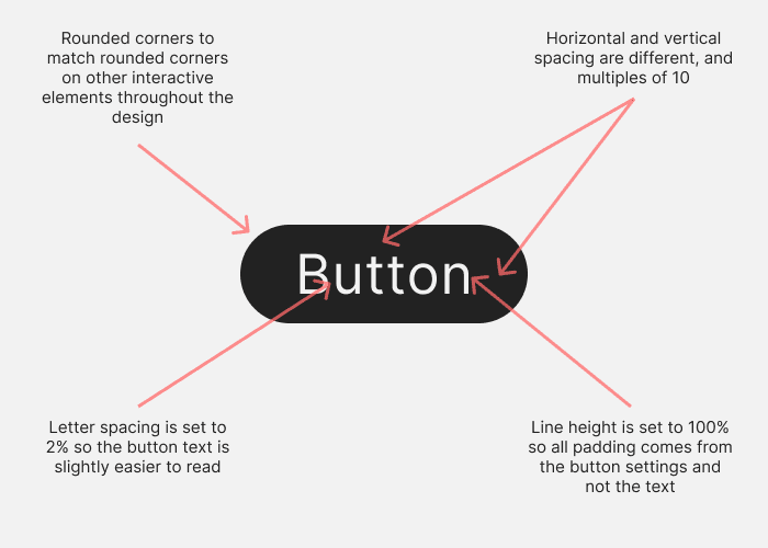
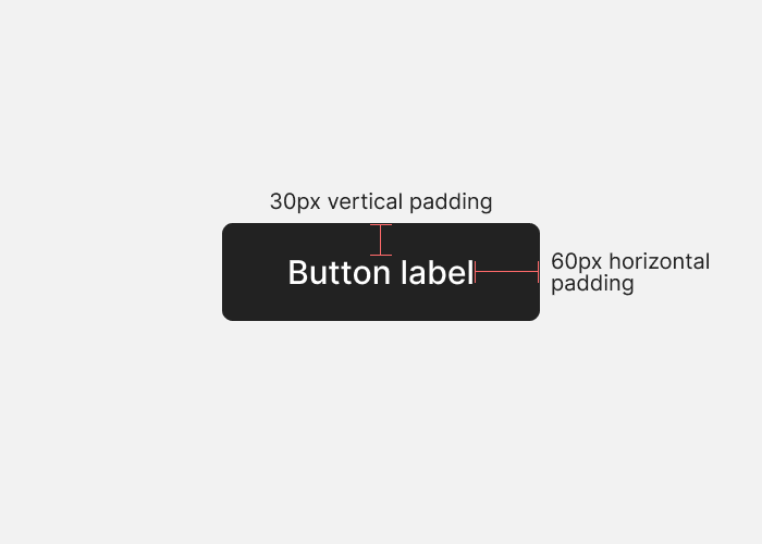
◆22: The horizontal padding of the button is twice the vertical padding.
A standard button pattern is wider than it is tall. Hobday points out that if you want an element to be recognized as a button, it's a good idea to follow this pattern. In the example below, the top and bottom padding of the label is 30px, and the left and right padding is 60px.
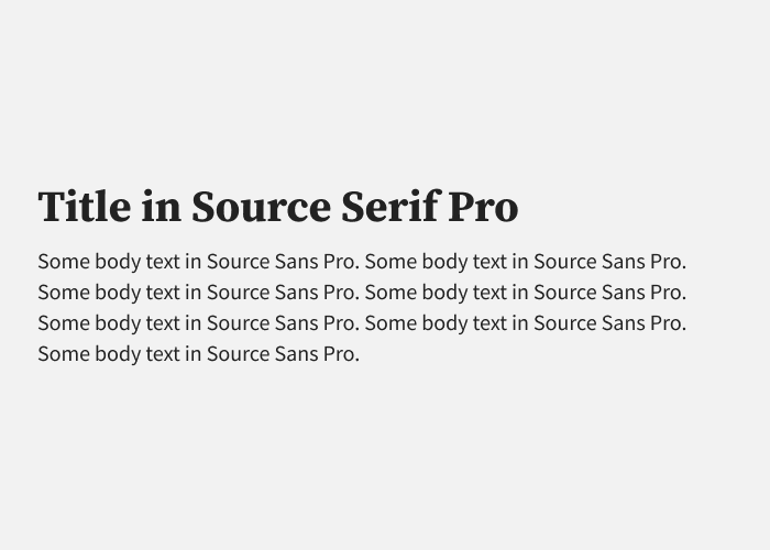
◆23: Use at most two types of fonts
Changing typefaces can emphasize the concept behind your design or add variety to your design. On the other hand, overusing them is bad, Hobday pointed out, ``There is almost no need to use more than one, and it can lead to a visually confusing design.''
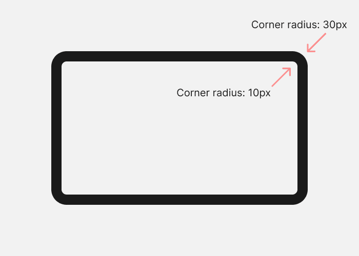
◆24: Round the corners appropriately
If you want rounded corners to look visually pleasing, make the radius of the inner corner smaller than the radius of the outer corner. Specifically, if the radius of the outer corner is 30 pixels and the distance to the inner corner is 20 pixels, the radius of the inner corner is 10 pixels (30-20).
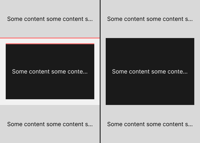
◆25: Do not place noticeable boundaries nearby
By placing a border, you can clearly indicate the break between the background or container. However, if you draw boundaries like the one shown in red in the image below, the boundaries will be close together, resulting in visual clutter.
Related Posts:

in Free Member, Design, Posted by log1p_kr