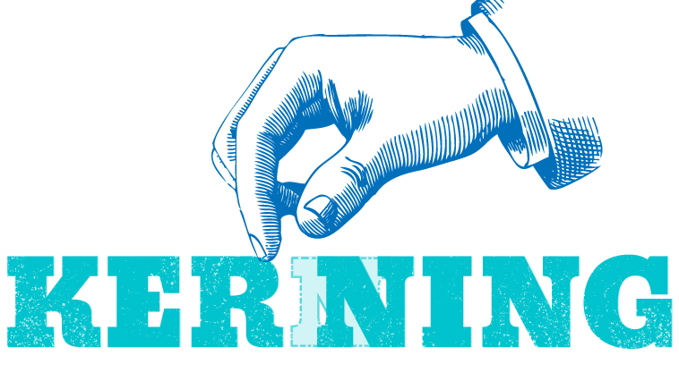
Even beginners nine points for mastering "kerning" that makes dramatically better looking of letters like designers
There are many excellent free fonts, but depending on the font, it is also possible that the spacing between letters becomes unnatural when arranging letters. In such a case, adjust the character spacingKerningYou can improve the design by doing, but how do you do kerning appropriately, nine points that even beginners can use are summarized.
A Beginner's Guide to Kerning Like a Designer - Design School
https://designschool.canva.com/blog/kerning/
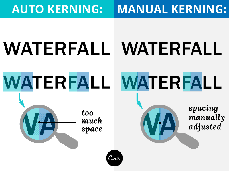
The spacing between letters and letters does not seem natural if it is simply the same distance. In the following images, the character spacing of "Type" on the left is equal and the right is not the same, but it is on the right side that looks natural if it is actually recognized by human eyes. This is because there is a difference in the size of "space" that each character has.

Characters used in the digital environment are contained in "boxes" where each is invisible. Depending on the letters, there is too much room in this box. Therefore, when arranging letters in a digital environment, letters with a narrow space and a wide character overlap a little "box" so that the space between letters looks natural.
So, the nine points to be aware of when kerning is done are from the following.
◆ 1: Observe the combination of letters firmly
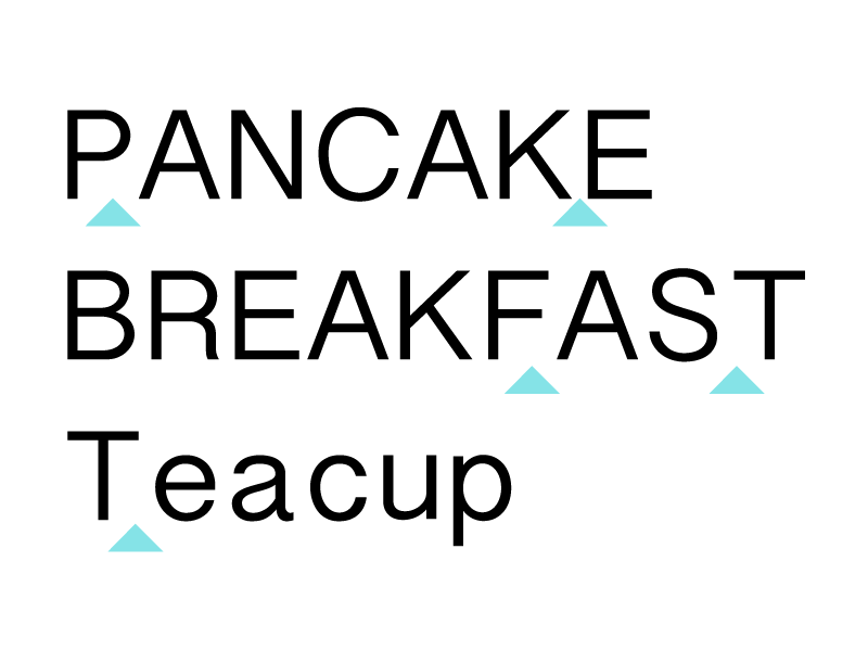
In case of alphanumeric characters, it is necessary to adjust the spacing between letters capital letters with diagonal lines and capital letters with lines and lines intersecting. The former is A · K · V · W · Y, etc., the latter is F · L · T etc. When combining these letters, extra space is often born, so you need to be careful, especially if these characters are in the middle of a word, you should check the space with the letters on the left and right.
Three words "PANCAKE" "BREAKFAST" "Teacup" are lined up, but if it is PANCAKE it is between P and A, between K and E, between B and F, A and S and T if it is BREAK FAST, In Teacup, it seems that the space between T and e appears to be too much space in the default state typing characters.
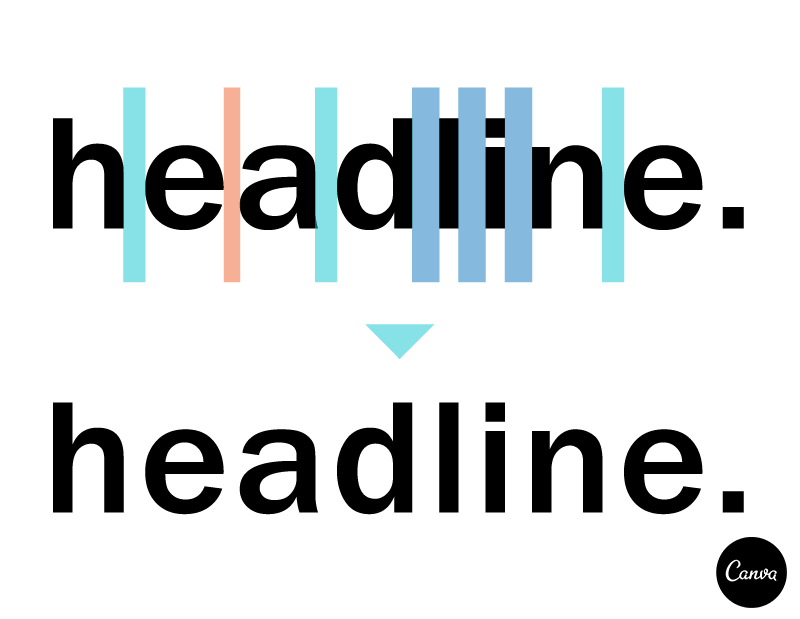
◆ 2: Understand the relationship between space and character shape
Even if the characters are of the same width, the appearance of the space varies greatly depending on whether the two side-by-side characters are using straight lines or rounded letters. Font designerIlene StrizverAccording to Mr., when two letters are lined up, it is the space that needs the most space between two straight lines, then between straight and round shapes, the one that does not need the most space has two round shapes It is said to be in line.
In the following image, let's narrow the space in order from the left, the letter spacing looks natural.
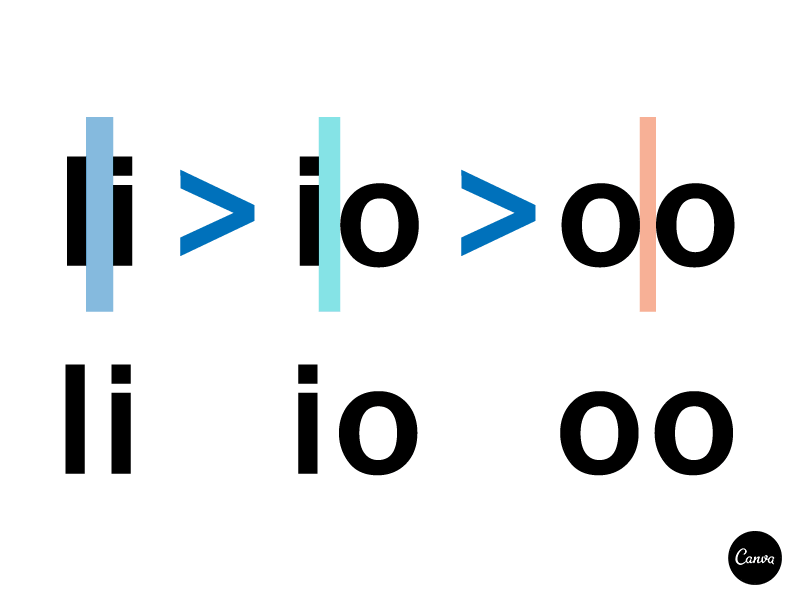
In the case of the word "headline", the space between "dlin" is sandwiched between straight lines, so it is taken somewhat wider and the space between "he", "ad" and "ne" is rounded to a medium width By narrowing the space between "ea" sandwiched between shapes, the spacing between the letters of the entire word looks natural.
◆ 3: Take into consideration the font size
Whether kerning should be done or not depends on the size of the font. For example, since the character "Hello" below uses the same font on the left and right, the ratio of the character spacing of the entire word is the same, but increasing the font seems to create extra space between H and e It looks like. Therefore, "Hello" on the left requires kerning.
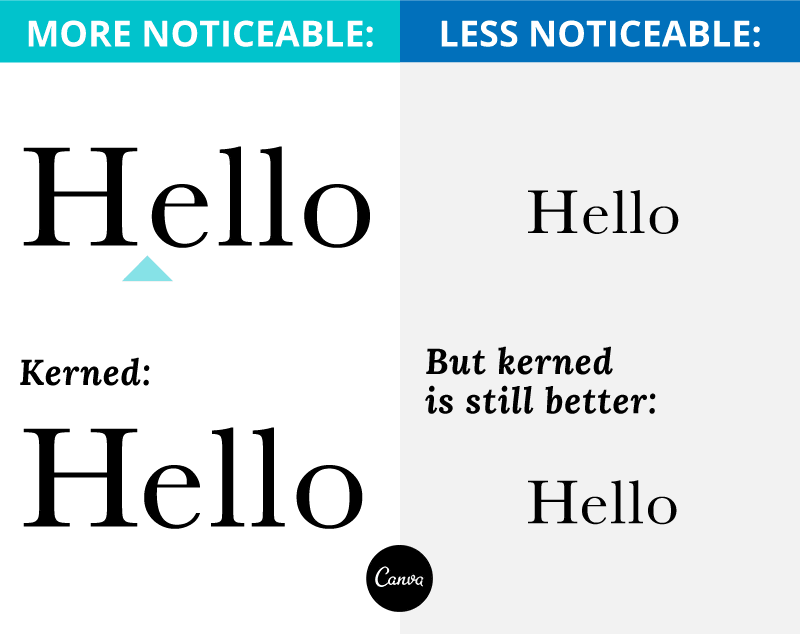
Basically, as you increase the size of the font, the necessity of kerning will come out, but in some cases even if the font size is small it may make it easier to see kerning.
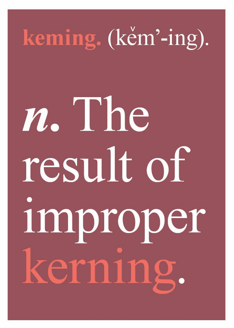
◆ 4: Be careful not to sharpen space too much
Not only will it become difficult to read if you compare too much between letters and letters, there is also the possibility of misunderstanding the viewer. For example, for the letter "kerning", if you shorten the character spacing too much, r and n will stick together to become "m", and you will also see the word "keming". Let's leave the space to not make the viewer's eyes tired and not misunderstand.
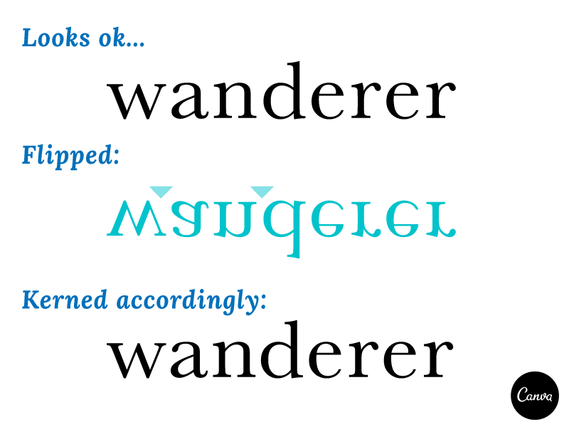
◆ 5: Try turning over the letters
If you are staring at a word, you also get confused as "Is it difficult to read? Is kerning necessary?" In such a case, it is good to turn over the word. By turning over the letters, it becomes possible to judge whether kerning is necessary for the shape itself, not the meaning of the word.
◆ 6: Kerning is done at the end
Whether kerning should be done with typefaces or written letters will change, so kerning should always be done at the end of the design process.
Also, prior to kerning, set spaces at equal intervals for a series of textsCharacter feedYaLine feedIt is also important to try out. Depending on the software you are using, it may be difficult to set up kerning, so the most recommended is to do kerning manually, but in some casesMetrics Kerning or Optical Kerning functions are providedSo it is better to use it.
◆ 7: When to kern
Not all typographies require kerning, but of course there are times when kerning is unnecessary. Therefore, let's pay attention to the following two points.
(1) Necessity of kerning at small character sizes such as 10 pt, 11 pt, 12 pt is hardly born
(2) In the case of high-quality fonts, there are cases where the space born by the combination of characters is calculated beforehand, and appropriate kerning has already been performed in some cases
In the case of designs where many characters are used, kerning takes a lot of time. It is recommended to perform kerning when it takes advantage of time, such as getting people's eyes by doing kerning, if benefits are born.
◆ 8: Practice
To learn kerning, practice is important anyway. However, without having to bother to set up a project, you can practice kerning by using the following web games.
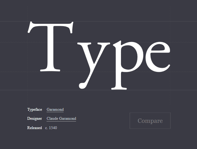
Kern Type, the kerning game
http://type.method.ac/

Since English words are displayed on the website like this, I will kern the space between letters and letters properly.
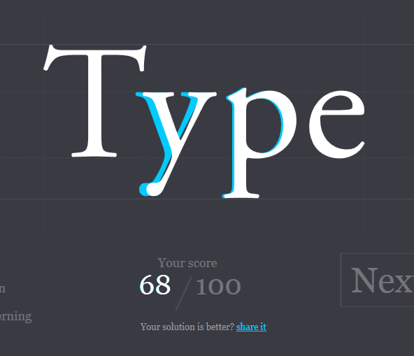
Drag the letters y and p by dragging and click "Compare" ... ...
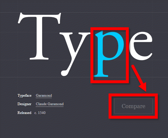
With this kind of feeling, you can see how much displacement is between the character you moved and where you originally should move the letters by kerning. The kerning that I went was evaluated at the end of 100 points and the problem was prepared for 10 questions in all.
◆ 9: Web designers should also kern
Kerning is strong with graphic designers who do static design and printed designers, but even web designers can benefit from kerning. Using "Kerning.js" makes it easy to kernel on CSS, so it is one way to try using the following web service.
Kerning.js
http://kerningjs.com/

Related Posts:


in Design, Posted by darkhorse_log