"Typography for User Interfaces" which summarizes the tips for making font and character design easier to see on the UI
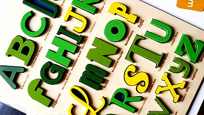
ByMarco / Zak
When designing websites and apps, what you must think about in order to create easy-to-use and easy-to-read content is "How to arrange information." Many of the information is displayed in letters and sentences, so web designersViljami SalminenThinks about why character strings are important for web design, how to design easy-to-read character strings.
Typography for User Interfaces | Viljami Salminen
https://viljamis.com/2016/typography-for-user-interfaces/
◆Graphical user interface(GUI) formation
The key turning points in the history of GUI introduced for the first time the window operation with the mouseXeroxComputer "Alto"is. Alto was not marketed, but its hardware technology later was another project "Xerox Star"It is said that it is" the first computer with a GUI installed in the OS ".
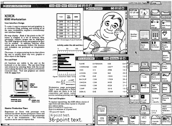
Alto and Star's "GUI operated by mouse" have a big influence on Apple and Microsoft, and Steve Jobs made Mac OS public in 1984 three years after Star was launched.
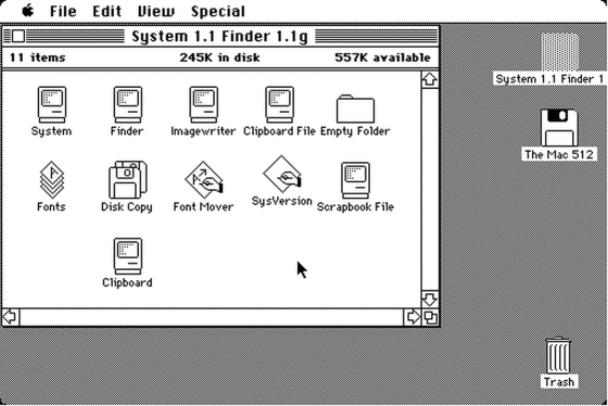
One of the big impacts of the original Mac on the PC world is that "various fonts were preinstalled". With the advent of the Mac, commercial computers can suddenly change the design of letters freely, and as time goes by, many custom fonts become available.
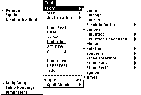
As you can see from the above, when we look at the history of the GUI, it can be said that "how to arrange each letter on the screen and how to arrange it" was a very important factor. And even now the same thing can be said, letters and sentences occupy an important position of the GUI. Therefore, you should carefully think about how to design typography.
◆ Text is an interface
Excellent sentences are synonymous with excellent design, web designers are copywriters to form letter information.
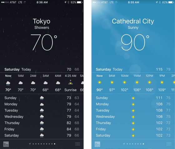
For example, in the iOS weather forecast application, if you put all the elements on the screen in the table and classify it, there are three types of "We", "Icon" and "Image". The job of the web designer is to combine these three pieces to create an attractive design. Although it may not be conscious of the clarity of letters in everyday life, when a lot of character information is lined up, font design and clarity are very important to allow users to recognize letters It is getting. Of course, not only the type of font, but also the balance and positioning of letters and sentences, the hierarchy & structure making are important, but there are also cases where 95% of the design's overall design is made with fantastic writing and fonts, Salminen Said.
◆ How to read
As it is important to put characters on the screen, in order to create an excellent design it is necessary to learn how people read "how the decisions on each design affects". Of course, this is a very difficult problem because there are individual differences, and in a word we can not set out the principle "kore". However, recent studies have revealed some points on human reading methods.
In a survey, when reading less than 20 letters, it turns out that people are reading at a slower speed than reading long sentences. This is because, when reading long sentences, the line of sight does not flow from left to right, because it grasps the meaning while coming back and forth. This eye movement called "saccade" helps people to understand the sentences more, but since many character designs in UI have short strings, we do not have a scene where the saccade effect is demonstrated to the designer You should keep it in mind.

Also, in the past, there was the idea that "people judge meanings from the outline of each word", but nowadays the readability of sentences is not a "word" unit but a character shape It is understood that there is. Therefore, we need to focus on the design of one letter and one character.
◆ What makes strings easier to read
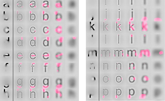
In 2008, what part of each letter is important for human recognition? A study to investigate that was done. As a result, we know that the end line of letters is most important for character recognition. In the figure below, the pink part plays a big role for character recognition most. In other words, in order to make recognizable letters, it is necessary for this pink part to be written in a general way, even for fancy decoration.
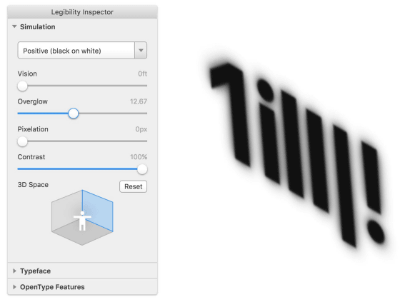
Also, in a study conducted in 2010, it was found that some fonts are not easy to be misidentified by letters even if the font size, type and thickness are the same. Characters with narrow widths are harder to be misidentified than wider letters, smaller letters "x" fit within the height of "X-height"It is difficult to make a mistake more than characters of other heights.
◆ What are the points you need in UI font
The points of "typeface" Salminen learned from experience as a designer are as follows.
01: Readability
Each character needs to be clear and easy to recognize. In that respect,Sans serifMany of the fonts should be avoided as it is difficult to distinguish between uppercase "I" and lowercase "l". However, Adobe released the open font "Source Sans Pro"Is recommended as it is easier to distinguish between" I "and" l "as follows.

Apple is temporarily a sans-serifHelveticaAlthough I was using, I have changed to a font called San Francisco due to complaints from users. San Francisco has a larger X-height than Helvetica, with fewer margins, which makes it easier to identify letters.
02: Modesty
The UI character needs to be noticed by the user, but it is out that pulls too much attention like the font to the right of the following image.

03: Flexibility
The UI can not control the user's ability and environments such as browser, screen size and connection speed. Therefore, it is necessary to be able to respond flexibly to users in any environment. It is not a UI that users who use small screen sizes · low resolution screens feel "hard to read".
04: X-height is large
For the alphabet, increasing the size of X - height increases the ease of distinguishing characters. The size of 'o' which is the letter of X-height is getting bigger as you go to the right of the following three "fox", the farthest right of "fox" is the least misread.

05: proportion
The relationship between the width and the height of the character determines the proportion of the character, but when the screen size is small, it is correct to take the width of the character wide.
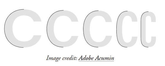
06: Take a wide margin
It is important to have a margin around each letter as it becomes hard to read if the characters are too dense. On the other hand, let's be careful as characters will not be consistent if they have too much space. According to Salminen's experience, the space between letters isCounter spaceIt is said that it is about a little narrower than that.

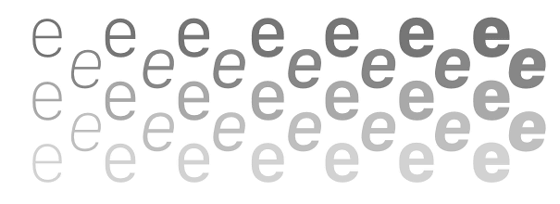
07: Strong weakness should be weaker
The strength of the strokes contained in the character is effective when the screen size is large, but if the screen size is small it makes little sense. On the other hand, it is difficult to create differences between letters when there is no stroke in one character, and it is also possible that a mistake in appearance is born. When choosing a font it is important to balance the two. Characters on the left side of the following images are clearly showing the strength of the stroke and there is little or no strength on the right side. In order not to be influenced by the screen size, it is necessary to balance as much as possible in the form that it approaches to the right side.

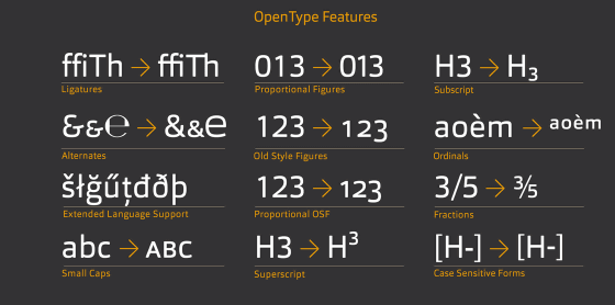
08:OpenType fontTo be
OpenType is a font format developed jointly by Adobe and Microsoft. It is designed to maintain compatibility between Mac and Windows, and display of variants is not affected by platform differences. High flexibility is the characteristic of OpenType, Salminen makes the character widths evenly spaced, in particularTabular FiguresIt seems that you like the function.
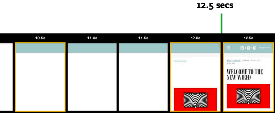
09:Fallback fontUse
The web font is displayed slowly, and the image in the page is displayed but the important character does not appear. In this case, change the fontNonblocking mode, It is possible to dramatically cut the reading time of characters.Fallback font, Until the custom font is displayed, the default font specified by the OS is displayed, which increases readability.
Ten:Font hinting
Font hinting means that fonts are optimized according to the computer's monitor. If you display vector data fonts on a computer with a low resolution, the design will collapse due to the small number of pixels, but if you do hinting, balance and thickness will be handled appropriately.
Related Posts:
in Design, Posted by darkhorse_log

