Even Apple has difficulty centering text in app layouts
Software engineer Martin Wojcik pointed out that the UI of Apple's native Calculator app on macOS is misaligned. It is very important to center text in the layout of the app because it directly affects the readability of the UI, but some people say that it is quite difficult to achieve perfect center alignment.
Is my vision that bad? No, it's just a bug in Apple's Calculator. | Martin Wojtczyk
Comically, I didn't even notice those wobbly numbers in the first screenshot, I ... | Hacker News
https://news.ycombinator.com/item?id=41407570
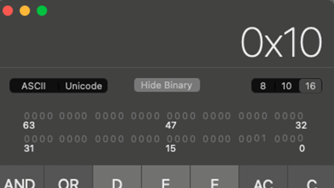
Below is the Mac calculator app. When Wojcik was converting decimal numbers to hexadecimal and binary numbers and doing calculations, the screen started to shake so much that he couldn't concentrate on his work and thought, 'My eyes are getting tired.'
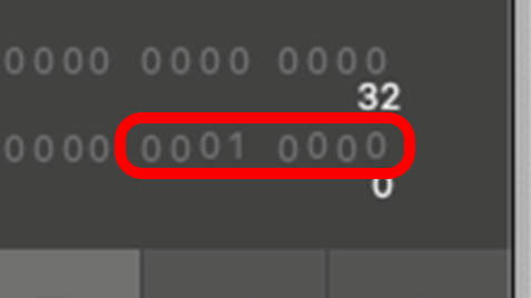
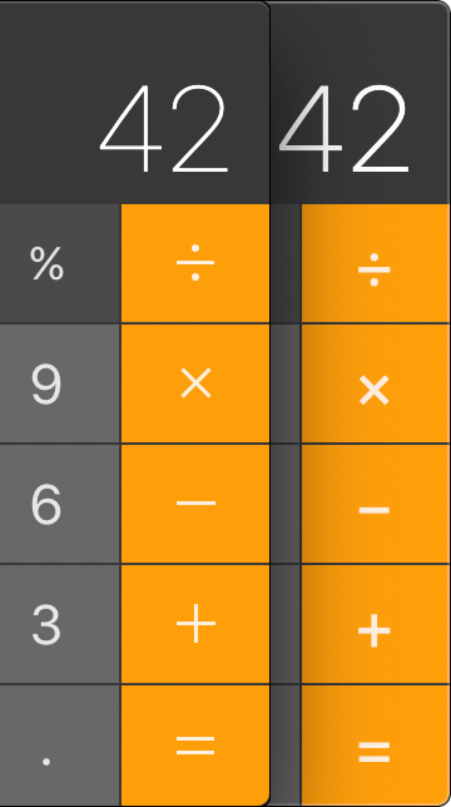
The cause of this was the unstable display of numbers in the calculator app. If you look at the string of characters below, '0001 0000,' the '0' and '1' are not aligned at the top and bottom, making it look choppy.
'The calculator app was open for days,' Wojcik said. 'It could be that the UI coordinate system uses floating point numbers, and rounding errors accumulate over the course of days.' He said he doesn't know why the UI is so wobbly.
When Wojcik's question was raised on the social news site
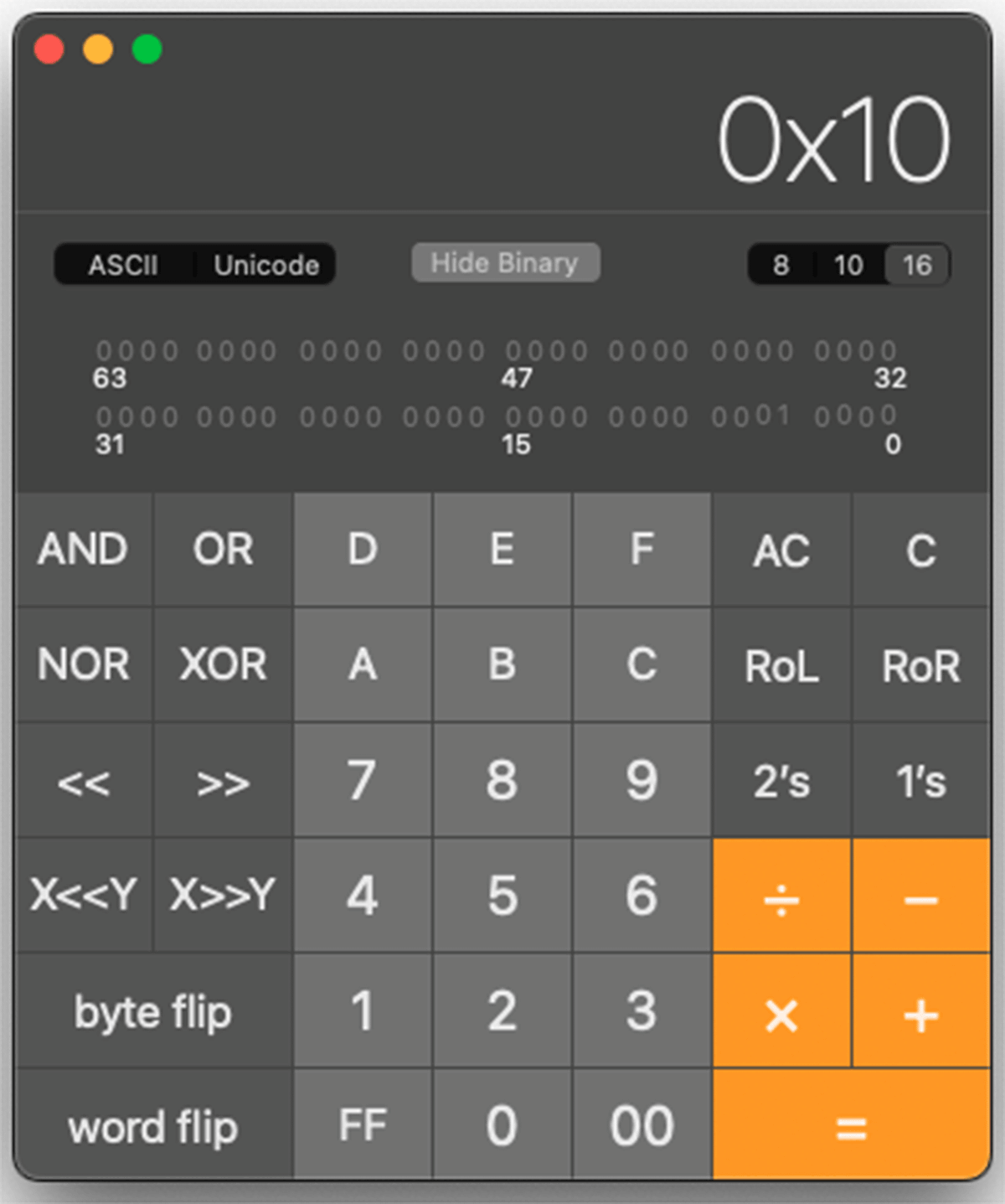
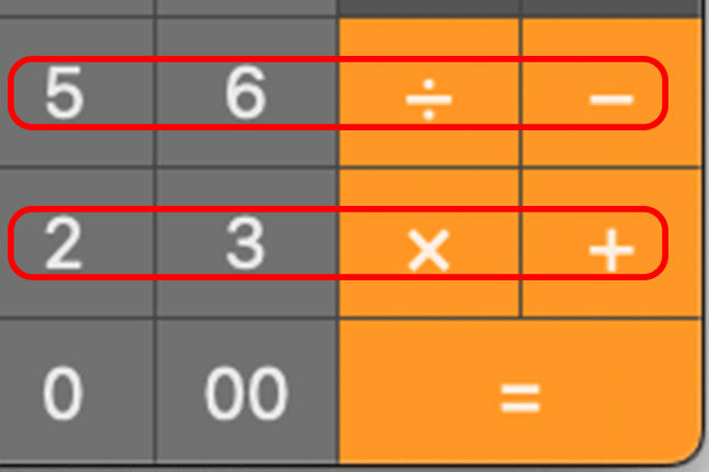
For example, in the number and symbol buttons below, the top and bottom of the button frames are aligned, but the numbers and symbols displayed are misaligned.
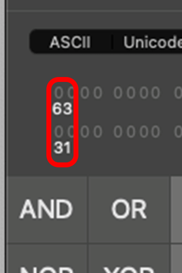
Additionally, the '63' and '31' in the calculation are not left justified, and are also misaligned with the '0000' string. Additionally, the numbers are not of equal width, so the widths of the '63' and '31' are different.
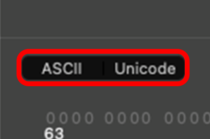
The 'ASCII' and 'Unicode' labels displayed above it are also misaligned with respect to the buttons. According to a Hacker News report , the 'ASCII' label is about 43/50 pixels off center, while the 'Unicode' label is about 20/25 pixels off center.
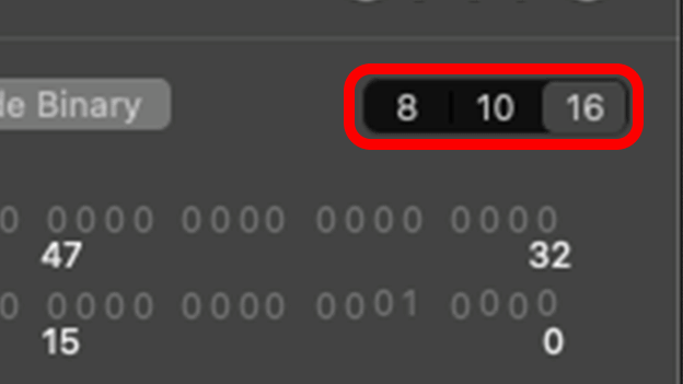
The label on the '8 10 16' selector for selecting the base number also appears to be misaligned from the center of the button.
However, achieving perfect centering in a UI is quite difficult. Software engineer Nikita Prokopov says on his website that he can find parts of the UI that are not centered in well-known apps and services such as GitHub, Valve, Slack, Telegram, Google, Airbnb, and YouTube.
Hardest Problem in Computer Science: Centering Things @ tonsky.me
Why is center alignment shifted in UI design and how to solve it | Collis
https://coliss.com/articles/build-websites/operation/work/about-centering.html
Prokopov also touched on the UI of the Calculator app on macOS, arguing that the reason symbols are not centered and are blurry in the Calculator app on macOS is because macOS Catalina (version 10.15) switched to an 'icon font' method that displays text instead of images for button labels.
Below is the QuickTime record button. This is also designed with an icon font, but if you look closely, you can see that the red circle is slightly to the left and fails to be centered with the white circle.

Prokopov said designers need to set tight bounding boxes that define the outline of their fonts, font designers need to set font metrics carefully, and developers need to understand the fonts they plan to use.
Related Posts: