Simple point to make charts and graphs dramatically easier to understand 10 pieces

When information is visualized it is easy to convey to people, and it is also possible to leave a strong impression. As a result, charts and graphs in presentations are becoming very important, but if you make a mistake it is difficult to understand the information, in the worst case it gives to those who are seeing the wrong understanding. there,HubSpotPresents ten points to make the presentation material dramatically easier to read such as charts and graph designs.
Why Most People's Charts & Graphs Look Like Crap
http://blog.hubspot.com/marketing/data-visualization-mistakes
Why Most People's Charts and Graphs Look Like Crap
http://visage.co/peoples-charts-graphs-look-like-crap/
◆ 01: Pay attention to the design of the pie chart segment
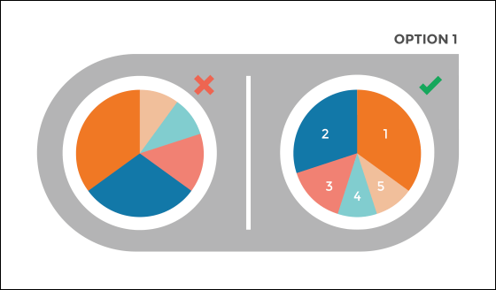
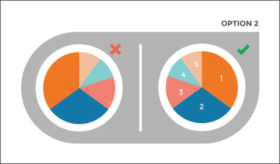
Pie charts are one of the simplest ways to visualize information, but there is also the possibility of complicating information. As a fundamental point, it is important to "show up to 5 segments" "intuitively display". As a sample of a pie chart that conveys important information to the viewer, the following two are mentioned.
This is the first one. Set the largest section clockwise from 12 o'clock and the second largest section set counterclockwise from 12 o'clock. Then we will continue with the third and fourth ... ... under the second largest section.
And another one. Place the largest section clockwise from the direction of 12 o'clock, and continue with the second and third ... ... under it.
◆ 02: Do not use dashed lines on line graph
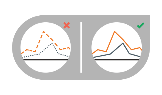
Line graphs using dashes and dots do not draw attention from viewers. Let's use a solid line so that each graph can be identified by color coding.
◆ 03: Data intuitively
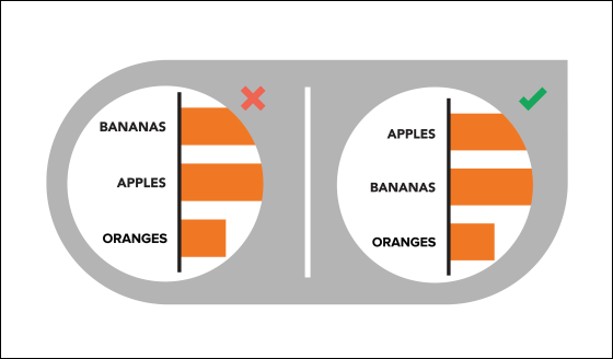
Content should be logical and intuitive. To make it easier for readers to obtain information, categories should be displayed in alphabetical order or in order of importance.
◆ 04: Unclear data out
Please be careful that all data is not damaged or obscured by the chart design. In the graph on the right hand side below, the overlapping part of the top chart is translucent so that the viewer can see all the data.

◆ 05: Make a leader
Making readers in graphic elements can help readers understand. If you want to focus on one trend in the scatter plot, it is good to draw an approximate curve.

◆ 06: Display accurately
All expressions must be accurate. When you want to show that the circle on the right is "2 times" of the circle on the left, you should double the area instead of doubling the diameter of the circle.

◆ 07: Do not make the heat map colorful
There are things that makes the colors stand out more than other colors. If you use many colors, you may place emphasis on unnecessary places, so when using the heat map please express the color between the two colors by adding a gradation.

◆ 08: Gap between bar graph and graph is consistent
Although sometimes tempted to show their creativity in the presentation, consistency and harmony helps the viewer to understand. Let's keep the gap between the bar graph and the bar graph at 1/2 of the bar graph body.

◆ 09: Chart easy to compare
Comparison of charts is an important means for conveying information, but it is meaningless unless the viewers can easily compare. Please make sure that you can compare the two charts at a glance.

◆ 10: The 3D chart is quite rare
Although it may seem at first glimpse, the 3D chart distorts the perception of people and twists the data. Please be sure to show the data exactly in 2D.

Related Posts:
