"Color CRAYON-TIP Method" summarizing the 50 most important rules of "document design"
Especially important elements for graphic designers to design documents are "Color", "Contrast", "Repetition", "Arrangement", "Why", "Organization" It is classified into 10 categories such as "Negative Space", "Typography", "Iconography", "Photography", and 5 categories in each category, including 50 rules in total Infographic is "Color CRAYON-TIP"is.
The 50 Most Important Rules of Document Design: Color CRAYON-TIP Method
http://thevisualcommunicationguy.com/2014/10/23/the-50-most-important-rules-of-document-design-color-crayon-tip-method/
"Color"
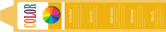
◆ Part 1: Color Wheel
Using the color wheel, you can select "Monochromatic", "Analogous", "Complementary", "Split Complementary", "Triadic", "Tetradic" Let's create the correct color scheme.
◆ Part 2: 4 colors or less
Color scheme with less than 4 colors for one design.
◆ Part 3: Emotions and Saturation
Serious atmosphere can be produced with dark coloration with low chroma, familiarity can be expressed with bright color saturation low color. To catch children's attention it is better to raise the saturation to the limit and color it.
◆ Part 4: Color psychology
There are colors that encourage stimulation for each emotion such as "attention" "danger" in red, "happiness" "hope" for yellow, "jealousy" and "fear" in dark colors.
◆ Part 5: White is an excellent color
White is a versatile color that gives the impression of "transparency" "enlightenment" "feeling of cleanliness" "expertise" and sometimes "expensive".
"Contrast"
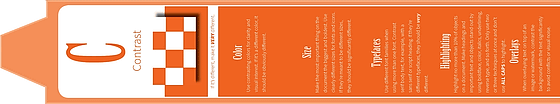
◆ Part 1: Color
A contrasting color usage is better for clarity and visual interest.
◆ Part 2: Size
The most important text in the document should be as large as possible and in bold.
◆ Part 3: Font
Fonts are not fixed to one kind, they are differentFont-familyLet's use. Even just changing the font of the serif portion gives a big different impression.
◆ Part 4: Highlight
When highlighting a document, please limit it to no more than 10% of the total, or even 2 or 3 degrees no matter how much. For example, it is obvious that even if all text is in bold it is ineffective.
◆ Part 5: Position where text overlaps
When placing text at the top of the image or placing it with a watermark, place it so that it clearly contrasts with background to reduce interference and visual noise.
"Repetition"
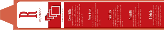
◆ Part 1: Repeat the same effect
A visual effect such as "change font", "color", "text size", "text color", "layout" once used, can be used more than once in a single document to achieve higher effect.
◆ Part 2: Iterate over multiple documents
By repeating the same visual effect with multiple documents, you can make the documents continue to be continuous, which also helps branding.
◆ Part 3: Visual cue
Let's think about visual cues (visual cues) that you can see at a glance such as "shape" "logo" "icon" in the design. You can give a unified impression by repeating the visual cue between pages or between slides.
◆ Part 4: Personality
The tone of voice, tone, layout, etc. are conscious of continuity so that individuality comes out and it is a quick way to obtain personality.
◆ Part 5: Style guide
When designing and designing it several times, use and repetition methods such as "color" "layout" "typography" "how to use the logo"Style guideLet's summarize it.
"Arrangement (Arrange)"
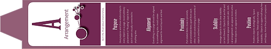
◆ Part 1: Purpose
Let 's have "purpose" and "connection" for every element of each page. It is important to omit something visually floating or not related to other contents.
◆ Part 2: Alignment
Layout and text in the page are somewhere determined and aligned. It is better to avoid "centering" as much as possible.
◆ Part 3: Close placement
It is clear that placing related content closely together and placing the related content at a distance is clear. It is out to randomly arrange objects and text.
◆ Part 4: Stability
To arrange the objects so that they appear to be stable, you can make them stably and calm by placing them horizontally. In contrast, vertically placed it gives an active impression.
◆ Part 5: Arrangement
The size of the space between objects means "time". Also, if you tilt the object, it will give you an unstable impression. Consider this effect and strategically arrange the objects.
"Why"

◆ Part 1: Meet expectations
Let's intentionally add elements expected by the reader along the brand, document type, genre, tone, color etc.
◆ Part 2: Distinctive use of complexity
If you use a lot of complicated design with less text, you will be given an elegant and sophisticated impression. On the other hand, increasing the text makes it possible to have an inexpensive image.
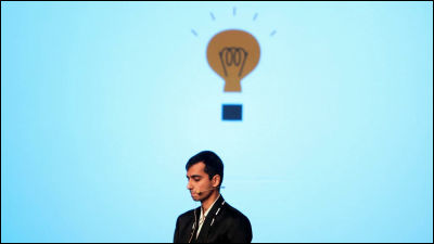
◆ Part 3: Metaphor
Let's try out the effects produced by various visual elements. As you continue you will be able to better understand the design, interests, depth of meaning, and you can see your own purpose clearly.
◆ Part 4: Propositional density
"Propositional density" is the relationship between the elements of design and the meaning of design. If you can choose elements with a high propositional density, you can leave an effective impression even with a simple design.
◆ Part 5: Four rhetorical effects
Let's attract readers by including "Eutos (reliability)" "patos (emotion)" "logos (theory)" "chiros (timing)" in the document.
"Organization"

◆ Part 1: Five hat tricks (LATCH)
The five elements that are effective in organizing information are called "LATCH". This is the acronym for "Location", "Alphabet", "Time", "Category" and "Hierarchy".
◆ Part 2: Hierarchy (hierarchy)
The most important of LATCH is "Hierarchy (hierarchy)". Specifically, in the document design, using the visual cue to guide the reader from the most important information to the next most important information.
◆ Part 3: To be able to understand with minimum capability
Configure the reader to "scan" the document quickly. It should be noted that readers who read like licking pages are rare and need to be able to read information at least by reading.
◆ Part 4: Improve visual interest
Fold three times vertically and horizontally so that the document is divided into 9 pieces. Then, since a line which we could not see until now appears, there is a training method to arrange the most important elements and interesting elements where the lines overlap.
◆ Part 5: To make the design look beautiful
By moving the image to the edge of the page and arranging it so that the border disappears, you can reduce the visual noise and make it look beautiful.
"Negative Space"

◆ Part 1: "1 + 1 = 3"
When designing two objects, it is good to design it thinking that there is another object between the two.
◆ Part 2: Logo Design
To increase the interest in logo design,Rubin jarThere is a method to make negative spaces of the background appear like figures as shown in Fig.
◆ Part 3: Eliminate visual noise
Observe all empty spaces and identify whether it is effective or not. If the white space does not look like a deliberate placement, visual noise is born and the reliability of the design drops.
◆ Part 4: The figure and the ground
The fact that the figure used in design is in a master-slave relationship with the background is called "Plot and groundHowever, by clearly distinguishing the figure from the background, it is possible to create a stable visual design.
◆ Part 5: Margin
You need to pay attention to how to add margins so that you do not inadvertently shape or line between the object and the text.
"Typography (typography)"

◆ Part 1: Two fonts
Most documents consist of two kinds of fonts. Let's distinguish between the title and the main text.
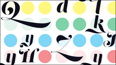
◆ Part 2: Font Family
Let's know what Font Family you use. The font name indicates the relevant Font Family.
◆ Part 3: Personality
Avoiding worn out fonts is the first step in order to make the document unique.
◆ Part 4: Visibility
When you find the font you like, please check whether the display of the specific character is not broken. Even if it looks nice, you can not get it read by font with poor visibility.
◆ Part 5: Readability
If you use a font with a large line spacing, you can maintain readability even if you stuff the line spacing. Also, thick fonts make clear contrast with the background makes it easier to read.
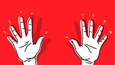
"Iconography"

◆ Part 1: Four Laws of Icons
"It can be read quickly" "I am clear" "Interesting" "All over the world"
◆ Part 2: Immediate cognitive ability
While the logo is a powerful tool to recognize brands, it is more effective to use icons for handouts and posters.
◆ Part 3: Samsung
By using "Punjaku" in the icon, you can relate it to the brand name clearly, you can easily remind.
◆ Part 4: Direction tool
By using guide lines and arrows effectively, you can control readers' interests and eyes.
◆ Part 5: Statistical Chart
In order to make information easier to read, it is better to insert statistical charts that are easy to see.
"Photography"

◆ Part 1: Superiority of photos
In most cases, the design that used a lot of photos and icons is an excellent tool that can show important information clearly. Compared to documents without pictures, 60% of readers who read a document with photographs remember information related to images.
◆ Part 2: Resolution
Please never use pictures or images with low resolution. It is 72 dpi for digital and 300 dpi for printing is the lowest number.
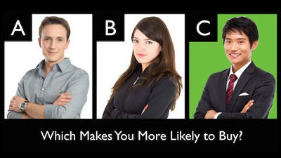
◆ Part 3: Percentage of faces in the photo
The impression given by the proportion occupied by the face of a person in the photograph will differ. If the face is a photo of up, it is easy for people to be interested in the person themselves and personality, and if it is a whole body picture, there is a tendency to pay attention to physical characteristics.
◆ Part 4: Face orientation in the photo
Please arrange so that the face of people and animals reflected in the photograph all face the inside of the document.
◆ Part 5: Make the photos consistent
When inserting many pictures into one document, let's choose what consistent lighting / subject position / hue etc.
Related Posts:


in Design, Posted by darkhorse_log