10 basic principles in visual design
10 basic principles in visual design,TomTomJosé Torre, who works as a visual designer, has summarized it.
10 Basic Principles of Visual Design - Prototyping: From UX to Front End
https://blog.prototypr.io/10-basic-principles-of-visual-design-55b86b9f7241
◆ 1: Point · Line · Shape
Point (point), line (line), shape (shape) are the most fundamental components of the design. With these combinations, you can create various things from simple icons to very complicated illustrations. In the geometry, the point is a combination of X and Y coordinates, and adding the Z axis to it adds to 3D, but this basic principle states that it describes only the two-dimensional design.
A GIF image showing the basic design of the point becoming a line and becoming a shape

Connecting the two points makes it a line, it is possible to create shapes by connecting lines and lines. Basically this will create what you need in the design.
◆ 2: color
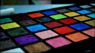
Human eyes can recognize more than 10 million colors from red to purple. For example, "Signal" means "Stop", "Blue" means "Advance". This is because every color can find a particular value or meaning. However, the meaning of color is thought to differ depending on the environment and culture cultivated. In other words, if you choose the right color, it will be possible to give meaning and intention to the shape.

The importance is also placed on marketing as to how to use colors well.
What is the role played by color in marketing, such as "blue of trust" or "green that can be reassured" - GIGAZINE
◆ 3: Typography
Typography is one of the most important and difficult things for designers. In typography, it is important not only what the designer made but also what type of font to use, and it shows how "designer's words" look like.
You can create consistent text by using an appropriate typeface, but that is not easy. Choosing the wrong typeface will completely destroy powerful sentences. Typography is an element that can determine the tone of the design equally to color.

Most fonts are designed with purpose, designers need to learn and use what it is. Some fonts may be suitable for use in titles, others may be functional and very easy to read.
There are thousands of fonts, but I always recommend "to stick to classics" unless something quirky is necessary.
◆ 4: Space
It is necessary to think about how each element and letter are related to each other and to provide the necessary space. This is usually called "negative space", and filling in blanks with characters is called "positive space".

You need to take negative space as part of the design and use it well. Space is powerful, it helps navigating the viewer who looks at the design and it can be a resting place to rest your eyes. If the space is too large, the design seems to be incomplete, and if the space is too small, the design seems to be crowded, so "how to use the space well" is very important.
◆ 5: Balance · Rhythm · Contrast
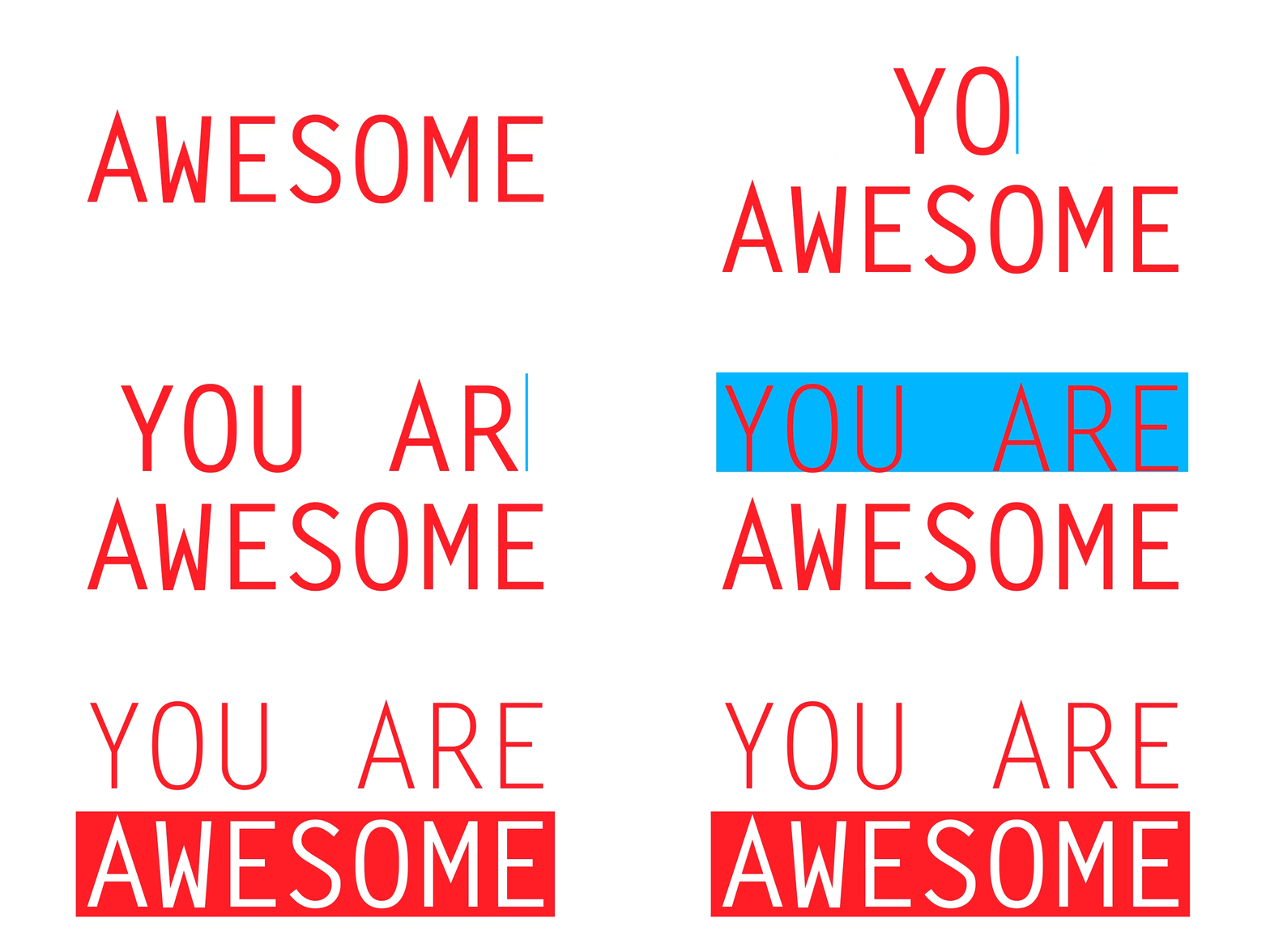
Considering the weight in the visual, it is necessary to adjust all the elements on the design in a well-balanced manner.
The way to lay out the elements in the page is important, you need to create contrast and rhythm and lead it to your destination gracefully through your design. For that reason, it is necessary to devise measures to make it stand out more important than other items.
◆ 6: Scale
Basically it is not necessary for every element in the design to have the same importance, so the best way to convey it is to change the size of the element.
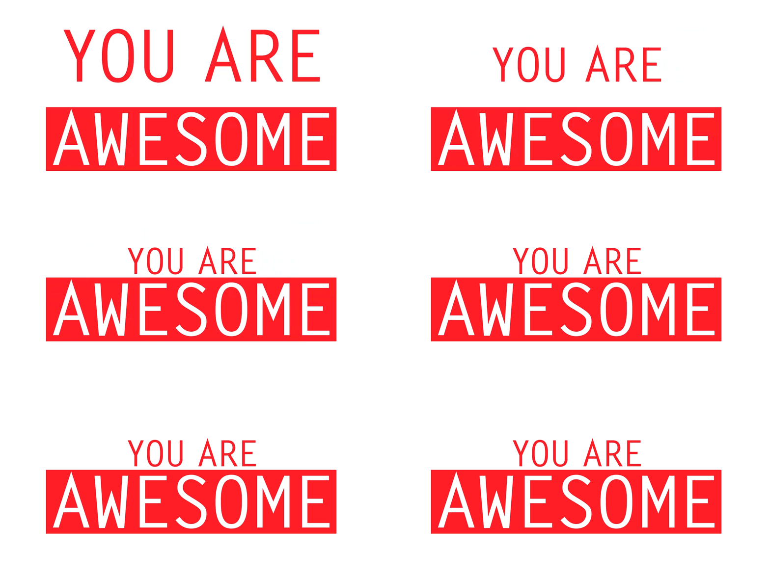
For example, what are the things you should maximize on a page as making newspaper pages? "Title" is usually very short. It is because it is adjusted to readable length so that you can see the page and see if the content is interesting. In contrast, "body" uses a small font. This is so that you can comfortably read long texts as well.
◆ 7: Align with the grid
When playing Tetris, dropping the last bar to break the block gives you a strange satisfaction. It is said that the grid and alignment in the design brings a similar feeling like this.
The grid and alignment are invisible, but they are displayed when you open a book or newspaper. By designing along the grid, the entire design will be structured and easy to digest.
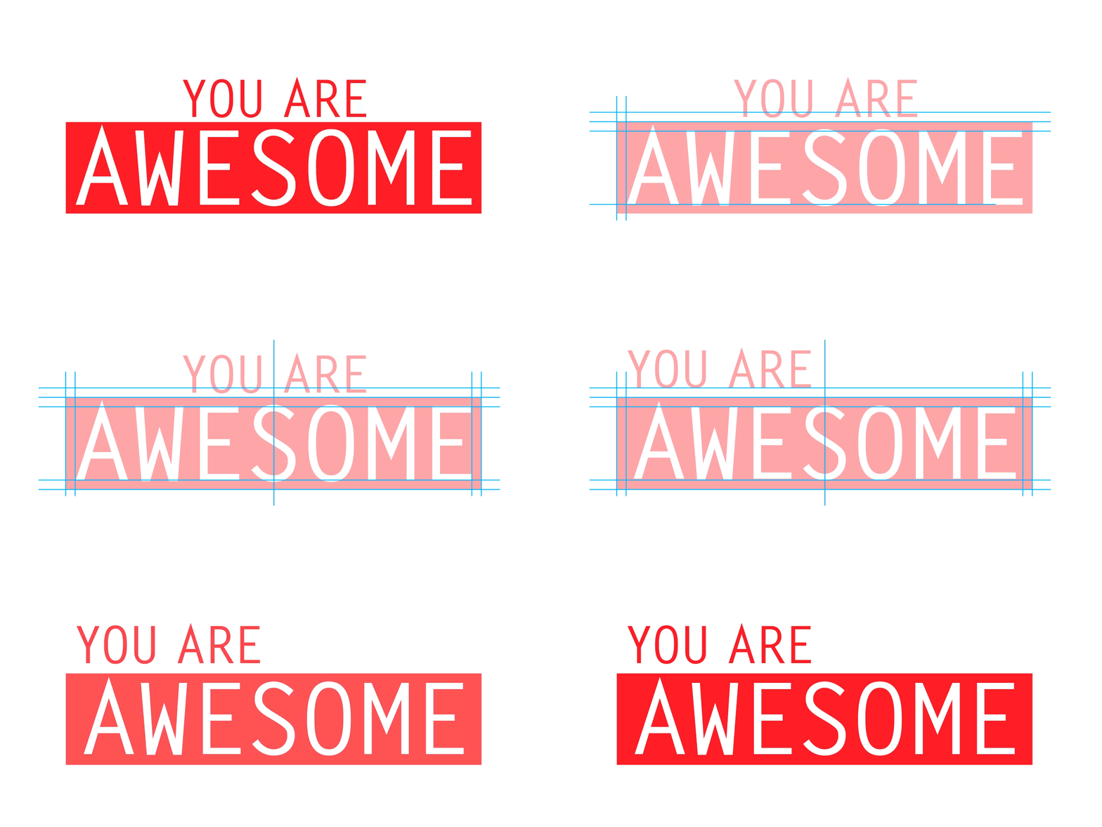
Even when intentionally making chaotic designs, there must be order in that chaos. Alignment is a particularly important factor in design using text. There are several methods of sorting, but from Torre's rule of thumb, left alignment is good. Of course, how to align is depends on "what you design", but in general, people read letters from left to right and top to bottom, so the center or right align text will be difficult to read .
◆ 8: framing
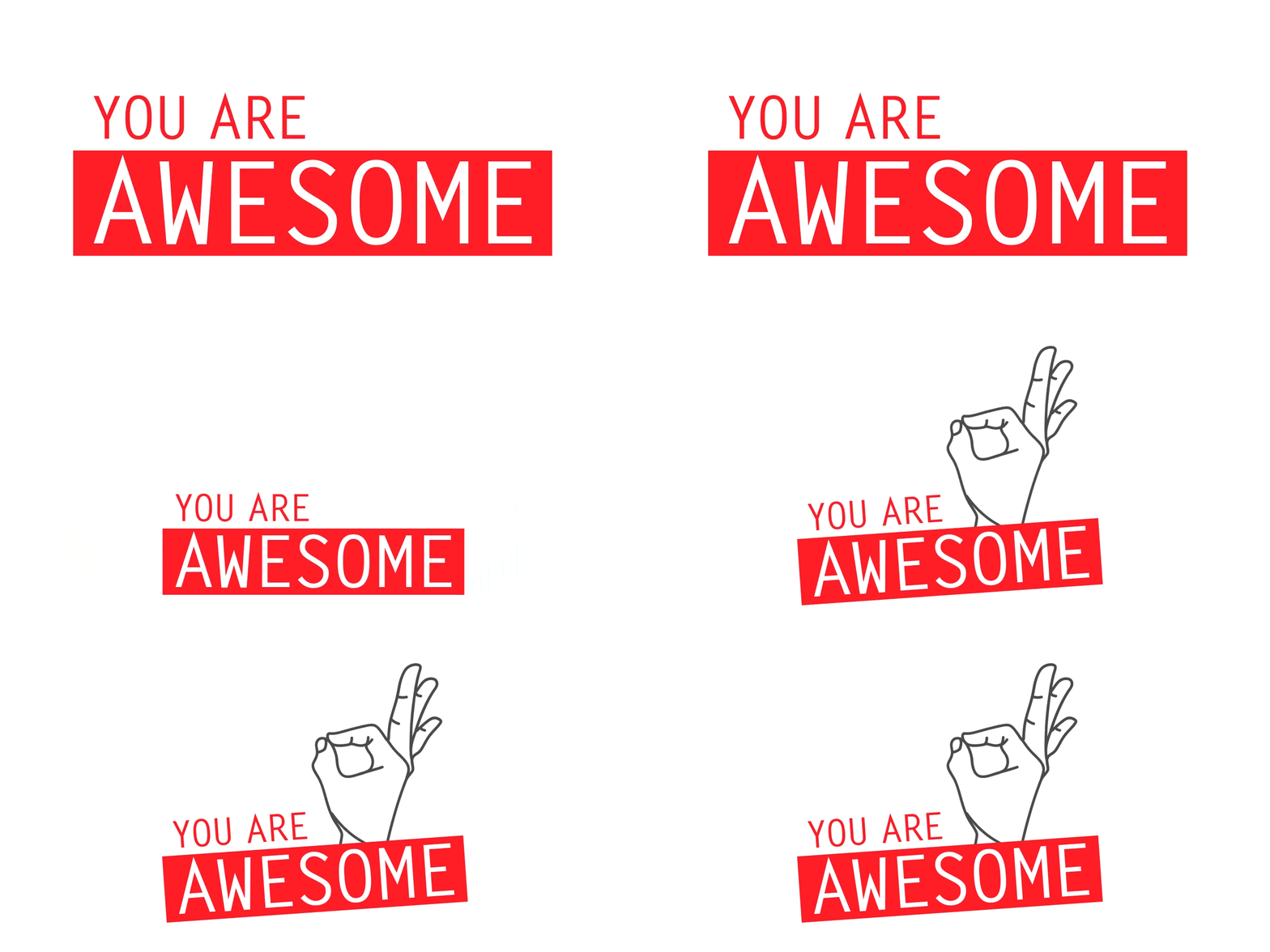
Framing is a concept in photography, but it is also important in visual design. When using an illustration or some kind of visual, it is said that a difference will be born if properly assembled.
In order to emphasize what you want to convey in the design and emphasize the message, you can make the eye on important things by cropping and composing the image.
◆ 9: Texture & Pattern
Mr. Torre personally seems to use textures and patterns like accessories, but "I do not need to use it certainly, and I can also stay without using them."
It is possible to add more dimensions to the design and to make it more stereoscopic if using texture. Textures can be selected as the paper to be printed, or by adding embossing or UV varnish processing, you can change the awkward design to an excellent one.
The pattern is used for injecting rhythm and dynamism into a flat design and can also be used as a method to compensate for excessive negative spaces. The pattern can be regarded as a texture depending on how it is used.
◆ 10: Visual Concept
What the design means and visual object is to decide what the deep meaning behind the superficial image is.

The visual concept is to distinguish between a design that can be downloaded from the design material site and a wonderful design that is not so. It is designed to design with will and to connect ideas of all designs. We need to select fonts carefully and purposefully and think about every part of the design according to the basic concept.
Related Posts:
in Design, Posted by logu_ii
