The design of the smartphone with "Firefox OS" will be like this.
from now on,"Firefox OSThere will be a slide that will show you what kind of concepts the buttons and tabs of the Firefox OS are created and what they are like.
MozCamp Warsaw: Design Principles Behind Firefox OS UX | Mozilla UX
https://blog.mozilla.org/ux/2012/09/mozcamp-warsaw-design-principles-behind-firefox-os-ux/
The theme of all basic designs of Firefox OS is as follows.
○ Strong, geometric, but more receptive
○ User interface to convey hand-made design
○ Design that feels small, effective, intuitive, and warmth
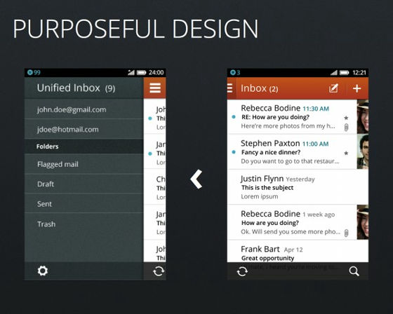
First, as a universal element of all applications, in a familiar layout, put the return · cancel · menu button on the left side top header, the title part shows where the user is. Up to 5 icons on the bottom toolbar. In a layout like a magazine, emphasizing the appearance of printing, we do not think about adjusting the sentence at the center unexpectedly, so that it is as if humans typed in letters, it is aligned on the left side.
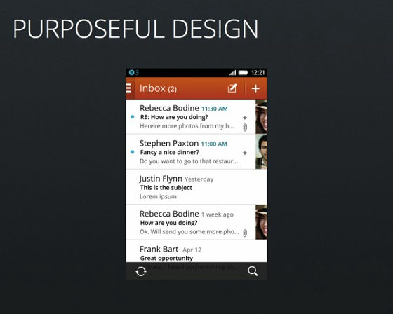
Header navigator and hierarchy are displayed simultaneously as shown in the sample below, and when you press the menu button in the upper left, a menu is displayed from the bottom of the content.
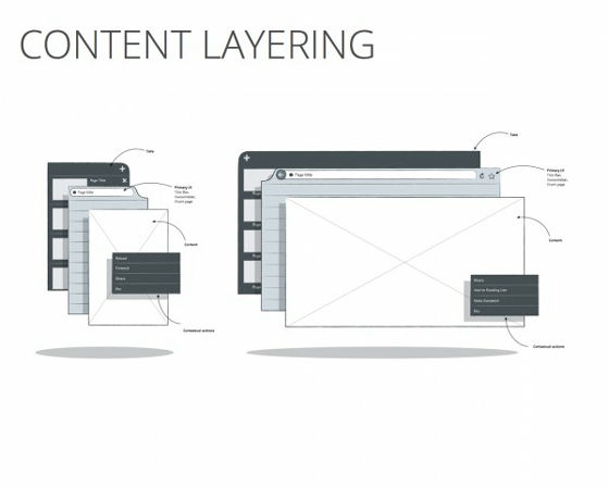
Content hierarchy uses elements of Firefox for Mobile, content is always on top so users are easy to use, settings are always below.
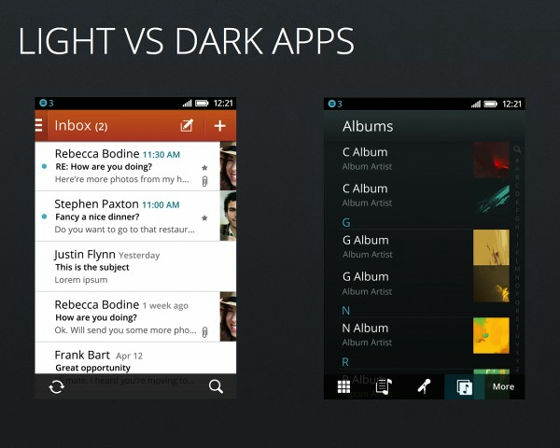
In the case of an application on the left side of the image below, it becomes an application that actually performs something such as an office work, so we will make the background white and emphasize the text to make it easier to read, so that it does not interfere with work. For multimedia applications such as video and music on the right side of the image below, blackening the background emphasizes the image from the text, creating an experience like a dark theater.
Media content (music · gallery · movie) will be the basis for each contentgridAre prepared for you.
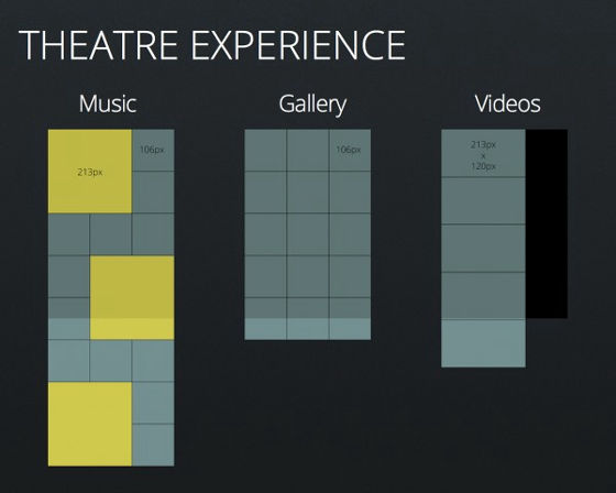
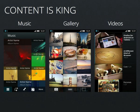
As the media content follows the idea of "Content is King" (CONTENT IS KING), the content itself has become very prominent and has the following features.
· Asymmetrical layout with left side aligned.
· Genuine texture texture and effect of video are considered to be light and limited.
Hand-made design that you can understand just by looking
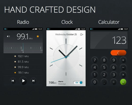
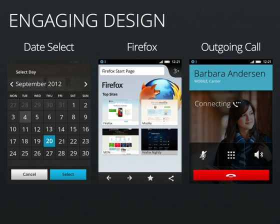
An example of the design of FirefoxOS.
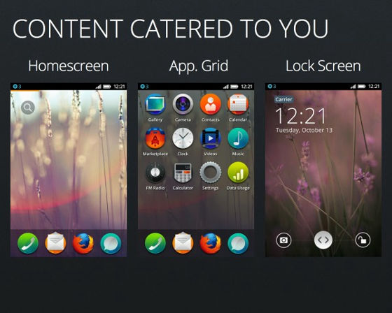
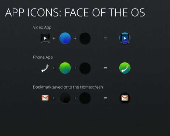
The icon of the application adopts a circle which is not adopted in any OS.
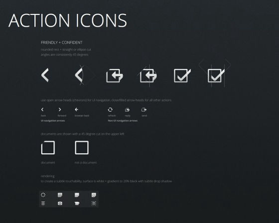
The concept of action icons is familiarity and trust.
There are over 100 kinds of icons.
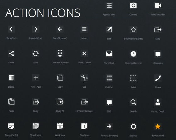
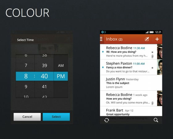
As many people like blue, adopt blue as the color to emphasize and use orange as an accent.
ZTE Firefox OS Smartphone Specs Emerge
http://www.tomshardware.com/news/ZTE-Firefox-OS-Smartphone,18135.html
CurrentlyZTEThe smartphone equipped with Firefox OS which is being developed at will be low power consumption than iOS · Android · Windows Phone with 3.5 inch display, 800 × 480 pixels resolution, 512 MB RAM, 5 megapixel camera It is that.
Related Posts:
in Design, Posted by darkhorse_log
