Four Basic Principles Important for Designing by Non-designers

by
Professional designer Anna Mészáros is often asked by family and friends for advice on creating websites, resumes, portfolios, photos for Facebook and Instagram, and thumbnails for YouTube. From Mészáros's experience, I have identified the ' important things for non-designers to design ' into four simple basic principles.
Fundamental design principles for non-designers – freeCodeCamp.org
https://medium.freecodecamp.org/fundamental-design-principles-for-non-designers-ad34c30caa7
◆ Principle 1: Create a clear contrast
People have an instinctual aversion to things that are slightly different, but only slightly different. According to Mészáros, this is a kind of 'the creepy valley phenomenon '. For this reason, when designing, it is important to pay close attention to the sense of unity, or to use it boldly and clearly, with 'contrast' in mind. The design elements to be noted in terms of contrast are broadly divided into the following four points.
1. Color scheme
In the example on the left, the text is broken because the background and text have almost the same color depth or similar colors are used. On the other hand, in the example on the right, the background and the letters are clearly separated, and it can be seen that it is easy to see.

2. Size ratio
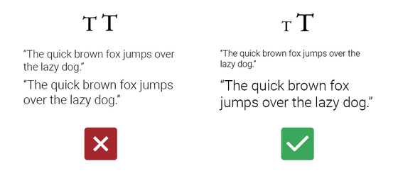
Even if you arrange 32pt text and 36pt font as shown on the left, there is only a sense of incongruity, as the size of the characters is slightly different. On the other hand, by changing the font size to a large extent like 18pt and 36pt as shown on the right, you can use headings and texts, and phrases and supplements you want to emphasize.
3. Text thickness
The principle that 'a subtle difference only gives a sense of incongruity, but works effectively by making a big change' also applies to the thickness of the font.

Four. Font type
Similarly, using similar fonts does not make sense, but you can emphasize the differences between the two paragraphs by changing the font at a glance.

◆ Principle 2: Provide consistency
By keeping the design simple and consistent, readers can focus on the content. In addition, by giving a sense of unity, it is possible to give the impression that the viewer is properly designed.
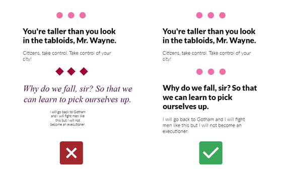
In the following example, sentences are repeated in two paragraphs, but the three symbols that separate paragraphs, the font size and type for each paragraph are unified with the same design as the example on the left and the left You can see that the impression you receive from the example on the right is quite different.
◆ Principle 3: The smaller the number of elements used for design, the better
'Occasus should not assume more than necessary to explain a certain thing,' a guideline advocated by the philosopher Occam is called '
About this principle Mr. Mészáros quotes the word 'Konmari' Marie
A British psychologist who practices 'Konmari' to marry the world 'Mari' Kondo's reorganizing technique evaluates the effect

◆ Principle 4: How to take space
The arrangement of texts and images can themselves function as meta-level messages. There are three more rules in this principle.
1. Arrange related things close together, unrelated things arrange far
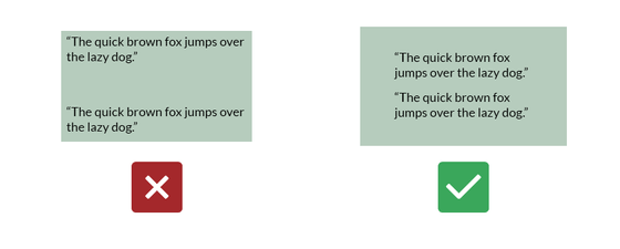
It is obvious that it is hard to see that the line spacing is jammed as the letters overlap, but if we also look at the line and line layout, in the example on the left of the figure below, the line spacing between the lines is the same. It does not convey that it is composed of two paragraphs. On the other hand, you can see at a glance that the example on the right is organized in two paragraphs, because it is organized by one paragraph.

In the example on the left, although the two paragraphs are combined into a square frame, there is an unnatural space between the paragraphs, which includes contradictory messages and causes confusion for the reader. I will give it. On the other hand, in the example on the right, since the two paragraphs fit into the frame at equal intervals, it is clearly understood to the reader that the two are a group of components.
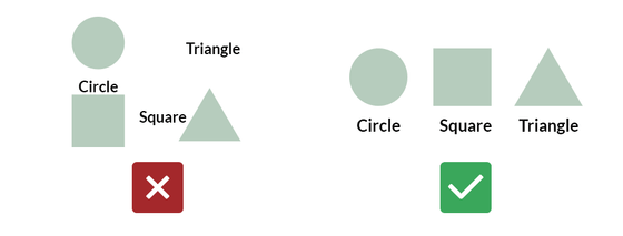
In the example on the left of the figure below, if it is thought that the label 'circle' is under the circle, then the label 'triangle' is on the triangle, or the label 'square' is between the square and the triangle. The labels don't make sense because you don't know until you read which one is the label of which figure. On the other hand, in the example on the right, the labels in the lower part of the figure are unified, so the relationship between the figure and the label is transmitted to the reader in a single shot.
2. Negative space
By taking a large empty space, it is possible to further emphasize the relationship between the grouped elements. This law is called 'negative space'. Also, as mentioned in Principle 3, if you pack information in a limited space, it will be necessary to sort out the information you really want to convey, as it will not tell the reader which ones are important in the end.
Mészáros cites Apple's web design as a good example of this law.

3. The important things are shown first and then
Place the most important components at the beginning of the whole, so that the proportion of the elements in the whole is the largest. By doing so, it is transmitted naturally to the reader that the element is important.
Related Posts:
in Design, Posted by log1l_ks


