What should we do to make a presentation that fascinates many people?

Presentation is a communication method for listeners to fully understand what they want to say. However, if the way of speaking and the slide design in the presentation are inadequate, the effect can not be obtained easily. A site that can easily create infographic graphics "Visme"Electronic materials that summarize attractive presentations and how to assemble slides are distributed free of charge.
Presentation Design: A Visual Guide to Creating Beautiful Slides | Visme
https://www.visme.co/presentation-design/
· Think about the composition of talk
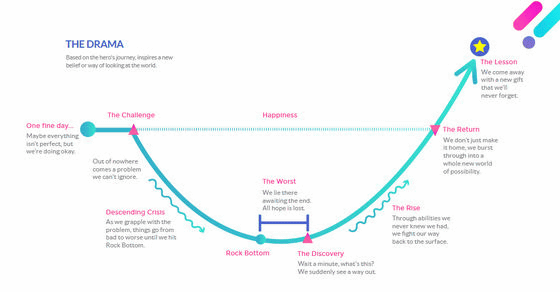
Of course it is important to make talks easier to understand by arranging start-up transitions, but it is claimed that it is important to emphasize the storytelling of "How to speak". It is not only talking about facts and data, but also talk that is engraved in listeners' memories like a story is important. To do that, we must also plan a dramatic deployment and a hallucination to move the emotions of the listener. He should prepare a deployment that attracts listeners while also incorporating his own personal things.
First of all, it is said that it is better to assume what kind of listener you are. It is necessary to consider beforehand such factors as the sex and age of the listener, the expectations of the listener, the comprehension ability of the listener, and the knowledge of the listener about what the user is talking about.
In order to think about how to make a presentation exciting and how to develop the story,Mind Map·Diagram·Story boardIt is recommended to create.
· Not conscious of 'show by mouth' but 'show'
Even if you can prepare the contents of slides and talks, that is not enough. When appealing something to the listener, it is important to speak with a gesture handshake, rather than telling by words alone. Also, if you can prepare, you need to prepare the real thing and demonstrate it. As an example, Bill GatesTED of 2009In order to emphasize the danger of malaria, we performed mosquitoes in the lecture hall.

· Positive content to be dropped
Presentation experts examined 200 kinds of lectures by TED. As a result, it was noticed that the most effective presentation was not only in discussion and excitement, but also realized that it concluded positively. For example, in a lecture on domestic violence, it is said that they not only talked about the painful experiences of the victims, they were emphasized that they are lovely and loved people, and positive keywords are also sent via social media such as Twitter While being explained, it is engraved deeply in the memory of the people.
· Understand the meaning of colors
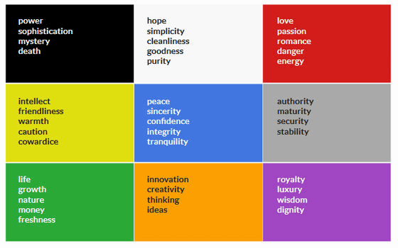
Even if black and white text is lined up on a slide, you can not attract a listener. To do that, you need to select the color according to the content. For example, red colors image love, passion, energy, and blue means peace and calm. By combining such colors in a balanced manner, you can effectively communicate the message.
That does not mean that you do not have to use many colors. In order to create a well-balanced slide, it is better to be conscious of the law of "60-30-10". The law of "60 - 30 - 10" is to select three colors to use, the most basic color to 60% of the total, the second color matching it to 30% of the total, and the third color to be accented To 10% of the total.
· Appeals visually rather than sentences
According to the latest research, about 65% of people tend to understand things with eyes, people say that images can recognize information faster than sentences. In a presentation, you tend to speak repeatedly over and over again, but by using more images than words, it makes it easier for the listener to understand what you want to say.
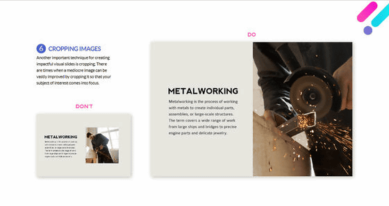
But anything is fine for images. It is not monotonous and worn out material photograph, but it is necessary to select high quality images that emphasize impact and humorous. Also, rather than placing the image as it is, so that the image conforms to the contents of the presentation, it is necessary to trim and also pay attention to the composition.
Even if you use letters. It is recommended that letter size and line spacing be considered readability first. Some people use different types of fonts to make slides more fancy, but it is important to keep the types of fonts as consistent as possible and conscious of unity.
Presentation has to be done within a limited time, so it is recommended that you do not only text and images, but also presentations with impact by making use of easy-to-understand graphs and charts, audio and movies as well.
Related Posts:
in Web Service, Design, Posted by log1i_yk

