Six design techniques for practicing the secret of presentation materials, 'Simple is Best'
By
Techniques such as how to speak are important as well as the content in order to give an effective presentation, but some training is required to improve these. However, there is also a method of 'refining the design of presentation materials' in order to give a more effective presentation, which can be adopted without special training. The six important points in the design of presentation materials that SlideShare , a slide hosting service, should keep in mind for presentations that appeal to the audience are as follows.
6 Presentation Design Dos and Don'ts
http://blog.slideshare.net/2014/04/07/presentation-design-dos-and-donts/
◆ 01: Background
It is strictly forbidden to use a colorful pattern with a rugged background on the page displaying the text. Such a background not only makes the text difficult to read, but also distracts the audience.
(NG example)
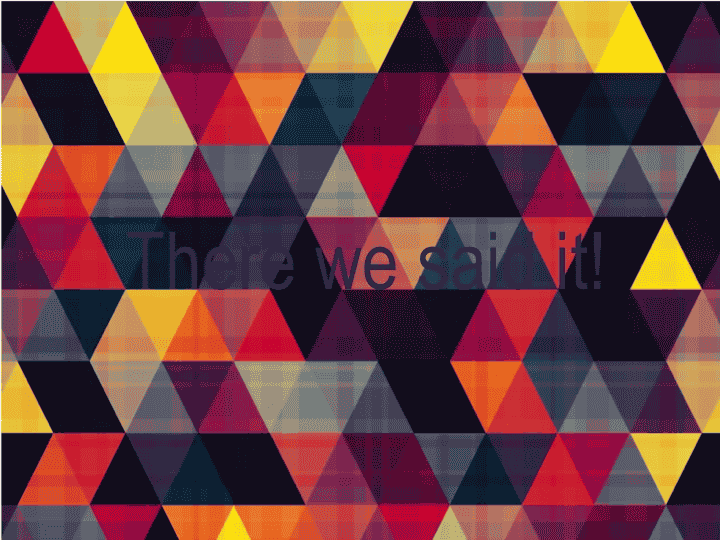
To make the text easier to read, it is easy and recommended to use a bright color for the background. If you want to use a strange background, you need to devise an arrangement that makes the text look three-dimensional at least.
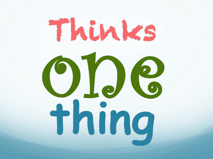
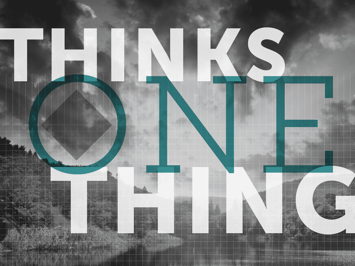
◆ 02: Text placement
Avoid centering all text. Placing the letters in the middle in chunks only makes the text harder to read.
(NG example)

Only center the main text, and left-justify the characters that supplement the content. The design should look tighter.

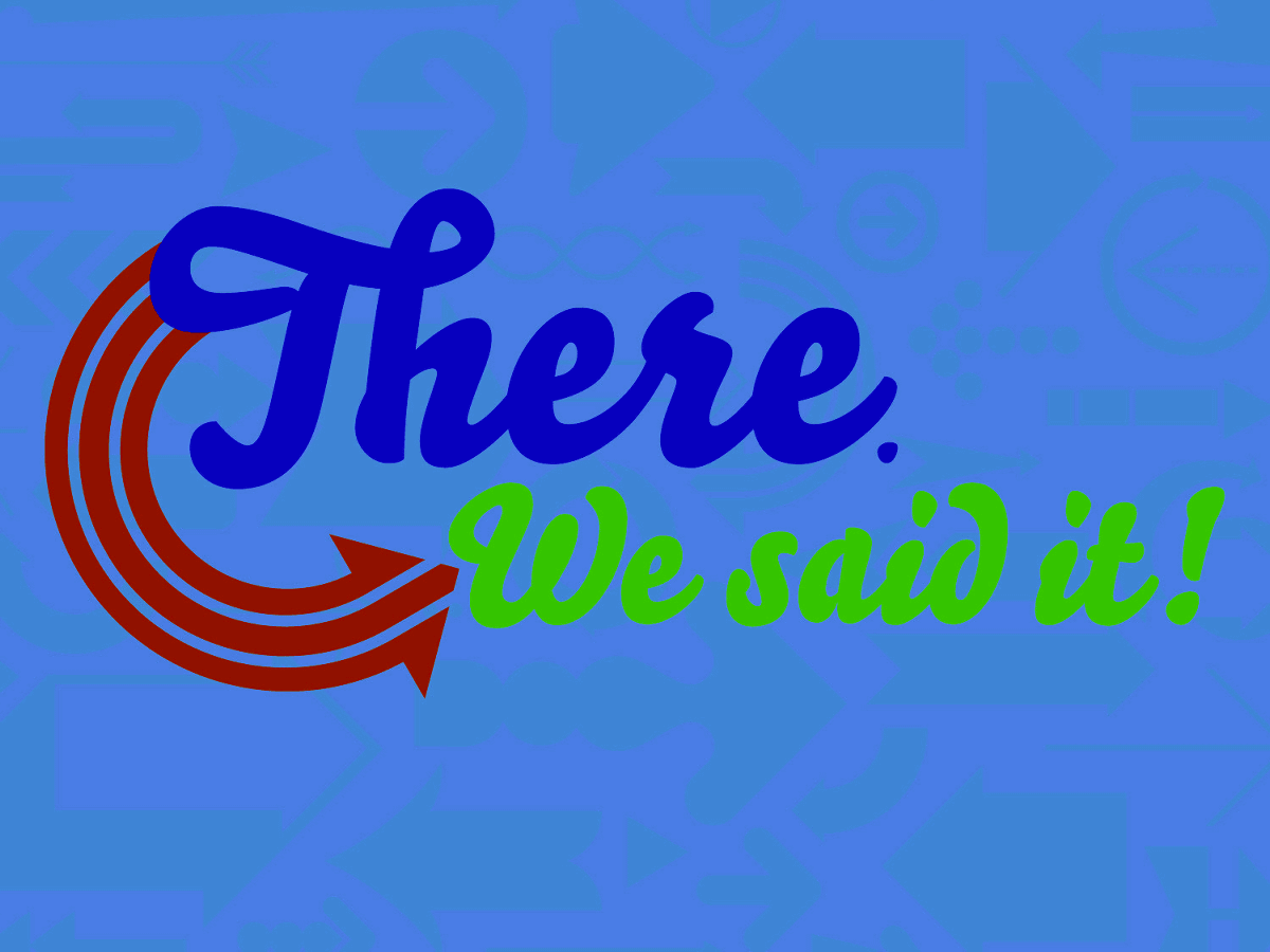
◆ 03: Character size
Avoid making all text sizes in slides the same. This is because the presentation needs to emphasize the important points that you want to convey.
(NG example)

The most important letters should be large. By adopting this simple method, it is possible to convey the most valuable information to the audience first.
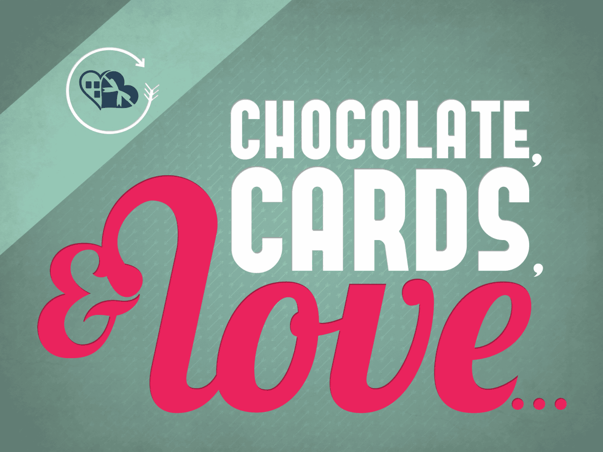
◆ 04: Drop shadow
You may want to add a drop shadow to emphasize the text, but if you add a light shadow on a white or gray background, the text will look blurry and dirty.
(NG example)
If you use a drop shadow, at least keep it in the title part. It is possible to make the characters look three-dimensional by using not only drop shadows but also white characters on a dark background.

◆ 05: Photos and illustrations
Avoid enlarging and using low resolution images. When viewed on a large screen, the roughness is more noticeable than you might imagine.
(NG example)

Use images and illustrations
◆ 06: Font (typeface)
Avoid using fonts that are too unique. Wacky fonts can get the attention of the audience but not take them seriously. The font is also simple is best.
(NG example)
It is also recommended to combine multiple fonts. For example, by properly combining fonts with different characteristics such as heavy and light fonts, typical fonts and rare fonts, it is possible to avoid a monotonous image.
Related Posts: