E-commerce site design guidelines viewed from eye tracking data
ByMatteo Penzo
Unlike real stores that can actually view and use products for their hands, sell products on the netEcommerce siteA customer's way of leading customers is required is a unique method. The users who purchase products at the online shop are summarizing guidelines for effective site design derived from what they actually see what they are doing and what actions they take.
Cxpartners | What people see before they buy: Design guidelines for e-commerce product pages with eyetracking data
http://www.cxpartners.co.uk/cxblog/what_people_see_before_they_buy_design_guidelines_for_ecommerce_product_pages_with_eyetracking_data/
This method is summarized as a consultant on improving the customer experience of the websiteCxpartnersChui Chui Tan, who leads the research team at the company. Mr. Tan's team is looking for collaborators from general users to investigate what users are doing in the top ten online retailers sites in the UK and conduct research that will lead to better site design. did.

In the experiment, tracking the subject's gazeEye tracking deviceWas introduced to gather data on which part of each page you are sending a line of sight and what kind of difference is caused by the difference in site design was verified.
◆ 01: Clarify action evocation
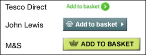
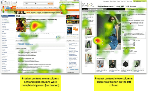
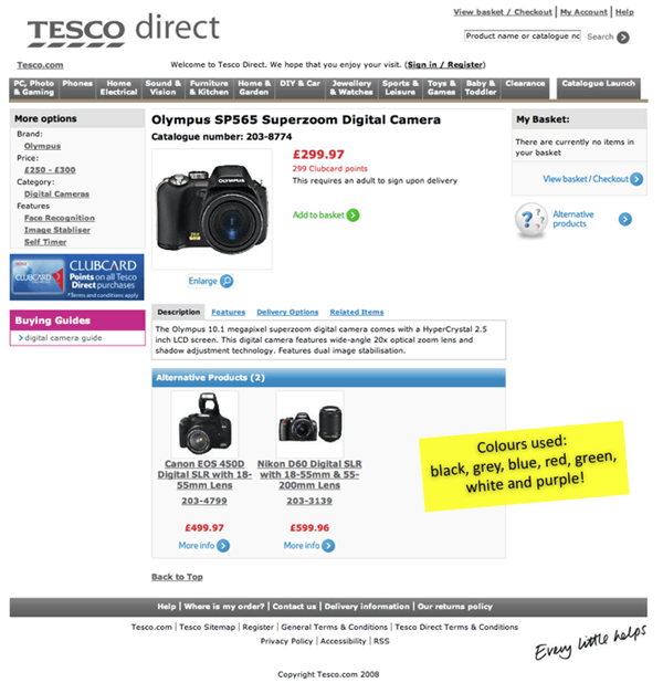
The most important thing among actions taken by users on the page that sells goods can be said to be "to have items on the cart", and the site design places the primary objective of linking to the action than anything else It is important. Therefore, you need to design "easily put items into cart" button easily recognizable. In the comments from people who participated in the experiment, the impression that "Cart button of Tesco Direct was hard to find" is raised, but this is obvious from the figure below. In other companies, colors that are clearly noticeable in design of buttons are clearly adopted, and besides a basket illustration is attached, they are easy to understand, whereas Tesco Direct is a simple text based design It is.
◆ 02: It is better for product introduction to be itemized
In some cases, the explanatory text may become longer in order to fully convey the attractiveness of the product, but this tends to be counterproductive rather than on the other hand. What users want is information to judge whether or not to buy the goods, and the result is that the information is easier to convey as the information is simpler.
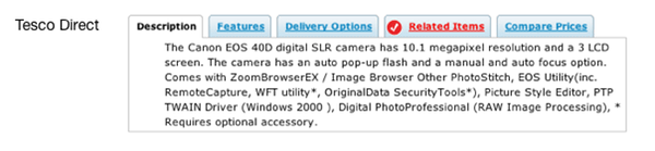
Again Tesco Direct page design is cited as a bad example. When you see the product introduction where the sentence continues with the dull, the user loses reading. Also, it is said that it is not very good to tabulate it unnecessarily. Although it seems to be sorted out at first sight, the design seems to be troublesome for the user to click on the information hidden in the tab and go to see, resulting in leaving the page without seeing anything It can lead to.
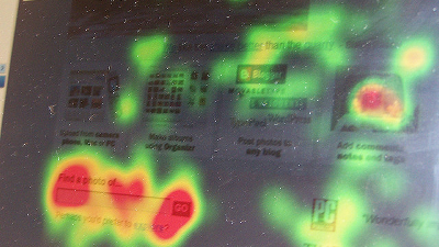
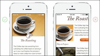
◆ 03: Upload high-quality items for product photos
The product photograph is the first thing that users visiting the product page see. Even if a photo is placed at any position on the page
As shown in the figure below, users know that they are most interested in photos on the page.
Unlike real shops where you can pick up the real thing, it is not an exaggeration to say that most of the materials that users who visit the web shop judge the product are the quality of the photos. Therefore, in order to appeal products more strongly to users, it is important to prepare images with quality and size that can withstand enlarged display, as products are clearly shown. It is also a point to prepare images taken from all angles of products. By showing products from all sides, you can give more advantageous judgment materials.
◆ 04: Simple page layout
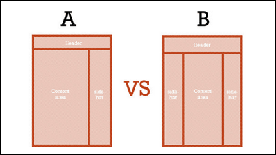
Analysis of opinions received from experiment participants revealed that the page layout preferred by the user was that "the product is on the left of the page and the description is on the right". On the John Lewis page shown below, we know that the user's eyes were directed uniformly to product photos and descriptions.
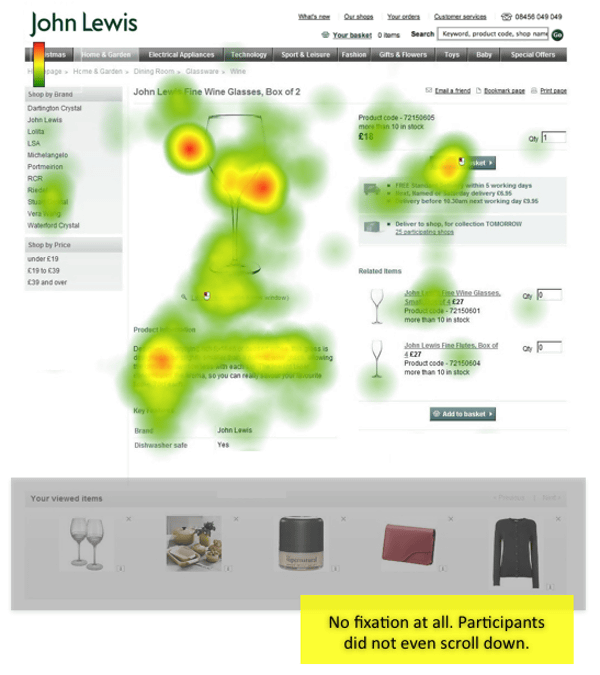
However on this site it is also clear that the area of "Your Viewed Items" displayed at the bottom of the page was not seen at all. It shows that the user's interest has been cut off because the layout is such that the top and bottom of the page are pseudo-separated. However, in general, the vertical layout has the effect of letting the user scroll the page.
◆ 05: Do not lengthen the page too long
No matter how much information is packed in the page, there are few users who read all the descriptions. This tendency is particularly noticeable as the content of the page is large, and it tends not to read pages which are too long even if the layout is good. There are many people who can realize that the contents of the page do not remain at all in the head as the page scrolls with the dull red as the page is longer.
The page of Amazon and Play.com below is shown as a long page representative. The line of sight has been distributed until the middle of the page, but you can see that it is not seen at all when it comes to the bottom.

◆ 06: List only important information
It is effective for users to tell briefly only important information for goods. Too much content, the user loses sight of truly important information. This also appears remarkably on the above Amazon page, too, because the page is too long, there was no column of customer reviews or "I'm also watching such items" displayed at the bottom because of the page too long.
◆ 07: Prioritize for each content
Unlike a real store, you can not adopt the face-to-face sales format at the e-commerce site. Therefore, the method of communicating the appeal of the product in the conversation with the user does not apply, and the user has the characteristic that the user has to understand the characteristics of the product by him / herself. If you can not understand the appeal correctly, and then simply get bored, the user will close the page and leave the site.
In the design that the necessary information can finally be found at the bottom of the page, you can not help saying that it is disqualified as a product description page. It is necessary to avoid site design that drag users long.
◆ 08: Place important information in the main zone
The main purpose of the user who visits the page is to consider whether to understand the product and whether to purchase it or not, layouts and information that would disturb the behavior will be ignored. A user who sees the layout of the page and feels "This page has the central zone as the main zone" is rarely noticed even if important information is written next to the page. That is because it is a natural behavior.
In order to avoid this it is essential to set the main zone of the page and place all important information inside that zone.
◆ 09: Provide moderate blank space in the page, do not overuse the color
It is not good to have a layout in which the information is too packed too much and there is a lot of letters on the page and where the information is located where it is not known at a glance. In the page layout, it is necessary to divide the zones to make the information masses feel, and it is effective to divide each chunk with appropriate blank space for this.
It is not a good idea to use too many colors. In the following Tesco Direct page, many letter colors are set such as red for the price and card points, black for the explanation, green for the "to put in the cart", and blue and gray for the link. It seems to be a measure to improve legibility, but on the contrary it is obvious that users are confused.
◆ 10: Do not let the link open unnecessarily
It is also counterproductive to explain the product or to open a link to suggest other products. Users will not try to proceed further with the anxiety that if you click the link you will not be able to come back to the current page.
◆ Summary
In summary of the above items, it can be said that the following points highlight the importance of building an e-commerce site.
· To devise a way to convey information that users need as quickly as possible, such as product photographs, sufficient explanation, price, delivery date etc.
· Keep the explanation concise, avoid too long or excessively colorful things.
· To prepare as high quality images as possible. If there is an actual use case, it is possible to convey the appeal of the product more effectively.
· Improve page layout, explanation, UI to improve user experience and increase repeat rate.
Related Posts:


in Note, Posted by darkhorse_log