The movement of the eyes to see the web page is "F" pattern
In other words, when viewing a page, a human is watching the entire page while drawing the letter "F".
This was done for 232 subjects, and it seems that we will look at the page at a phenomenal rate in a tremendously short time of 2 seconds to 3 seconds to find important content from about 1 page.
It is this image that visualized the path of the line of sight. We are taking three steps in all, and following each step we draw the letter "F". It seems that almost all users consistently follow this pattern. The following is an explanation of all three stages. You can see what layout is effective.
F-Shaped Pattern For Reading Web Content (Jakob Nielsen's Alertbox)
http://www.useit.com/alertbox/reading_pattern.html
Phase 1:
The visitor first moves the content area at the top of the page horizontally. This is the top horizontal line of "F".
Stage 2:
Next, the visitor moves his / her line of sight a little downward and then makes a second horizontal movement again. This second horizontal motion is shorter than the first horizontal motion. This is the second short horizontal line from the top of the letter "F".
Stage 3:
Ultimately, the user moves the line of sight by scanning the page vertically downward from the left side. I sometimes see it at a slow speed and mechanically. Some say that some people move their eyes to a mottled state. Since it moves downward anyway, it becomes the last element of "F".
In other words, only about one-third of the contents of the entire page is touched by users.
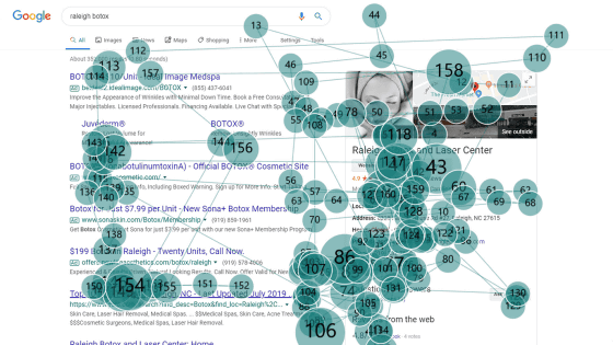
What is shown in the color of this figure is red, the next is yellow, the smallest is blue. It is gray that it is not seen at all.
As a result, the cumulative pattern seems to be classified into three patterns roughly below depending on the contents of contents.
Pattern 1: Article
In the case of a company profile or a general article on the corporate website, this image pattern. It is a typical "F" pattern.
Pattern 2: Product page
This is also an F pattern. After looking at the top title, I saw the product photo, and it seems that I am also looking at the explanation roughly.
Pattern 3: Search result
I will look at the title of each search result, but I only see the top of the top page .... And surprising is that 'Google Adwords', you are looking at it properly, that.
Probably, if it is horizontal writing, it will be the flow to read characters from left to right and from top to bottom, so it is inferred that such results will come out.
So it seems that people who read the sentences of the page from the end to the end are extremely rare. Well if you are interested it seems to be reading but still few people carefully read the whole thing. Especially if it is an e-commerce relationship this is quite important, is not it? In order to attract the eyes of those who came and surely bring them to purchasing, it is necessary to introduce the product carefully, taking care of the first part, than anything more than placing detailed content on the page .
Likewise, regarding affiliate links and advertisement places, it is more effective to put it on the left rather than put it on the right.
* Since I did not write quotation origin at the time of initial publication, I added it.
Related Posts:
in Note, Web Service, Posted by darkhorse_log

