Survey results that are useful for web design and content creation are being released, how the eyes of people who read web pages move
A
How People Read Online: New and Old Findings
https://www.nngroup.com/articles/how-people-read-online/
In 2006, the Nielsen Norman Group, which researches website usability, published a report that visualizes how people's gaze moves when they visit a website. The report showed that a person's gaze is moving from top to bottom, left to right in an 'F' pattern.
The movement of the eyes looking at the web page is the ``F'' pattern-GIGAZINE
And a study conducted from 2016 to 2019 shows that there are 'changes' in this eye movement and 'not change' depending on the date of 10 years.
◆Change to new layout and new pattern
For example, in 2006, a liquid layout was recommended, which keeps the readability of the web design even if the browser size is changed, but with the advent of responsive design, the concept of liquid layout is no longer necessary. Also, as the zigzag layout, in which the positions of images and sentences alternate, has become popular, a new line-of-sight pattern has been created.
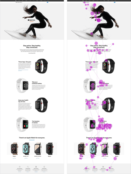
When a page with multiple cells is opened, the line of sight of the person generally moves from left to right over the cell, goes down one step, then right to left, goes down one more step, left to right, and so on. Move to. This is called a lawn mowing type pattern.
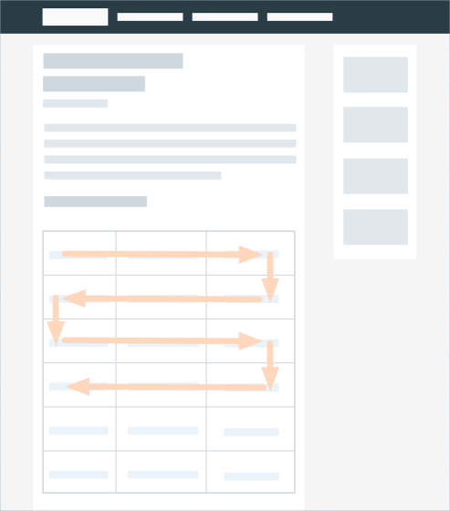
The Apple Watch page is designed so that the product description and photo layout alternate as you scroll. When people visit a website, they have the habit of 'looking at the photo first, then moving their eyes to the text,' so using a lawn-mowing pattern naturally encourages the movement of the eyes.
◆Search results have a more complex layout
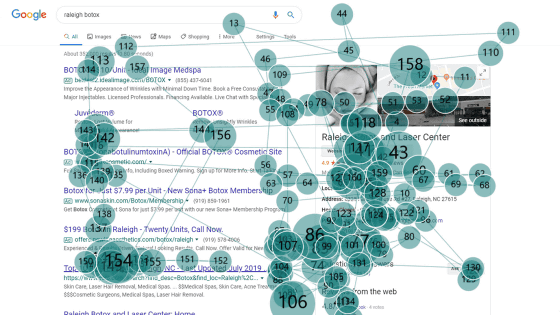
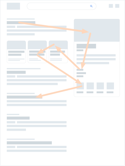
We also found that people weren't scanning their content more linearly when they were looking at the search results. This is because search engines such as Google and Bing have adopted a new layout called the 'pinball pattern.' Google has adopted a mechanism called 'snippet' that displays a part of the information on the website in the search results, and by incorporating such a function in the layout, the user is not linear, like a pinball bounces It takes the movement of the line of sight.
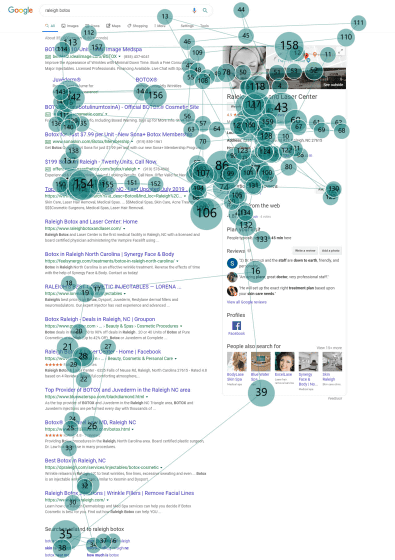
Actually, the movement of the eyes of the person who saw the Google search result is as follows. The subjects who examined Botox gazed at 158 points on the page within 14 seconds, but noticed the eyes bounce back to various locations around the snippet.
◆Gaze pattern on Chinese site
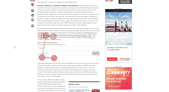
In the 2006 survey, only English websites were examined, but new websites in other languages also showed similar patterns to English. I also saw the 'F' pattern, where when I opened a web page my eyes moved from left to right and from top to bottom, and I rarely read to the end of the page.
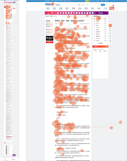
Researchers say that it's surprising that English-speaking and Chinese-speaking people have similar user behavior patterns in many respects, despite different cultures, characters, services offered and preferences. ..
However, in Chinese, the pinball pattern as seen on the English page was not observed. It is believed that this is because Baidu search results are not multifunctional like Google, images are not used much and sidebar elements such as advertisements and links were not related to user's interests well. ..
◆ New content element
Compared with the 2006 survey, the following three contents are popular.
1: Table containing comparison table
2: Inline elements such as quotations and advertisements
3: User-generated content such as reviews
Here's an example of an inline element in a quote. Impressive text in the body of the article is prominently quoted with inline elements.

However, when following the line of sight of some subjects, a user who was able to move his line of sight linearly until he reached an inline element such as an advertisement may reduce his attention and stop reading when reaching the inline element. It seems there was.
◆No change
People are still 'scanning' rather than 'reading', and it is rare to scan every sentence on a page. Even when the user scans the entire content, it doesn't scan it perfectly linearly, the viewpoint jumps around the page, skips some content, returns to see what was skipped, and has already scanned. It is reported that he was repeating the action of rescanning things.
Also, how much time the user spends 'reading' is decided by the following four factors.
1: Motivation level
How important is the information to the user?
2: Task type
A type of task, such as whether you are browsing to find new interests or are you researching a topic.
3: Concentration level
How focused the user is on the task at hand.
4: Individual characteristics
Personal qualities such as whether it is the type that reads in detail when reading online or whether it is the type that reads firmly when motivation is strong.
Based on these, content creators should note the following points.
· Organize your content by labeling it with clear and prominent headings and subheadings so people can find what they are interested in.
・Place information in front and add headings and links so that you can immediately understand the information while scanning.
・Make content simple and clear with plain language
Related Posts:
in Design, Posted by darkhorse_log
