A flat design website could waste user time and hurt the brand
byHeima
"Flat design" used for websites and applications gives people a modern and clean impression. However, according to a survey by Nielsen Norman Group, a consulting firm, it turned out that the flat design has the effect of giving the user extra time and weakening the determination power. Although the navigation of the button etc. becomes a flat design, while the user's stay on the page increases, there is a possibility that the view to the brand may change to a negative one.
Flat UI Elements Attract Less Attention and Cause Uncertainty
https://www.nngroup.com/articles/flat-ui-less-attention-cause-uncertainty/
The survey group got 71 general web users, got each user access 9 websites, got it on the website by tracking eye movements and measuring time to stay on the page We observed how tasks are performed.
The nine websites are as follows, one with a so-called skew-morphed design, with the use of the often used "shaded 3D buttons" etc., and those with flat design buttons without shadows And was prepared.
As a result, on a so-called flat-design website with few shadows on buttons, the average time spent per page was 22% longer. Also, the time to fix the gaze by the user averaged by 25% on average. "A flat design web site gives a user longer time" is not a positive meaning that a longer staying time on a page is "rather than spending time on pages to find what they are looking for It means the state that it must not exist. It is the page of the flat design that it becomes the state that you do not know what to do when it is seen at once.
Below is an image showing how gaze at user's website is done. The left is a sky morphic design, the right is a flat design website, and you can see that the more the line of sight gathers on the left side.

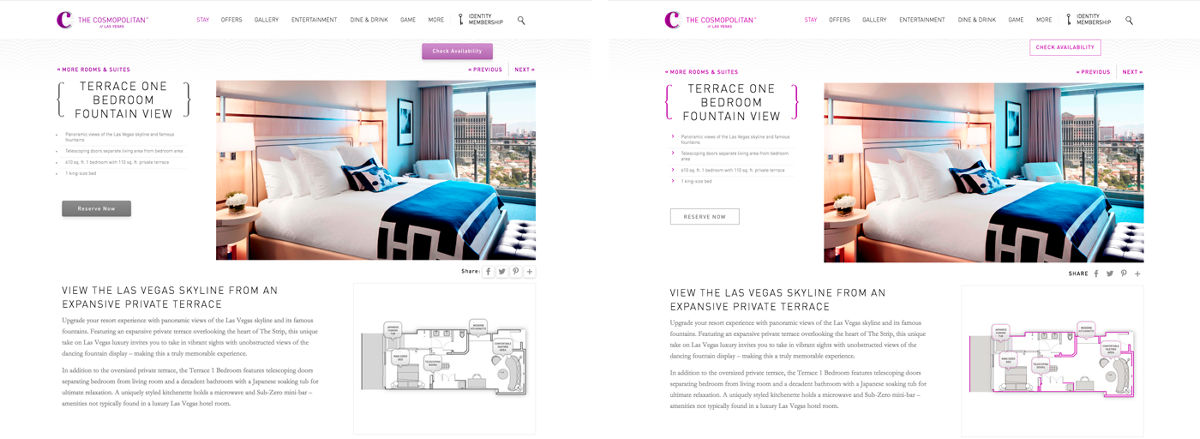
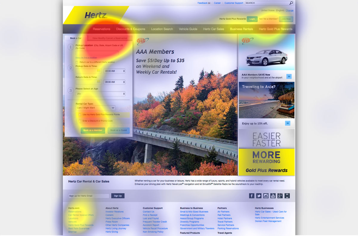
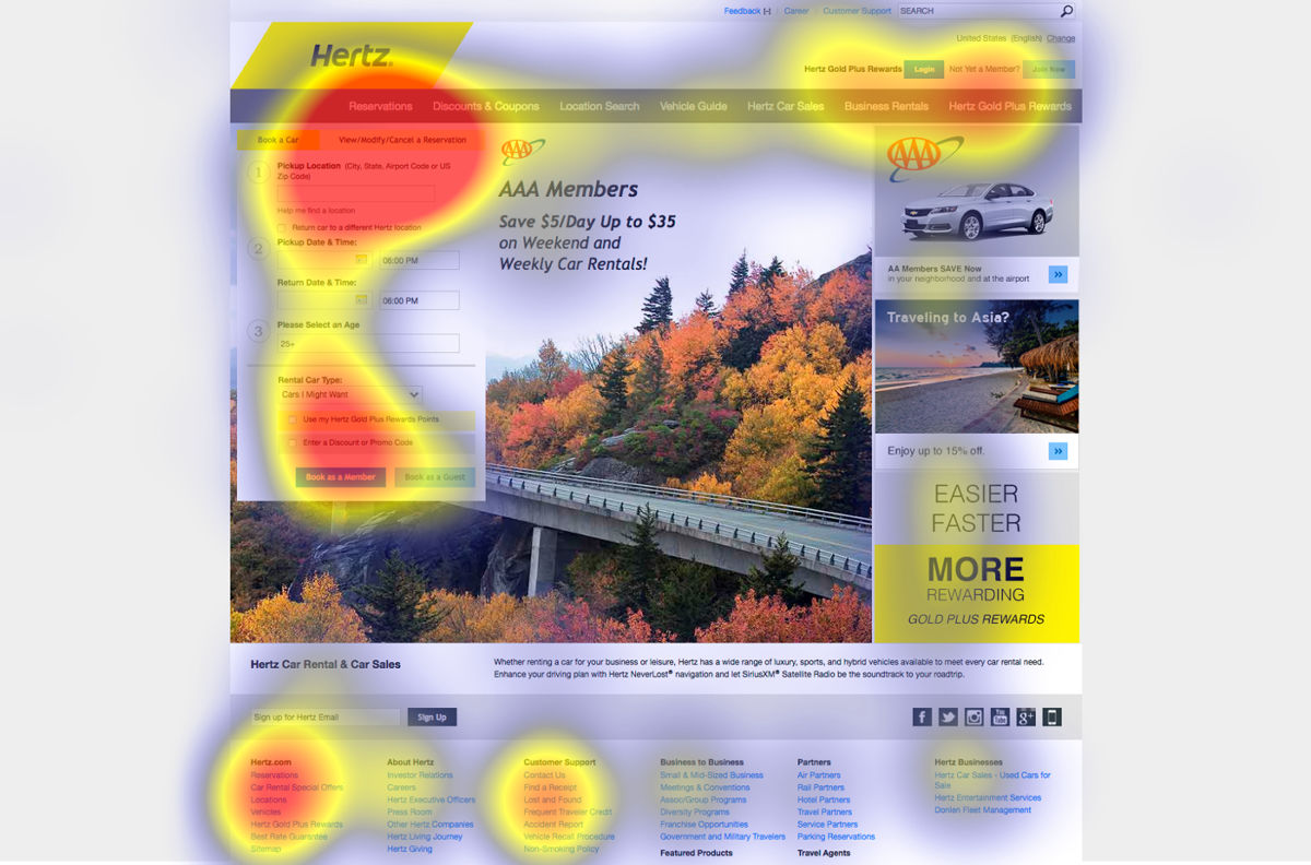
The sky morpick design version and the flat design version of the rent-a-car website called Herz are as follows. The skew morphic design makes it easier to distinguish tabs written as "Book a Car" and tabs labeled "View / Modify / Cancel a Reservation".
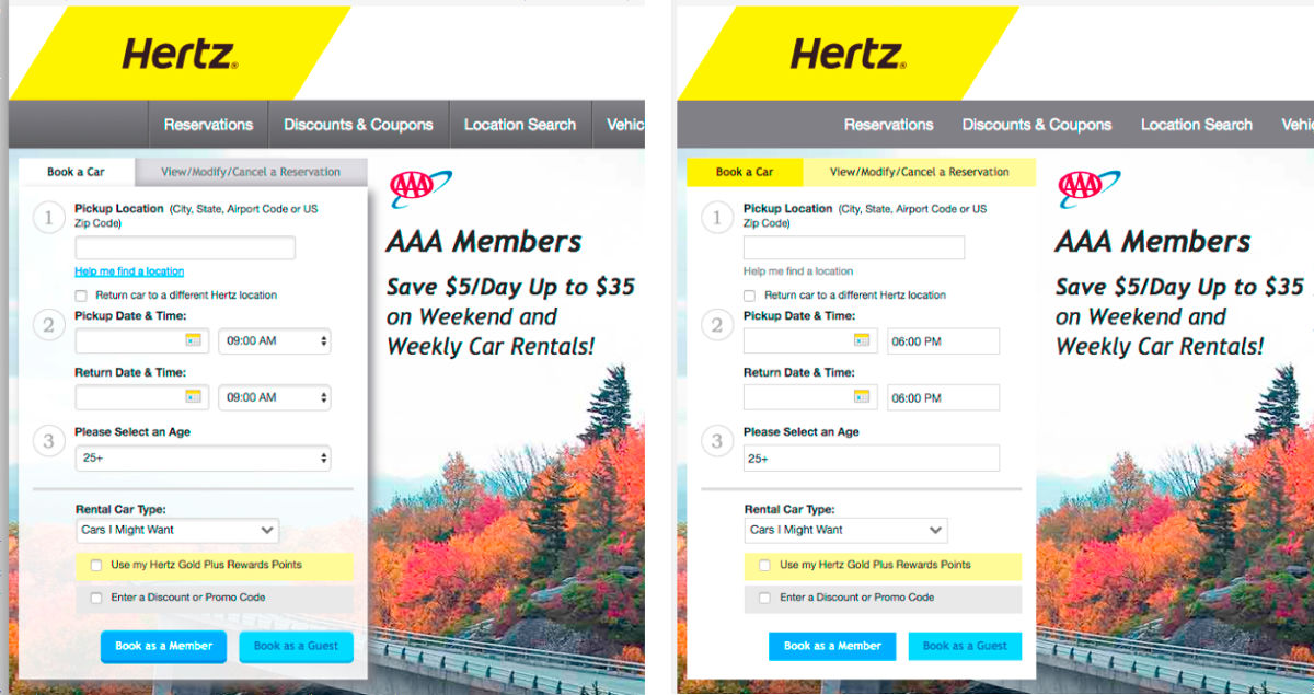
The task given by the user on this website is "to cancel the reservation". In the sky morphic design version, the red part showing concentration of gaze is concentrated on "View / Modify / Cancel a Reservation" tab ... ...
In the flat design version, you can see that the line of sight is wandering various parts, such as the footer link with customer support.
On a website dealing with jewelry called Brilliant Earth, the task of "finding pearl jewelry" was imposed.
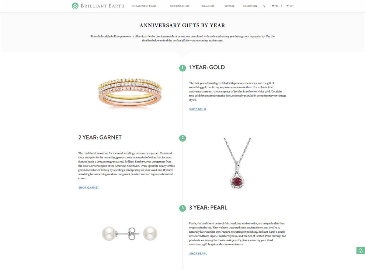
The difference in design is as follows. In the sky morphic design version, the character link "Shop Pearl" under the sentence is underlined / colored, but the flat design version does not have a distinction between the link and the body.
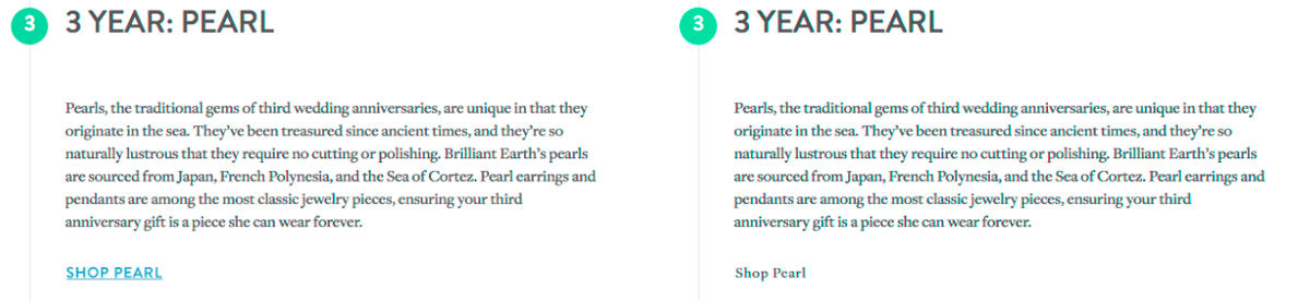
The difference in gaze of the user is this. The line of sight is concentrating on the left side with underline / colored links and the character "3 YEAR: PEARL" about the same degree, but underline / colorless link the line of sight gathers toward "3 YEAR: PEARL" It is.
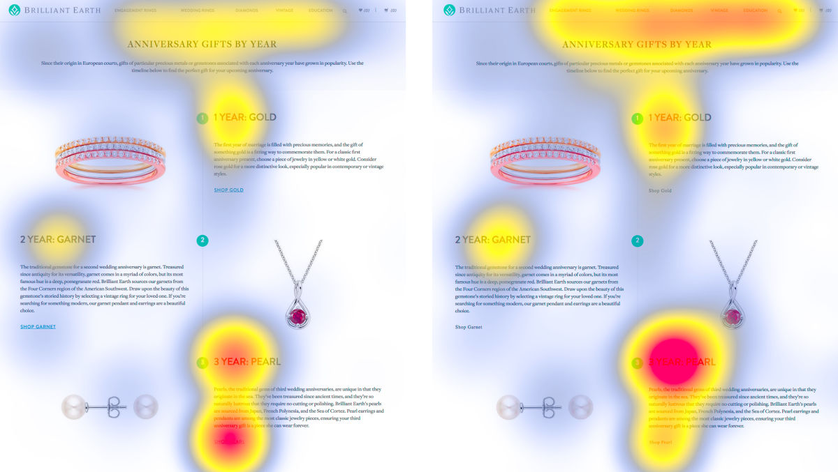
According to the survey group, 25 people out of 29 people saw headlines at first, but saw the pages with underscored / colorful links, but then moved their eyes to the target link of "Shop Pearl" It was. However, out of the 24 people who saw the underline / colorless link, 12 people moved the line of sight from the headline to the link of Shop Pearl, 9 out of 24 looked at sentences under the heading , He said he did not see the text link of Shop Pearl.
The research team shows that designs that are difficult to distinguish between content and navigation controls will waste user time and weaken the user's ability to make decisions. On the other hand, if the amount of information on the website is small, the skew-morphed design is not used, and interactive elements such as buttons are placed in noticeable places away from other elements, negative design of flat design It also states that the effect will be small. Features of flat design such as visual simplicity, consistency, visually clear hierarchy, contrast bring basically good results. It is also important to turn attention to the negative effect that flat design brings and to use the design carefully.
Related Posts:


in Design, Posted by darkhorse_log