Six ways to improve the attraction power by maintaining the "About" page
To many web services and corporate websites, we asked them who they are doing and what kind of business they are doing, such as "About" "About Us" "About us" "What is ○○?" A page to introduce is set up. When you get to a website where you can not tell what kind of business alone is the company name alone, you can just look at the About page, but the pages such as the ... what the concrete type of business is written with the president's profile being written endlessly ... There are many. Infographics that summarize six ways that you can improve the attraction power and page view by maintaining the About page that becomes "entrance with customers" is released.
Infographic: 5 ways to capture customers using your "About" page
http://www.thehubcomms.com/infographic-5-ways-to-capture-customers-using-your-about-page/article/364986/
◆ 1: Create an About page for customers
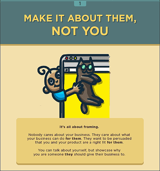
What I want to know about the About page is not "what kind of business do you do" but "what can we do with this service / product"? Although it is not a mistake itself to talk about who you are the president,Framing effectBy successfully using, you can influence the decision making of customers who read the About page.
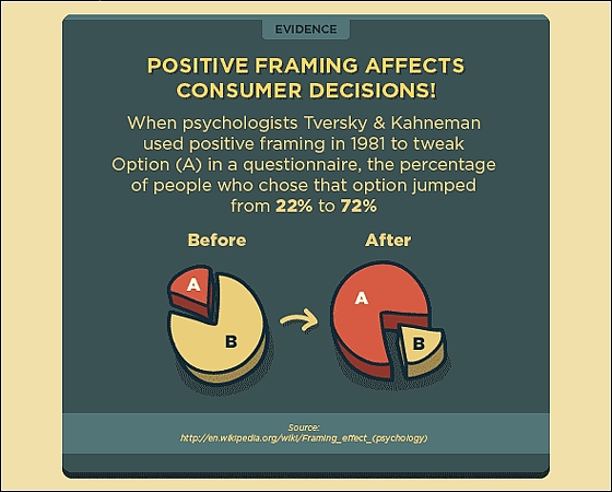
"Framing effect" is a phenomenon of psychologists in 1981Amos TverskyWith Mr.Daniel KanemannIt is a psychological phenomenon discovered by the experiment that Mr. performed. In the questionnaire of the 2-option question of the same content, the proportion of people who select A when the option A is positive is increased from 22% to 72% compared to when the option B is positive I understood that. We can apply this psychological phenomenon to the About page.
◆ 2: Headlines of valuable suggestions
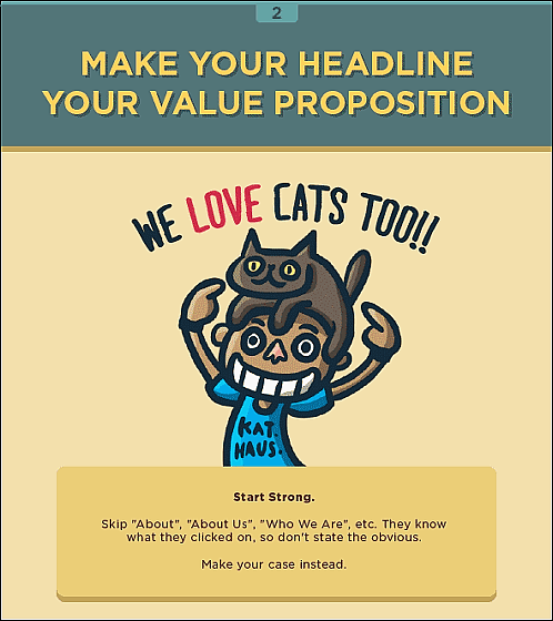
"About" "About Us" "Who We Are" etc is unnecessary at the beginning of the page because the customer knows that they clicked the About page. Let's headline a subject with a draw.
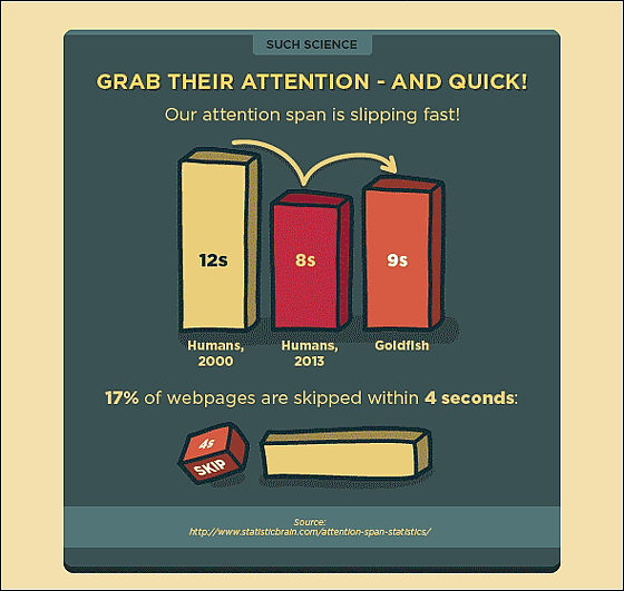
Human attention decreases year by yearIt has been scientifically proven. 17% of web pages are skipped within 4 seconds.
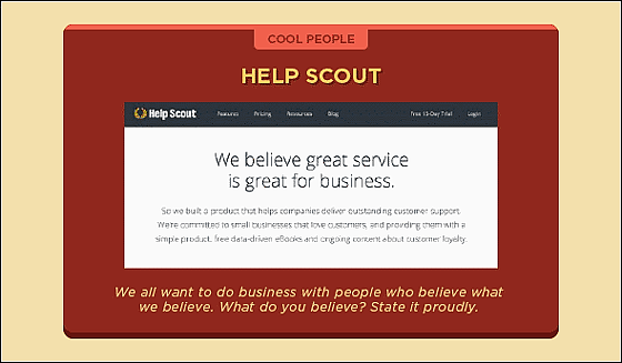
As a good example that will not be easily skipped, provide an excellent help desk serviceAbout Help Scout About pageWill be helpful. The top of the page starts from the headline "What we believe in" and what is important to the business is written.
◆ 3: Talking in a narrative style
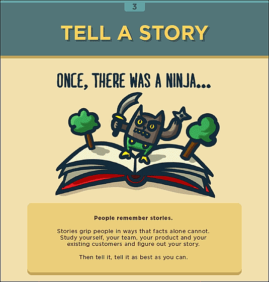
It is a sentence easy to remember in the memories of those who read by recollecting their team / products / attractive customers etc. by story-like description.
In 2007Wharton SchoolResearchers have proved that you can get a 2.4 times donation by showing the story rather than the actual data.
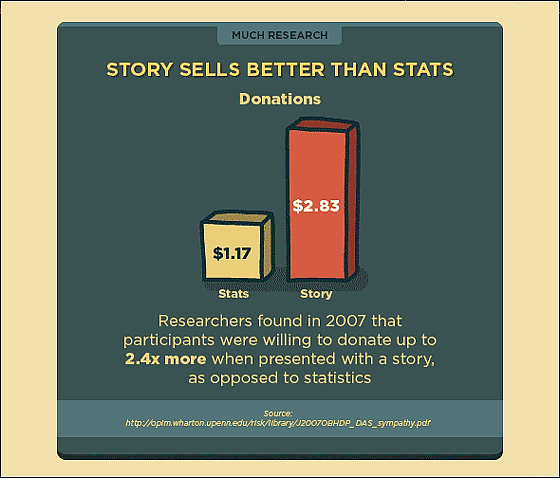
[PDF file] doi: 10.1016 / j.obhdp.2006.01.005 - J2007OBHDP_DAS_sympathy.pdf
http://opim.wharton.upenn.edu/risk/library/J2007OBHDP_DAS_sympathy.pdf
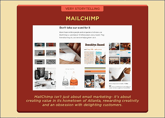
The story-like About page provides a free mail distribution serviceAbout page of MailChimp. What kind of services have you grown while interwoven with articles on media that have been taken up so far? That is spelled out.
◆ 4: Specify the following purpose as bus stop
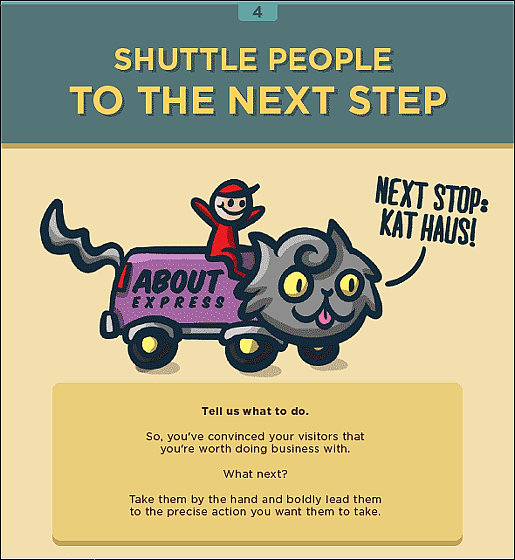
If you have a "powerful headline" reflecting things from 1 to 3, customers who read the About page should understand the value of the business. So, by taking their hands and leading them to the next action,Conversion rateYou can increase it.
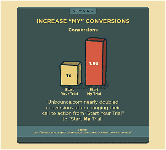
Landing pageSell templates ofUnbounce, The item name of the free trial is "Start Your TrialFrom "Start My TrialBy changing to "Successfully gathered about twice as many customers.
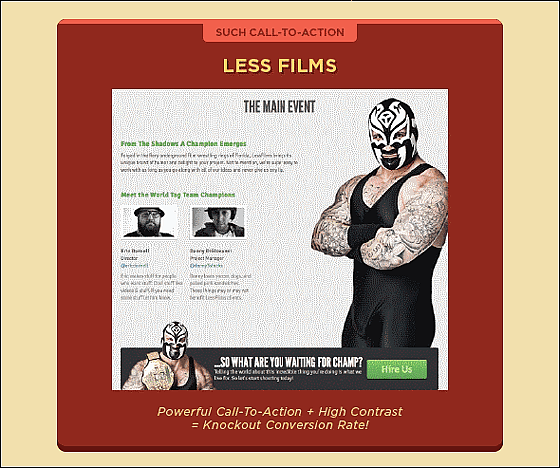
Strengthening the apparent contrast like "simple page + tiger's mask wrestler" is one way to increase the conversion rate.
◆ 5: Avoid overfilling
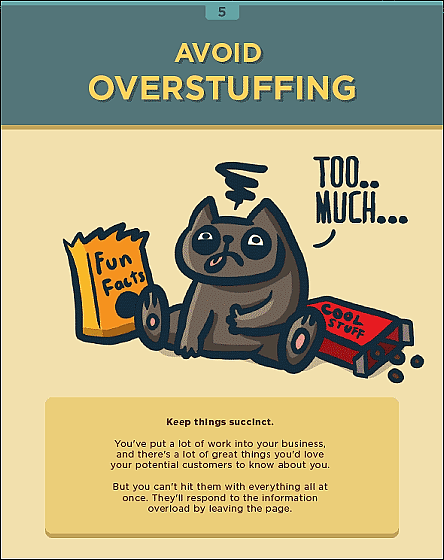
Even if you provide a number of great products and services, if you cram them all in the About page, the customer stops reading the page.
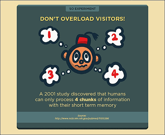
Research in 2001, We know that human beings can handle up to 4 pieces of information in short term memory.
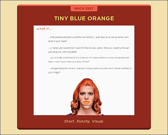
Work on web design for WordPressTiny blue orange's About pageIt is, briefly sore that one is four sentences and women of the photo.
◆ 6: Test, test, test!
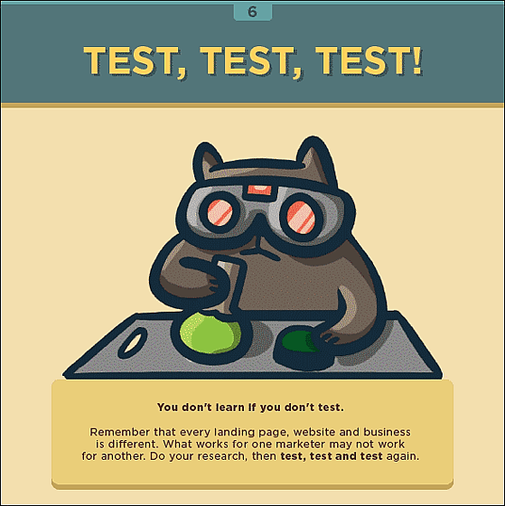
No matter how much you study, you do not acquire anything without testing. Let's try as many landing pages, websites, and businesses as you can research and use if you can use them.
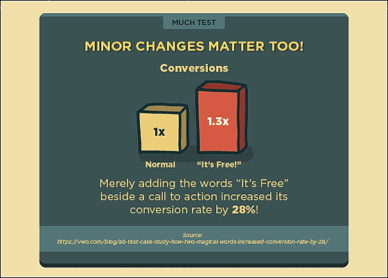
On a certain website, simply adding "This is free!" In one sentence "Please call me" increases the number of calls by 1.3 times and the conversion rate is28% riseHe said that he showed.
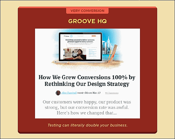
The importance of the test is clearly understood by reviewing the design strategyConversion rate rose to 100%It is calledGroove. It is not a dream to double the page view just by trying out what I came up with.
Related Posts:
in Note, Posted by darkhorse_log
