Things to know about conducting the A / B test to increase the conversion rate
ByA
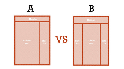
What is indispensable in constructing a website represents the proportion of trials of different designs that resulted in outcomes of the number of visitors to the siteConversion rateCompare and compare the "excellent"A / B test"is. She said that she has talked about A / B tests with many clients on a daily basisRobin JohnsonAccording to Mr. says, it is said that the client asks for surely "Where do I start the A / B test?" In order to answer the questions many clients have, Johnson divided the A / B test into 13 categories "71 ideas on A / B testing"I tried picking up what seemed to be useful from among them.
71 A / B Testing Ideas | The Optimizely Blog
https://blog.optimizely.com/2013/04/30/71-things-to-ab-test/
◆ "Call To Action (CTA)"
In Japanese, CTA stands for "action arousal", in other words, it makes clicking on the button "SIGN UP" or "Purchase", for example, letting users visit the website shop or download some actions such as downloading It refers to making it.
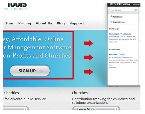
ByAmber Case
· 01: Change the text of CTA
There are various kinds such as "buy it now", "purchase", "check out", "put in cart", and so on, just to text on CTA prompting purchase at the shopping site. It is also important to change the text of CTA.
· 02: CTA button position
The CTA button's position is located more prominently than other buttons.
· 03: Number of CTAs
Tested when installing multiple CTAs on a single page and installing one CTA.
· 04:hyperlink
Try a hyperlink instead of a button.
· 05: type of CTA
Find out which conversion rate is highest among CTAs such as text only, icon only, text and icon.
· 06: Instead of content
Try changing the content of the website to "such as clicking here and beer is free!"
· 07: When mouse is aligned to CTA
To empathize users with clicks, emphasize changes when mouse is placed on CTA.
· 08: CTA button
I will test the CTA button's color, shape and size.
◆ "Content"
Content is playing a very important role in doing business on the Internet. The position of the content and how to display the content greatly affects the conversion rate.
· 09: "Gated Content" and "Ungated Content"
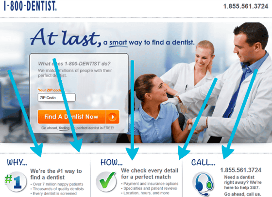
There are "Gated Content" and "Ungated Content" in the content. Gated Content can not be viewed unless the user enters some personal information such as mail or telephone number. On the other hand, Ungated Content means something that you can browse just by clicking like a YouTube movie. It is one way to test whether the user prefers to install both Gated Content and Ungated Content on the website.
· 10: About us
Tested on the presence or absence of "About us" or "About". This will tell you if you want to sign up immediately or want to know more about the service.
· 11: Content tone
Content coloring has a big impact on how long visitors stay on the website. You should test what kind of tone or style the user prefers.
· 12: Content display
For example, test the content display method, such as whether to make the page vertically long to scroll down, or divide the page into multiple, and let the user click "NEXT" to display the next page.
◆ "catch copy"
The catch phrase has the role of communicating directly with the user, and the user can instantly understand the contents of the service.

· 13: length of catch phrase
For catch phrases and explanations of products, test whether users like short ones or long ones.
· 14: Content of catch phrase
I will test two of "catch copy where the contents of the service are transmitted straight" and "a little abstract but creative catch phrase".
· 15: Paragraph
Whether the text consists of paragraphs in list format or bullets is good.
· 16: Negative? positive?
Depending on the content of the service, messages of negative meaning may capture the user's mind. So, try both positive and negative messages.
· 17: composition of haiku
One way is to introduce the composition of haiku into catch phrase or product explanation.
◆ "Visual Media"
Visual media included in the content, images or movies used for so-called websites. Images and movies have the power to greatly influence the conversion rate.
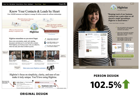
· 18: Landing page (LP)
Try using LP with various types of images. Initially it is better to test with portrait and product images.
· 19: Test again
After determining the portrait or the product image in the first test, we will further refine it and iterate it. For example, whether the portrait is male or female, such as one or more people.
· 20: Test again one more time
We will also test on media types such as still images, movies or 360 degree images.
· 21: Movie
Auto play or after click play?
· 22: Compare product movies
Investigate whether product movies are more attractive than cute animals' movies that have been uploaded to YouTube and elsewhere.
· 23: Carousel
Perform a test with a carousel, a still image, a movie like a slide gallery that scrolls side by side.
· 24: Easier to read the site
To make the site easier to read, try increasing the font or tightening the contrast.
· 25: Sound of movie
Test the sound of the movie with various types. For example, male and female voices.
· 26: Description of service
Would you like to demonstrate the service, use Screencast that recorded operations on the screen, or use animation?
◆ "Marketing Funnel"
Marketing funnel is a process of registering people who visited the site to the service, making them actually purchase, leading to customers, as a concrete example is sign up and check out.

· 27: Shut out unnecessary information
I will remove the items such as "product price" and "delivery information" that disturb the marketing funnel and test it. In many cases, a simple UX has a higher conversion rate than a complex UX.
· 28: Split the page
For example, we test whether good information on delivery is contained in one page or divided into multiple pages.
· 29: Check out
If other elements are included between product selection and checkout, it is good to do A / B test which removed it.
· 30: dialog box instead of page
If the process from picking a product up to checking out is divided into multiple pages, it is also ant to try using a dialog box that summarizes them. Try testing with multiple pages and dialog box.
◆ "Site navigation"
Site navigation is like a table of contents used by users to find the information they want. The A / B test also helps optimize site navigation.

· 31: Menu items
Change the order of items in the menu and test it.
· 32: Design of navigation bar
Test whether navigation bar such as menu is portrait or landscape.
· 33: Follow-up navigation bar
In addition to the portrait or landscape navigation bar, there is a navigation bar that scrolls down when scrolling down the page, so it is good to try using it with it.
· 34: Navigation bar name
Change the name displayed in the navigation bar and test it.
◆ "Input form"
The input form is time-consuming and complicated for the user, which is troublesome. I will actively carry out the A / B test to overcome such a troublesome input form and to sign up.

ByGustavo da Cunha Pimenta
· 35: length of input form
Normally the input form enters information from the top to the bottom, but try changing it by trying to change the vertical length of the form. Investigate the optimum length of the input form by removing unnecessary elements for sign up.
· 36: Free Offer
"Free" is a magical word that resonates with the hearts of all users. If you introduce a free offer on the input form and do an A / B test, there may be a big difference in the conversion rate.
· 37: Spam prohibition
There is no user who says "It is OK to send spam". For that reason let's test the A / B test by adding a message saying "Do not send unnecessary mail" to the input form.
· 38: Large input box
I will try the A / B test by enlarging the box for entering personal information. It seems that users may be given a friendly impression if the box is large.
· 39: Listen to various information
Try testing instead of the type of information you enter on the input form. For example, listen to either work email or personal email, listen to either a work phone number or a personal mobile phone number.
◆ "Mobile Site"
A slightly different design from the PC site is required for the mobile site, optimizing the mobile site through the A / B test may raise the conversion rate and profit at once.

· 40: length of the page
Tested with various page lengths and investigated whether mobile users prefer scroll down or prefer to click on the next page.
· 41: Content and navigation bar
Content and navigation bars displayed on mobile sites should be tested with different types. For example, whether to make the menu bar drop-down or button with image.
· 42: Different OS
When doing A / B test of mobile site, it should be tested with different OS. For Android users and iOS users, your favorite web design may be different.
◆ "Advertisement"
If you are planning to publish web advertisements that spend your budget on your site or service, it is important to conduct an A / B test and investigate the number of clicks on ads.

ByPaukrus
· 43: Catch copy of advertisement
Test catch phrases of various ads and investigate clickthrough rates.
· 44: URL
Try displaying the URL of the site in the ad and doing the test.
· 45: LP of advertisement
Since the LP displayed after clicking on the ad is the best place for the A / B test, we will do the A / B test not only on the advertisement but also on the LP in parallel.
◆ "SNS"
There are tremendous influences of SNS such as Facebook and Twitter, so many people can recognize the service by being shared by SNS. For that purpose, it is important to install SNS share buttons like "Like" or "Tweet".

· 46: SNS button
Test the SNS button with different size and display position.
· 47: Default button
Test with the default buttons provided by SNS and buttons that changed their designs themselves.
· 48: Twitter text
When tweeting your own service by yourself, change the content of the text to be displayed with the service link every few days and investigate the conversion rate.
· 49: Customer Review
To review the customer reviews on the website, try A / B test with different types of reviews displayed.
◆ "Mail marketing"
Mail marketing is a marketing method to let users know about products and services by using e-mail. Even if it says in a word, it consists of various elements such as subject, body, sender and so on.

ByMaria Elena
· 50: Subject
Perform A / B test with a long subject or short subject.
· 51: sentences
Tested with two kinds of texts that have a strong impression, such as "Friendly sentences starting with" Hello! "And" I am indebted to everyone from the very beginning ".
· 52: Transmission time
Try sending mail at various times to test when you are reaching the user at what time it is best to send.
· 53: Newsletter
There seems to be some clients worried about sending newsletters to keep users away. In such cases, we will test with weekly newsletter and monthly newsletter and investigate user's trend.
· 54: From
CEO, marketing director, marketing team, etc. by sending mail with various sender's name.
◆ "Customize for each user"
The website is open to the world, and the race of visitors is also diverse. Therefore, it is also important to classify users according to the area of residence, the language to use, and prepare the appropriate functions and contents for each.

ByChris Jupin
· 55: Automatic input
When the user enters the address on the input form, we will introduce the function to automatically enter according to the area where the user lives, and carry out the test.
· 56: User specific language content
When a user visits a website from all over the world, it is one way to prepare the content for each major language the user speaks and perform the A / B test.
· 57: New user and repeater
Introducing different web designs for new users and repeaters and testing.
· 58: Mobile and PC users
Performing A / B test by separately preparing LP for mobile users and PC users.
◆ "Price"
If products and shipping charges are given appropriate prices, it is possible to increase the willingness of users to purchase.

ByJapanexperterna.se
· 59: Free trial or cash back?
We conducted two campaigns, a free trial and a cash back, at different times, and investigated the long-term and short-term perspective conversion rate.
· 60: Autocomplete check box
For example, after entering the invoice delivery address, prepare a check box "Is the delivery address the same as the invoice delivery address?", And if checked, introduces the function of automatically entering the previously entered address I try.
· 61: Frequency of withdrawal
Test the withdrawal either once a year or once a month to test which leads to a long term subscription.
· 62: low price after high price
Try using a method to show cheap price after showing a high price first, such as "Competitor is 10,000 yen but our company will be 7000 yen".
Related Posts:
in Note, Posted by darkhorse_log
