Five secrets to design buttons with outstanding usability
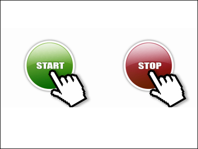
But considering the usability is quite important the button design. As I heard the story, on some sort of loan application page, make the size of the button extremely large so that it stands out and make the button stand out like "decka" and "post it now" instead of "OK" or "post" When I labeled, it was said that there was an application increased by several hundred percent. Even a slight design difference can not be a fool.
So, if you look at the design of buttons that were packed with ideas of various well-known sites and looked at the design of buttons, it seems that none actually seems normal at first glance but actually it is not so. Five rules are applied to them in common.
The secret law is from the following.
■ Secret Part 1: Color
Let's make the color of the button stand out more than the rest of the page, use brighter, contrast and color contrast with page color.

■ Secret Part 2: Place
Let's place the buttons in a location that users can find quickly. Horizontal items, headers, navigation menu right up, etc.

■ Secret Part 3: Description
In order to realize appropriate communication with the user, it is important to add words to explain the function of the button. It is not too long, not too short, it makes it easier for you to understand if there are words that briefly describe the function. It is also effective to show the reason for clicking the button to the user. For example, "Free!" Is displayed, and so on.

■ Secret Part 4: Size
Make it as large as possible to make it bigger than any other button to indicate that the button is important for the user.
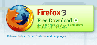
■ Secret Part 5: Margin
Let's have enough margin around the button and give a margin. Also, to make it look like a button, it is necessary to make it look three-dimensional rather than flat.

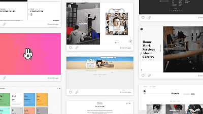
The button design of each website to which these rules are applied is summarized in the following site. Because none of this is well done, it is helpful to be informative.
Web Design Trends: Call To Action Buttons - Freelance Web Design Belfast Northern Ireland Lee Munroe's Blog & Portfolio
Related Posts:
in Note, Posted by darkhorse
