The five most important rules to design with photos
ByTakuhitofujita
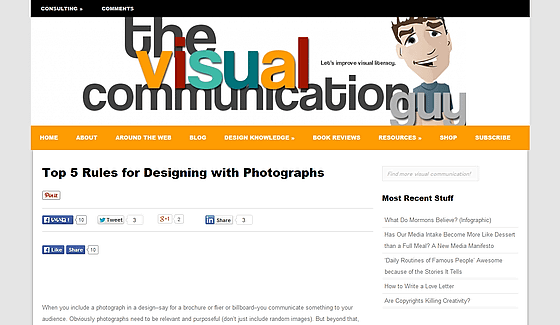
In the design using photographs, it is not merely necessary to use excellent photographs, but the impression given to the reader largely changes by "what kind of photos" and "how to arrange". In professional-made magazines and websites, such professional techniques and techniques are abundantly used, but the infographic that collects such know-how, "the five most important rules in photography design"Clemson UniversitysoVisual communicationProfessor Curtis Newbold teaching is open to the public.
Top 5 Rules for Designing with Photographs
http://thevisualcommunicationguy.com/2015/02/02/top-5-rules-for-designing-with-photographs/
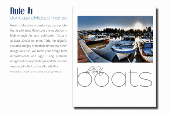
◆ Rule 1: Never use photos with low resolution
In any circumstances, you should never use photos that have become crisp due to insufficient resolution. The resolution is at least 300 dpi for printed matter and 72 dpi for web. Rough photographs are more rude than any other failures related to design, not only makes the design uncomfortable, it is like proving that it is not a professional.
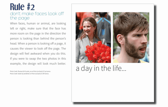
◆ Rule 2: Do not point the face direction outside the page
When using a picture of a person or animal facing left and right, please arrange so that the line of sight of the subject faces towards the center of the page or the part with much space. If the person in the photo inserted in the page is looking out of the page, your design looks clunky. For example, in the picture below, it is better to swap the two photos on the right side.
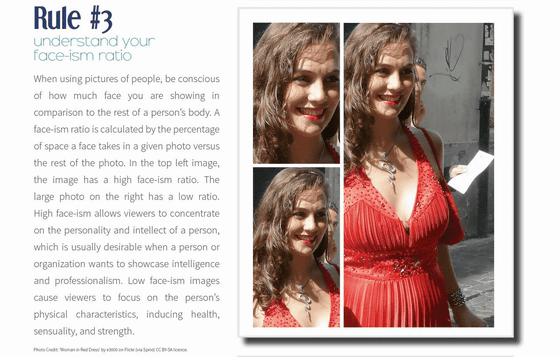
◆ Rule 3: Consider the proportion of "face" parts in the photo
When using a person's picture, you can give different impressions to the reader even by the same person by calculating "What percentage of the space of the person is occupied by the face of the person?" As an example, if the percentage of facial parts is high as shown in the upper left in the picture below, the reader tends to pay attention to the personality and intelligence of the subject, which is effective when it is desired to compare the intelligence and expertise of a specific person. Also, in a whole-body photograph with a low proportion of facial parts like the right side, the reader focuses on the physical characteristics such as the "body" of the subject, so when it is desired to complement "health", "sensuality", "strength" It is good to use.
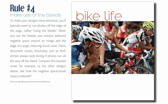
◆ Rule 4: Use "bleed"
A commonly used method when you want to show your design more attractive is to post pictures to the edge of the page, this method is said to be "Use the bleeds" in English. By eliminating the space around the photo, it has the effect of reducing visual noise, and it is often used for advertisement handouts, document covers, pamphlets, etc. It may be easier to understand its effect by comparing the photographs of the following bicycles with other pictures.
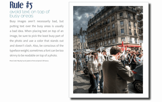
◆ Rule 5: Do not place text in the garbage area
The following crowd photos themselves are not bad materials, but texts are placed overlapping the crowd. Placing text over many objects is generally considered a bad idea, and when placing text in a photo, pick the most "non-cropping" place and color the text It is better. In addition, consideration not to destroy the atmosphere of the photograph is necessary. Also, the thickness of the text is important, depending on the font it gets too thin, sometimes it becomes unreadable if it is made into a picture so be careful.
Related Posts:
in Design, Posted by darkhorse_log
