"Web Design in 4 minutes" explained visually and clearly how to make website design dramatically in 4 minutes
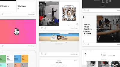
"Based on the basic principle, anyone can do an attractive web design in just a few minutes" to explain visually easy to understand "Web Design in 4 minutes"Has been released. It is becoming a very useful website for those who want to improve the design of text-centric webpages seriously.
Web Design in 4 minutes
http://jgthms.com/web-design-in-4-minutes/
When accessing Web Design in 4 minutes, first, there is no design element, simple text is displayed.
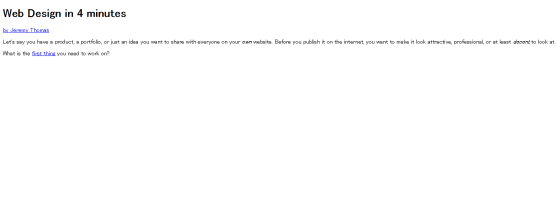
By clicking the link in the sentence, the method of improving web design is displayed in sentences, and the design of the site actually changes. When you click "first thing" ... ...

It was displayed about "contents".

So the contents are as follows.
◆ Content
The purpose of web design is "to show the contents on the website better", so it is natural to say that it is natural, but the first thing the content should think about. Therefore, it is undesirable that "Attempt to think about content after thinking about design" attitude.
At this time, 90% of contents existing on the web are composed of sentences, and styling of sentence content is very useful for improving web design. So, "What we do is" centering ", assuming that the sentence content has already been completed and that a file called" style.css "exists.
◆ Centering
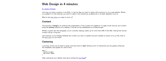
Centering is to bring sentences in the middle of a web page. If the sentence is continued from the left end to the right end of the page, you will move the line of sight a lot and it will become a hard to read web page. Therefore, by restricting the length of one sentence, we make sentences easier to read.
What is centering is that web design like ... ...

To be displayed with such feeling.
◆ Font family
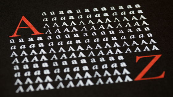
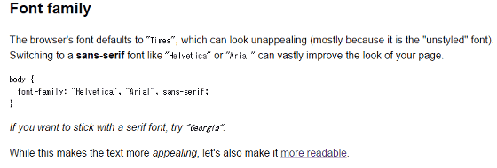
After making sentences easier to read in units of "katamari", I will add a hand to the sentences themselves. That is, it is selection of font. For alphabetic characters, CSS font defaults to "Times (Times New Roman)It is specified as. But Times is not an attractive fontSans serifIt is better to change to a font etc. "Helvetica" and "Arial" are listed as recommended sans serif fonts.
Below is the Times font.

When you designate the font as "Helvetica" or "Arial" it looks like this.

◆ margin
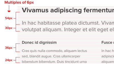
If you get impression that you are disturbed when you see a web page, there is a possibility that there is a problem in the margin. Web design may be greatly improved by leaving enough space around the content, or between content and content.
The following is the case when there is not enough margin.

If you set a margin, it looks like this.
◆ Color and Contrast
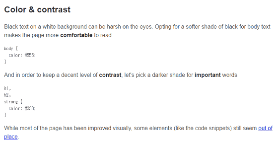
The sentence contents, all of which are "black characters on a white background" give a hard impression to the reader. It is said that readers can comfortably read sentences if the text of the text is slightly lighter in color.
However, it may be difficult to read properly if you do not keep proper contrast, so add important shades of color to important words. In Web Design in 4 minutes, both titles and texts were black, only titles and important words were specified as black & bold, and others were set to gray.
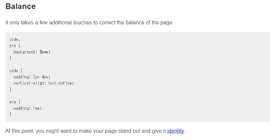
◆ Balance
In order to balance on the page, coloring only a part of the text background makes it possible to visually recognize the composition of the text.
Primary color
Many brands use primary colors as visual accent. Using primary colors on websites is also effective, and you can emphasize interactive parts like links.

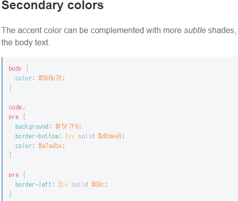
◆ Equal color
While using primary colors as accent, complementing with border, background, text etc. with fine coloring is also effective for design.
◆ Custom fonts
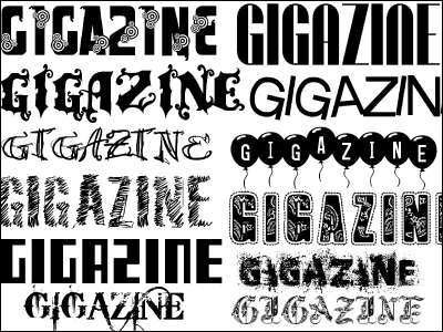
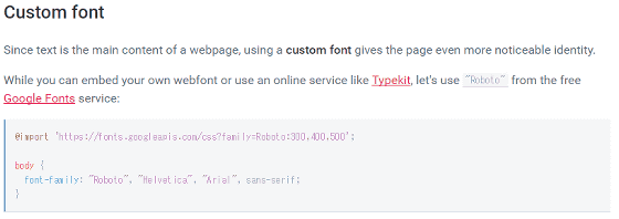
If the text is the center page, it is also a hand to use custom fonts to make it easier to stop and to bring out personality. It is free to use publicly released by GoogleWeb fontYaTypekitIt is also useful to use a web service like.
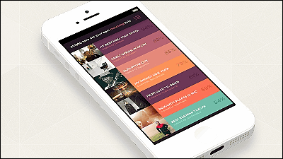
Otherwise, you can display images and icons on a web page ......

You can get high resolution images for freeUnsplashIf you use the image of the background or add a logo ... ....
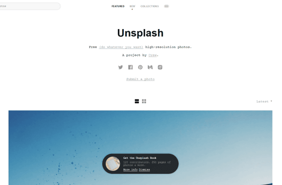
This is the first nonpalatable page that was only text.
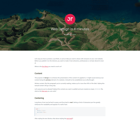
Following the basic principles of some web designs, you can create web pages that are attractive as a design in just a few minutes. And after making a good web page, remember to share with people, and created Web Design in 4 minutesJeremy ThomasI am talking.
Since the CSS code for actually designating centering and fonts is also described on the web design in 4 minutes website, people who wish to improve web design right now copies the code You can also make changes while doing it.
Related Posts:
in Design, Posted by darkhorse_log
