What is "flat design" that may be adopted in "iOS 7"?
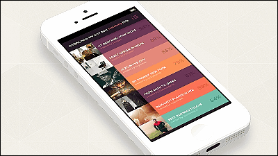
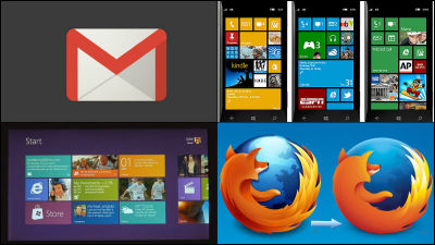
It was adopted in a characteristic metro design where tiles are lined with Windows 8 and Windows PhoneFlat design"Is very easy to understand,"Will it also be adopted in iOS 7?Although it is predicted to be,DesignmodoSo we are summarizing what is now a trend "What is flat design" as six principles, and if you are a designer or interested person, such as web design or project design, It is a useful guideline.
Principles of Flat Design - Designmodo
http://designmodo.com/flat-design-principles/
◆ 01: No extra effects
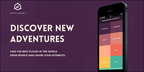
It is cited as a feature of the flat design that there are no unnecessary decorations. All elements are clear, simple, two-dimensional design from frame of image to button, navigation tool, without shadow, inclination, embossing and depth.
BelowTriplAgentThe website. There is absolutely no effect such as depth and tilt, it is a very clear design.
◆ 02: Simple element
Simple UI is often used for flat design. Designers use independent shapes such as rectangles, squares, circles for buttons and icons. And the corners of those shapes are perfectly angular or rounded. Each UI should be simple to make clicks and taps easier and intuitive so that users can understand at a glance.
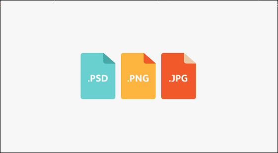
In addition to a simple style, please use buttons that are easy to click with colorful colors to promote use by users. But do not confuse simple elements with simple design. The concept of flat design is as complex as other design schemes.
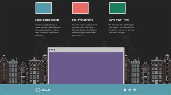
◆ 03: Pay attention to typography
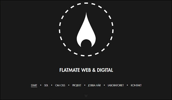
Because the essence of flat design lies in the simplicity of elements, typography such as layout, composition, font etc. of typography becomes very important. Character fonts should match the design ideas as a whole, for example in a design that has been made as simple as possible, the decorative characters will look odd. In order to eventually have a consistent tone both visually and textually, the letters should be powerful, simple and effective.

When using a flat design on the website, as a basis of typography, consider a simple sans serif font with affinity for many variations. Also, by incorporating not only typography in sentences but also label buttons and other elements, users should be able to use it more interactively.
◆ 04: Focus on color
The color occupies the majority of the flat design. When designing a website using a flat design, the color palette is often brighter and more colorful than the palettes of other designs. Also, although most design projects focus on 2 to 3 colors, in the case of flat designs there is a possibility to use 6 to 8 colors equally.
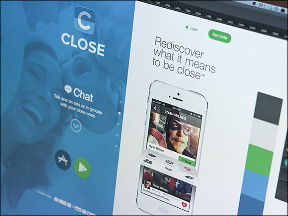
The color tone is brilliant. Please think about the color that is the least blended in the color wheel. There is no shading or light and dark. Primary colors and equilateral colors are popular, and retro color such as salmon, purple, green and blue is popular, and it is often used.
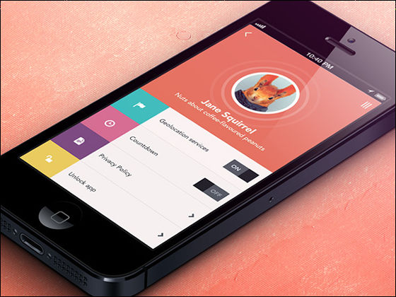
◆ 05: Minimalist approach
Flat design is inherently simple and has affinity with design approach by minimalism. Simple colors and text are enough, so if you want to add photos, please choose a simple one.
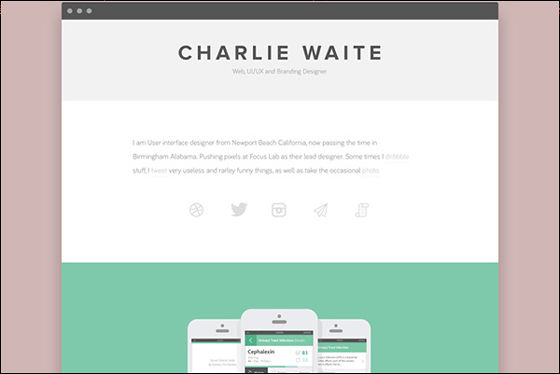
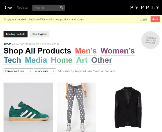
Product sales siteSvpplyAs you can see, it is effective to use the flat design to place items on a simple background. There is a depth in the product photograph, but it fits to the flatness of the overall design.
◆ 06: "almost" flat design
Many designers agree that they are "almost" flat designs. In other words, based on the flat design plan, adding some effects there.
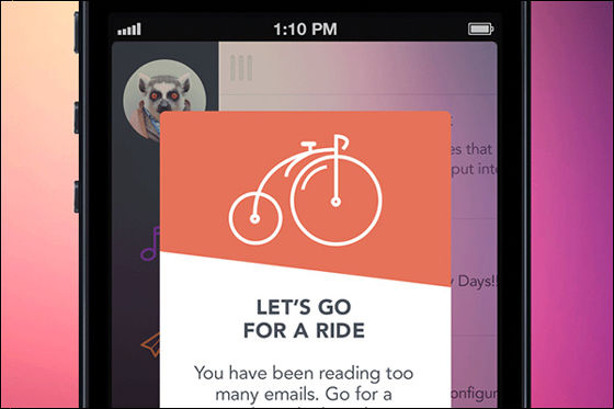
For example, if it's a button, designers usually use one effect in a "almost flat design" with a little slope and a shadow. This allows a little flexible style. The design which moderated a little sharpness gives the user ease of use. Since designers can add depth and texture to designs, they like "almost flat design", but putting two styles in one design may lack definition as well.
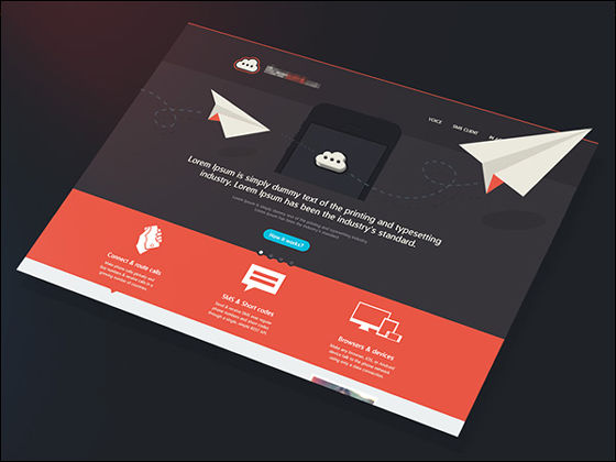
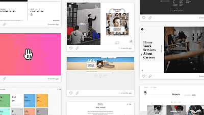
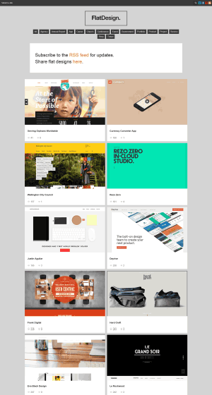
In addition, the following websites are staggered with the site design using the flat design, what is the flat UI design? It is becoming sensible to know that.
Flat UI Design - A showcase of the best examples of the flat UI design aesthetic on the web.
http://fltdsgn.com/
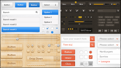
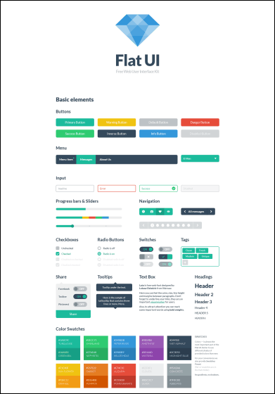
There is also a service that you can actually download the UI kit that can be used for flat design.
Flat UI
http://designmodo.github.io/Flat-UI/
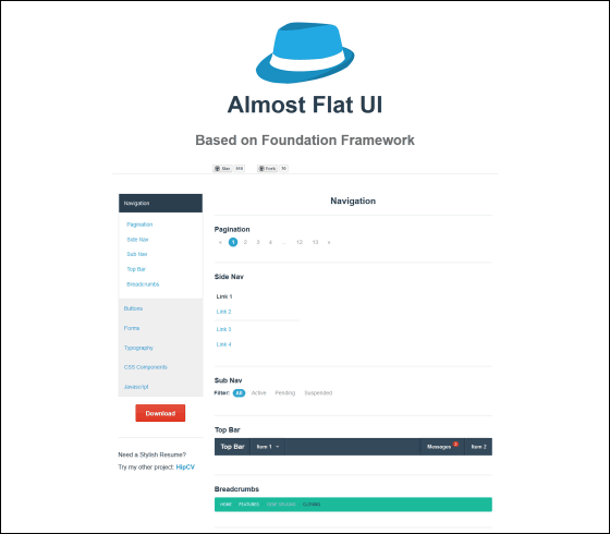
The following is a "almost flat design" UI kit.
Almost Flat UI
http://websymphony.net/almost-flat-ui/
· Continued
Advantages and disadvantages of flat design prevalent in the web industry - GIGAZINE
Related Posts:
in Design, Posted by darkhorse_log
