How has the "button" web design evolved?
ByWebtreats
Software developer Nick Babich explains how "Button", an essential element in websites and applications, changed the design and important elements to make effective buttons .
Buttons in UI Design: The Evolution of Style and Best Practices - UX Planet
https://uxplanet.org/buttons-in-ui-design-the-evolution-of-style-and-best-practices-56536dc5386e
I see buttons every dayInteraction designIt is one of the elements. The button seems to be a very simple element, but according to Babich, the design of the button has changed a lot during the decades, and it is said that a design that is always easy to understand and clear has been demanded.
Evolution of Button Design
· 3D button
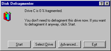
The initial OS button was designed to distinguish it from the background color with a look that looked like a button lifted using highlights and shadows. This design is based on the simple principle of using borderline, gradation, drop shadow, and made it easy for users to recognize the button by making the button stand out against the background color It was.

Below is the Windows 95 dialog box. It is a design that makes it easy to understand which parts are buttons visually by showing the buttons three-dimensionally with shadows and highlights.
·Sky morphic design
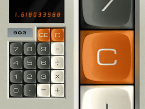
In digital design, "skew morphism" is to design an object real like the reality exists. Buttons using real world textures and visual buttons like physical buttons correspond to skew morphic design. As in the design of the following calculator buttons, by incorporating what actually exists in the digital design, it is easy for the user to recognize the function of the button, and the user is familiar with the actual button so that the user can use the button as it is It can also be used in digital environments.
· Flat design
"Flat design" which has transformed into a simpler design by eliminating the stereoscopic effect from the skew morphic design has become a trend in recent years. Unlike the sky morphic design, flat design tends to make digital unique buttons without managing the appearance of buttons in the real world. The flat design removes the heavy feeling traditionally used to visually understand buttons by button designs so far.
The traditional skew morphic design on the left side and the flat design button on the right side.

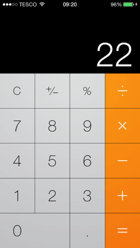
In iPhone calculator, flat design is adopted for all buttons. However, if everything turns into a flat design, it will be difficult for users to know which elements on the screen are buttons. Therefore, even with a flat design, visual features that indicate clickable or tapable are necessary. Babich says it is "color" as important.
· Flat design andFloating action button
This design method is almost the same as the flat design, but uses the shadows and highlights skillfully and uses the layer to indicate the priority of the UI. Google'sMaterial designIs using a floating action button to show correct attributes in flat design. Buttons are placed at the front of the interface, making it easier to click and tap, and the buttons are placed in the corners so that the entire screen can be used widely.
For example, on Google Maps, since many users use the guidance function, a floating action button dedicated to starting a guide is placed in the lower right.

In addition, Evernote employs a flat design for almost all designs, and a button is slightly shaded to make it easier to understand which button was tapped.

· Ghost Button
The ghost button appeared with a flat design, and began to become popular as Apple adopted it for iOS 7. This is the same rectangular or square button as before, but it is a design that looks as if the background color is transparent and letters are floating inside the button. Ghost buttons are usually surrounded by very thin lines.

In addition, the ghost button is a site that emphasizes refreshing appearance and is often used to make a clear impression.

◆ Basic design method of buttons
Babich says that when making buttons you should keep in mind the "design that's easy to see and click". In order for the user to recognize elements on the site as buttons, Babich says that the following points should be noted.
·form
The shape of the royal road button is a rectangle or a rectangle with a rounded corner. The shape of the horn should be changed according to the style of the site. Among rectangles, the rectangle seems to be user friendly because it has been used since ancient times.

If you make more creative buttons, it is also ant to use different shapes such as circle and triangle, but it is said that the risk is a little high to have users recognize as buttons.

·size
Massachusetts Institute of Technology Research (PDF file), It has been found that the size of the belly of the average human finger is 10 to 14 mm and the size of the fingertip is 8 to 10 mm. In other words, to prevent erroneous taps, the size of the button should be set to 10 mm × 10 mm or more.

The following graph shows the size of the button and the number of erroneous taps, whereas the number of erroneous taps is 5% to 20% in 3 mm to 5 mm, whereas when set to 9 mm or more, almost no erroneous tap disappears You see that there is.

· Distance between buttons
Another important thing to prevent erroneous taps is to take appropriate distance between the buttons. Especially in flat design, it is important to leave a little space without adjoining the buttons to prevent erroneous taps.

·character
The character inside the button must be an appropriate indication of the action after clicking the button. For example, in Dropbox, "Awesome!" Is written on the button in the notification screen that you can use the drag & drop action when uploading files, but with this it is not clear what will happen next if you click the button .

·color
By using the appropriate color, it helps the user to recognize the button. On the following screen, the action "Delete setting" is indicated by a red button with the meaning of advice.

Amazon is designed to display the purchase button in yellow and click the correct button when the user wants to purchase the item.

Related Posts:
in Design, Posted by darkhorse_log
