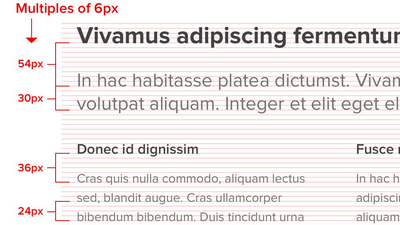
Apple opened a site that summarizes "What to Do" and "What to Do" in the UI design of the application for iOS 7
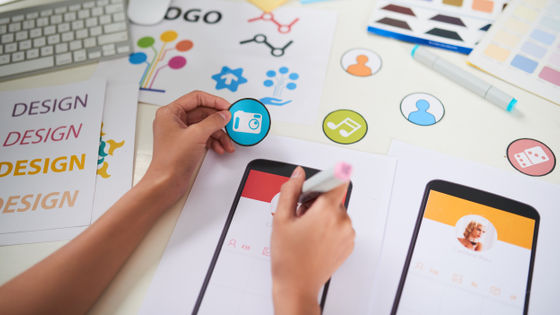
In iOS 7, the user interface (UI)Flat designbecome,Look and operationIt was different from iOS so far. For developers developing such iOS 7 apps, Apple summarizes the points and guidelines that Apple should be aware of in UI design.
Designing Great Apps - Apple Developer
https://developer.apple.com/design/
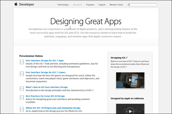
This site is for registered iOS developers, and it is necessary to add elements necessary for designing an application for iOS 7 to multiple pagesApple World Wide Developer ConferenceYaTech TalksIt explains with the movie of.
For example, the following page collects hints on UI design.
UI Design Dos and Don'ts - Apple Developer
https://developer.apple.com/design/tips/
◆ Formatting content
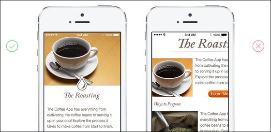
This means that developers should create applications with a layout that matches the screen size of iOS devices. For example, you should place key content so that the user does not have to zoom in and out, scroll horizontally.
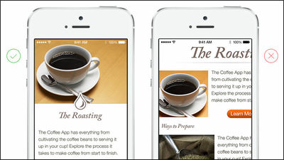
In the case of the following images, in order to see and read the images and text displayed on the iPhone screen on the right side, it is necessary to zoom in on the image by pinch operation or scroll the screen horizontally to follow the text There is. However, if you place the image and text as shown on the screen on the left, the user only needs to scroll the screen vertically, eliminating the need to perform detailed operations.
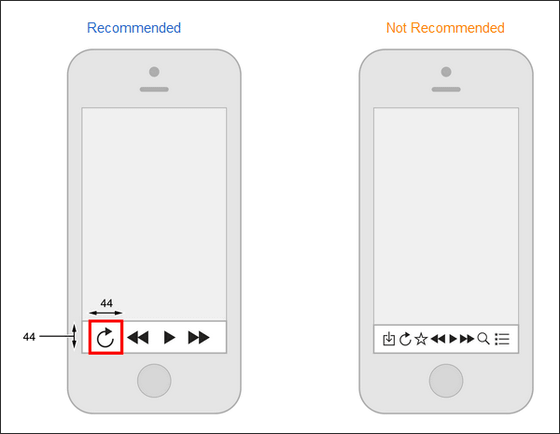
In addition, since the operability of the application changes according to the layout, in order to make it easy for the user to manipulate the content, the interval of each element is sufficiently opened, and a tapable icon is assigned a size of about 44 × 44 points It seems to be the best.
Furthermore, it is very important to decide the layout so that users can easily concentrate on the main content and functional parts of the application. A good way to achieve this is to place important items on the top left of the screen.
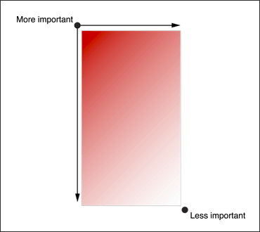
There is also a method of "using visual balance" to represent the relative importance of each icon displayed on the screen. You can make the user understand that icons or icons with different colors than other icons are eye-catching and that it is more important than the other icons.

Once you understand these elements and format icons and layouts, you will be able to design UIs that are easier to use and use.
◆ Touch operation
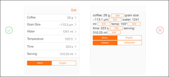
In the UI for iOS 7 application, in order to make the application more natural and easy to manipulate, each element should be designed for touch operation.
For example, on a screen that inputs the year, month, day, hour, minute, you can tap the year, month and day like the right side, calendar and time as you can enter all the elements by touch operation as on the left side It is more natural and easy to operate.

Ease of tapping icons
To make it possible for users to tap icons accurately with your fingers, please create icons that are at least 44 points in size.

◆ Text Size
The text size seems to be at least 11 points so that you can read characters clearly without having to enlarge the screen when reading letters on iOS terminals.

◆ Contrast
By making a sufficient difference in contrast between the font color and the background color, the characters become very easy to read.

◆ Space
It is good to extend the line spacing to make text easier to read.

◆ High resolution
If you prepare images with a resolution that is twice or more that of all images, the image will not appear unclear even on the Retina display.

◆ Strain
In order to avoid distortion, it is better to always designate the intended aspect ratio for the image.

◆ Structure
Regular layout of changeable content allows you to create easy-to-read layouts.
Related Posts:
in Software, Smartphone, Design, Posted by logu_ii
