What are the UI design rules in 'spatial computing' created by Apple for the MR headset 'Vision Pro'?
At the keynote speech of Apple's developer conference ``
Design for spatial user interfaces - WWDC23 - Videos - Apple Developer
https://developer.apple.com/videos/play/wwdc2023/10076/
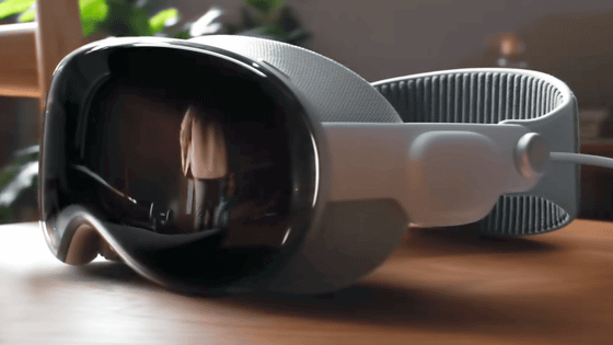
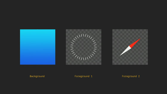
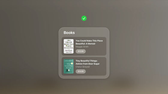
A major feature of visionOS installed in Vision Pro is that app icons are represented in three dimensions.
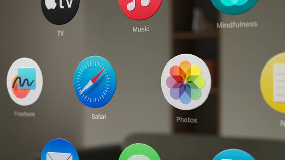
An app icon consists of 1 background layer and 1-2 foreground layers, a total of up to 3 layers. Each layer is a square layer, 1024 x 1024 pixels. It becomes an icon by overlapping it and cutting it into a circle with a diameter of 1024 pixels.
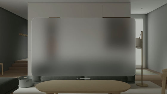
The window is made of translucent glass material. Apple's design team said, ``Apps must adapt to the surrounding lighting environment. .
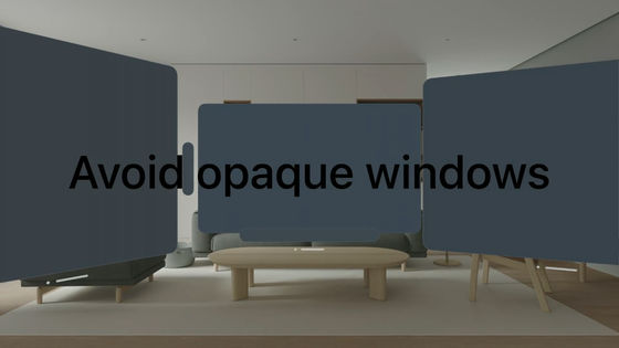
Also, Apple's design team says that opaque solid windows, rather than translucent windows, should be avoided because they do not blend in with the surrounding environment and may feel cramped or make the interface feel heavy.
The glass windows respond dynamically to lighting, automatically adjusting contrast and color balance, so they become part of the space as day turns to night.
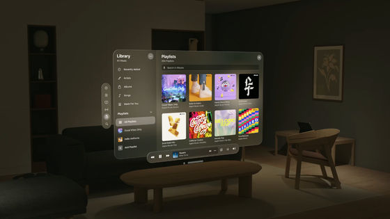
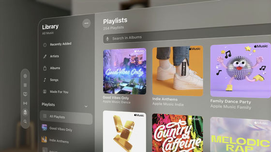
As a result, visionOS windows are not as bright and dark as iOS and iPadOS windows. The cels in the window are represented by the shades of the glass material. Also, the characters displayed on the window are white by default.
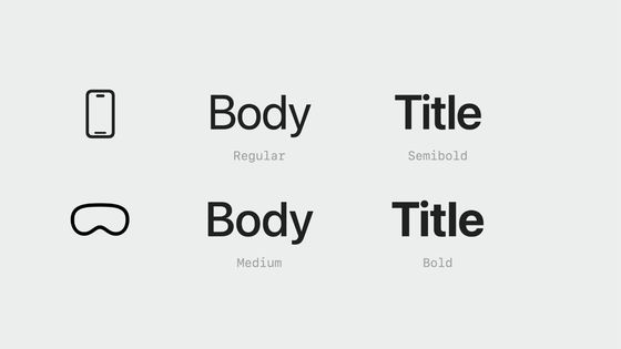
Regarding the system font, the type is the same as iOS and iPadOS, but it is said that it is a little thicker to improve readability.
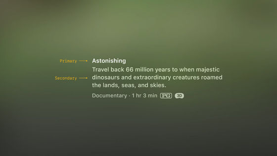
And since it becomes difficult to read if the font size is increased or decreased, headings are basically emphasized by adjusting Vibrancy instead of font size.
As for color, it is still recommended to use white background for text.
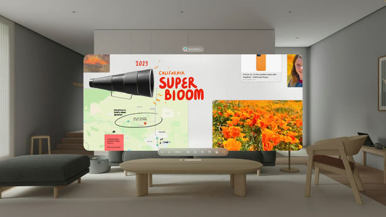
Apple's design team said, ``With visionOS, you mainly operate with your eyes and hands, so it is important to create an experience that prioritizes physical comfort and safety. It should be placed so that it does not cause eye or neck fatigue, ”he said, and the UI calls for sufficient margins on the top, bottom, left and right so that it can be seen by people.
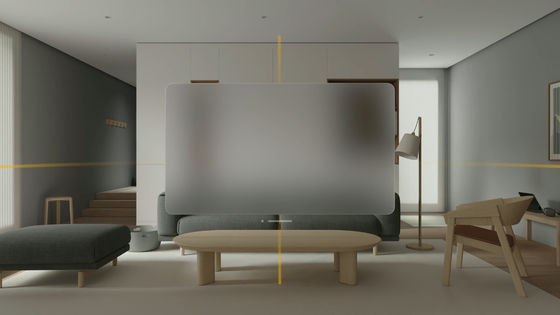
Also, if you need a larger canvas than the app, basically it is recommended to spread horizontally instead of vertically.
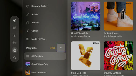
For buttons, it is recommended to set the size to at least 60 points by 60 points. In the case of a 44-point button, which is a common size, 8-point margins are set on the top, bottom, left, and right.
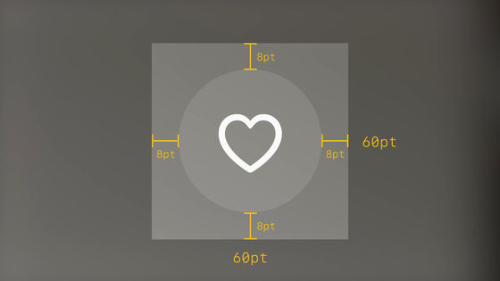
By doing this, the spacing between the buttons is visually 16 points. This 60 points vertically and horizontally is a setting that makes it easier to select on the visionOS window.
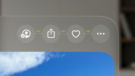
For example, this button is visually small at 28 points.
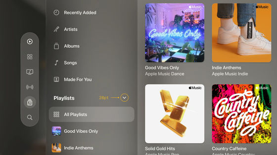
However, the button area is actually 60 points vertically and horizontally. By doing this, even small buttons can be selected without problems.
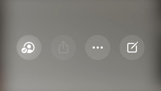
Button shading visually indicates whether the button is active or inactive.
It also uses a hover effect that makes it pop out of its surroundings when selected. This hover effect makes it easy for users to see which parts of the interface are interactive.
It is recommended to leave at least 4 points between cells that appear on hover.
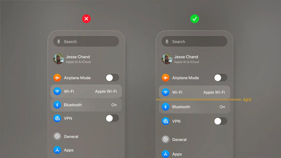
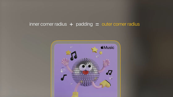
Also, Apple's design team says that the shape of each element should be unified. For example, in the following the outer container and the inner nested element are rectangles with rounded corners. Be sure to set the radius of the corners and make sure they are concentric with each other.
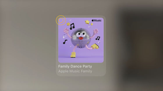
In other words, it is important to be aware of the formula: Corner Radius of Nested Element + Width of Margin = Corner Radius of Container.
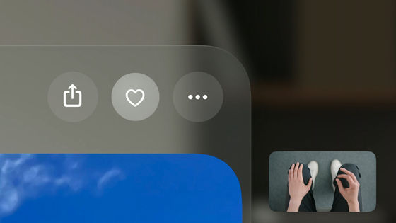
Now for the input. With visionOS, you use your hands and eyes for input without using physical devices such as mice and keyboards. For example, you can add a character to your favorites by squeezing your right hand on your lap.
Also, by directly touching the virtual keyboard that appears in the space with your fingers, you can use it in the same way as a physical keyboard.

In other words, visionOS requires a design for spatial input. That's where 'system components' come in.
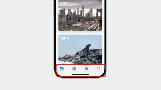
For example, when you open the 'Photos' app on your iPhone, the window stock has a horizontal tab bar controller for quick access to each section of the app.
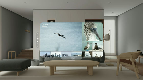
On the other hand, in visionOS's 'Photos' app, the tab bar is oriented vertically and placed at a fixed position on the left side.
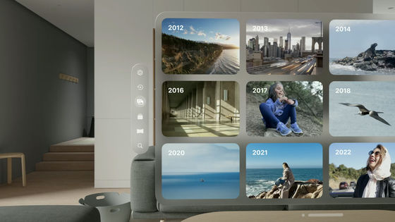
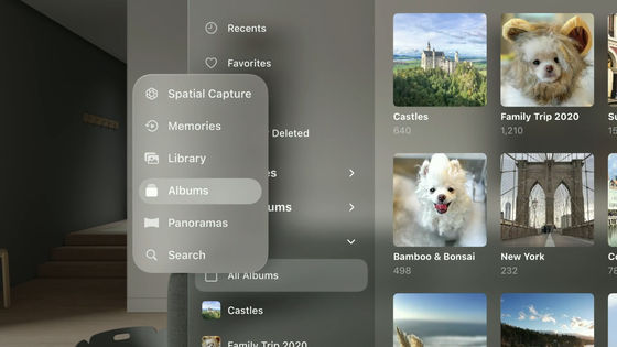
It's usually on the left side out of the way, but if you keep your eyes on this tab bar, it will automatically expand to reveal the labels for each section. And when you look away from the expanded tab bar, it automatically closes so you can focus on your content again.
Looking at the 'Photo' application on the iPad screen looks like this.
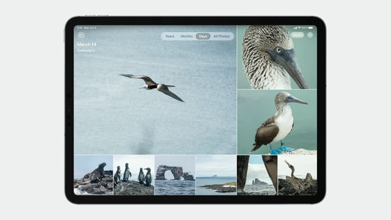
And when you look at the 'Photos' app in visionOS, you can see that the tab bar is displayed on the left side of the window with solid margins on the top, bottom, left, and right for ergonomics.
In addition, visionOS has a function called 'ornament'. This ornament is used as a toolbar for easy manipulation of content.
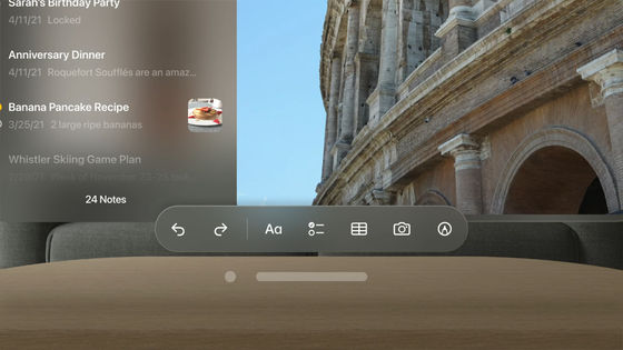
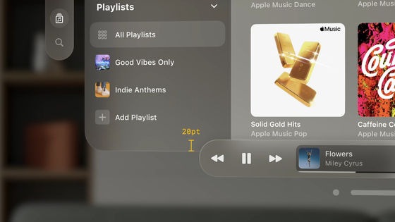
The point is that the ornament covers the window a little. According to Apple's design team, the 20-point overlap makes it feel integrated with the main window, but doesn't block content. Ornaments can be turned on and off completely, providing quick access to important operations with a simple tap, making them a necessary element for more intuitive content manipulation.
When the menu is displayed on the iPad, the menu part pops up as shown below.
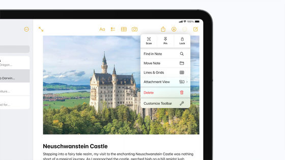
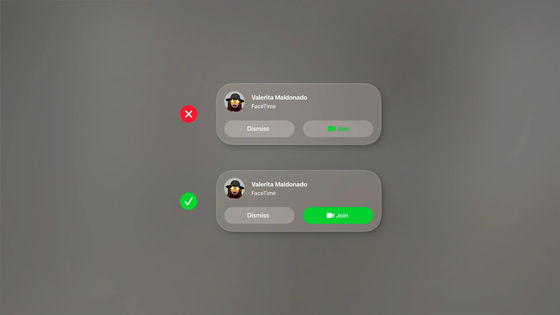
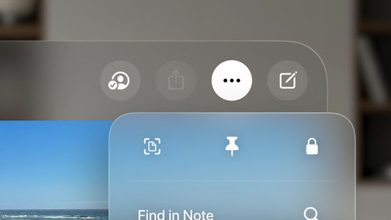
In the case of visionOS, the button that pops up the menu is highlighted in black on a white background. This makes it easier to visually understand which button invoked the popup menu. Therefore, Apple's design team calls out, 'In visionOS, please do not use buttons with a white background other than to indicate that they are 'selected.'
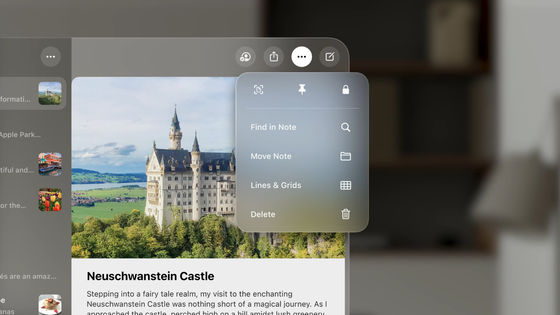
Also,
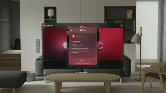
Apple's design team says that modal window close buttons and back buttons should always be placed in the top left.
Related Posts:
