Anyone can easily create their own beautiful color palette and use it in their designs.
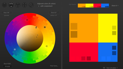
Tools such as the
Building Your Color Palette
https://refactoringui.com/previews/building-your-color-palette/
For example, suppose you use a color palette generator to generate the following five color palettes.

It looks like this when UI design is done using the generated 5 colors. It's not beautiful to compliment.
You should be looking for the following design. Such a design is not possible with as few as five colors, and many colors must be used. In other words, to create a beautiful design, you can either create your own color palette without relying on the color palette generator, or learn how to handle the colors generated by the color palette generator correctly.
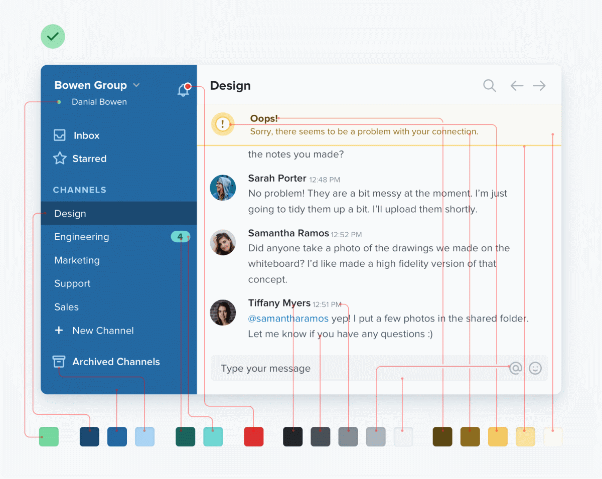
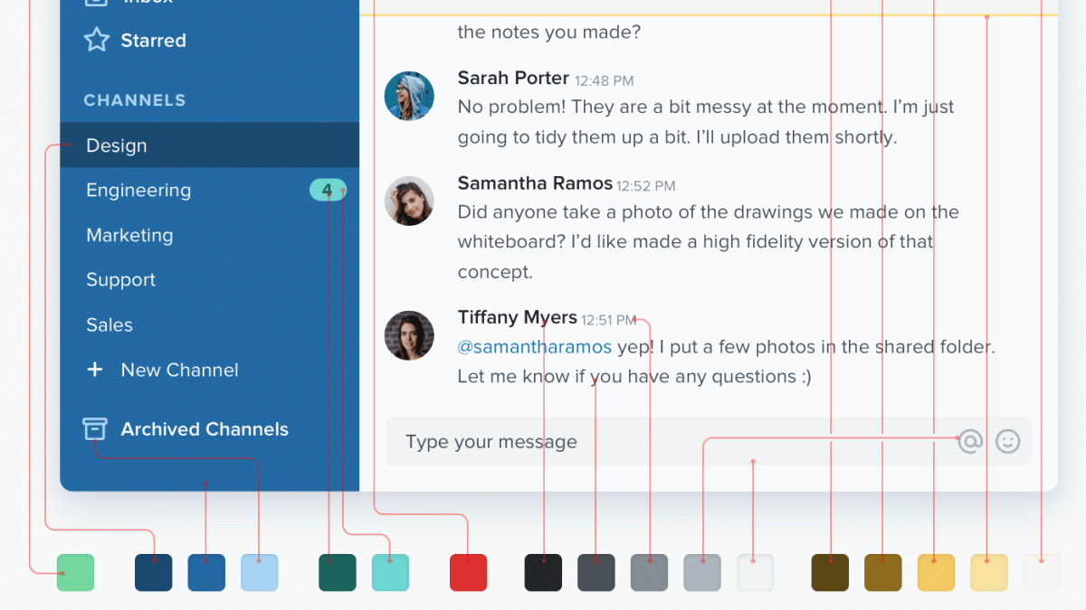
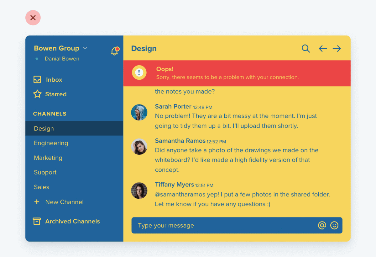
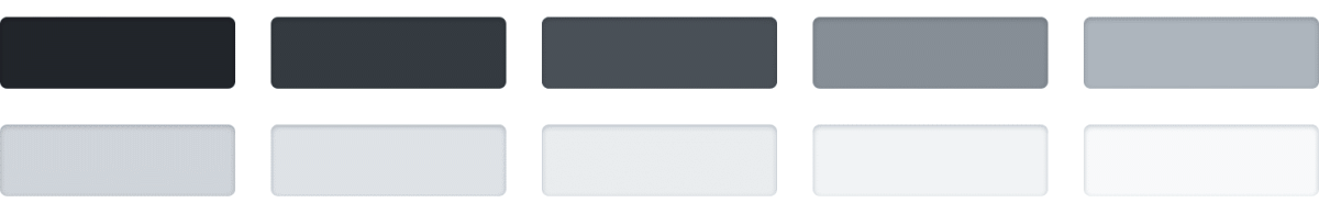
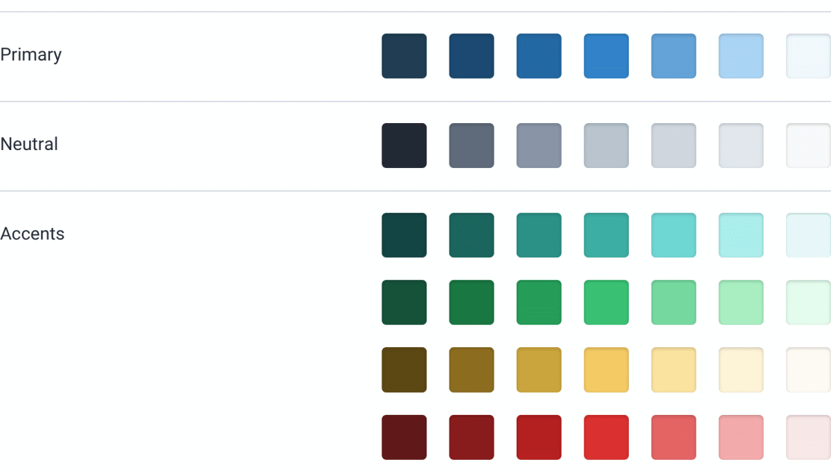
The colors used in UI design can be broadly divided into three types. First of all, ' gray '. Text, backgrounds, panels, and many other
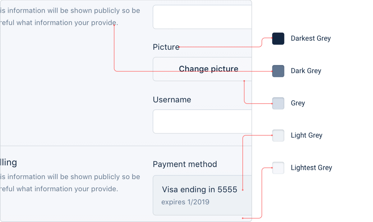
As mentioned earlier, a beautiful UI design requires many colors, and even if you say gray in a bite, you need to utilize multiple brightness grays. However, it is not possible to use too many grays unnecessarily, so it is desirable to prepare grays with 8 to 10 levels of brightness.
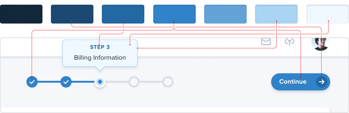
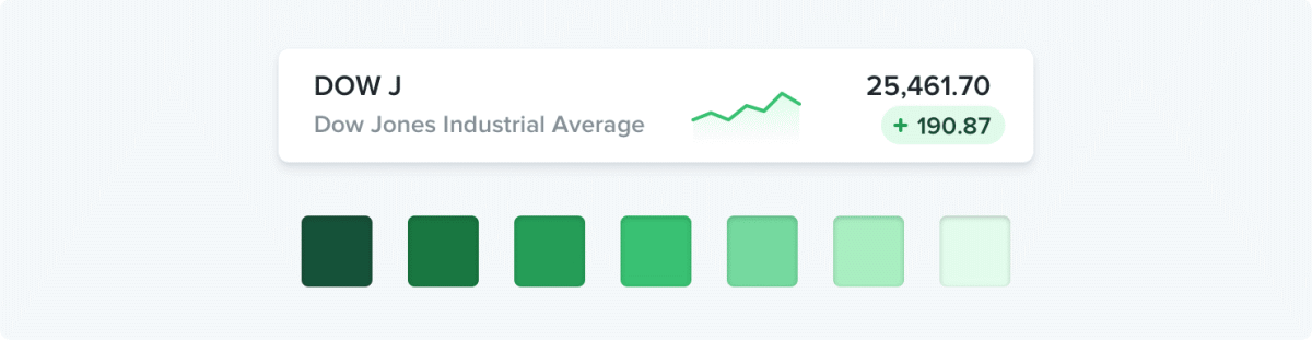
Next, you need to decide on the ' primary color '. The primary color is the face of the design, such as 'Facebook's color is blue.' Also, the primary color needs to be prepared with some brightness as well as gray.
The last one is ' accent color '. Accent colors have the effect of communicating the purpose and meaning of the UI to the user. For example, red represents irreparable elements ...
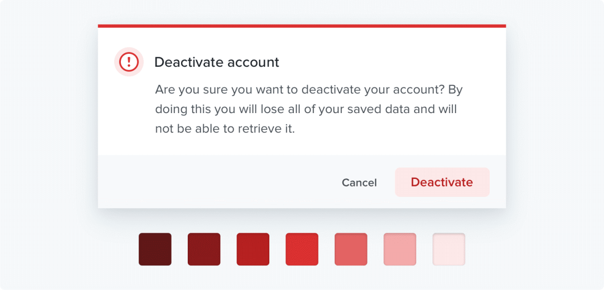
Yellow is a warning display ……
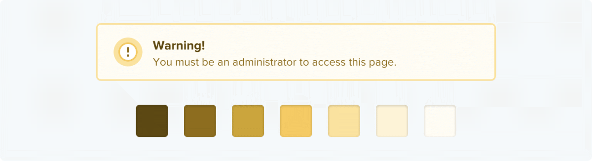
It is important to choose a color that allows the user to guess what is displayed, such as a display that has a positive meaning for green.
As the number of items you want to display increases, the accent color tends to increase, so it is said that 10 or more accent colors may be required for designs that include complex elements. In addition, it is necessary to prepare 5 to 10 kinds of brightness for the accent color as well as gray and primary color.
Once you've decided which color to use, it's time to create different brightness variations. First, determine the brightness between the darkest and lightest colors. As shown in the image below, a color that is neither too dark nor too bright as the background of the button is suitable as an intermediate brightness. The important thing here is not to think numerically, such as '50% brightness of the brightest color', but to find the brightness that you actually feel 'just right'.

Once you have decided on the intermediate brightness, decide on the darkest and lightest colors. Here too, it is important to 'decide visually'. It is easy to determine the darkest color based on the brightness used for the text, and the bright color based on the brightness used for the background color of the colored background.

Once the above three brightnesses are decided, all you have to do is fill in the gaps. Assuming that the darkest color is 900, the standard color is 500, and the bright color is 100, first decide the brightness of 700 and 300 in the middle of each ...

Furthermore, it is OK if you decide the brightness in the middle of each.

If you do this work for each color including gray, the color palette will be completed.
'It's certainly convenient to use a color palette generator, but don't be afraid to make changes to the colors that are generated.' With your own eyes 'rather than the' mathematically suitable shades 'that the generator produces. 'The shades that I feel are just right' are more suitable for the actual design, 'concludes the Refactoring UI.
Related Posts:


in Design, Posted by log1o_hf