Make it with a simple color Web design with no false thoughts
In web design, "color pattern" which has a big influence on the site image is important. A web designer explains the methodology of sticking to a certain color and increasing the number of colors to make color designs that tend to collapse the whole balance, with only as few colors as possible, making it a beautiful finish in a well-balanced appearance.
A Simple Web Developer's Guide To Color - Smashing Magazine
https://www.smashingmagazine.com/2016/04/web-developer-guide-color/
Design AcademyWeb designer Laura Elizabeth advocates a simple color workflow design that does not fail with a simple color design. Mr. Elizabeth thinks it is easier to make simple coloring based on one color which becomes the color icon of the site rather than using many colors complicatedly, and it is effective for creating beautiful design.
◆ Selection of base color
· Basic
The first thing to do with simple color workflow is to determine the base color that is the key. If it is decided that it is OK if the color to imagine on my head is decided. However, in most cases there is a favorite color of the client that requests the design. It is unavoidable that priority is given to the opinion of clients who make money, so when clients strongly desire it, we should respect the opinions without thinking too deeply.
Be careful in choosing the base color, avoid the same color as the rival company. It is not a design like a copy of a rival company but a unique color selection different from it is indispensable.
In color selection, it is important to envision the target user of the site. Elizabeth says there is a color suitable for the site so that funeral sites and sites for children can not be the same design. In addition, for selecting a color suited to the site,I think scientificallyIt might be good.
What role does color play in marketing, such as "blue of trust" and "green that can be relieved" - GIGAZINE
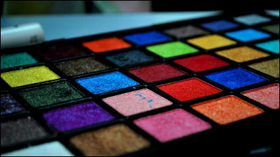
If you can not think of anything by all means recommend recommending the features of the site in words. You may see the color of the service you did not expect. However, because it is a site suitable for young ladies, it is like pinkShould not be caught by stereotypesAnd that.
· Specific method
For example, if you decide that the base color is "blue", there are many kinds even if you say blue, so you need to find "what is the best blue". Recommendation is to use the color sample which Dribbble etc. has published.
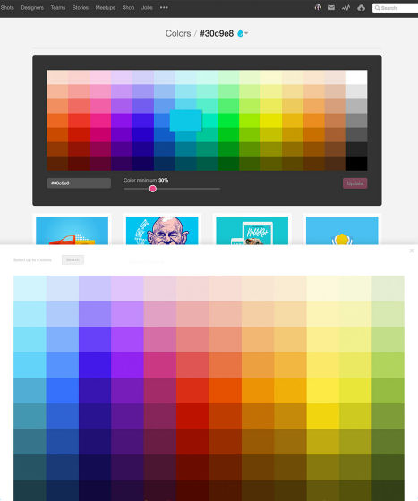
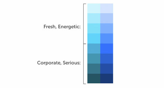
In case of such a color sample, you can compare your favorite color from among colors close to "blue". Elizabeth advises you to choose the pale colors from the top if you are aiming for a lively site and 4 colors below if you aim for a solemn image.
It is a great ant to refer to various blue toned sites.ColorZillaYou can reproduce the same color by examining the HEX value from the sample site using a service like.

◆ Other colors to use
Elizabeth says that three colors of "white", "dark gray" and "light gray" are sufficient for colors other than the base color. It is not easy to add other colors, basically it seems that you can not recommend it. The only exception is accent color for accenting pages. Elizabeth states that you can create a site with good design with up to 5 colors of "base color" "white" "dark gray" "bright gray" "accent color".
According to Elizabeth who has worked on numerous web page designs, the two types of gray are tremendously useful. Elizabeth 's recommendation is to use light gray for characters and light gray for parts where you want to use subtle changes in white used as background.
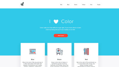
The lower page uses "light blue" as base color, vermillion for accent color, vermillion in other colors, white, only two kinds of gray, but it can be said that it is a simple but beautiful site page.

Accent color is effective for parts such as clicks and mouse over asking for actions by the user in the page, and the part you want to pay attention to. However, it is a point to keep the accent color very small. By limiting the range of use of accent color, it seems that you can make it stand out.
The accent color is more effective if it is a color that shines on the base color. "Paletton" is recommended to find the best accent color for the base color.

You can see what kind of service Paletton is in the following article.
I can intuitively make a color palette to check how the page looks, PNG · HTML output can also be "Paletton" - GIGAZINE
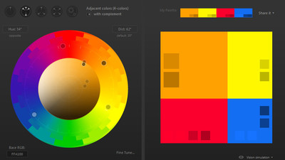
In this way, we were able to decide the base color, white / gray, accent color.

Finally, we will color these colors on the page. Elizabeth says that it is better to first make a site with "gray" color first, in order to make it easier to see the overall composition and hierarchy before actually coloring.

It is like this when incorporating the five colors chosen earlier into the mock design made from gray. The base color that determines the image of the site is greatly pushed out, and the red color of the accent color stands out for the base color. Also, it adopts dark gray for texts and outlines, giving a sophisticated impression with the sound of creating a background with white / light gray. Elizabeth says that the details of coloring icons should not spare trouble on details as they make a big difference.

Elizabeth thinks that designing a site with simple color usage is effective for making simple and beautiful designs, but it does not mean that it excludes the idea of adding other colors. However, since the difficulty of adjusting the balance increases as the number of colors increases, it is recommended that you first try 5 simple color designs and try additional colors.
Related Posts:
in Design, Posted by darkhorse_log
