Checklist for choosing the right font

Font selection is an important point in manga texts and web design. There are many services that allow you to install various fonts for free, but with so many options it can be difficult to decide. For such times,
A checklist for choosing type – Fonts Knowledge - Google Fonts
https://fonts.google.com/knowledge/choosing_type/a_checklist_for_choosing_type
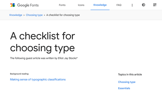
Google Fonts has a category called 'Font Selection', which provides various guides for choosing fonts according to your purpose and intention. Designer Elliot Jay Stocks has comprehensively condensed the multiple guides he posted on Choose a Font into a checklist you can refer to every time you choose a font.
◆1 Does the font match the purpose of the project?
First, when choosing a font, you should consider whether the font is suitable for the purpose of your project. It seems obvious, but Mr. Stocks points out that the world is full of examples where designers' fonts are not working well.
According to Stocks, readers, even those who know nothing about fonts, react emotionally first and foremost when they see type. ``It's no exaggeration to say that most people are unconsciously aware of the historical and cultural design trends behind the typeface they see,'' Stocks said.
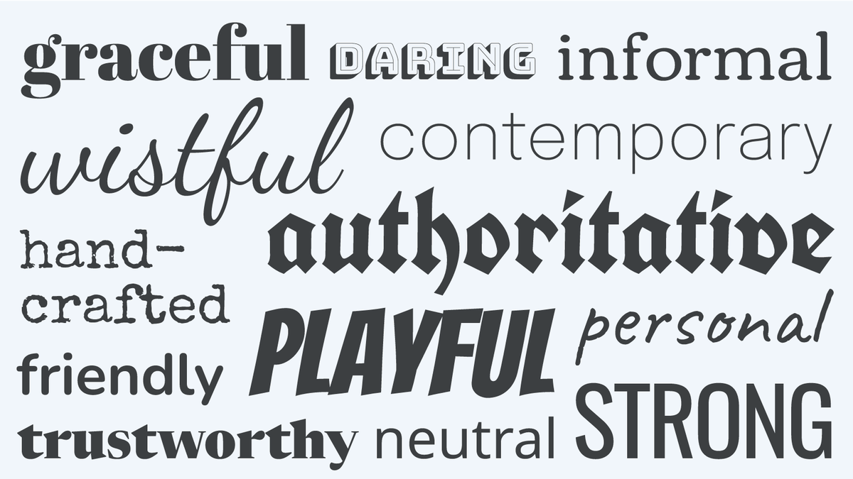
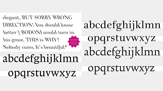
The image below is an example of font impressions given by German designer
Fonts that are full of flair and personality are great for brand logos and short headlines, but they are more likely to be difficult to read when applied to body text. Although there are common impressions like this in many cases, emotional reactions to fonts are a highly personal experience, so consideration of emotional factors is useful, but preferred as a more practical method. Stocks points out that the degree is not high.
◆2 Is the font design comprehensive?
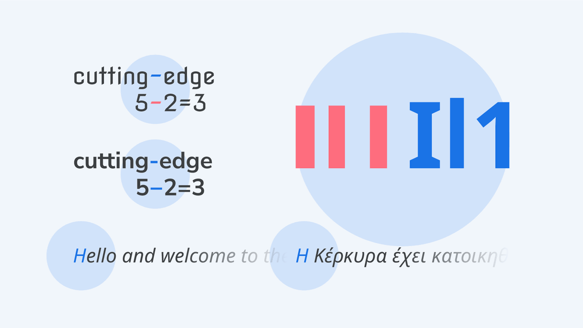
There are a few details you need to check about the fonts you've discovered that 'looks good'. The first is whether the font has sufficient multilingual support. For example, even if you choose an English font, if it doesn't include characters like the ``
It is also important to check whether there are any characters that are difficult to read. For example, it is difficult to distinguish between the subtraction symbol '- (minus)' and the '- (hyphen)' between words, and between the uppercase 'I' and lowercase 'l' and the number '1'. There are cases.
In addition, Stocks said it would be desirable if the font included a 'weight' option. A designful font may only have one weight, and such a font may be suitable for your project, but the more weights you have, the more flexibility you have in your design.
◆3 Is the font file reliable?
After choosing a font based on your design, you should check if the font files you want to use are available without problems. For example, fonts are divided into 'free version' and 'paid version', and there are cases where weight changes and special characters are only available in the paid version, and free fonts may not be fully utilized. Also, if you want to share the same font with others, be aware that the latest version may be different depending on the service that installs the font.
Also, according to Mr. Stocks, there are rare cases where `` even if the design is desirable for a single character, the character spacing is not appropriate ''. Stocks says that it is important to check the option of whether the font can be kerned , in addition to the caution of ``checking the appearance with sentences rather than letters,'' because you may notice it by actually entering the text. points out.
◆4 Can the font be used in situations where it is necessary?
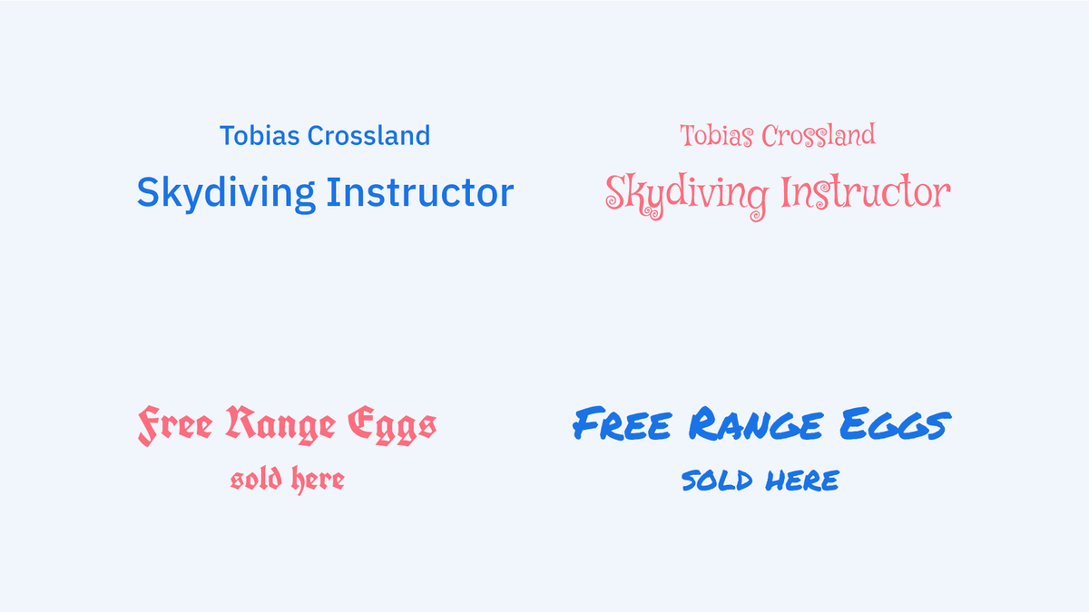
Even if you find a desirable font, you need to check the 'font combination' and 'license' at the end, says Stocks. First of all, regarding 'font combination', operations such as changing the font of the area you want to stand out, making the brand name a unique font, and changing the weight and width to change the impression may be effective. . However, if multiple fonts used in the same medium are too similar or too far apart, dissonance will occur.
Graphic designer Jason Santa Maria, in his book On Web Typography, describes it as 'a balance between distinction and harmony,' saying, 'You need to choose fonts that don't compete too much with each other or are indistinguishably similar. When in doubt, combine serifs (decorative fonts) with sans-serifs (non-decorative fonts), as this provides perhaps the most flexible of the two and is almost guaranteed to give you plenty of variation. I will.”
Last but not least, even fonts that are freely distributed have licenses associated with them. There are rules such as the need to install directly from the site and secondary distribution is prohibited, there are restrictions on the number of terminals that can install files, and there are restrictions on the types and attributes of media that can use fonts. Then you need to decide if it is usable for your project.
Related Posts: