Points of design reflecting psychological effects on business cards Summary
Even if you go to a business card with a bite, the design is diverse. Even a business card of similar "white character on black letter" will change the image even if it is written vertically or horizontally. From a psychological point of view, how to effectively design business cards,Uprinting blogIt is summarized.
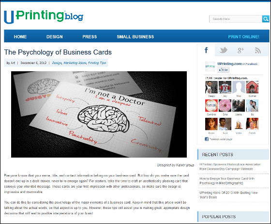
The Psychology of Business Cards | UPrinting Blog
http://blog.uprinting.com/the-psychology-of-business-cards/
◆ Font Selection
That's a typical sentence (in English), in the title or headingSans-serif (sans serif)The font is in the body,Serif (serif)Font is used. Serif is a small decoration at the end of a letter, sans - serif has no ornament. Then, how to choose for a business card
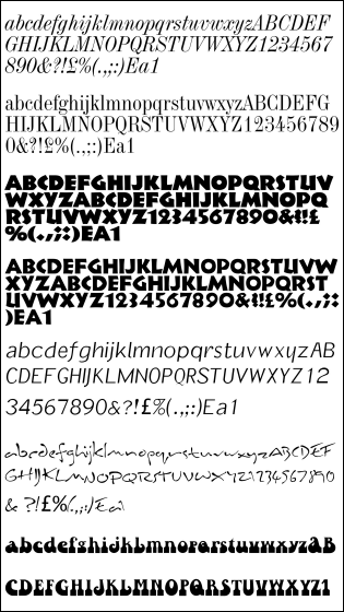
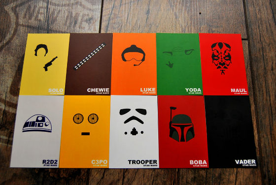
ByTarrytown
At least the idea of "using several kinds of fonts" must be abandoned. Because it seems cluttered if the font is different than necessary, it is because the person who got the business card hugs the bad impression. If it is used, it seems to be appropriate to use one, at most two.
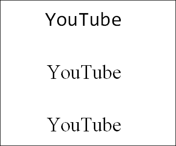
Next, I will consider the goal point of business card design. This is what kind of image you want to convey to your opponent by giving up a business card. The font will change depending on what you like to be fun, energetic, tense and crisp, the content you want to tell. As an example, if you write the string "YouTube" with three kinds of fonts, the image changes like this.
◆ space
Please select the font "I want to use this", check the readability. Readability is whether or not the font itself is easy to read, but there are cases such as "between characters, words,intervalIt is important. For texts written at appropriate intervals, information comes in through the head.
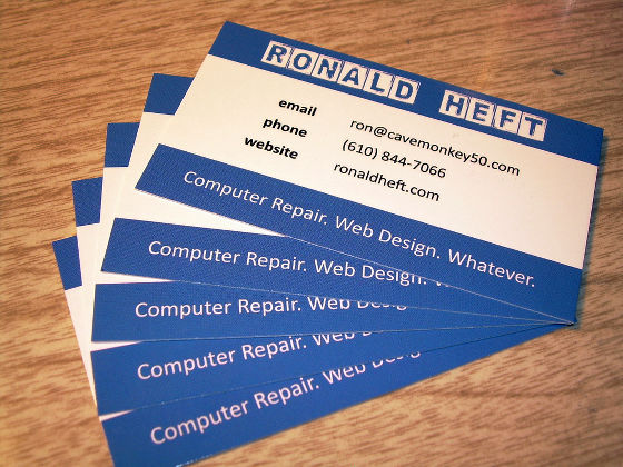
ByRonald Heft
At the same time as' interval 'is important'margin". As you design it, you should see a margin in many parts. This space does not mean "space to fill". Rather, if you fill in, the recipient just gets confused with "Where should I look?" In addition, it seems cheesy when it is buried, so how much blank space will be created will lead to a sophisticated image.
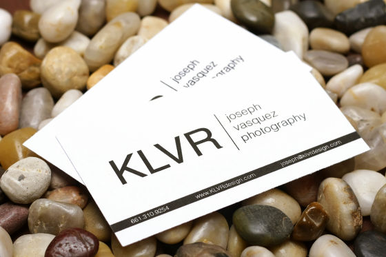
ByJOE-3PO
Also, by successfully calculating the placement of the margins, you can expect the effect of complementing text and images.
◆ Color
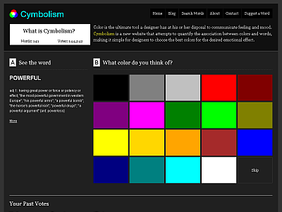
It is the color that ultimately determines the image of the business card.
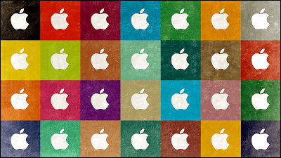
First of all, we will consider based on the color of your logo (company's logo if you are a company, logo representing yourself if you are an individual). If the logo is made of more than one color, choose a noticeable color that represents the image. The image that the color has is as follows.
Red: love, power, danger
Yellow: intelligence, warning, cowardice
Blue: peaceful, trustworthy, honesty
Orange: Creativity, innovation, thinking
Green: money, growth, life
ByBlackwarrior 57
You can also replace existing images with the power of color. However, there is an image like the above in color, so why you choose that color needs to think well.
If there is a unified design in the company, there may not be a chance to apply these ideas quite a lot, but when there are opportunities to make by yourself, there is no loss to remember.
ByJeff McNeill
Related Posts:


in Design, Posted by logc_nt