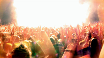
True usage of color psychology in marketing
ByTiger Pixel
Although it is considered important to use color psychology in marketing, the effect of color depends on the individual's experience, and there are few discussions on academically supported data. thereHelp ScoutIs summarizing the effect of coloring marketing which was revealed by research on blog "The Psychology of Color in Marketing and Branding"It is very useful for selling products and actually designing websites.
The Psychology of Color in Marketing and Branding | Help Scout
https://www.helpscout.net/blog/psychology-of-color/
Misunderstanding concerning color psychology
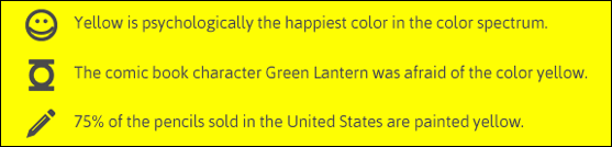
Why color psychology involves many misunderstandings, and is there little data as facts? It is because we know that color psychology is susceptible to factors such as personal taste and experience, growth and cultural / contextual differences, etc. by previous studies. Purple or yellow causes some kind of special emotion "has only the accuracy of Tarot cards. That is, "Yellow is the most psychologically happy color in the color spectrum"DC comicSuperheroesGreen lantern"I am afraid of yellow" "75% of the pencils purchased in the US are yellow" There is no evidence whatsoever on the content.
Then what is the role played by the color which is clarified by the research?
◆ Importance of colors in branding
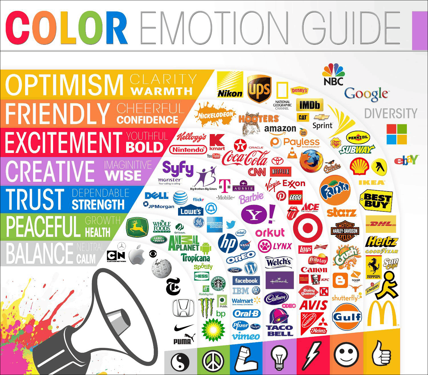
In the past, there have been many attempts to classify consumer responses to different colors. But what they revealed is that how you feel the color depends too much on your personal emotional experience. However, it is certain that a wide range of message patterns were found from color vision through investigation, and color can play a significant role in shopping and branding.
Impact of color on marketing (Impact of color in marketing)In the research that says, 90% of the prompt decision made by consumers has been made based only on color depending on the product. Also,Interactive influence of colorIs studied, "It is clear that the relation between brand and color depends on whether color suitable for a brand is used or not". In other words, is the color being used suitable for brands? That is important.Exciting red and competent blue (stimulating red and competent blue)In the study of purchasing, it was confirmed that the intention of purchase is greatly influenced by whether or not the color representing the impact of "how the brand is recognized" is used or not. This is "I do not feel hard and coolHarley-DavidsonWho buys the bike? That's the reason.
Furthermore, since the human brain prefers a familiar color, it is very important to say "color" when establishing the brand's identity. In the case of a new brand, if the competitor's logo is blue, you can also differentiate it by making it a purple logo. And, in terms of choosing "right colors", it is more important than "color" that consumers react in relation to goods, not the colors themselves. If you think so, you can judge that "Harley Davidson using pink glitter can not be sold."
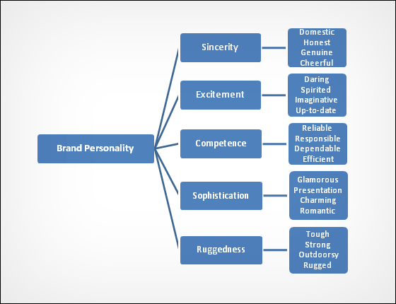
Jennifer Aaker, a psychologist and professor at Stanford University,Dimensions of Brand Personality (Characteristics of Brand / Personality)I touched on the above points in the paper that I found out that there are five characteristics in brand personality.
Jennifer Aaker's personalities discovered are "sincerity", "excitement", "adequate" "refinement" and "robustness". For example, fashion belongs to "refinement" and camping equipment belongs to "robustness". Many items are dominated by one of these characteristics, but some characteristics may cross each other.
Several colors representing these characteristics can be thought of as "brown is a rough impression, purple is refinement, red is excitement", but academically "those colors that indicate to your brand" There is almost no existence. Green is sometimes used as a brand for environmental problems, but it is also used in financial relations, so the idea of "green is calm" is wrong. The brown used for leather brands also has a rough atmosphere, but it also creates a welcoming atmosphere by stimulating appetite and directing warmth.
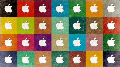
In other words, it is not easy to show guidelines for choosing brand colors. However, it is essential to think about the context of products. The color shows the sense of the brand's persuasive power, mood and image. Love a clean and simple design Does color match the brand and playing the role of persuasion like Apple uses the white brand color? Please recognize that. It is meaningless to choose a color without such a context. There is no universal law such as "Orange fires people more than silver".
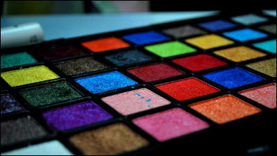
◆ Color preference by gender
There are certainly adequate colors as there are white, black, silver in many of the cars, but why then does not there exist any purple electric tools?
Joe Hallock'sColor AssignmentHe clarifies color preferences by gender, and the view of the environment, especially cultural things, seems to affect personal preferences and colors. The preference of the sex of men and women by the investigation of Hallock is as follows.
First of all, about men's taste. The first favorite color of men is 57% blue, followed by 14% green, then black, red, orange, gray, brown, white, yellow and so on.

Female favorite color first place is also blue. The percentage is less than men at 35%, followed by purple, green, red, black, orange, brown, yellow, white and gray.

On the other hand, the color that men did not most like as "favorite" is brown. The second is orange and purple, followed by yellow, gray, white, green, red, black, blue.
In the case of women, the first rank was orange, the second ranked brown, the third ranked gray, followed by yellow, purple, green and white.

Most remarkable is that blue is superior to both men and women, and there is a significant difference between the gender and purple popularity among men and women. Purple is popular with women, but in men it is not even on the "favorite color" list. This is the reason that there are few purple tools.
In addition, with regard to nuances, shades and colors, studies have shown that men prefer bold colors and that women tend to like soft colors.

Also, men found it easier to select shadowy colors like black added as favorites, and females often accept tones like white added.

Remember this when choosing the main color palette of the brand. If there is a large difference between men and women who buy goods, it is also necessary to match with one.
◆ Color Coordination + Conversion
Conversion rateIt is also a recent popular topic to reveal the best colors to contribute to. However, there is no single best color that contributes to the conversion rate so that there is no universal best color in branding.
However, to the principle of psychologyThe Isolation Effect(Isolation effect)There is what is called, "According to it, it seems that it is easy to remember that" it is out of place "in memory. Studies have found that if there is something that protrudes from the surroundings, people recognize it as "much better than others" and remember it later.
For example, the red button at the bottom right of the following website is distinguished from the surrounding blue, so it is easier to remember later.

Also,Aesthetic response to color combinationsYaConsumer preferences for color combinationsWe know from the survey that many consumers prefer color patterns made of similar colors and color palettes with strong contrast with accent color.
From this it can be said that in terms of color coordination, when creating a visual structure you should use passive similar colors and active complementary colors that contrast with that.
In addition, also possible to use this idea as the color of the background-based accent. Create a hierarchy within the web site, it can also lead to assume the action to visitors.

You may feel like an interior designer by reading the above sentences, but this fact is very important in conversion rate. It helps people not to fall into the 'blind faith in conversion rate optimization' where people fall.
For example, which of the following 2 cases just changing the color of a button, which one can raise the conversion rate?

According to the experimentThe red button screen on the right can increase the conversion by 21%. But this is not that red is a magical color that causes people to take action. If you look closely at the image, the remaining elements on the page are made up of green palettes. When placing the green button on the page, it is obvious that it harmonizes with the surroundings, placing a complementary color red creates a visual contrast.
As further evidence of isolation effect,Paras ChopraI went by the followingtest. Chopra isPDFP producerI investigated the software which is most downloaded by the following buttons.

As a result, Download For Free was written in red letters, and PDFP producer v1.3 below it was the result that the 10th link written in black was clicked the most. As mentioned above, the link of No. 10 is written with important points with red letters contrasting to the gray background, and other characters are grouped in colors similar to the background. Isolation effect is just one study you should keep in mind, causing people to take action.

◆ Why is the way that Moka is loved, and how to say Brown is disliked?
As you like the color, how to call colors is also an important issue. Even if it is the same color fancy name is betterFavorable, The way of saying mocha is preferred over Brown. This can also be said about goods, consumers feel that they are more fun watching a better name than a simple name. For example,Jelly BeansIt tends to be easier to choose "Romantaz (tingling)" taste than "Lemon Yellow" taste. This effect is not limited to food. Choosing a descriptive name "sky blue" instead of "light blue" is also an important element that has a big impact on the product.
Related Posts: