A mysterious font 'Datalegreya' that can fuse text and data curves that can be used for free and for commercial use
Of open source
Datalegreya
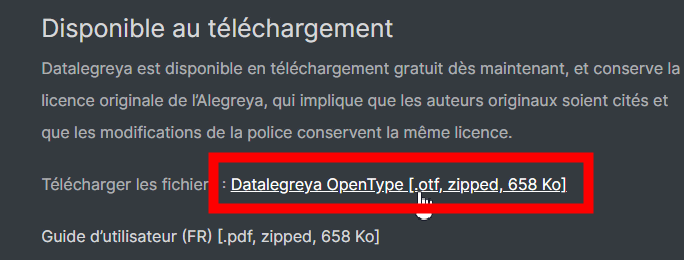
http://www.datalegreya.com/
Click 'Datalegreya OpenType [.otf, zipped, 658 Ko]' at the bottom of the page to download the typeface.
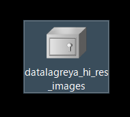
You can download the ZIP file, and unzip it using
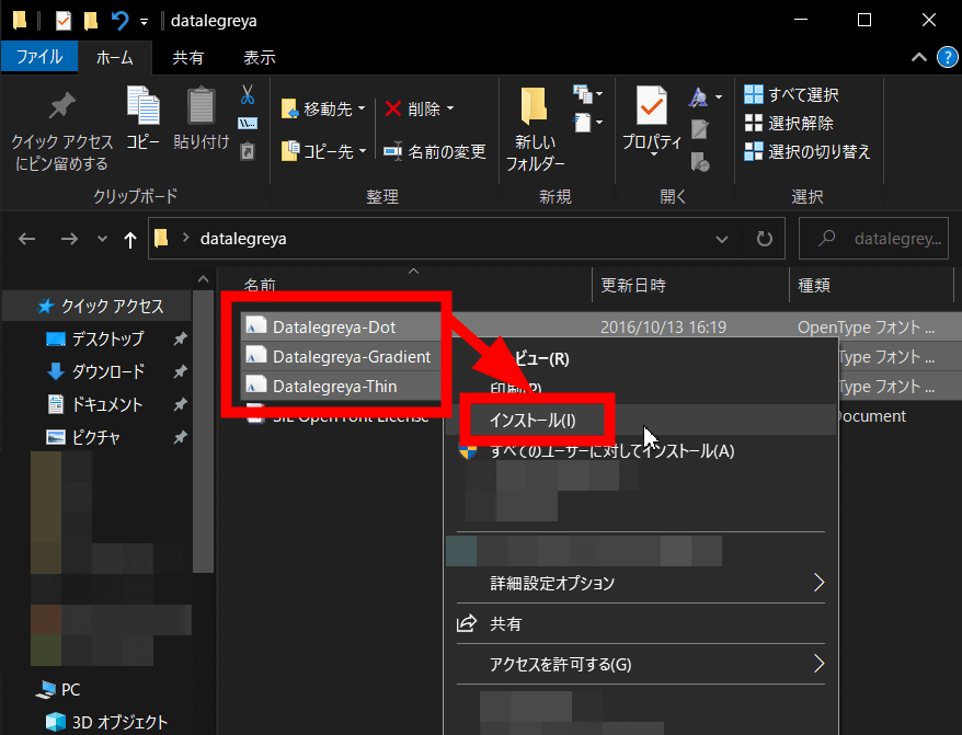
Three OpenType fonts are stored in the unzipped folder, so select them all together and right-click and select 'Install'.
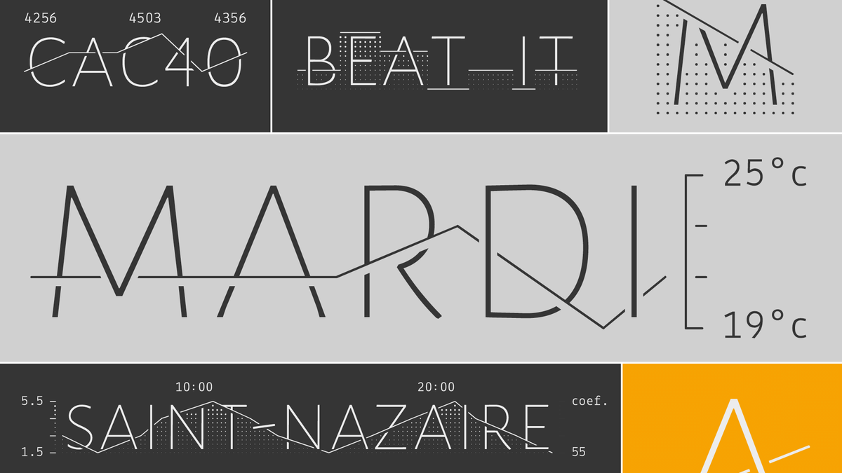
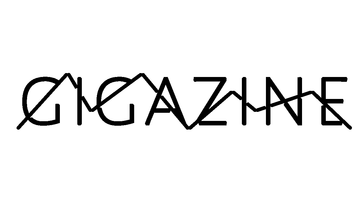
When I actually use it, it looks like this. Datalegreya displays uppercase alphabets regardless of whether it is entered in uppercase or lowercase, but if you enter in uppercase even if the font size is the same, the font will be slightly larger.
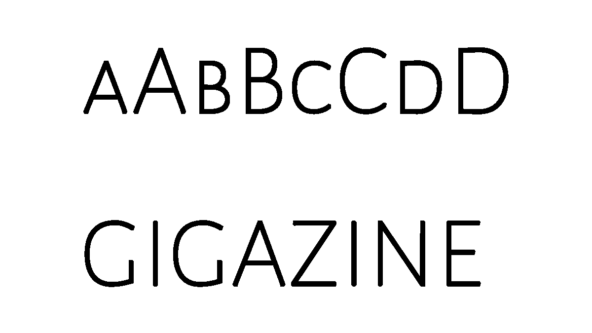
The feature of Datalegreya is that you can express a line graph behind the font by setting numbers along with the letters. Alphabets and numbers can be combined with '|', so if you enter 'g | 3i | 1g | 3a | 0z | 2i | 1n | 2e | 0', for example, the following 'GIGAZINE' and line graph will be combined. It is possible to express 'mysterious characters'. In addition, the number that can be used is only '0 to 3', and the change of the number before and after is expressed as a polygonal line.
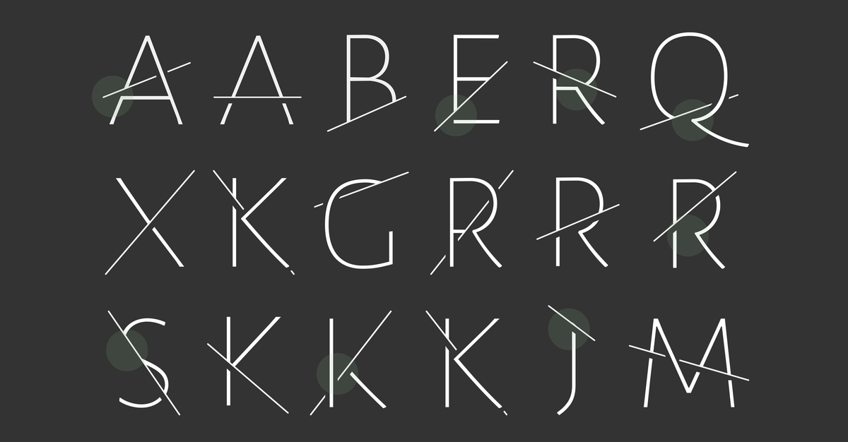
Looking at the following examples, you can see that when the alphabet and the line overlap, the readability of the characters is not impaired.
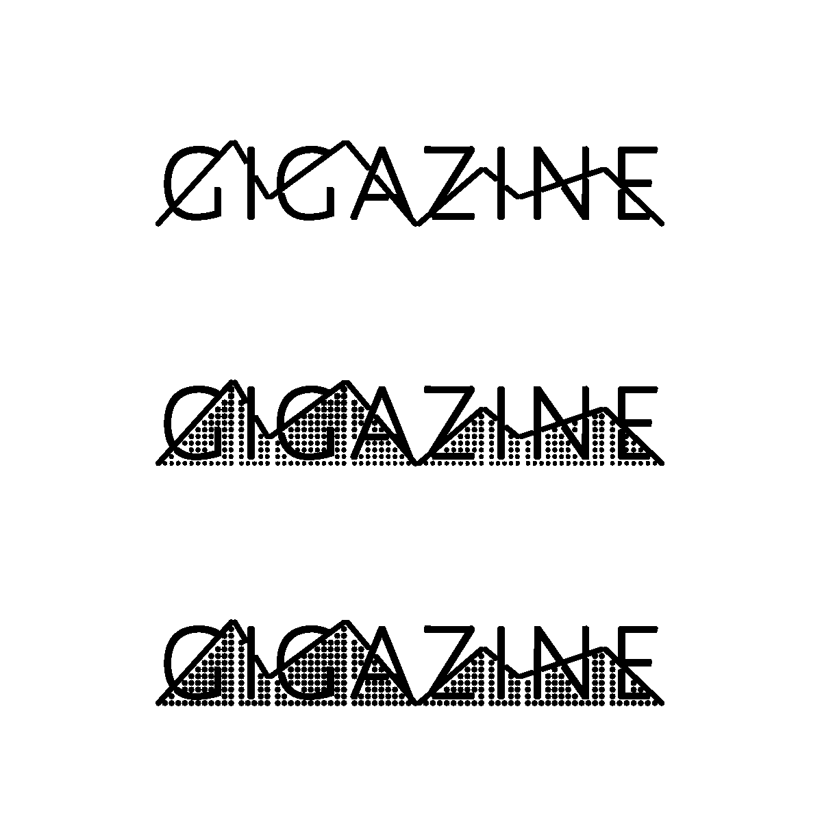
Since 'Datale graya' is a typeface, it comes with three fonts, 'Thin', 'Gradient', and 'Dot'. The image below shows 'g | 3i | 1g | 3a | 0z | 2i | 1n | 2e | 0' in the fonts 'Thin', 'Gradient', and 'Dot' in order from the top. It is difficult to tell the difference between 'Gradient' and 'Dot', but in 'Gradient', the dot size becomes smaller as it goes downward, while in 'Dot', dots of uniform size are lined up. I'm out.
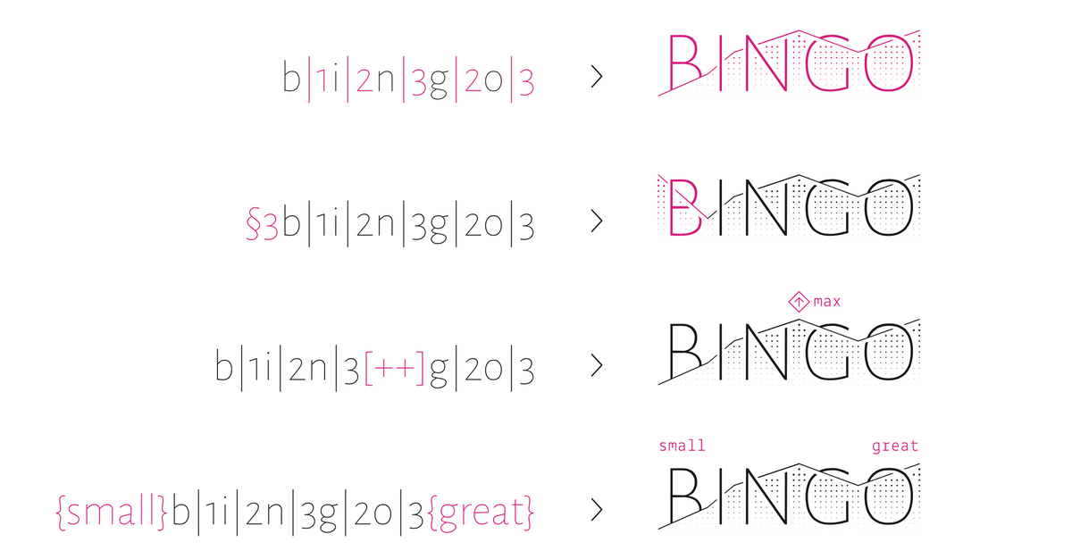
You can also use {small}, {great}, [++], etc. to increase the graph feeling.
'Datale graya' is distributed free of charge under the SIL Open Font License.
Related Posts: