The road to reproducing Windows 2000-like jagged fonts in the 2020 web browser
Two web engineers who wanted to make a homepage in the 1990s style where the pictograms and
Convincing-looking 90s fonts in modern browsers – Vistaserv.net
https://vistaserv.net/blog/90s-fonts-modern-browsers
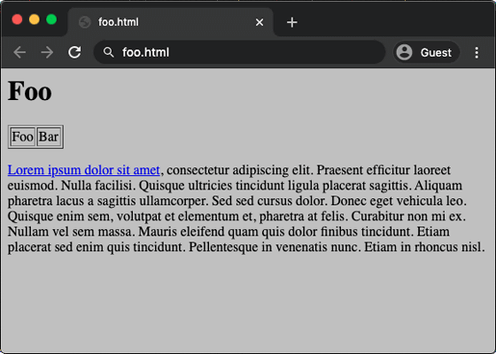
Katelyn and Paul, who run the 1990s-style website Vistaserv as a hobby, initially said, 'A gray background with black Times New Roman fonts could reproduce a 1990s-style design.' It seems that he was thinking. However, when I checked the actually created web page with Google Chrome, the font was displayed more smoothly than expected as shown below, and it did not have the desired design.
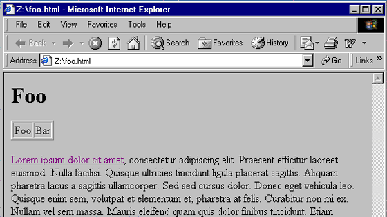
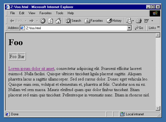
In order to investigate the cause, when I opened the same web page using Internet Explorer 5 on Windows 2000 on the virtual machine, the display was as expected by the two people as follows. In other words, Google Chrome and Internet Explorer 5 used the same font, but the display was completely different.
The reason why the text was displayed differently was due to the difference in anti-aliasing that rendered the outline smoothly so that the font and image did not look jagged. Anti-aliasing was a technology that did not develop much in the 1990s and was introduced in many OSs in the 2000s.
The font displayed in Google Chrome is processed by anti-aliasing so that the outline looks smooth with not only black but also gray dots.

On the other hand, the font is represented by one color in Internet Explorer 5 of Windows 2000, which gives a more jagged impression than Google Chrome.

The two made a trial and error attempt to reproduce the jagged fonts of Windows 2000 in all browsers used in 2020. The two came up with the idea of using the bitmap font files that were used in the 1990s as is, but it was found that using the old font files as they were would result in CSS not working properly.
In order to remove the cause of the error, I searched for a tool that can convert a font file that corresponds to CSS while leaving the font jagged, and found a free open source font editor, FontForge . When I converted a 16 pixel Times New Roman in FontForge, I was able to reproduce almost the same font that was displayed in Internet Explorer 5.
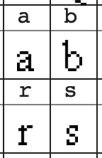
The created font was in raster format and needs to be converted to vector format for actual use in web pages. When I converted the font with a software called Potrace , Potrace converted the jagged outline into a smooth curve, and changed to the following blurred and rounded font.
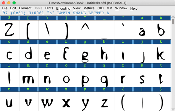
To solve the problem, I enlarged the bitmap font before the conversion, gave Potrace a high resolution input, and converted the 80 pixels Times New Roman to create a Times New Roman that can be used as 16 pixels. Was successful.
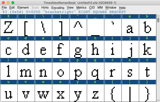
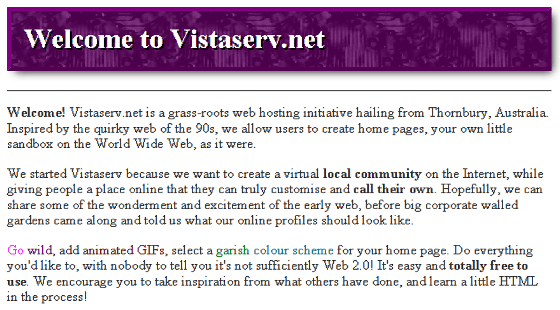
The font actually created by Mr. Kaitlin and Mr. Paul is used at the following site operated by two people.
Vistaserv.net
https://vistaserv.net/
Related Posts:
in Software, Design, Web Application, Posted by darkhorse_log
