Tips for beginners to be able to write beautiful handwritten characters `` modern calligraphy '' with high design
Beautiful fonts are indispensable when designing something such as websites and posters, but handwritten characters have a unique goodness not found in digital, and in recent years it has attracted attention. While thinking that it would be convenient if you could freely write beautiful characters with high design, it was quite difficult to actually try, so the points that beginners should
How To Do Modern Calligraphy (3 Popular Styles 2019) | Lettering Daily
https://www.lettering-daily.com/modern-calligraphy/
◆ What is modern calligraphy?
Calligraphy that makes characters look beautiful is positioned like calligraphy in the Middle East and Western Europe, and is often used to attract attention with posters, flyers, and signs. Calligraphy itself is an old technology that originated in the second half of the century, but in recent years a new type of character called “modern calligraphy” has attracted attention.
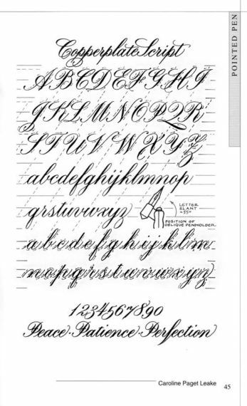
The definition of modern calligraphy is not clear, but it is generally considered to be more flexible than classical calligraphy. The following is a classic calligraphy called 'Copperplate'. Written while measuring the height and angle with a specific tool.
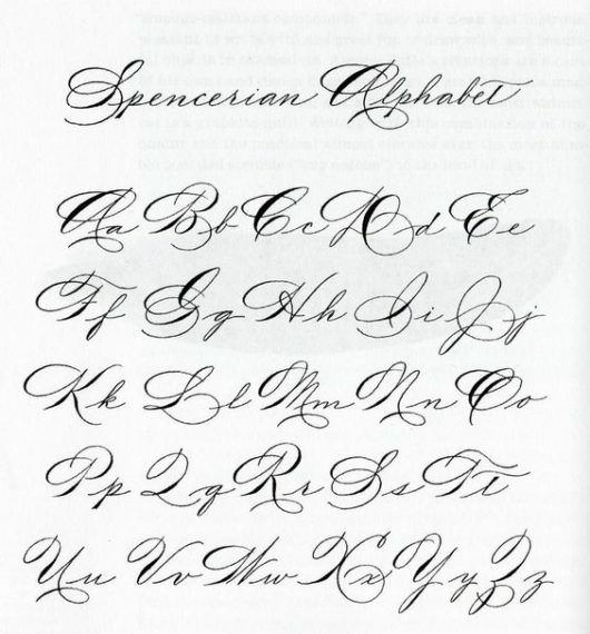
On the other hand, modern calligraphy is like this. Compared to classical calligraphy, the shape and curves of letters appear to be less regular.
However, modern calligraphy is not “everything is free” and there are basic rules.
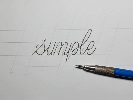
◆ Tool
In classic calligraphy,
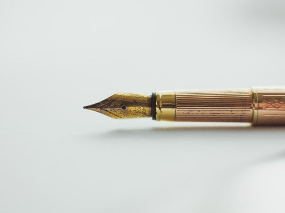
Many pens may be unfamiliar, but it consists of two parts: the nib and the shaft. The shaft is straight and there is an oblique holder that keeps an oblique angle, and it takes time to get used to it. Since maintenance is also necessary, beginners should start with a brush pen in terms of handling.
by
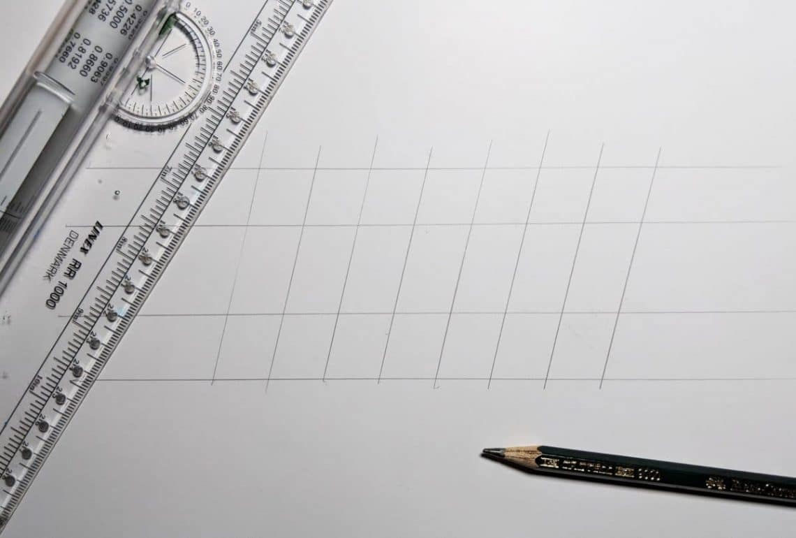
You can also use HB pencils and mechanical pencils. A pencil is also required to draw calligraphic guide lines.
In addition, a ruler is used to draw guide lines. Some rulers have rollers , and you can see how they are actually used in the following movie.
Roll N Ruler.MOV-YouTube
◆ How to write modern calligraphy
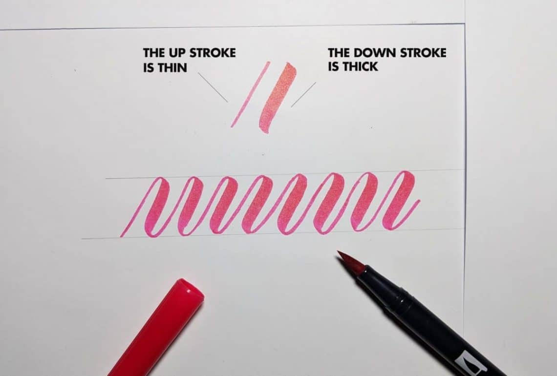
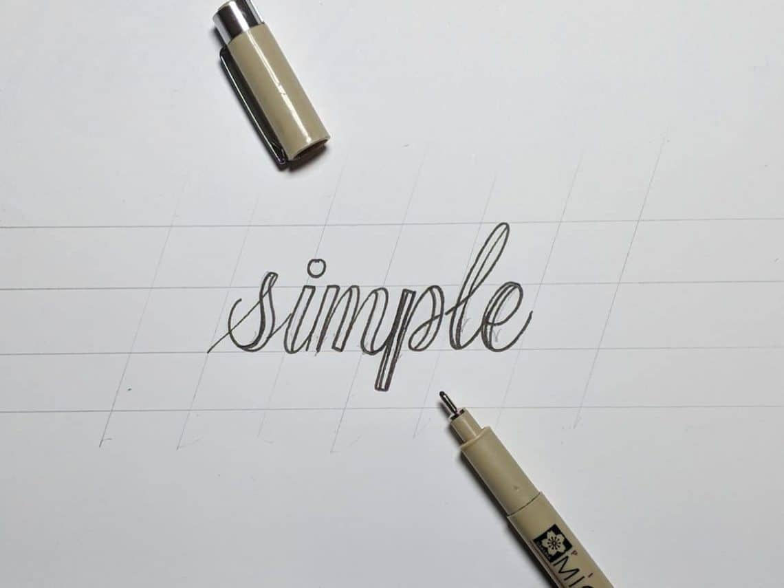
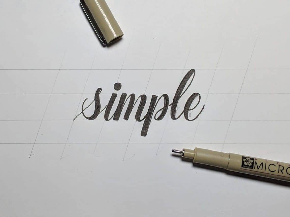
A modern calligraphy that appears to be free graffiti at first glance, but there are some rules. The most important thing is `` Which line is thicker and which line is thinner '', but this answer is `` The line drawn from the bottom to the top is thin, the line drawn from the top to the bottom is thick '' .
This is written according to the above rules. Write thin lines with the pen tip, and thick lines with full pressure.
Full beginners are encouraged to practice basic strokes first. Various shapes of characters contain common shapes, so if you practice the shapes, you can simply attach them together. The following are the seven basic strokes.
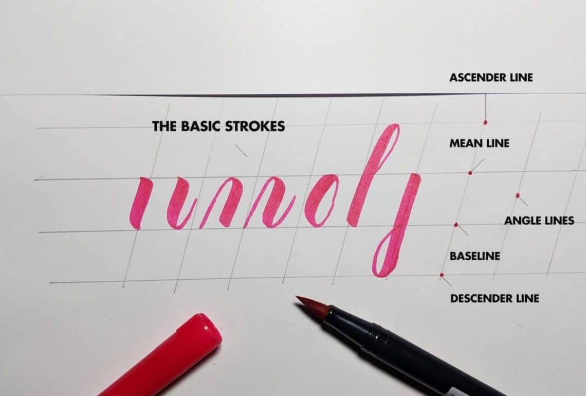
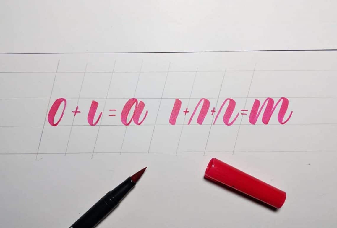
For example, the lowercase letter “a” is the second and fifth shapes attached, and the “m” is the first to third attached.
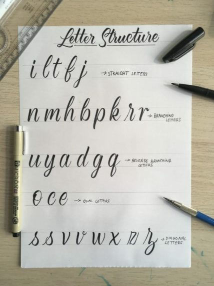
In addition, practice is essential to improve calligraphy, but efficient practice is possible if you remember that there is a common shape among letters. The five lowercase groups that are useful to remember are:
1: Straight line / i, l, t, f
2: Character with branch / n, m, h, b, p, k, r
3: Characters with reverse branching / u, y, a, d, g, q
4: Letters including ellipses / o, c, e
5: Characters including diagonal lines / s, v, w, x, z
◆ Points of modern calligraphy
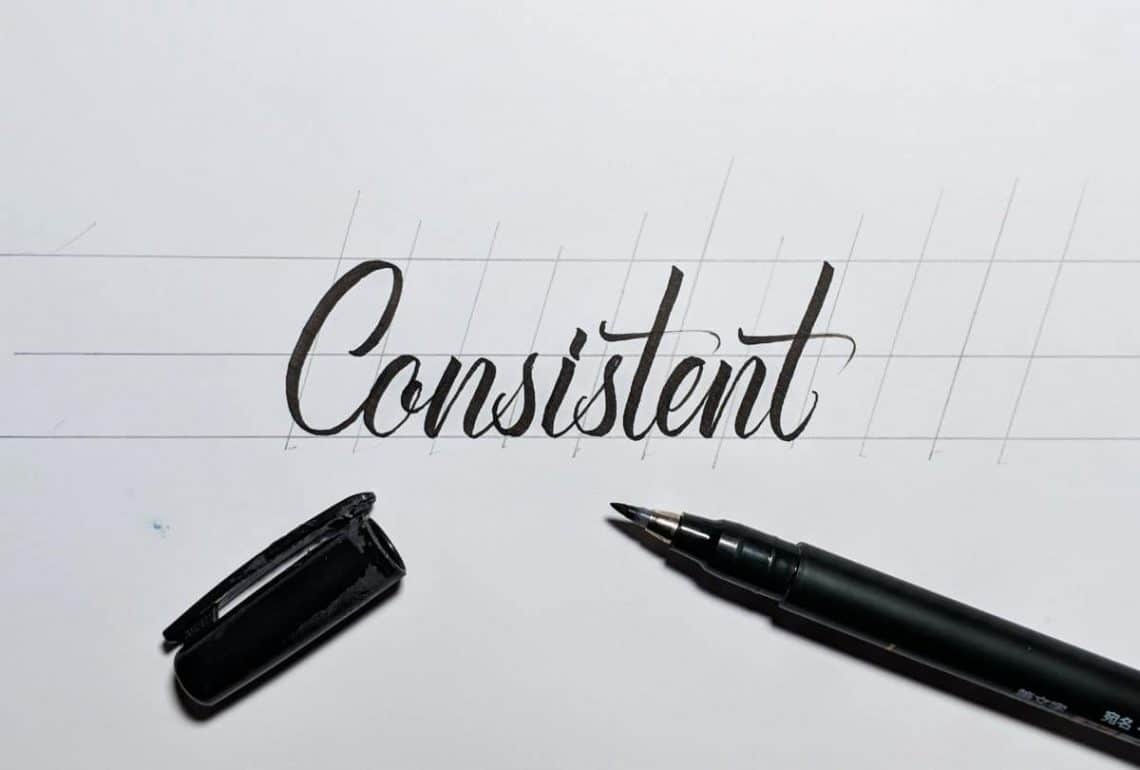
1: Consistency
It doesn't require perfect consistency like classic calligraphy, but even modern calligraphy with a high degree of freedom can create visual harmony and create a beautiful look. The Beginners tend to ignore guide lines, but be sure to use guide lines.
This is a modern calligraphy written with a guide line. Arrangements are included in various parts, but because the “height” and “angle” are the same, they are consistent and look beautiful in the eyes.
2: Balance
It is difficult for beginners to understand the balance of letters, but after practice, they can gradually understand.
It seems that the point to be careful of is “do not apply excessive weight to either the left or right side”.
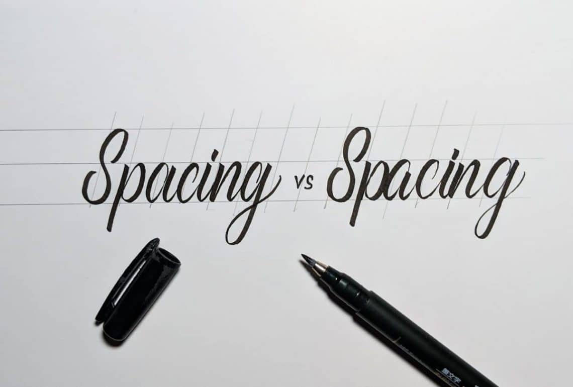
3: Interval
Words and sentences are easier to read by providing appropriate spacing between letters. And to maintain sufficient spacing consistently, strokes must be slow. It is important to lift the pen with each stroke and check the distance from the previous letter.
◆ Popular modern calligraphy techniques
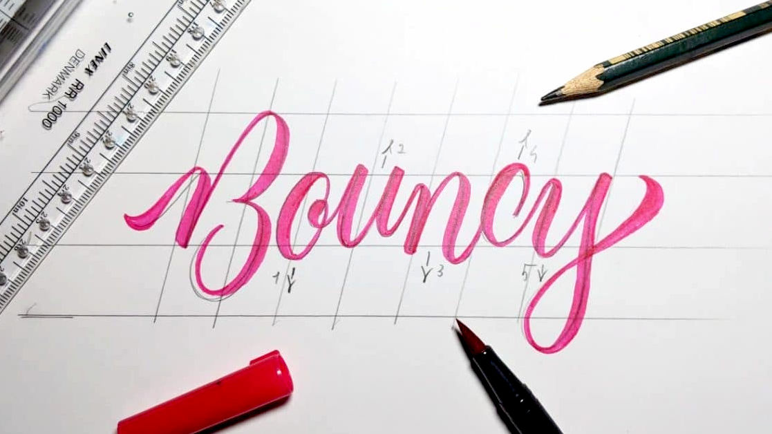
1: BOUNCE LETTERING
First, use a ruler and a pencil to draw several
Start with a pencil. BOUNCE LETTERING, as the word BOUNCE (Bouncing), the point is that the letters are bouncing up and down. To make this shape, make sure that the edges of the characters protrude above and below the reference line.
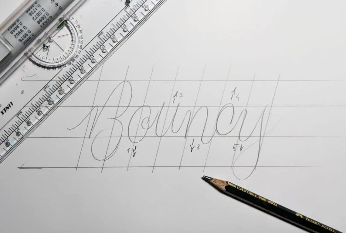
When you have finished your draft, use a brush pen. We are aware here that the line up is thin and the line down is thick.

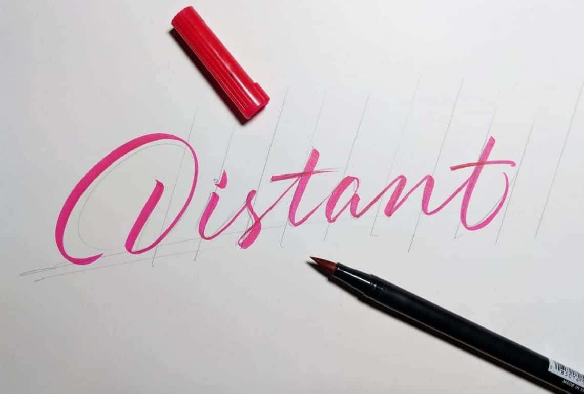
2: DISTANT LETTERING
DISTANT LETTERING is a calligraphy with DISTANT (distance) between letters. To create a more “flowing” atmosphere, the underline can be written by hand instead of a ruler. However, a ruler is used to keep the lines with a slanted slope at regular intervals.
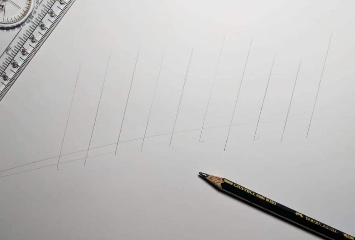
The point to be aware of in the draft is to give momentum only to the end stroke.
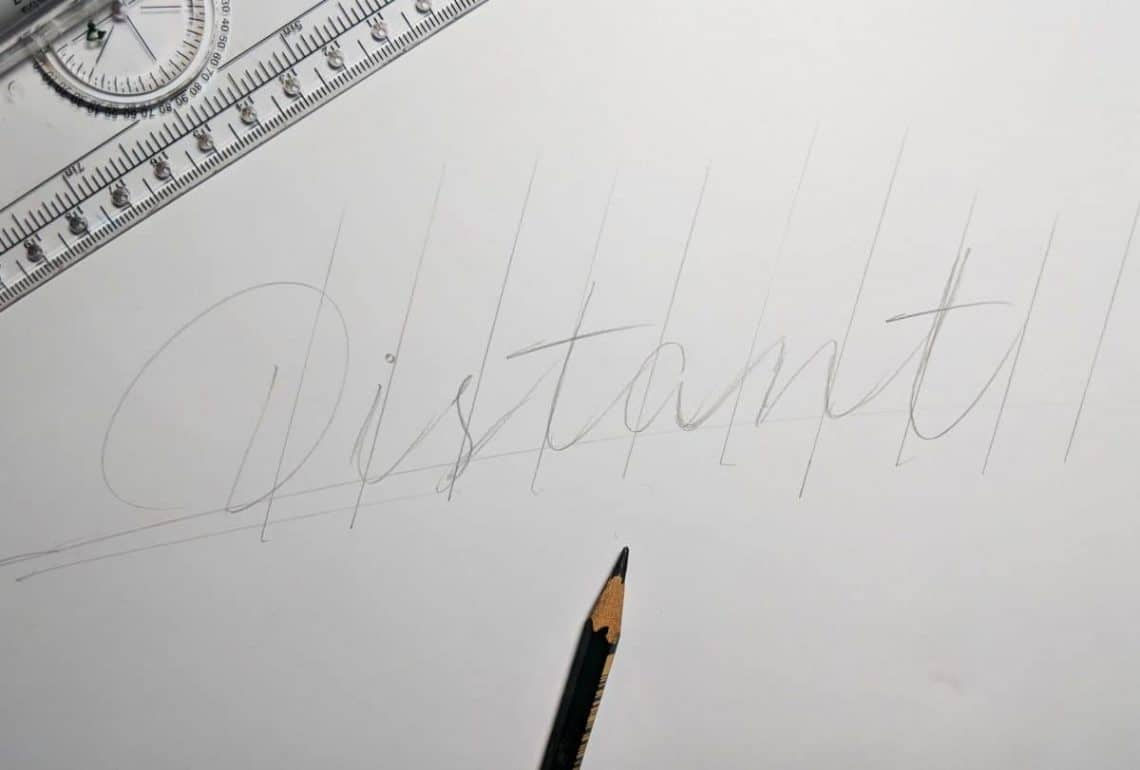
I am doing the clean-up while being conscious of the fact that each character is well spaced. You don't have to think about perfect writing, but you will have nuances to avoid writing too clearly.
3:
This calligraphy, named FAUX, is drawn with a thin pen or pencil, and then fleshed out like calligraphy.
The guide line is drawn in the same way as above. First, write a character with a thin pen, and specify where the 'line from the bottom to the top' is to be thick.
Then add a thickness to the 'line from bottom to top' ...
If you paint it, it's OK.
Once you get used to modern calligraphy, you will be able to create your own original calligraphy according to your intuition. All you need to improve your calligraphy is practice, and it is recommended to repeat a short practice of 10-15 minutes a day.
Related Posts: