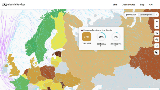
'ElectricityMap' that shows at a glance which countries are working on power generation methods that do not easily emit carbon dioxide
In recent years, concerns about global warming have been actively raised, and it has been pointed out that
electricityMap | Live Carbon Dioxide Emission Map
https://www.electricitymap.org/map
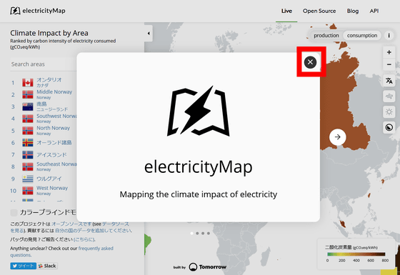
When you access electricityMap, you will see a description of electricityMap in the center of the page, such as 'This site allows you to see in real time how much carbon dioxide is being emitted to produce electricity per unit.' I will. Click x to actually use electricityMap.
electricityMap looks like this, with a list of registered countries and regions in the left column and the map itself on the right.
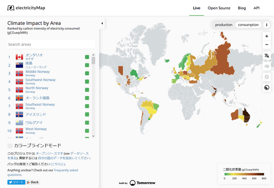
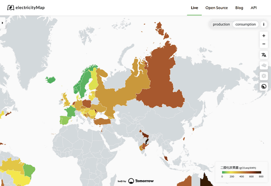
In electricityMap, the world map is color-coded according to 'the amount of carbon dioxide generated by power generation in each region' as shown below. It means that the closer it is to green, the less carbon dioxide it emits, and the closer it is to brown, the more carbon dioxide it emits. In addition, gray means the area where there is no data, and at the stage of writing the article, more than half of the countries had no data.
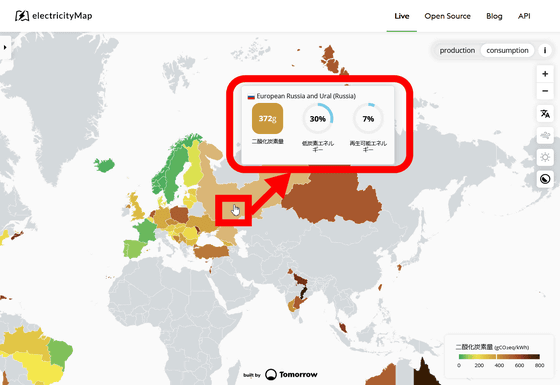
When you place the cursor on it, you can see the number of grams of greenhouse gas emitted when 1 kilowatt of electricity is generated in the area for 1 hour, converted to carbon dioxide, low-carbon power generation methods such as nuclear power generation, and solar power generation. And the percentage of
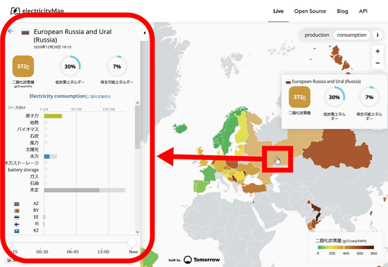
You can also see the details by clicking.
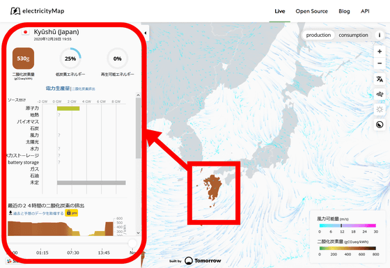
In Japan, data existed only in Kyushu. The greenhouse gas emitted when 1 kilowatt of electricity is generated continuously for 1 hour in Kyushu is equivalent to 530 g of carbon dioxide. Of the electricity used, 25% uses low oxygen energy, all of which is generated by nuclear power. Renewable energy was 0%.
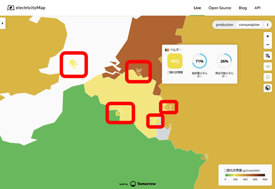
Also, if you zoom in on the map, you will see an arrow indicating whether you are selling or purchasing electricity to neighboring countries.
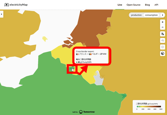
You can check the specific transaction volume by hovering over the arrow. France seems to sell 27 megawatts of electricity per hour to Belgium.
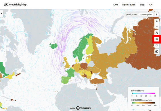
You can also add a layer that shows the wind direction by clicking 'Show wind layer' on the right side. You can understand where the emitted greenhouse gases blow.
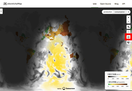
With the 'Show solar layer' button, you can check the sunlight falling. At 20:00, the waters between the African continent and Australia seemed to be shining as follows.
Related Posts:
in Review, Web Application, Posted by darkhorse_log
