European Space Agency publishes 'Air Pollution Map' that shows at a glance how air pollution has decreased due to the effect of the new coronavirus
It has been found that air pollution is decreasing in various parts of the world such as
Copernicus Sentinel-5P Mapping Portal
https://maps.s5p-pal.com/
ESA-Global air pollution maps now available
http://www.esa.int/ESA_Multimedia/Images/2020/06/Global_air_pollution_maps_now_available
Map uses satellite data to show global air pollution levels-ABC News
https://abcnews.go.com/International/wireStory/map-satellite-data-show-global-air-pollution-levels-71195510
Sentinel-5P was launched as part of the Earth Observation Project '
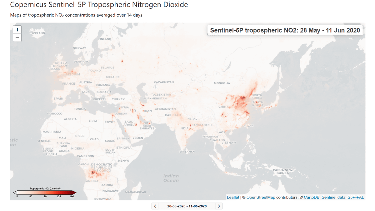
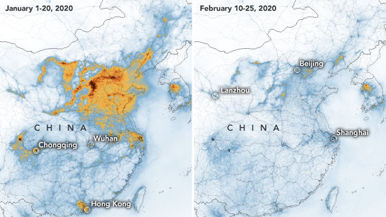
One of the substances that Sentinel-5P is monitoring is nitrogen dioxide, which is emitted when fossil fuels are burned at power plants, vehicles, and industrial facilities. Nitrogen dioxide emissions are greatly influenced by human industrial activities, and it has been reported that COVID-19 pandemics have reduced emissions around the world due to the reduction of human movement and industrial activities. I am . ESA continuously monitors the nitrogen dioxide concentration in the atmosphere with Sentinel-5P, and released the result as a map on June 11, 2020 (Thursday).
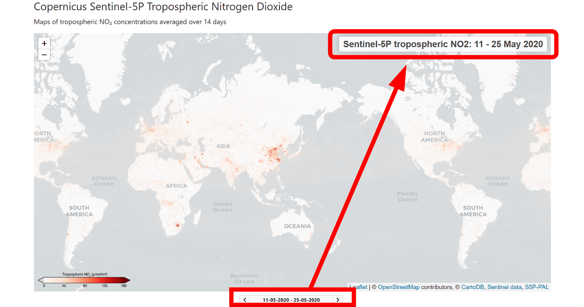
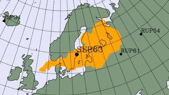
When you open the map that is actually open to the public, a map showing the concentration of nitrogen dioxide in the atmosphere in red shades is displayed. Since the amount of nitrogen dioxide in the atmosphere fluctuates due to short-term weather fluctuations, ESA uses the average of the data for the last two weeks to create a map that suppresses fluctuations as much as possible.
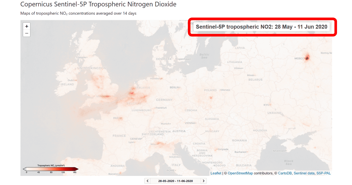
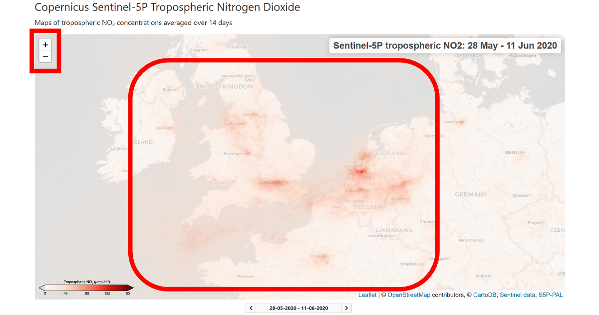
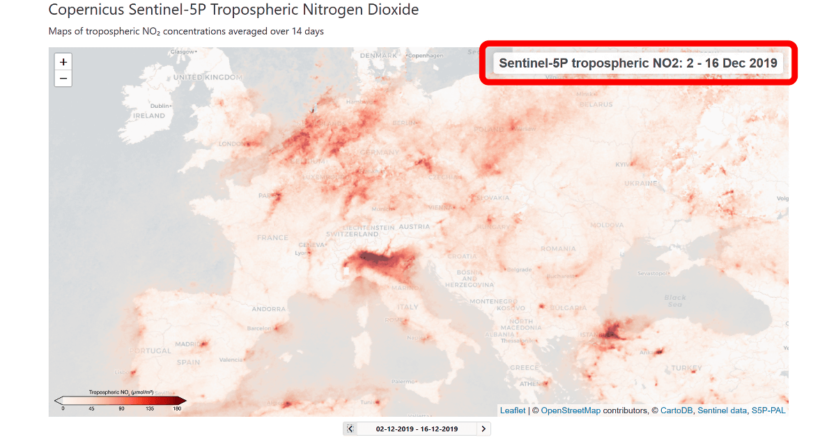
The map can be enlarged/reduced by operating the buttons on the upper left, and can be moved by dragging the cursor on the map. If you look at northern Europe, you can see that nitrogen dioxide concentration is high around England, Germany, Belgium and Paris.
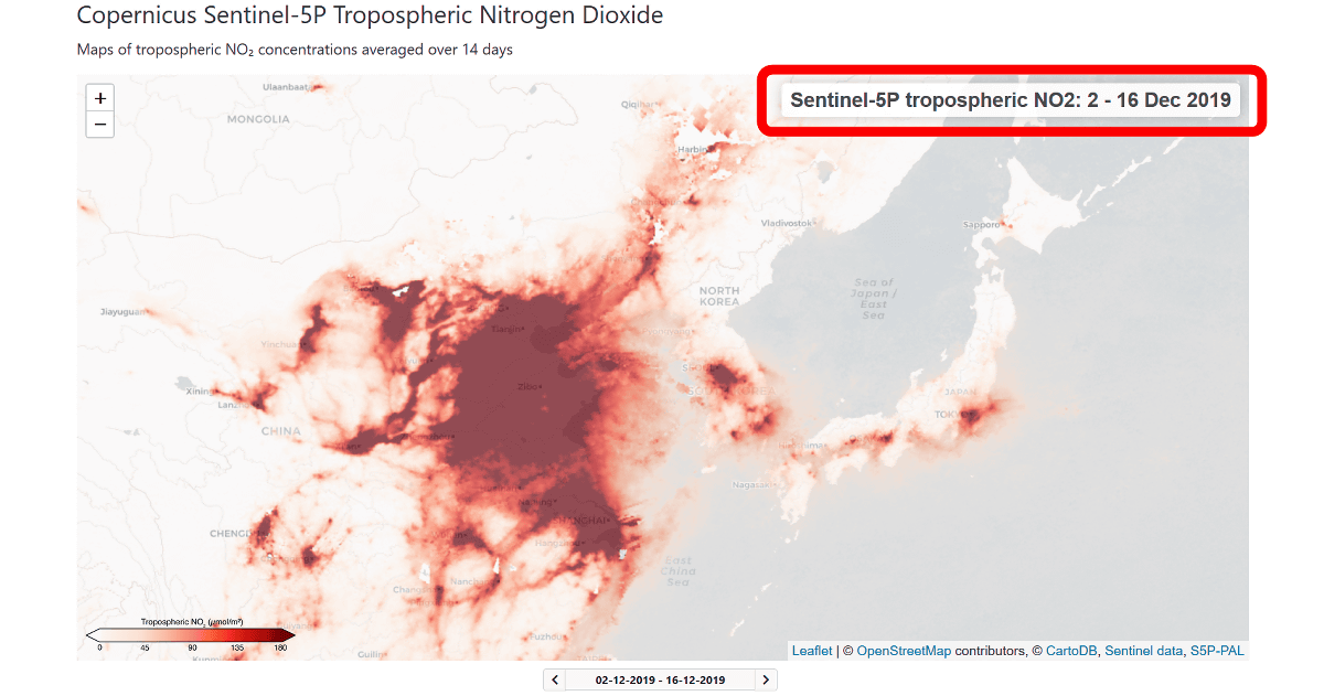
If you extend the map to the whole world, you can see that the amount of nitrogen dioxide around China and Japan is particularly high. When I try to enlarge it...
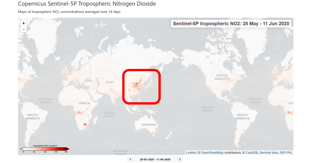
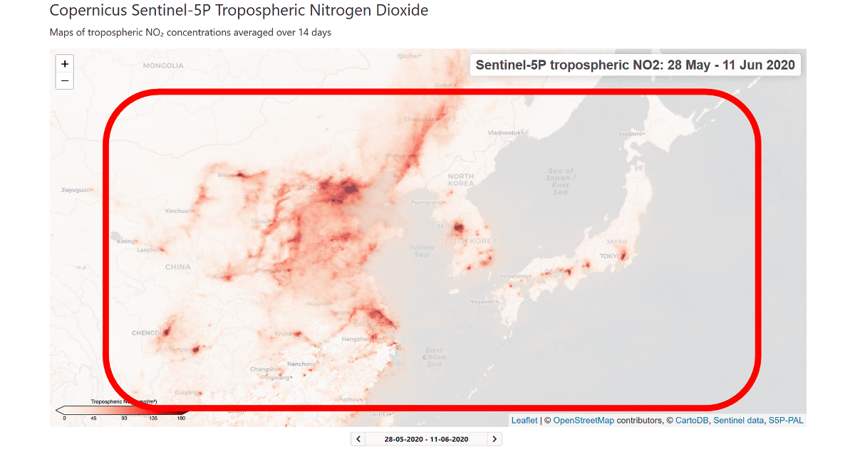
The red color was much darker in the coastal areas of China, South Korea, and the urban areas of Japan.
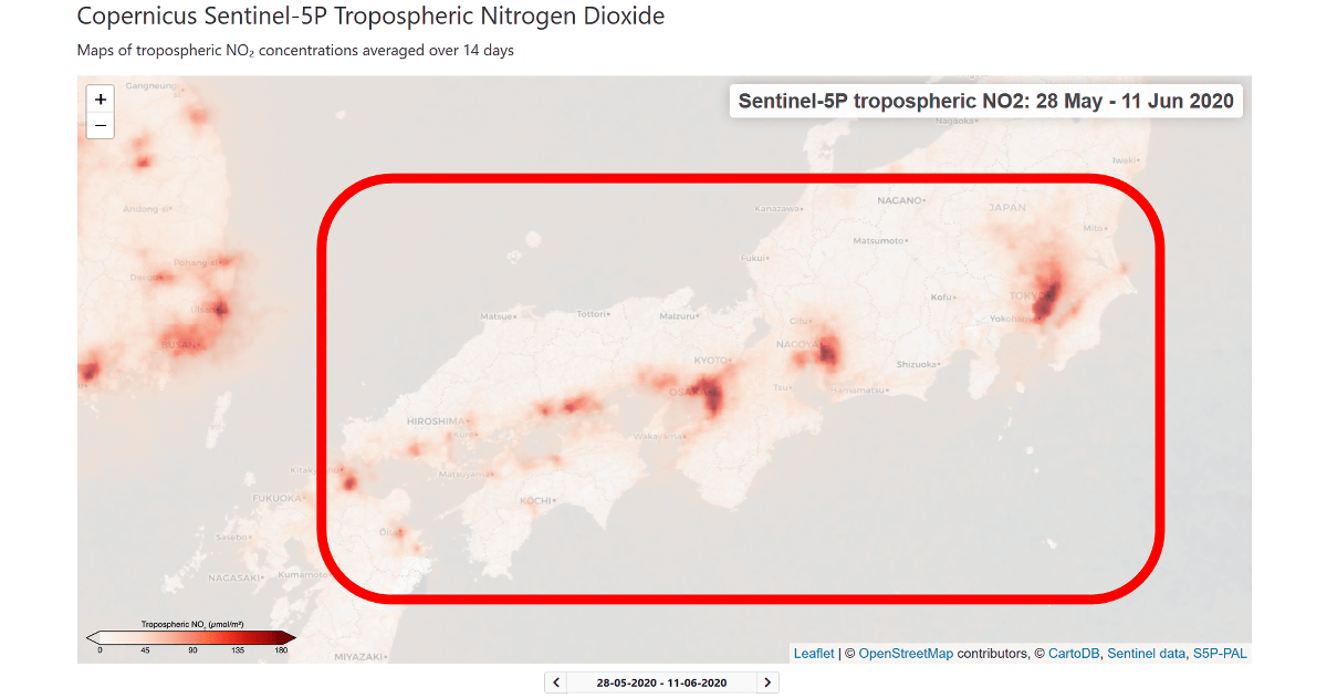
In Japan, you can see that the concentration of nitrogen dioxide is high around the Seto Inland Sea and northern Kyushu, mainly in large metropolitan areas such as Tokyo, Nagoya, and Osaka.
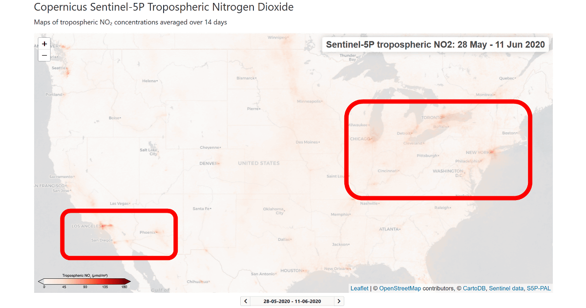
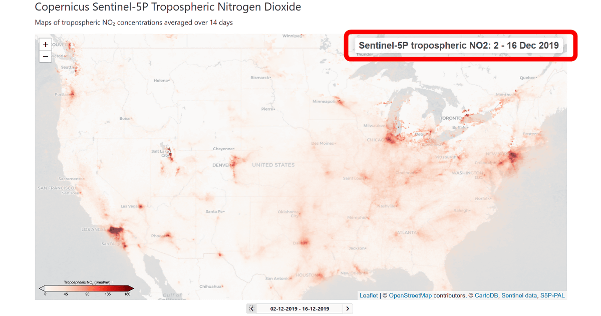
Looking at the United States, it seems that nitrogen dioxide emissions are high around Los Angeles on the west coast, around the Great Lakes bordering Canada, and near New York on the east coast.
In Africa, especially in the vicinity of Johannesburg in South Africa, nitrogen dioxide emissions are high.

You can change the time period for which the data was collected by clicking the arrow buttons beside the dates displayed at the bottom of the map.
As a test, I tried to display the amount of nitrogen dioxide from December 2 to 16, 2019 before COVID-19 spread all over the world.
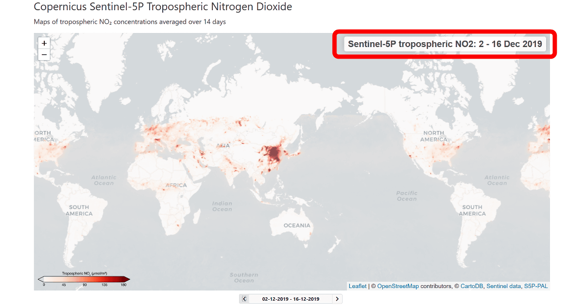
The amount of nitrogen dioxide in Japan and China is like this.
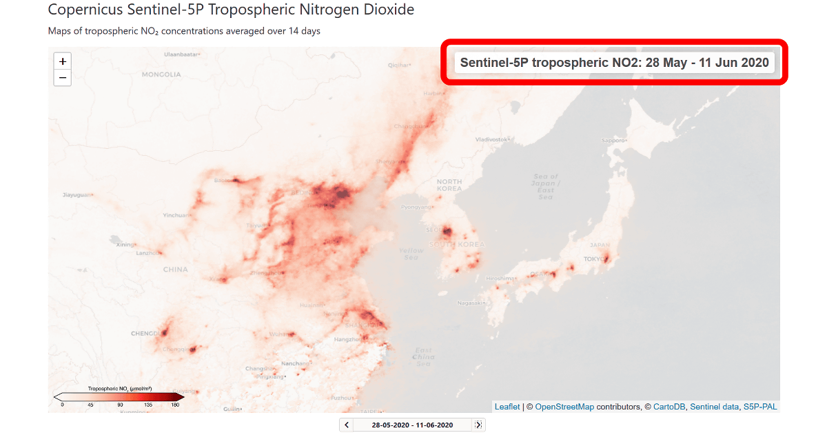
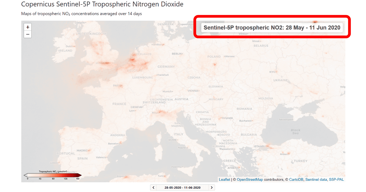
Comparing the data from May 28, 2020 to June 11, 2020, it is clear that nitrogen dioxide emissions have decreased significantly.
Comparing the range to Europe...
After all, it seems that the amount of nitrogen dioxide emission is drastically decreasing as a whole.
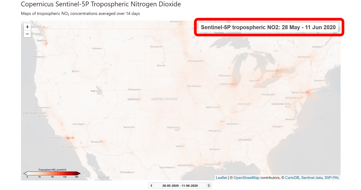
In America...
Similar changes were seen.
The map released this time can be traced to the data from April 30th to May 14th, 2018, and it not only compares the degree of air pollution with that before the COVID-19 pandemic but also shows the seasonal air pollution. It was also possible to visually investigate fluctuations.

Related Posts:


in Review, Web Service, Science, Posted by log1h_ik