NASA's interactive map "Worldview" which displays the appearance of the earth seen from outer space in time, weather and environment
Meteorological observation satellites flying in space acquire a wide range of data such as climate, disaster situation, air pollution as well as photographs of the earth's surface. NASA's open interactive map "Worldview", You can draw such information on the map and you can check the weather situation further back in the past.
EOSDIS Worldview
https://worldview.earthdata.nasa.gov/
When the page was opened, the image of the global sphere made by joining the images of the satellite was displayed. There are black parts in some places, but this is a pattern of parts that were not taken due to the area covered by the camera of the satellite.
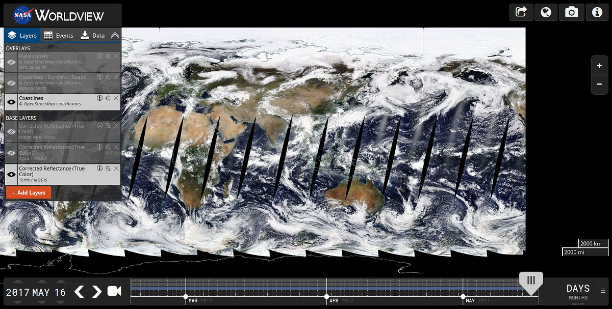
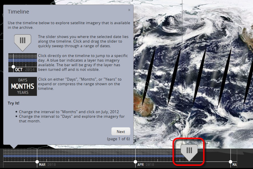
By moving the slider at the bottom of the screen you can specify the time of the earth you want to see. Also, as we will see later, the page display is layered, and the layer currently on display is indicated by a blue bar at the slider.
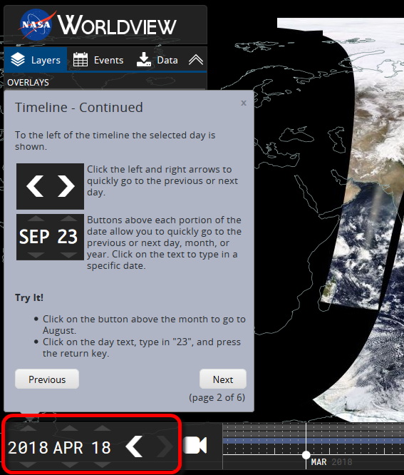
In the lower left part of the screen, you can set the Christian calendar year, month, day. You can change it directly with the icons above and below each element, or you can move it one day at a time with the icon to the right of the date and time.
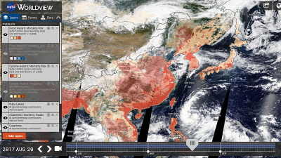
In the upper left of the screen, a list of layers that you can select the information to display on the screen is displayed. At the bottom "Base Layers", NASA's Meteorological Satellite"Tera" and "Aqua"And the Meteorological Satellite of the United States Oceanic and Atmospheric Administration"Suomi NPP"You can select the image you acquired, you can also change the order of the layers.
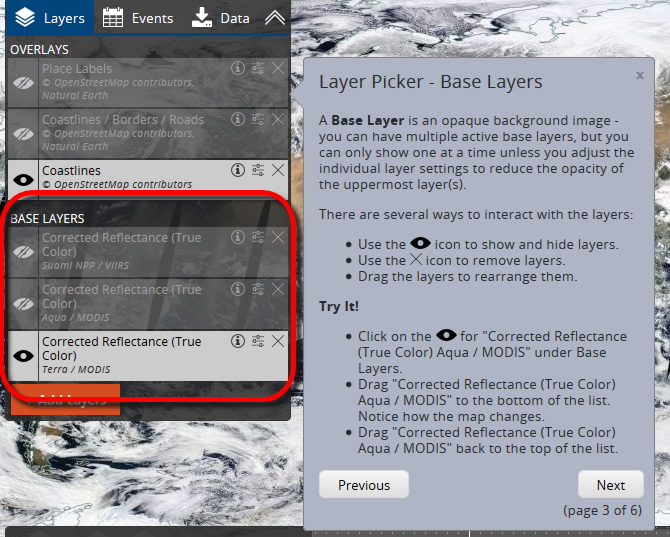
In "Overlays" it is possible to select the information to display on the map. In the initial state, "Coastlines" (coastline) is on, and there are other layers of "Coastlines / Borders / Roads" (coastline / border / road) and "Place Labels" (place name) .
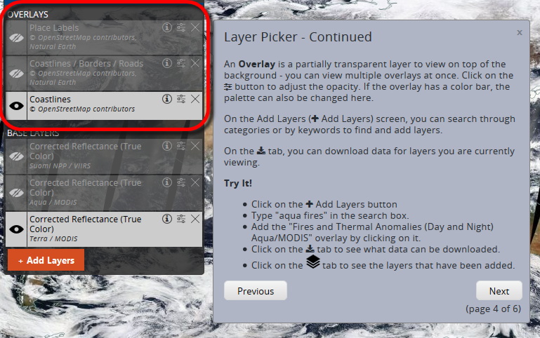
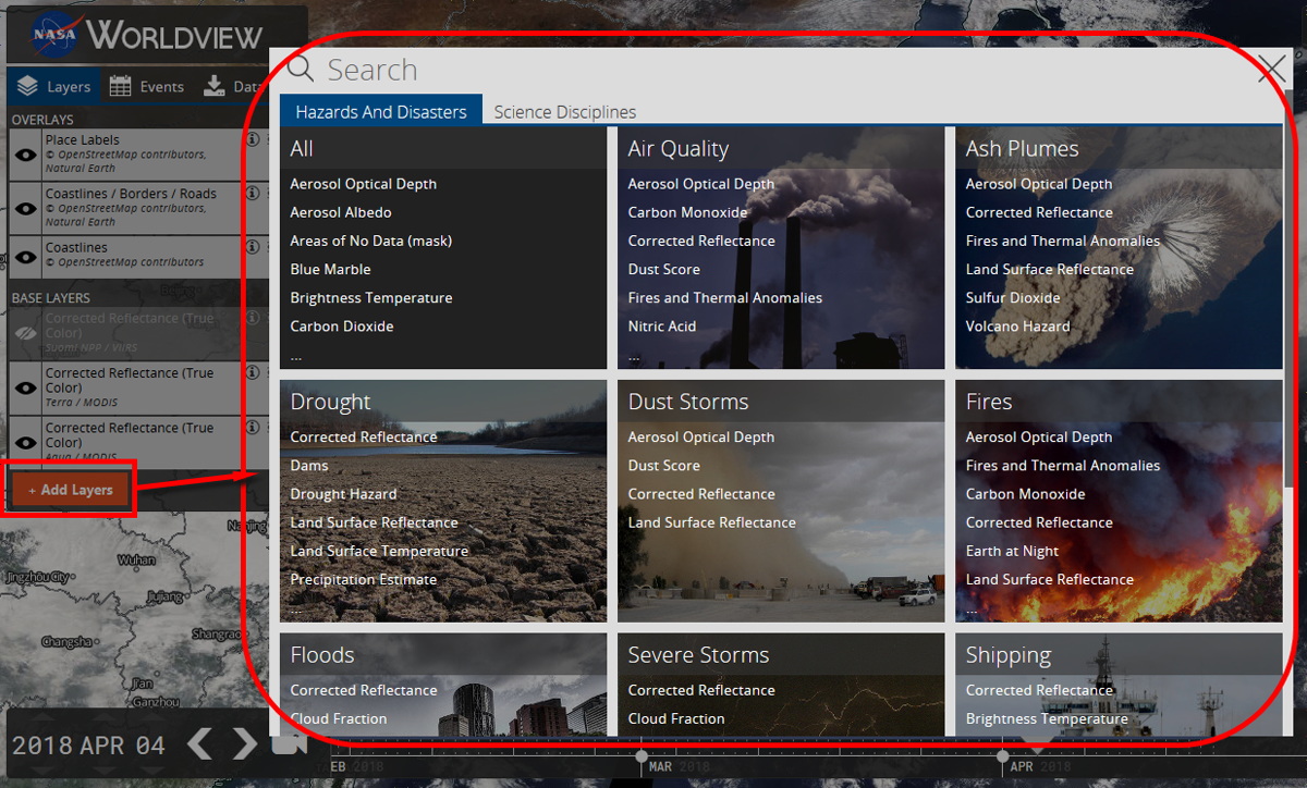
Note that you can add the information you want on the layer on the overlay side, and click the "Add Layers" icon to display the genres of the layers you can add.
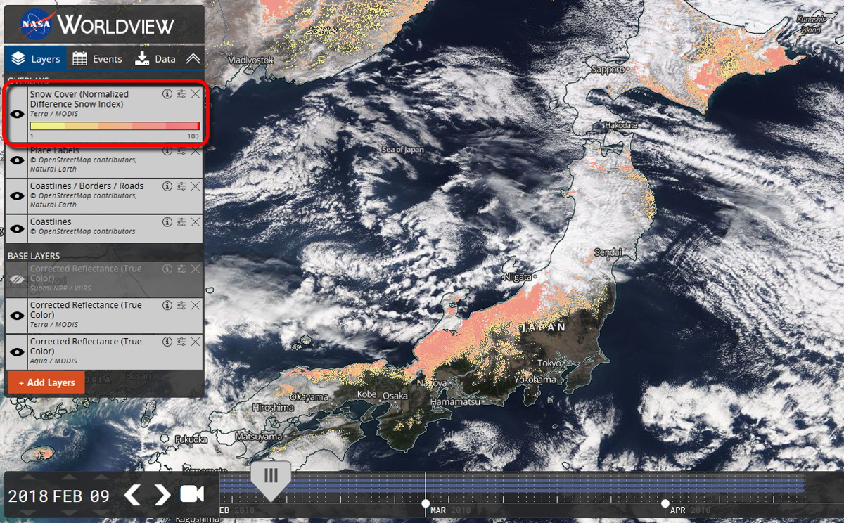
As an example, let's display "Snow Cover (Normalized Difference Snow Index)" (snow: normalized snow index) and it is like this. The date is 9th February 2018, from February 5th to 8thIt was heavy snow on the Japan Sea sideTraces are indicated by orange or red dots.
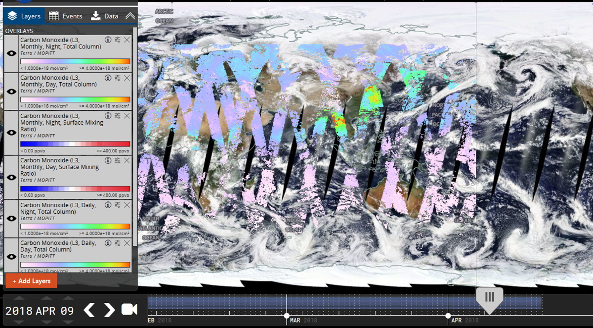
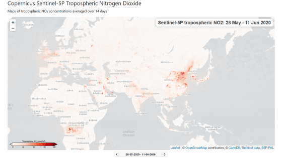
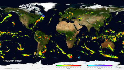
It is also possible to display the status of air pollution. When observation data of atmospheric carbon monoxide on April 9, 2018 is displayed, it is like this. Although it is not the state of the global because only the area that the weather satellite could observe is displayed, it can be grasped that the concentration of carbon monoxide is the highest around the eastern end of Eurasia Continent.
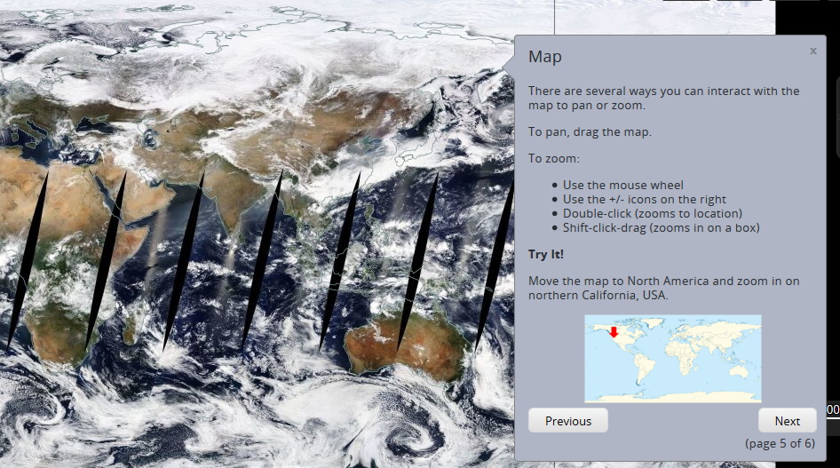
The map can be moved by dragging with the mouse, enlarging / reducing by mouse wheel, keyboard, double click.
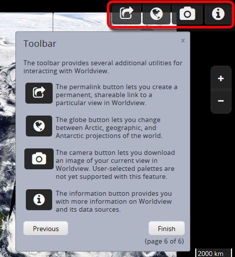
Icons in the upper right corner of the screen are switched between fixed link generation that displays the date and time specified from the left and information on the map, map display with "Arctic Center", "Equatorial Center", "Antarctic Center", downloading the current display as an image, displaying various information It is an icon.
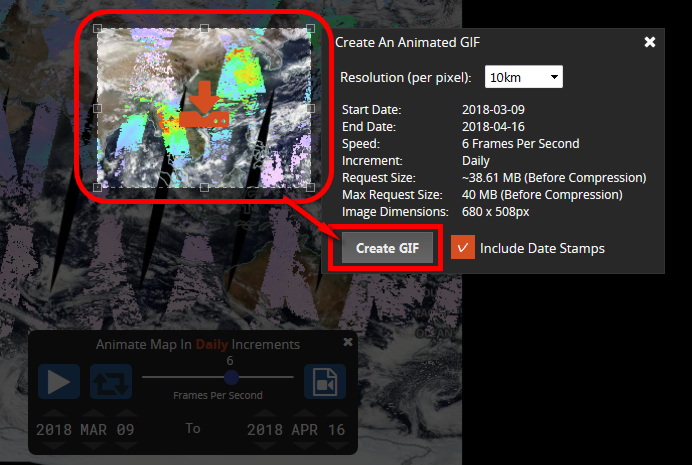
You can also export weather changes by daily GIF animation by clicking on the icon at the bottom left of the screen.
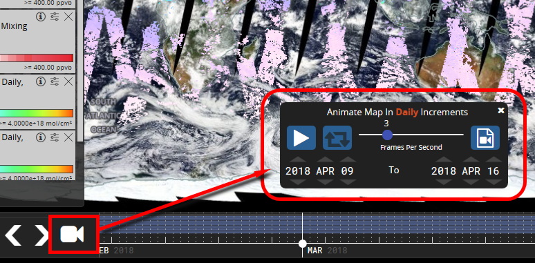
As for the size of GIF animation, the capacity before compression is 40 MB up to the limit. Using the mouse, select the range so that the file capacity limit is not reached, and click "Create GIF" ... ...
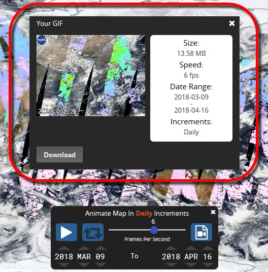
A GIF animation was created. This file can be downloaded and saved locally.
Related Posts:

in Review, Web Application, Science, Posted by darkhorse_log