Windows new logo design revealed

It is reported that the logo design of the Windows OS 'PC' developed by Microsoft has been changed to a new one.
Microsoft reveals new Windows logo design and 100 modern app icons-The Verge
https://www.theverge.com/2019/12/12/21012997/microsoft-new-windows-logo-fluent-design-icons
Microsoft reveals new Windows Logo and Microsoft 365 icons-The Redmond Cloud
https://www.theredmondcloud.com/microsoft-reveals-new-windows-logo-microsoft-365-icons/
At the end of November 2018, Microsoft announced a new icon design for Microsoft Office related software. The new design has been gradually introduced from the cloud version of “Office 365”, and finally the desktop version of the icon has also been changed to the new design.
Microsoft Office icon design is renewed-gigazine
At about the same time as the icon design of Microsoft Office was renewed, Microsoft was rumored that it might be considering redesigning the application icons of Windows 10. The source of the rumor was the unfamiliar design icons that appeared in the movie that announced the icon design of Microsoft Office.
Is Microsoft considering changing the design of Windows 10 app icons? -GIGAZINE
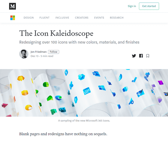
On December 13, 2019, just one year after the icon design change began to be rumored, Microsoft announced that it has changed the design of over 100 types of icons, including Windows standard applications etc. It is. The design of the new app is based on the Fluent Design System , a design system proposed by Microsoft.
The Icon Kaleidoscope-Microsoft Design-Medium
https://medium.com/microsoft-design/the-ripple-effect-expanding-our-icon-design-system-74b4d916b7a4
The following article summarizes what the Fluent Design System is, which plays an important role in Microsoft icon design.
Microsoft announces `` Fluent Design System '' to develop apps with better designs-gigazine

Microsoft plans to revamp the design of software and services under the Fluent Design System, and the Windows logo change is at the heart of that big project. “When we redesigned the icon, we faced two major creative challenges,” said John Friedman, vice president of Microsoft design.
Microsoft has released multiple images as the icon design has undergone a major renovation. One of them is an image containing what seems to be a new Windows logo.
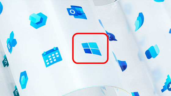
Microsoft announced ``
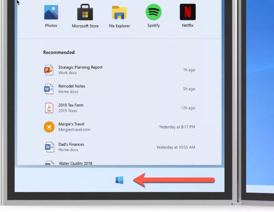
The new icon design announced by Microsoft does not change the appearance from the conventional design dramatically, but the consistency in the design is clearer when viewed in the whole application installed in Windows etc. It has come to understand that. The Redmond Cloud writes, “It seems like an attempt to eliminate inconsistent icon designs on Microsoft Windows.”

In addition, the icon design change by Microsoft is made in stages and is expected to continue until 2020.

Related Posts:
