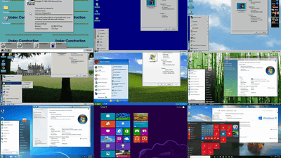
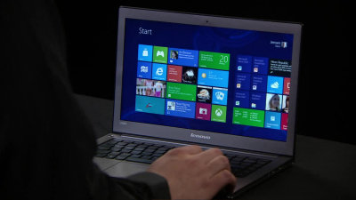
Windows 11 has past Windows UI elements here and there
by
Windows 11 has greatly improved design consistency from Windows 10, and the UI has been significantly redesigned to match the new design language ' Fluent Design '. The introduction of WinUI 3 also allows developers to easily integrate these elements into their apps. Although Windows 11 has evolved greatly in terms of design, the design improvement is not perfect, and if the UI elements of past Windows such as Windows 10, Windows 8, and Windows Vista remain at key points, The blog NTDEV, which deals with building Windows, explains it.
State of the Windows: How many layers of UI inconsistencies are in Windows 11? – NTDEV
https://ntdotdev.wordpress.com/2023/01/01/state-of-the-windows-how-many-layers-of-ui-inconsistencies-are-in-windows-11/
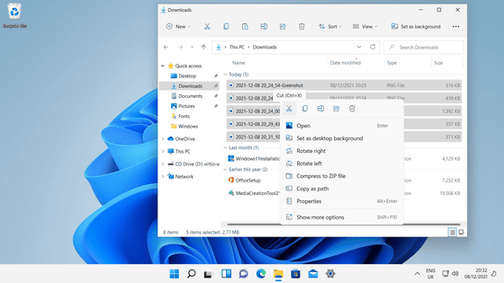
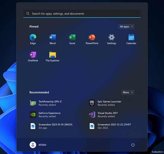
The fundamental change in Windows 11 is that the position of the start button has moved from the left corner to the center of the screen.

In addition, Explorer has a tab switching function, and the design of the context menu etc. has also changed.
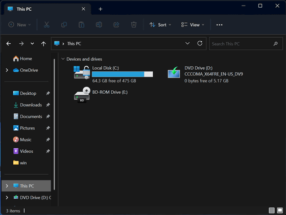
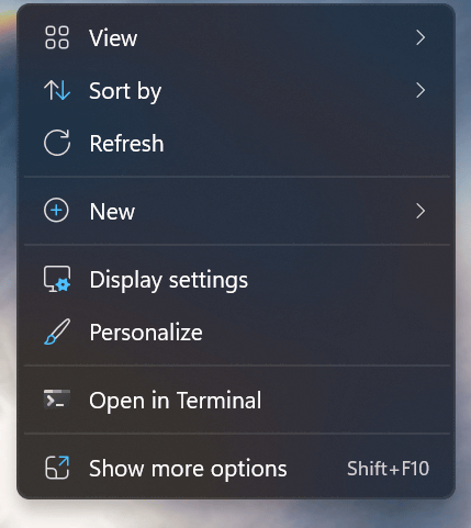
As a result of the redesigned Start Menu, the live tiles introduced in Windows 8 are gone. Another big improvement in Windows 11 is that it's updated to areas that casual users rarely see, like the firewall prompt and much of the
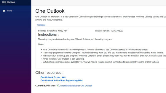
Some apps, such as email and calendar, haven't been redesigned, but are said to be replaced by a new application codenamed Project Monarch in 2023.
It turns out that Microsoft is developing a new mail application 'One Outlook' - GIGAZINE
On the other hand, the kernel of Windows 11 has not changed much from Windows 10, and the version number is 10.0.

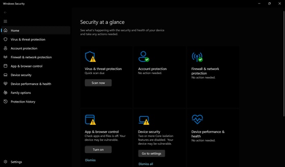
Also, Windows Defender's UI hasn't been updated, so it looks pretty old compared to other UIs, says NTDEV.
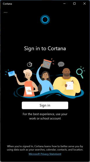
Voice AI Cortana is also installed in Windows 11, but it is not linked with the OS design renovation, and Cortana's UI has not changed from Windows 10.
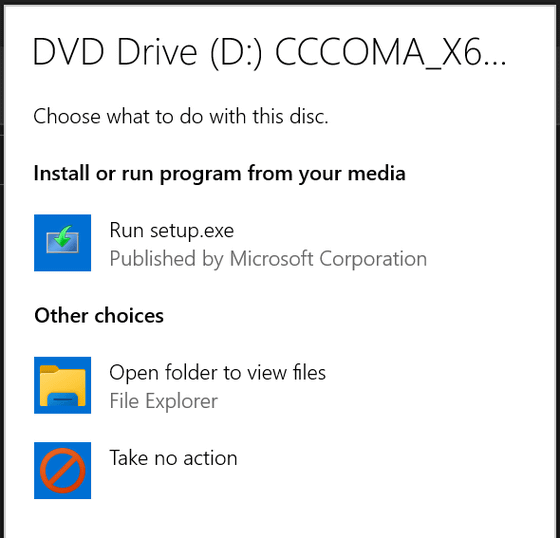
In addition, the autorun prompt and the error that appears when you run an incompatible program are all inherited from Windows 8.
Application installation screens have been updated with WinUI 3, but some loading screens remain in the Metro UI.


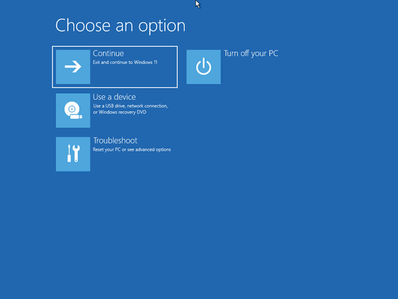
And the screen when restoring Windows remains almost the same as Windows 8.
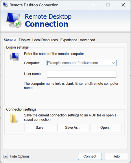
As for the remote desktop connection program, the familiar
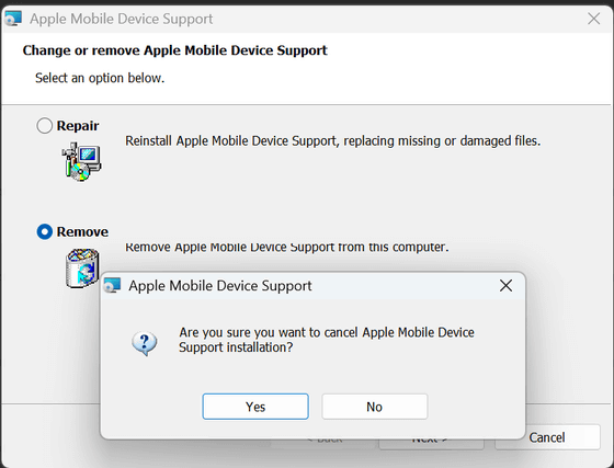
The driver copy screen remains Windows XP.
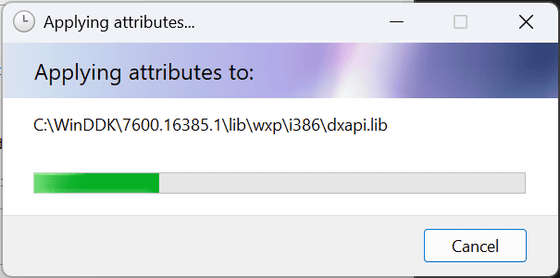
The repair / delete icon used on this screen was adopted in Windows 2000.
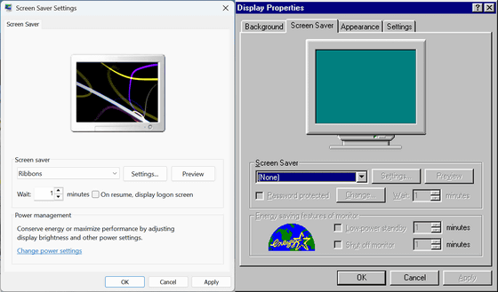
Comparing the screen saver setting screen between Windows 11 (left) and Windows 95 (right), the font and window design itself have changed, but the panel UI itself has not changed.
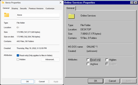
The UI configuration itself is the same even if the font and design of the folder properties have changed.
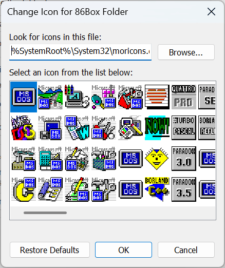
And Windows 11 has Windows 3.1 icons built-in.
The
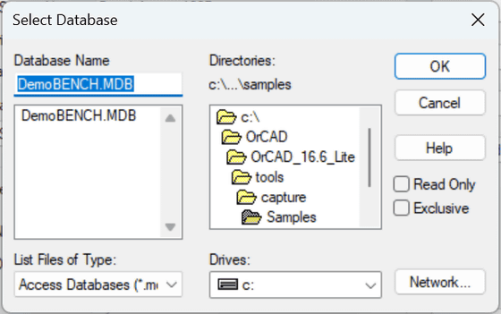
NTDEV evaluates the design of Windows 11, ``Its consistency is a clear improvement over what was introduced in Windows 10, but it is somewhat superficial and there is a lot of room for improvement.'' However, Windows 11 is reported to have three new improvements in 2023, and we can expect new features and UI fixes. NTDEV said, ``I think that many improvements will be made more quickly because Microsoft is believed to be working on further fixing UI elements left over from past Windows.''
Related Posts:
