Windows 10 app icon design renewed, adopting Microsoft's design system `` Fluent Design ''
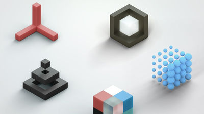
Microsoft has redesigned the icons for various applications used in Windows 10 and other operating systems. The new icon with a colorful and simple design is the culmination of
Iconic Icons: Designing the World of Windows-Microsoft Design-Medium
https://medium.com/microsoft-design/iconic-icons-designing-the-world-of-windows-5e70e25e5416
Microsoft first revealed the existence of Fluent Design at the 2017 Microsoft Build 2017 developer event. Since then, Microsoft has gradually changed the icon design to a new one using Fluent Design through the renewal of the Office icon and the UI of the new OS ' Windows 10X ' for dual display terminals.
The history of Microsoft's efforts to redesign its icons is summarized in the following articles:
Reveal new Windows logo design-gigazine

Meanwhile, Christina Kane, Microsoft's design leader, unveiled a new Windows 10 icon using Fluent Design on February 21, 2020.
Looking at the changes in the icon of the email client, you can see at a glance that the design has evolved over time.
Also, if you look at the transition of the calculator icon from the leftmost monochrome design used around 2012 to the rightmost Fluent Design, you can see that it has changed to a colorful and rounded design I can take it.
'Through Fluent Design, we have introduced depth and color to the icons. These changes are subtle, but they make a big difference to the look at first glance,' Kane said. The addition of rounded corners and colors provides a unified “design language” across devices and platforms, and gives them a familiar and familiar image.
The newly designed icon will be visible in the icon of the application distributed in the Microsoft Store, and Windows Insider members who can quickly experience the new features of Windows will already have new mail client and calendar icons provided That it is. Over the next few months, the icons of Windows Insider users will gradually be renewed over the next few months.
'Our new designs are flooding not only Windows, but also third parties such as Android, iOS, and Mac. In this new cross-platform, cross-device, new user experience,' said Kane. The goal is to create icons that are friendly, beautiful and comprehensive, '' said the end user, not only Windows users, but also Android devices and iPhone users, everywhere. You'll start seeing new Microsoft icons.
![]()
Related Posts:
in Software, Posted by darkhorse_log


