"HUE / 360" which tells by one click one color which harmonizes with the color to be used for illustration and design
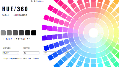
Choice of color is very important in designing posters and flyers, websites and books, but it is also a fact that it is difficult without knowledge and sense. Therefore, selecting one color as the main without having expert knowledge will automatically pick up multiple colors that harmonize with the main color "HUE / 360"is. Anyway it is easy, it displays a color choice with a single button, so afterwards you can make a work with unity if you choose your favorite color from it, very useful item in design and making It has become.
[HUE / 360] The Color Scheme Application
http://hue360.herokuapp.com/
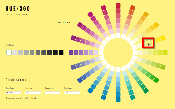
The main page looks like the following.
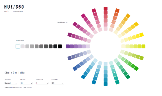
Since the color pallets are arranged radially, first click the color you want to be the main.
Then, the color decreased at once, and the main color was arranged at the bottom of the screen.
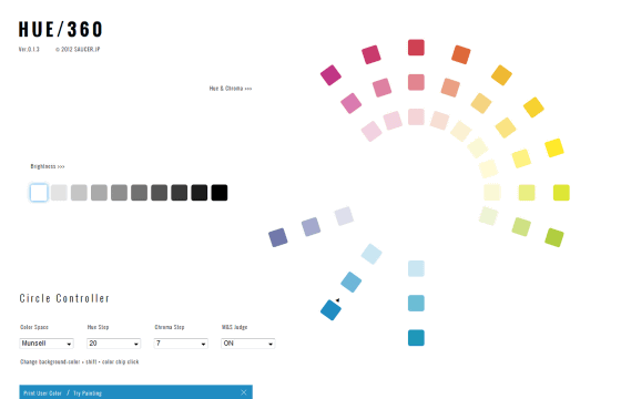
Of the remaining colors, as you click on what you want to use, it will line up next to the main color.
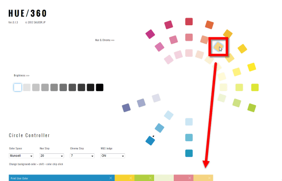
"After all, let's stop this color" and delete it by clicking on the x.

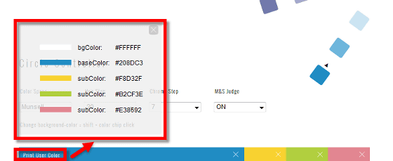
When you can pick up a satisfactory color, click on the word "Print User Color". A color code is displayed such as "bgColor (background color): # FFFFFF" "baseColor (main color): # 208 DC 3" "subColor (sub color): # F 8 D 32 F" "sub Color: # B 2 CF 3 E" "sub Color: # E 3869 2" So it is OK if you use the color code displayed when creating an illustration or the like.
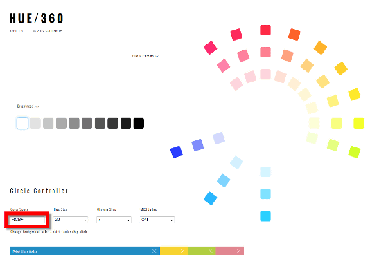
The color space, hue, saturation, etc. can be changed. For example, color spaceMunsell color system,RGB, RGB +, you can choose from three types.

When RGB + is chosen it is like this.
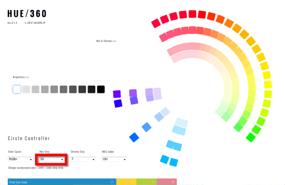
The number of hues can be reduced or increased in 6 stages.
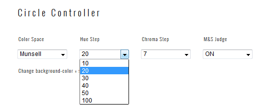
By default it is 20, but when you change to 50, the number of colors has increased a lot.
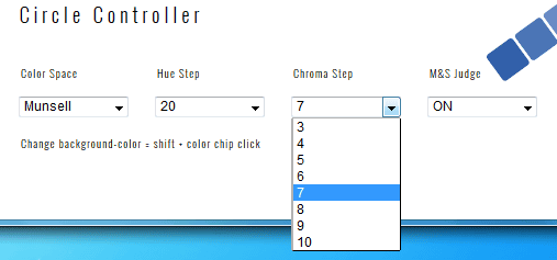
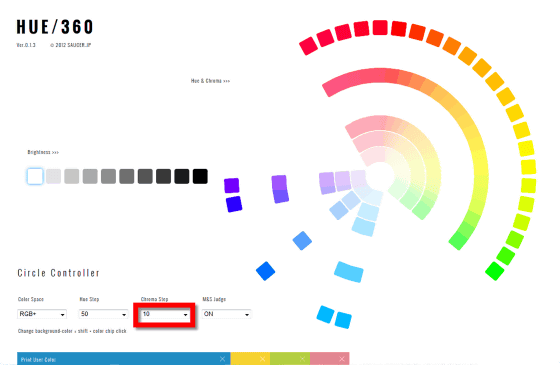
You can choose the number of steps from 8 steps of saturation from 3 to 10.
I changed the default 3 to 10. As the number of steps of hue and saturation increases, the color and lightness become ambiguous and the color that can be selected increases, and when the number is decreased, the difference is clear and the color that can be selected decreases.
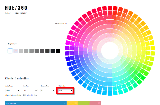
Although "M & S judge" can be turned on and off ... ...
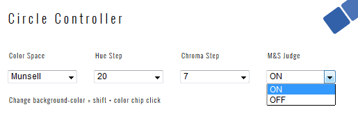
If you turn it off, the color pickup function disappears, so it's always on and OK.
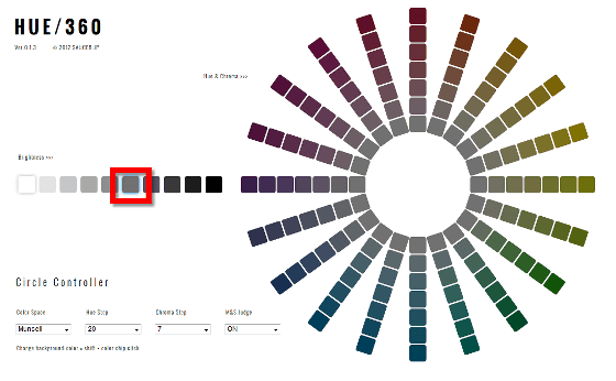
In addition, the brightness can be chosen in 10 steps from the left side of the screen.
That is why I placed the main color and picked up the color appropriately.
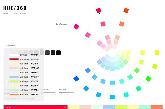
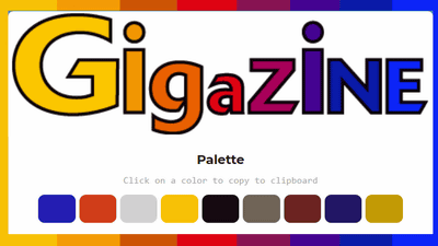
Using the displayed color code to make the GIGAZINE logo look like this. There is not the same color as one, but it has become an overall impression.

It is like this when trying to make blue as the background color.

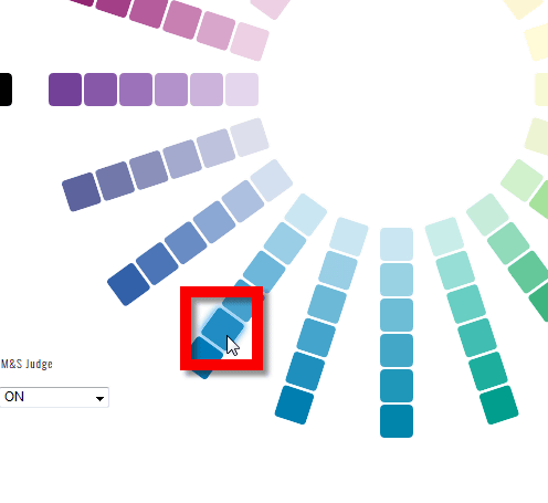
If you click the color while holding down the Shift key, you can change the background color, so you can pick up colors while checking if the color you choose actually matches the background color.
Related Posts:
in Web Service, Design, Posted by darkhorse_log
