I tried using the open source self-hosted app ``Metabase'' to create a dashboard that automatically visualizes a large amount of data for free in easy-to-see graphs and is updated regularly.
`` Metabase '' is a data visualization tool equipped with an ``automatic exploration'' function that automatically summarizes data in a good manner in response to various data. Since it is open source and self-hosting is also possible, I immediately tried it out.
Metabase | Business Intelligence, Dashboards, and Data Visualization
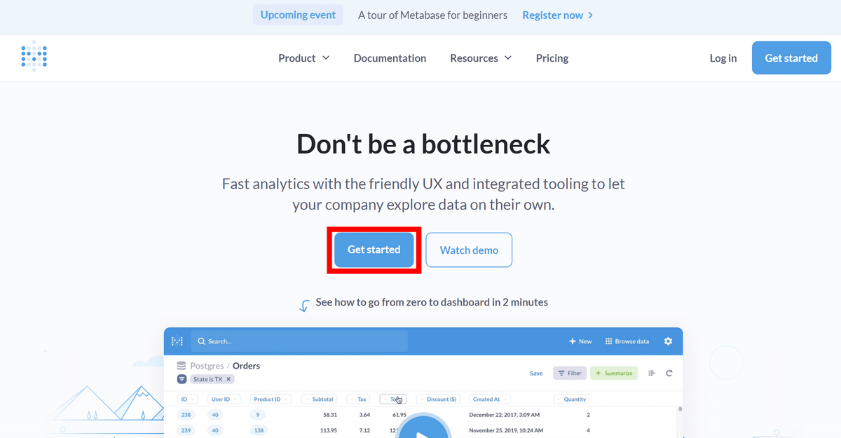
Click 'Get started' on the official page.
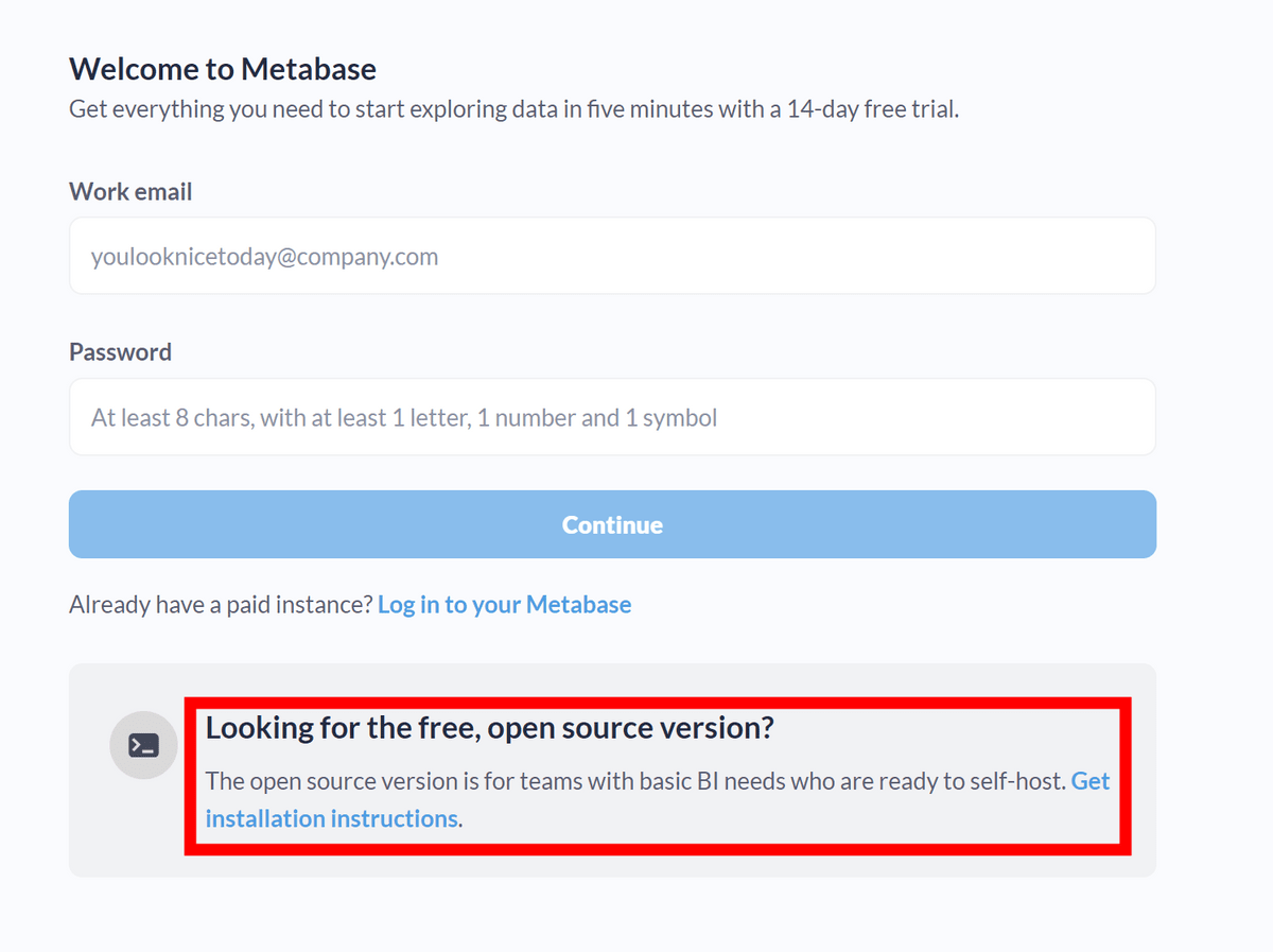
This will be a screen to register for a paid cloud service operated by the developer of Metabase, but at the bottom there is a link to how to self-host for free. Click on the 'Get Installation instructions' part.
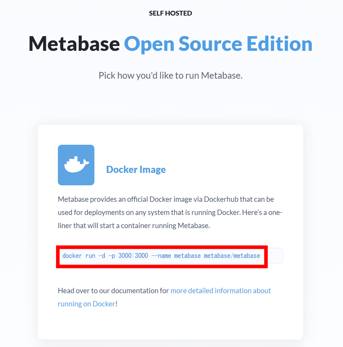
There are two methods: one using Docker and one using Java. This time we will use Docker.
So, install Docker using the method that suits your environment from the link below.
Install Docker Engine | Docker Documentation
This time, to use Debian, I entered the following command.
[code]sudo apt-get update
sudo apt-get install ca-certificates curl gnupg
sudo install -m 0755 -d /etc/apt/keyrings
curl -fsSL https://download.docker.com/linux/debian/gpg | sudo gpg --dearmor -o /etc/apt/keyrings/docker.gpg
sudo chmod a+r /etc/apt/keyrings/docker.gpg
echo \
'deb [arch='$(dpkg --print-architecture)' signed-by=/etc/apt/keyrings/docker.gpg] https://download.docker.com/linux/debian \
'$(. /etc/os-release && echo '$VERSION_CODENAME')' stable' | \
sudo tee /etc/apt/sources.list.d/docker.list > /dev/null
sudo apt-get update
sudo apt-get install docker-ce docker-ce-cli containerd.io docker-buildx-plugin docker-compose-plugin[/code]
Once Docker is installed, start Metabase by entering the command mentioned in the installation guide earlier.
[code]docker run -d -p 3000:3000 --name metabase metabase/metabase[/code]
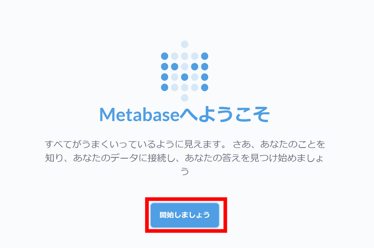
After starting the server, access 'http://localhost:3000' and the 'Welcome to Metabase' screen will be displayed as shown below. Click 'Let's get started'.
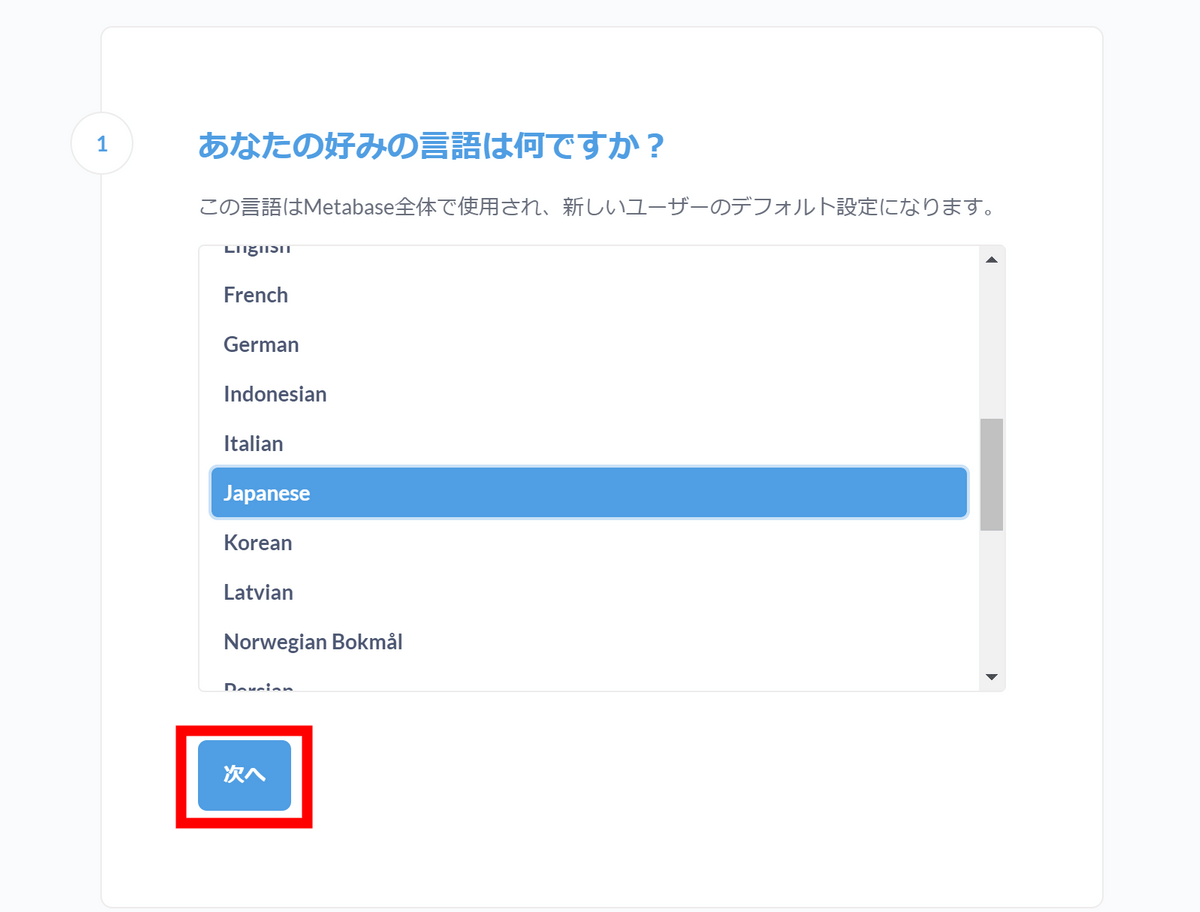
Set language. Japanese is selected by default, so click 'Next'.
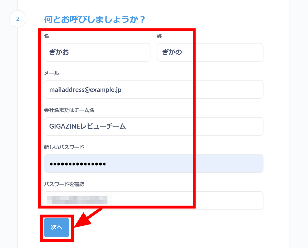
Enter your name, email address, company name or team name, and password, and click 'Next'.
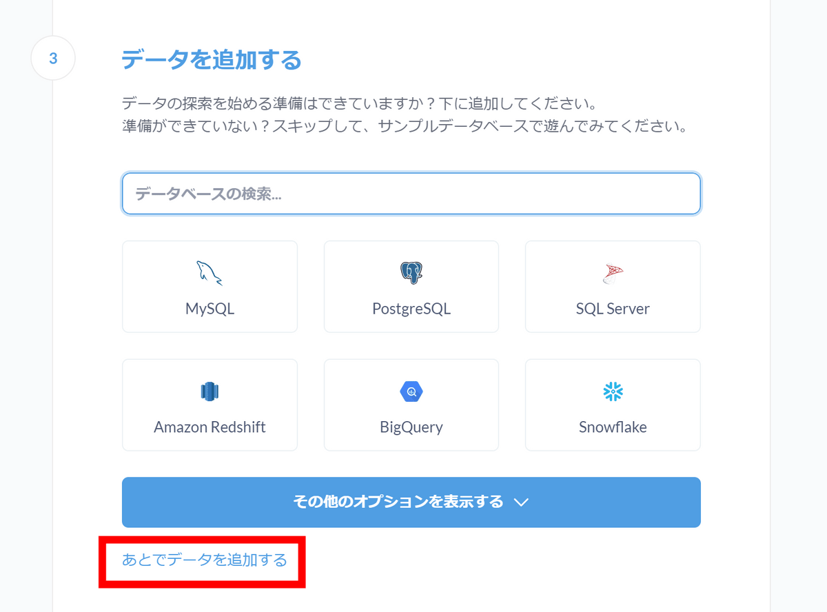
A screen appears where you can select which database to connect to. Since we will be using a sample database this time, click 'Add data later.'
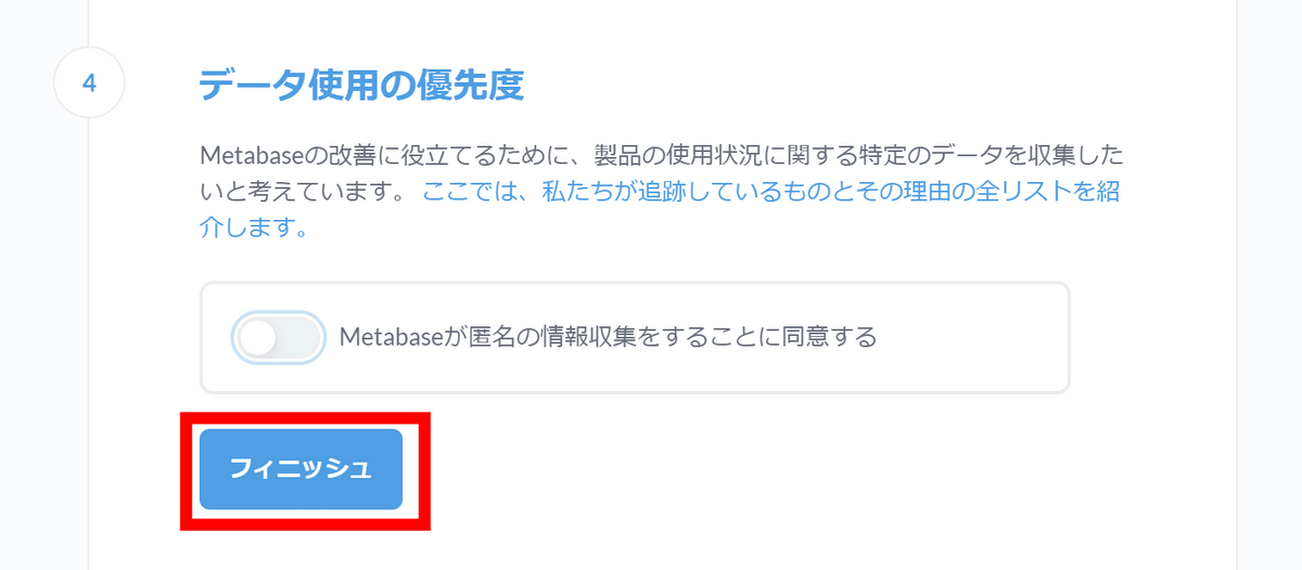
Click 'Finish'.
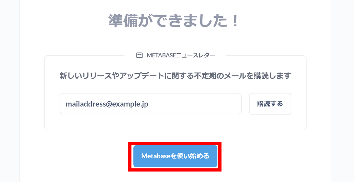
Click Get started with Metabase.
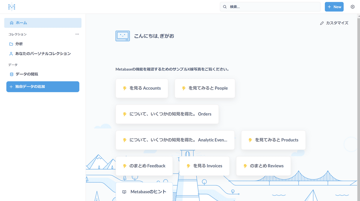
The screen shown below will appear. There are some parts that are a bit questionable in Japanese, perhaps due to machine translation.
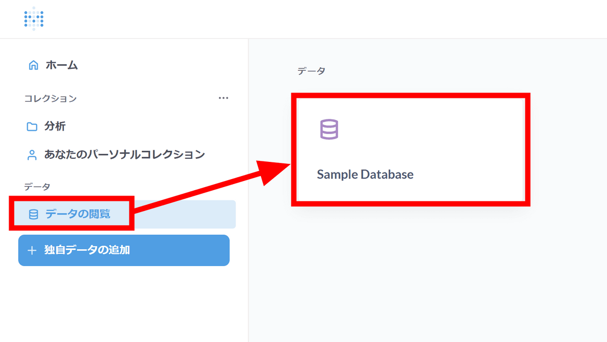
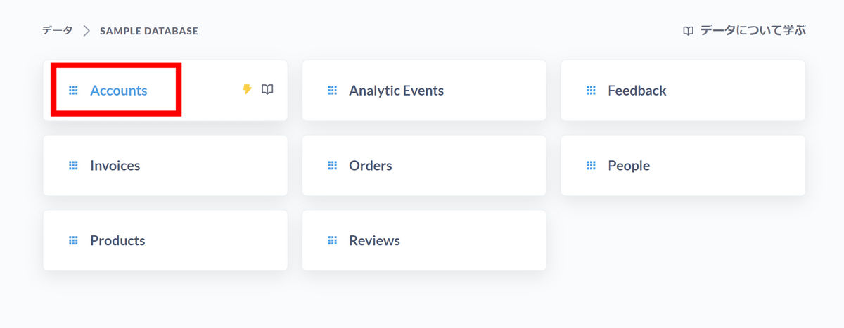
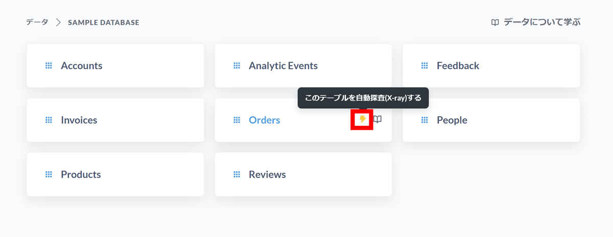
First, let's check the contents of the sample database. Open the 'View data' tab from the left menu and click 'Sample Database'.
A list of tables will be displayed. Click 'Accounts'.
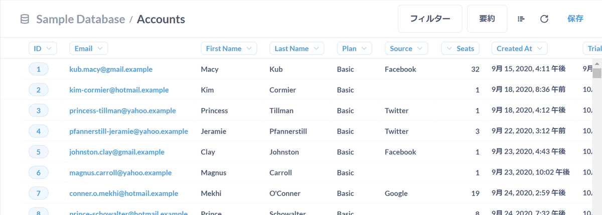
Common account data such as 'ID', 'email address', 'name', 'plan name', 'inflow source', etc. were lined up.
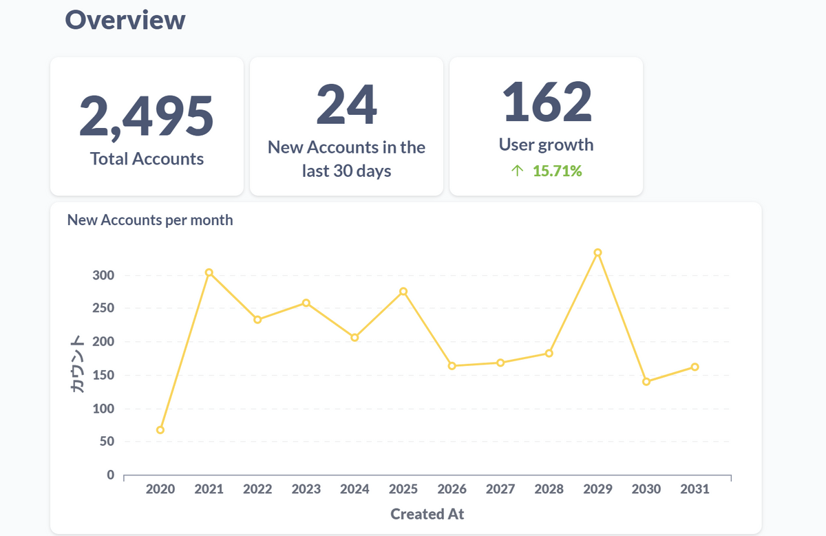
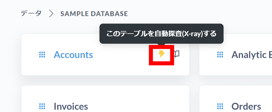
Return to the table list screen and click 'Automatically explore (X-ray) this table' under Accounts.
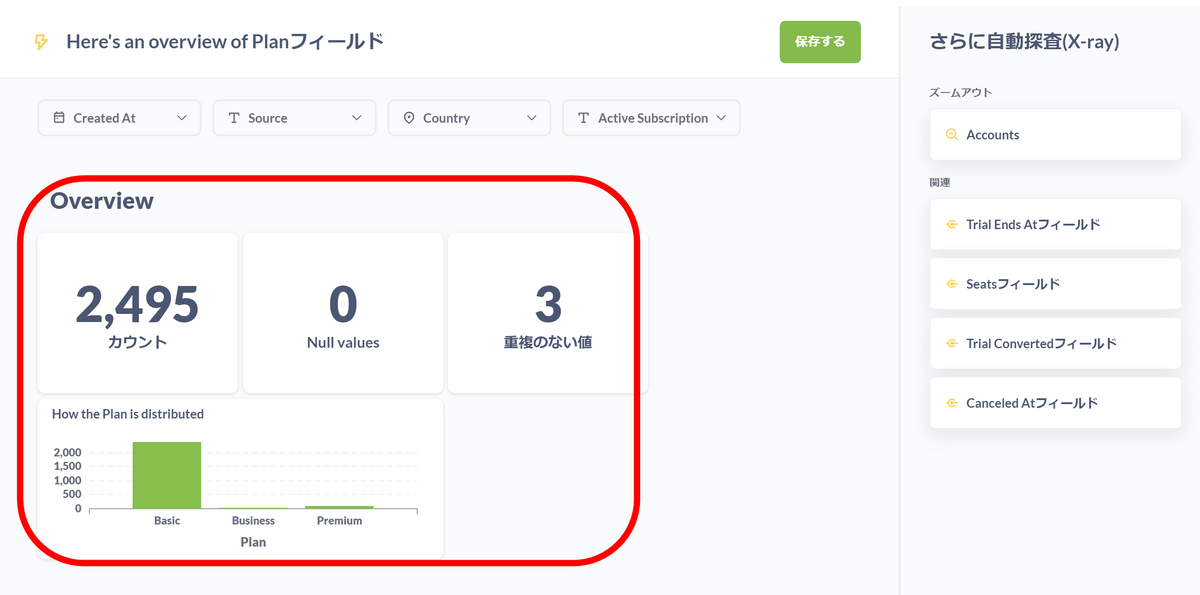
The automatic exploration function automatically generated information such as ``total number of accounts'', ``number of accounts registered in the past 30 days'', ``number of increased users'', and ``graph of number of new accounts per month''. It seems that automatic exploration can be used not only for table units but also for field units, and the fields that can be automatically explored are lined up on the right side. Click on the 'Plan field'.
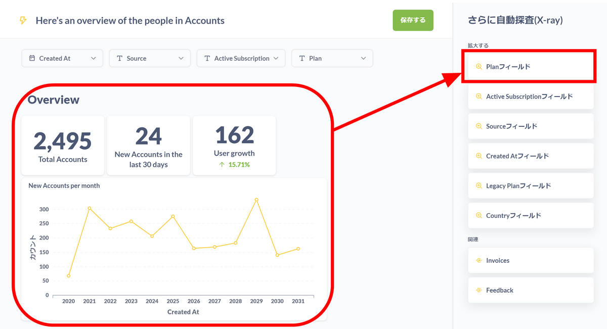
It analyzed and displayed the contents of the plan.
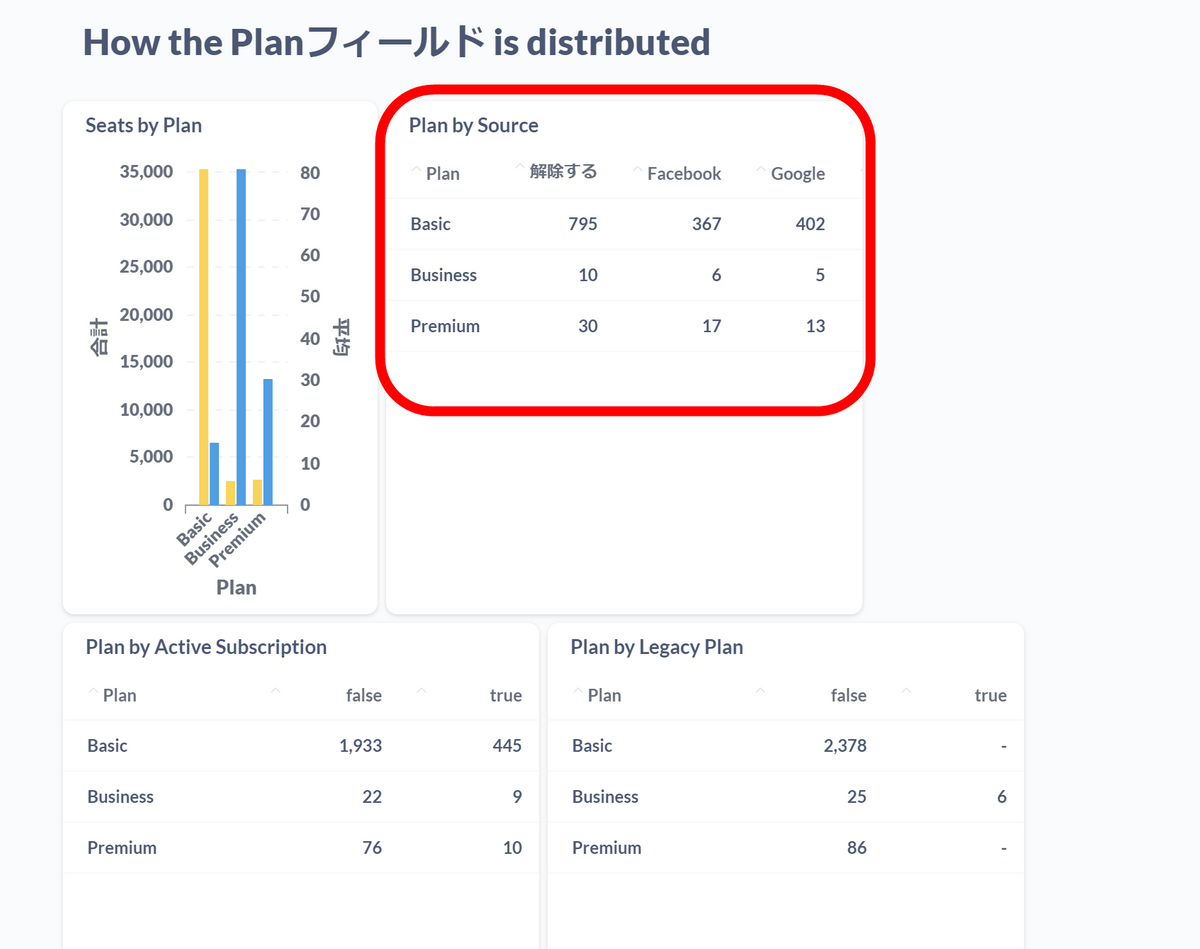
In combination with the inflow source data, a table is also generated that shows ``Which plan is subscribed to by the people who came from which source?''
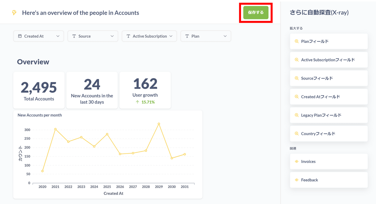
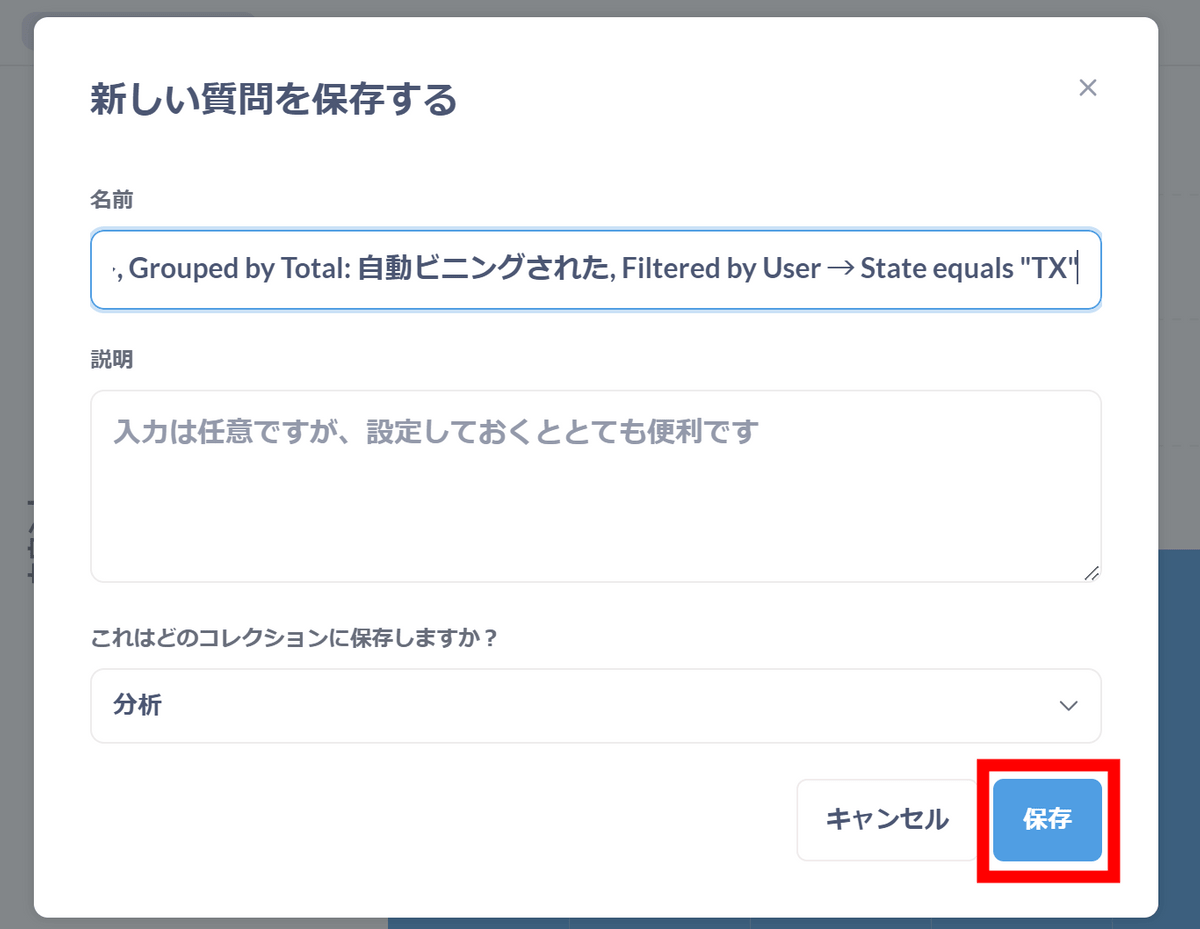
To save the dashboard generated by the automatic exploration function, click 'Save' in the upper right corner.
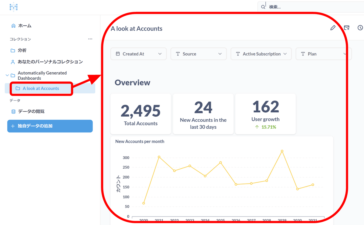
Dashboards are now saved in the left menu for easier access.
Let's check other tables as well. Click the automatic exploration button for 'Orders'.
Order data is summarized in various charts.
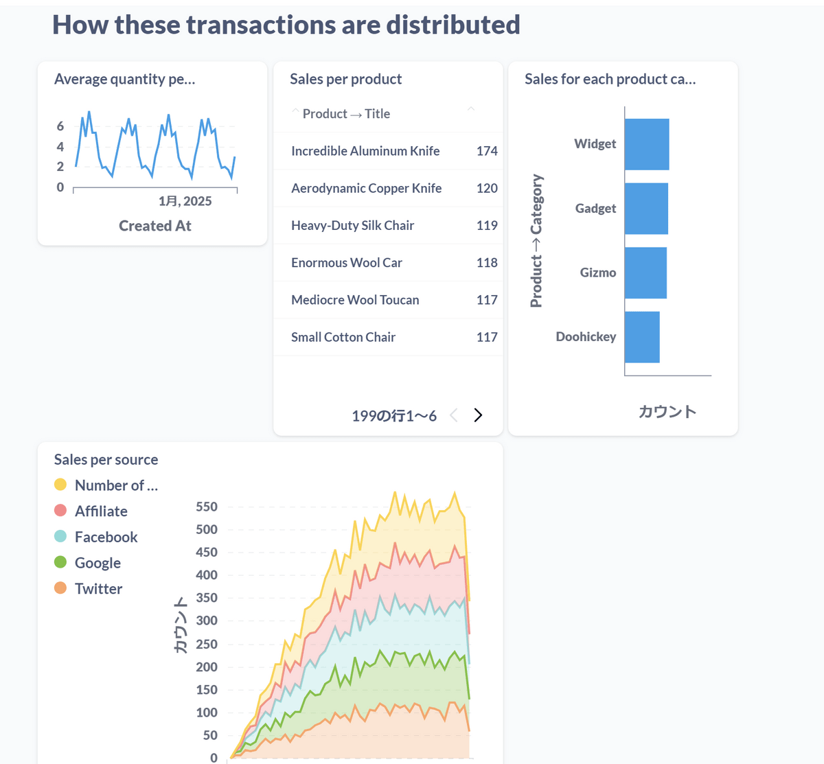
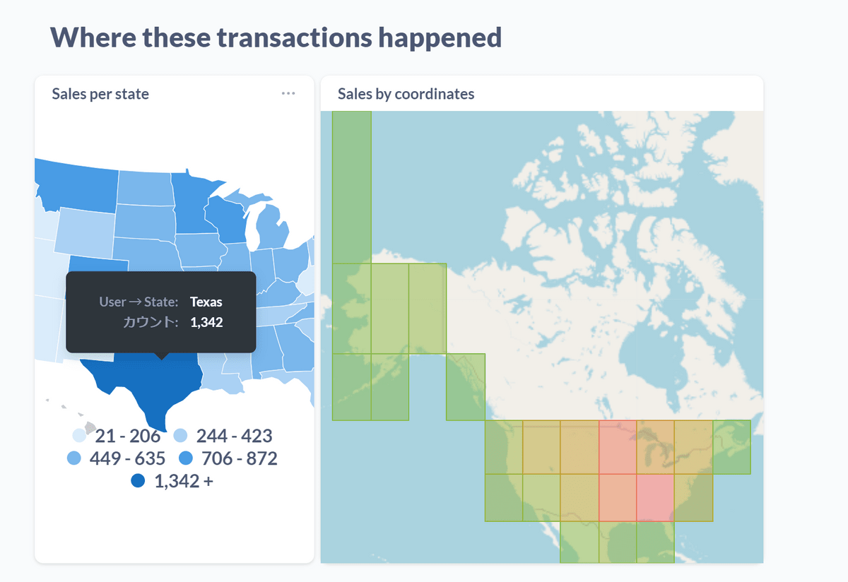
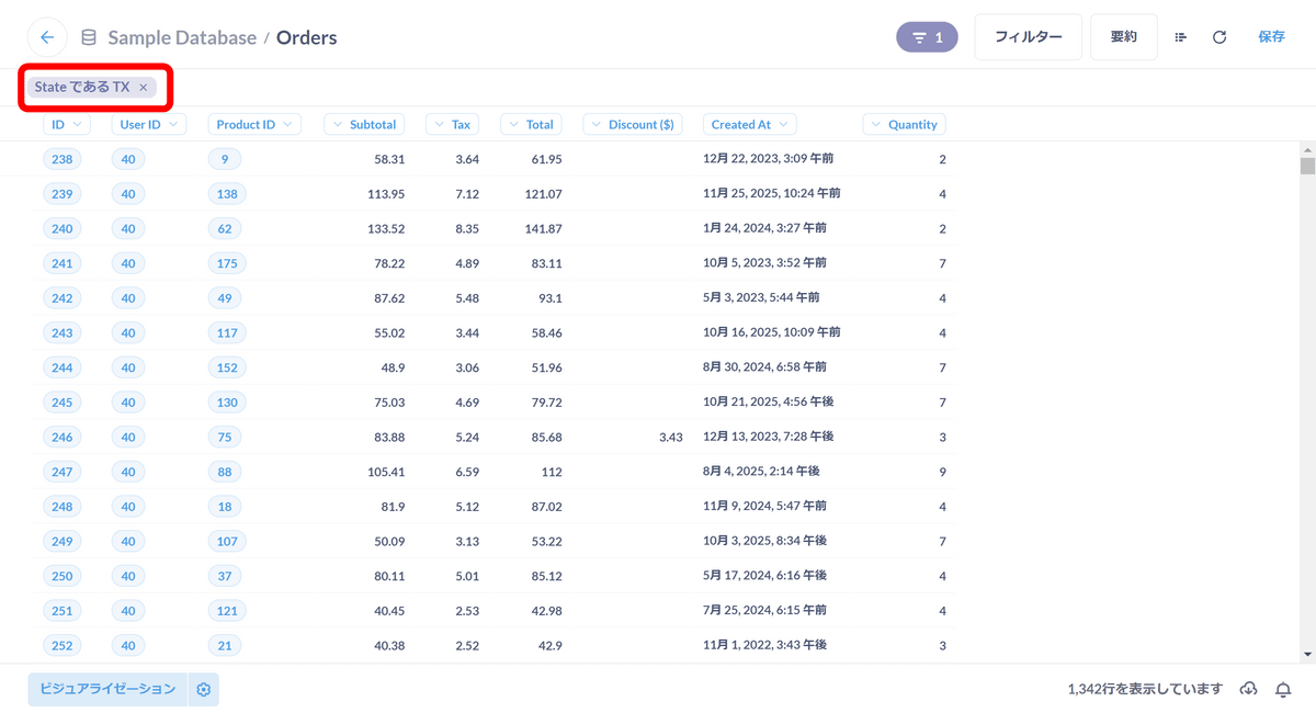
The number of orders by region was also generated. Apparently orders from Texas are overwhelming.
When you click on the map, a menu will appear, so click on 'I want you to see this Order.'
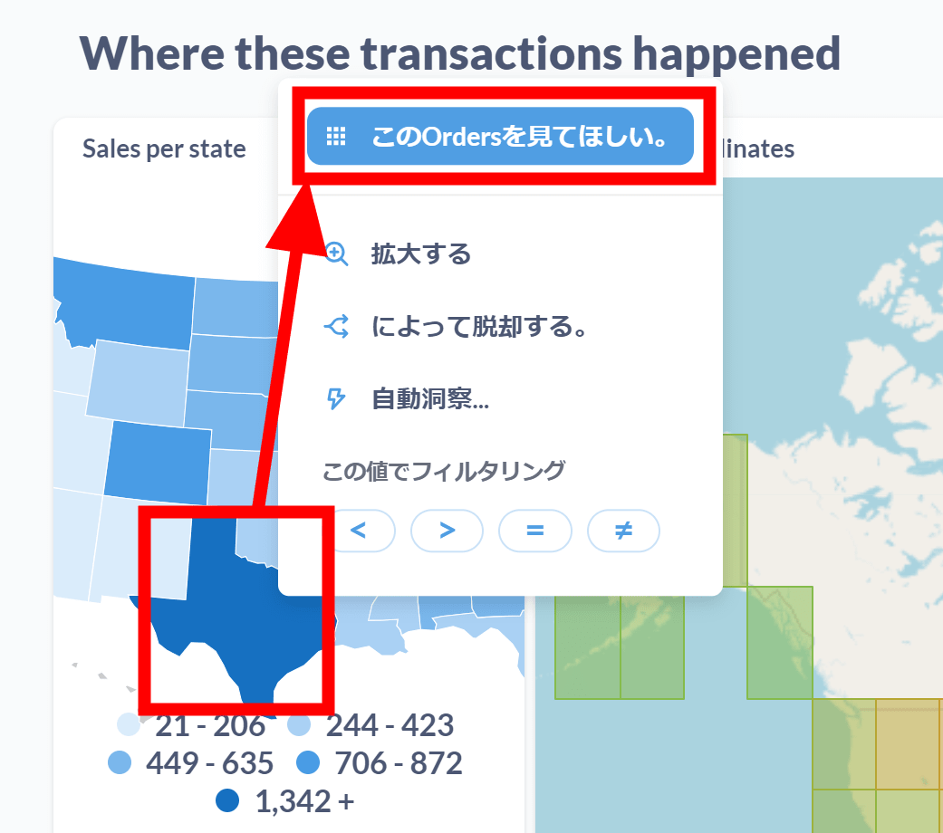
Then only orders from Texas were displayed.
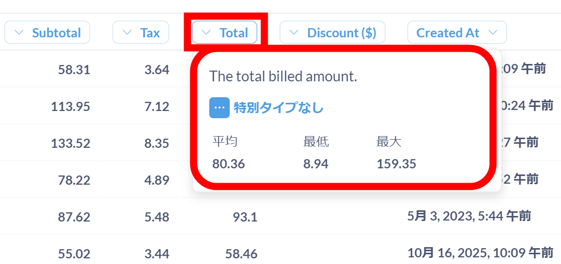
Hover over the column header to display the average, minimum, and maximum values.
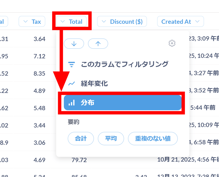
Click on the header and click on 'Distribution'.
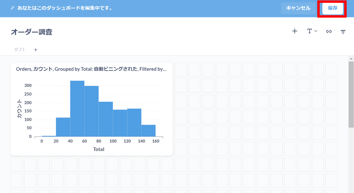
I was able to create a graph in one go. It seems that the sales per item are often between $40 and $80. Click Save to continue tracking your orders from Texas.
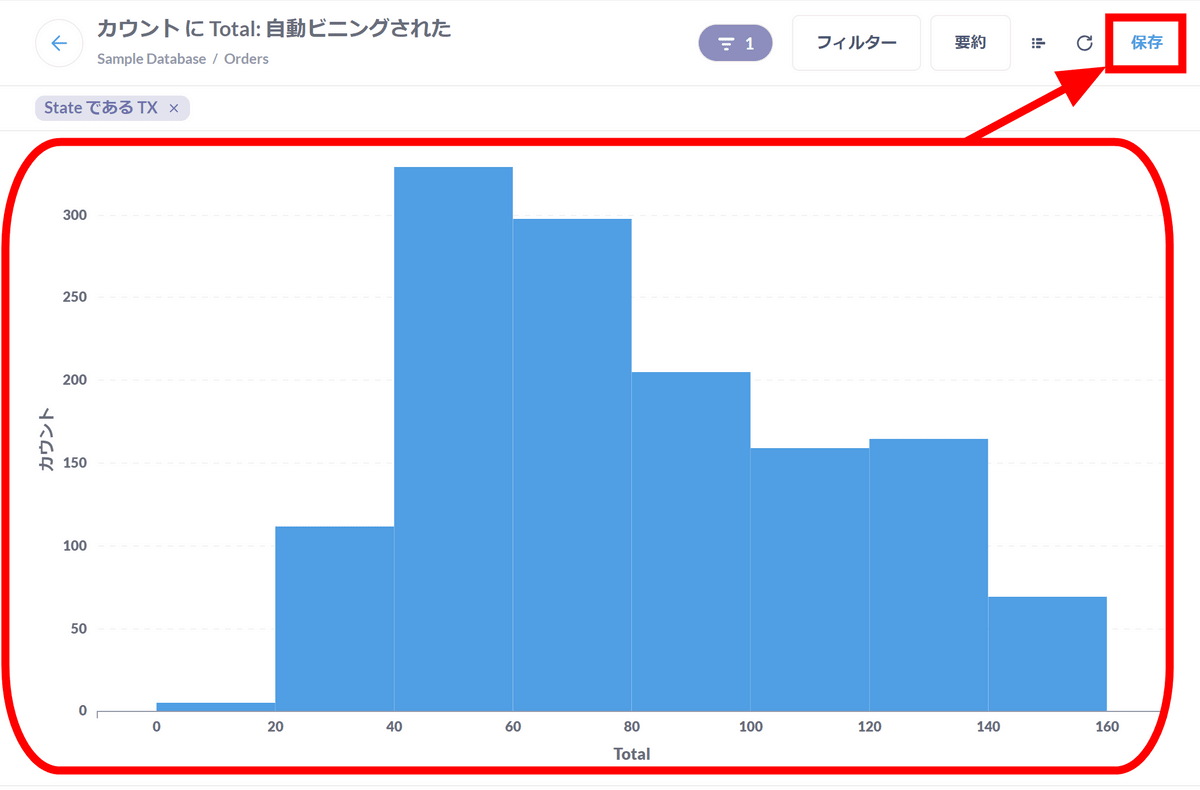
Click 'Save'.
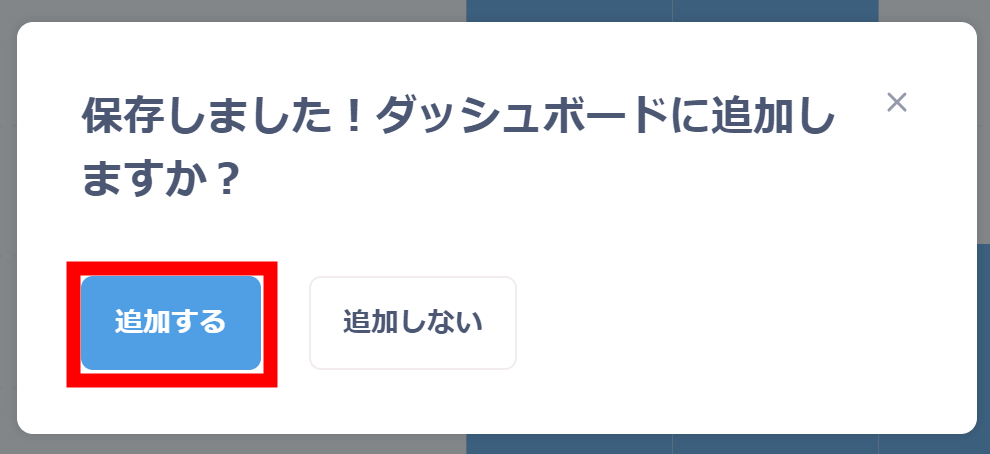
You will be asked if you want to add the graph to the dashboard, so click 'Add'.
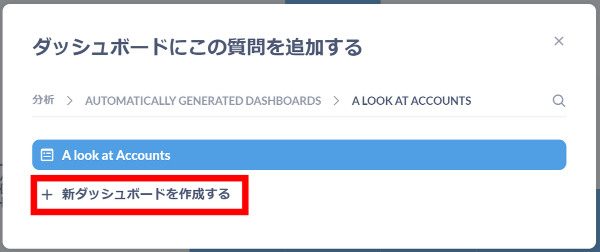
Click 'Create a new dashboard'.
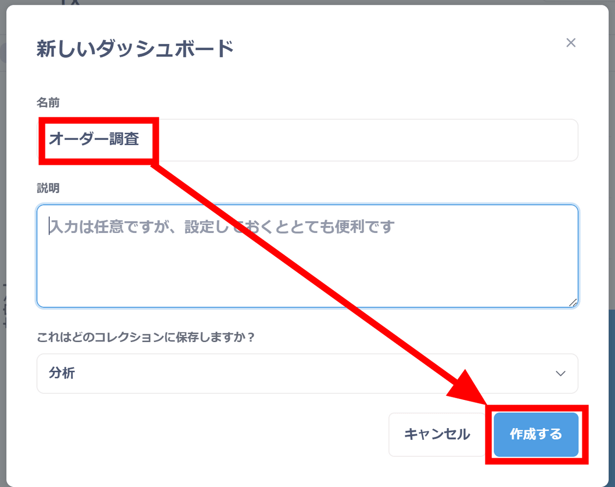
This time, I named the dashboard 'Order Survey'. Click Create.
A dashboard is created and the graph you saved earlier is placed on it. Click 'Save'.
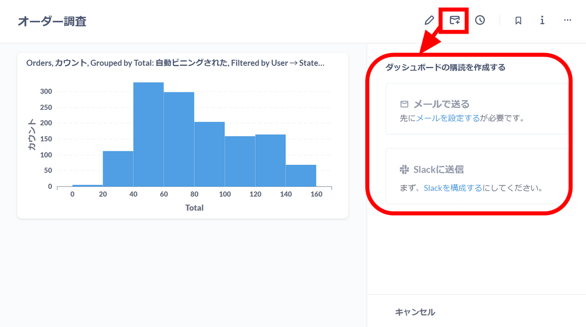
The dashboard has been saved. By subscribing to the dashboard, you can regularly check the status via email or Slack.
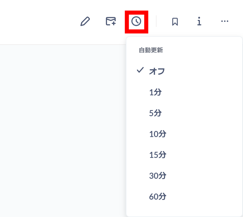
You can also set up automatic dashboard updates.
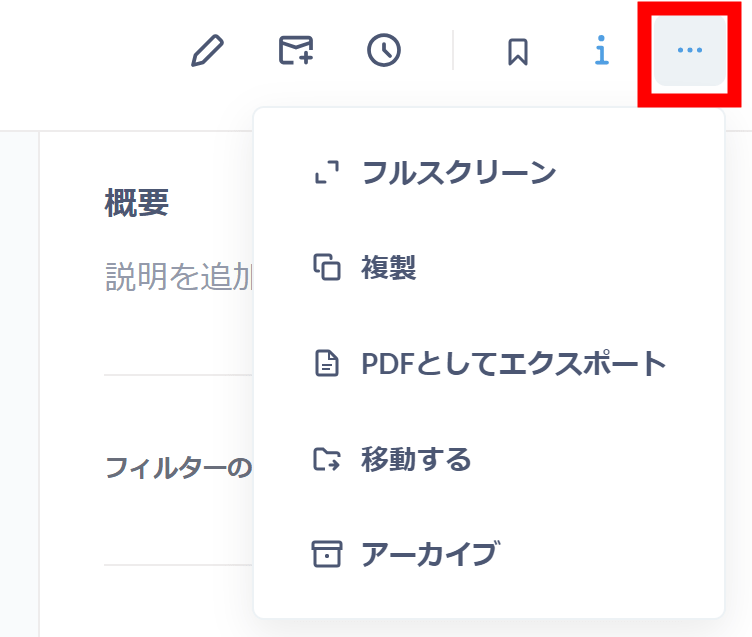
In addition, the '...' menu seemed to allow full screen display and export in PDF format.
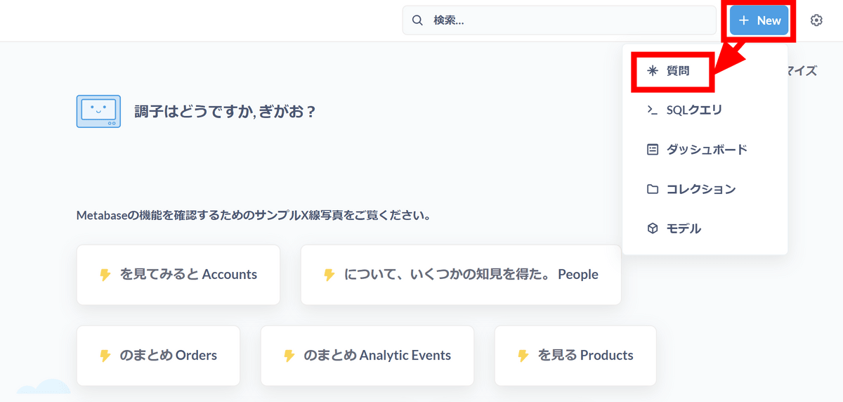
Next, let's check what kind of review rating the products have good sales. Click 'Question' from the '+ New' button in the upper right corner.
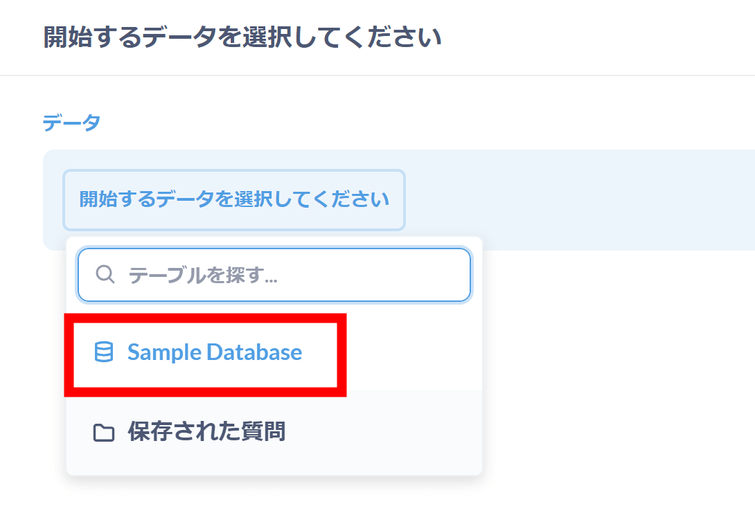
Click Sample Database.
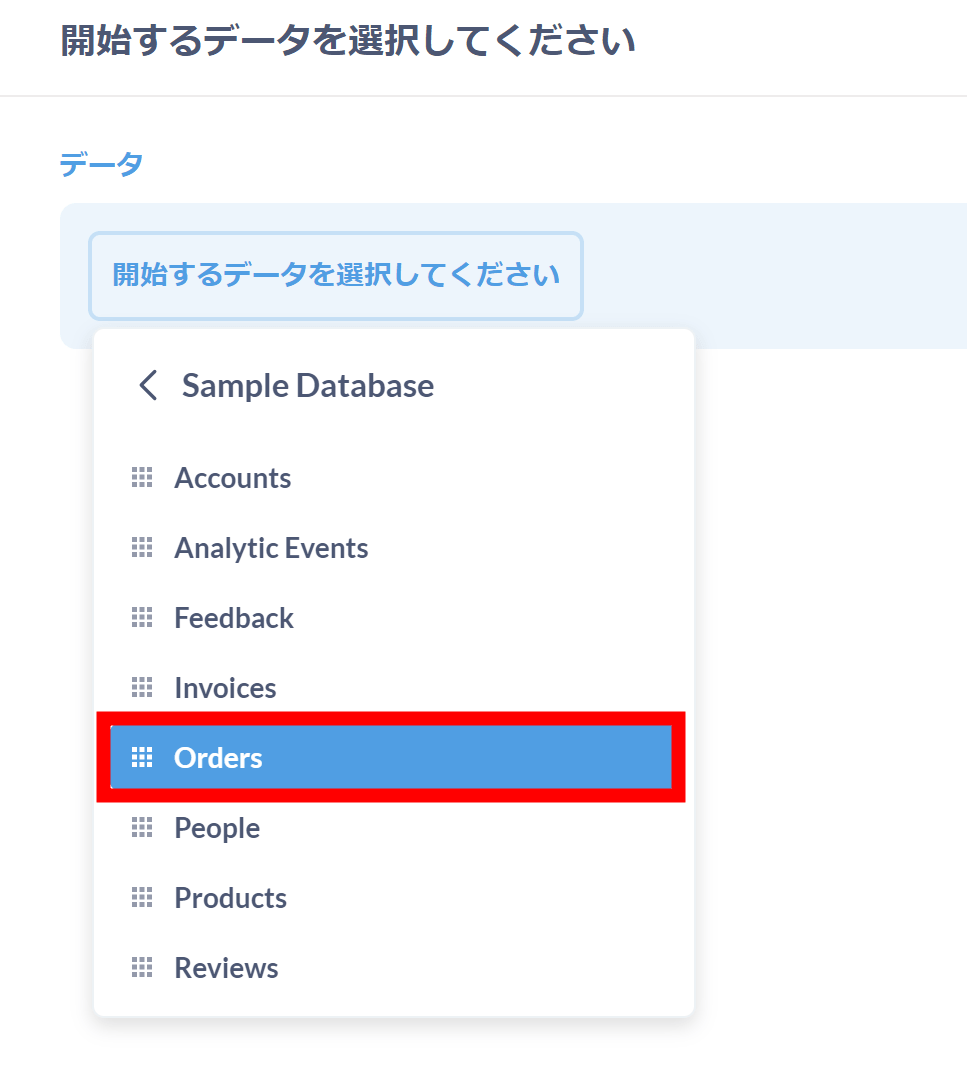
Click on the 'Orders' table.
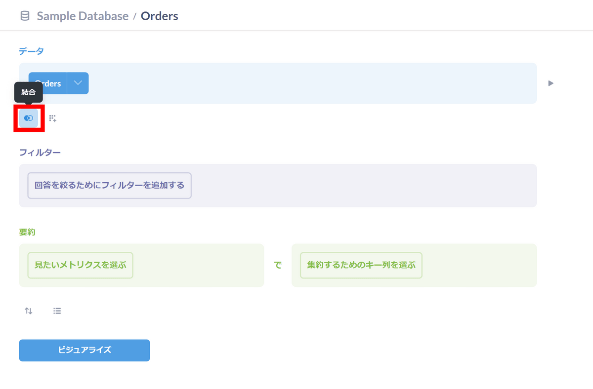
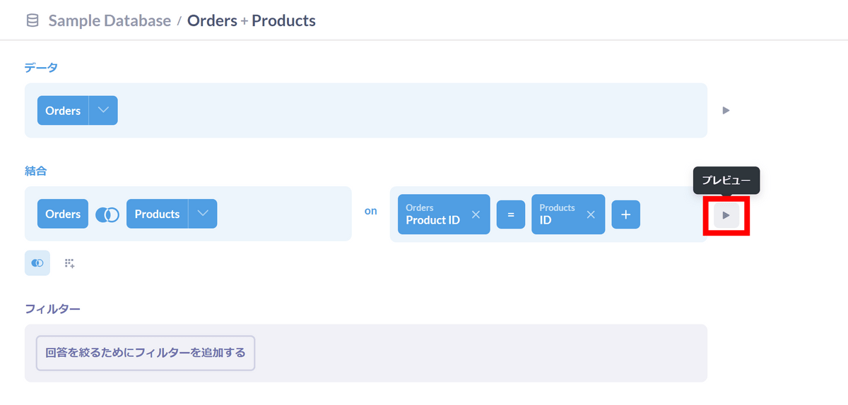
Since the Orders table does not have product review rating data, we will join it with the Products table. Click the 'Merge' button at the bottom of 'Data'.
Click on the Products table.

The join settings are now complete. Click 'Preview'.
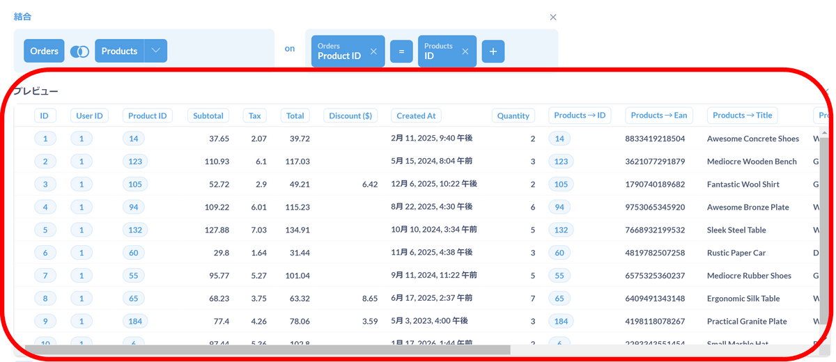
A preview will be displayed, so check that the data you want is properly combined.
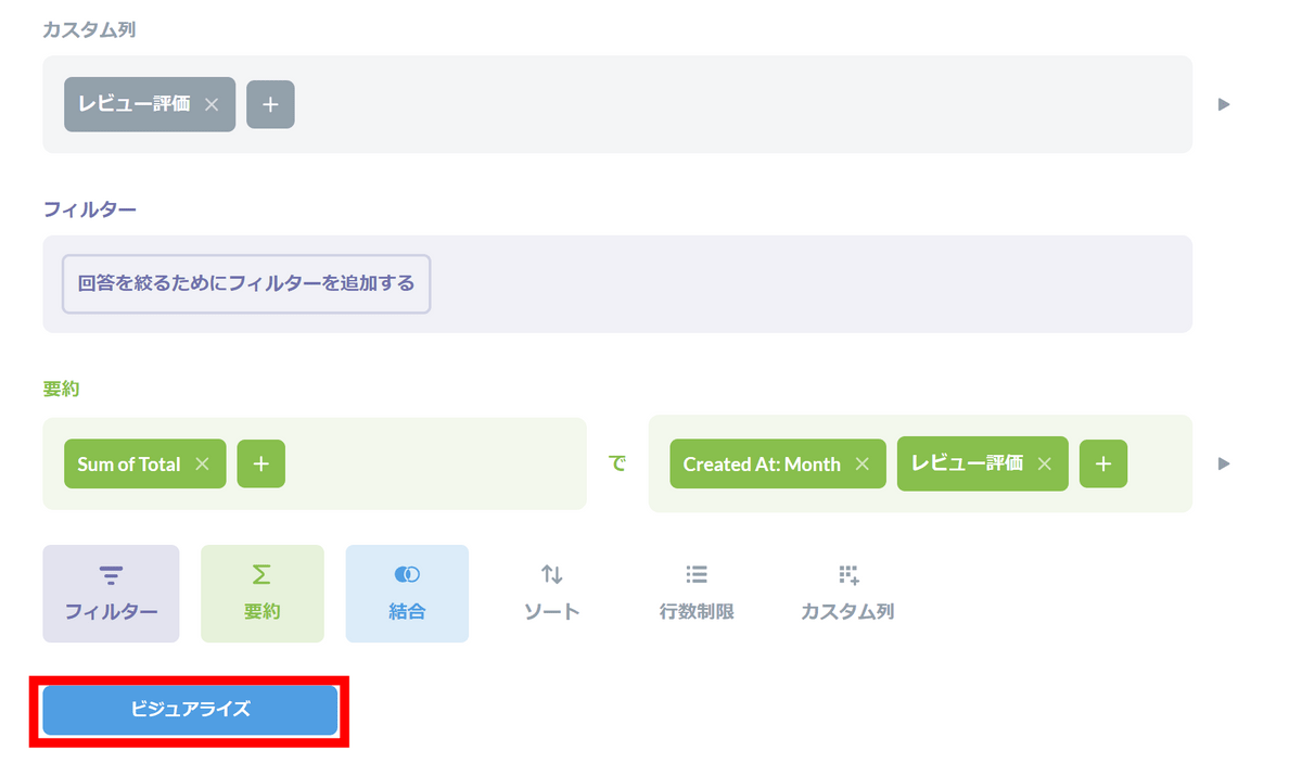
Review ratings are divided into detailed numerical values for each product, but this time we will roughly distinguish between 'high ratings' and 'low ratings.' Click 'Custom Column'.
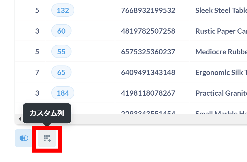
Custom columns allow you to create new columns using functions and equations.
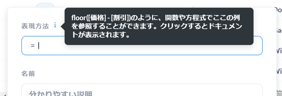
A friendly design where when you enter a function, an explanation appears immediately above it.
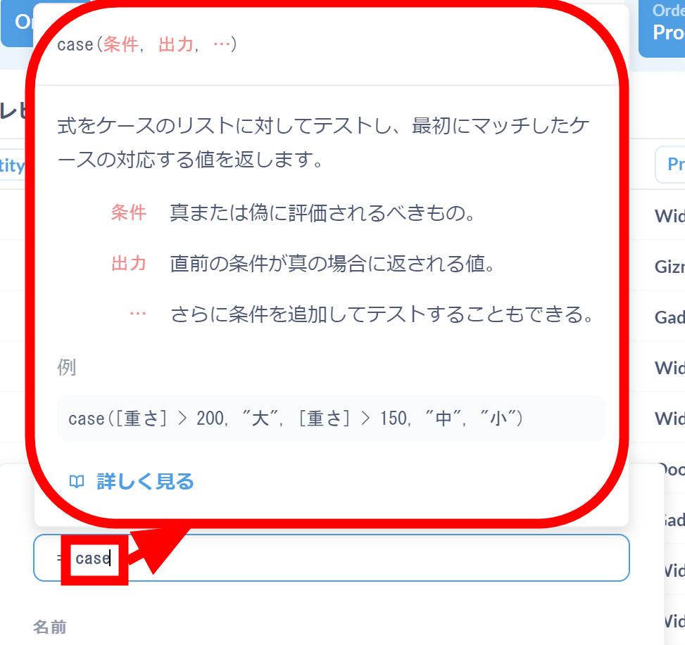
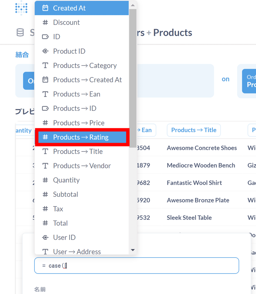
Also, when you enter '[', column auto-complete appears, making it easier to enter.
I added a column to determine whether the review rating is 4 or higher, as shown below. Name the column 'Review Rating' and click 'Finish'.
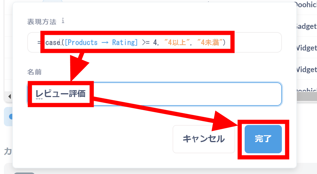
The custom column settings are now complete.
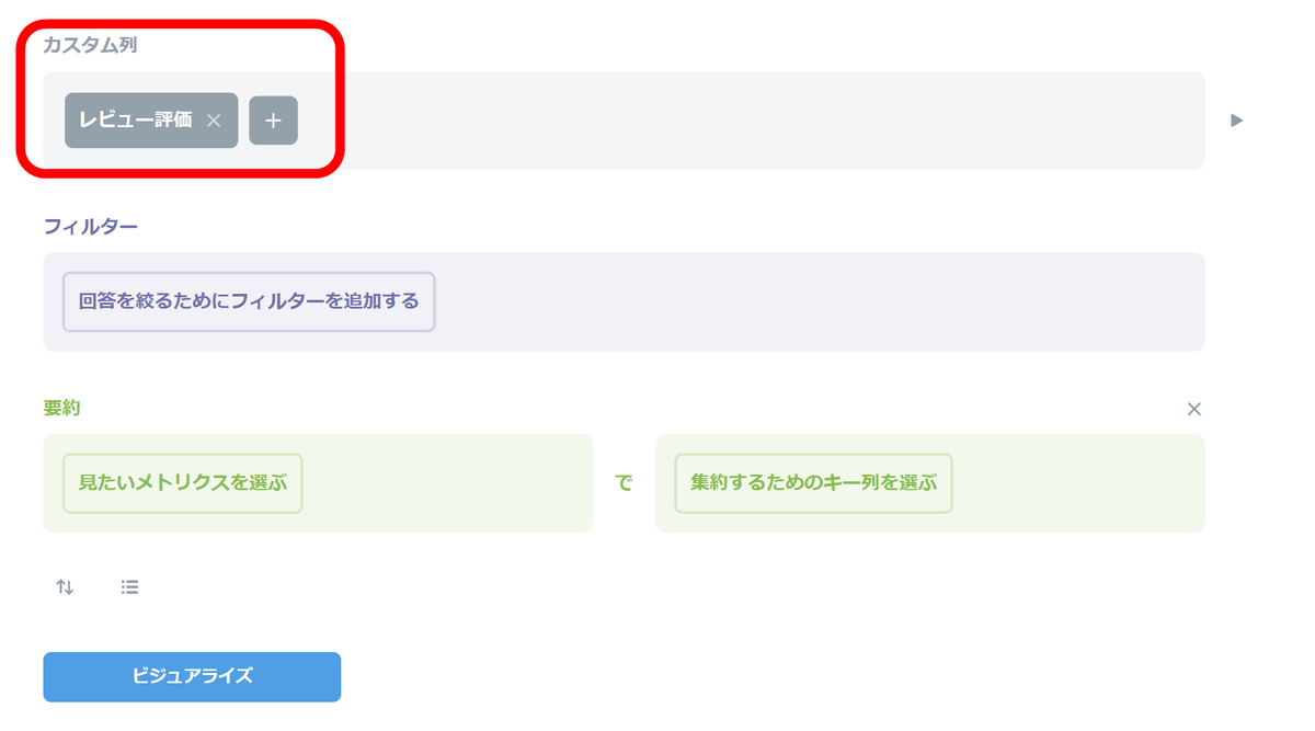
Finally, set the data to be drawn as a graph. Since we want the vertical axis to be the sales amount, first select 'Total of...'.
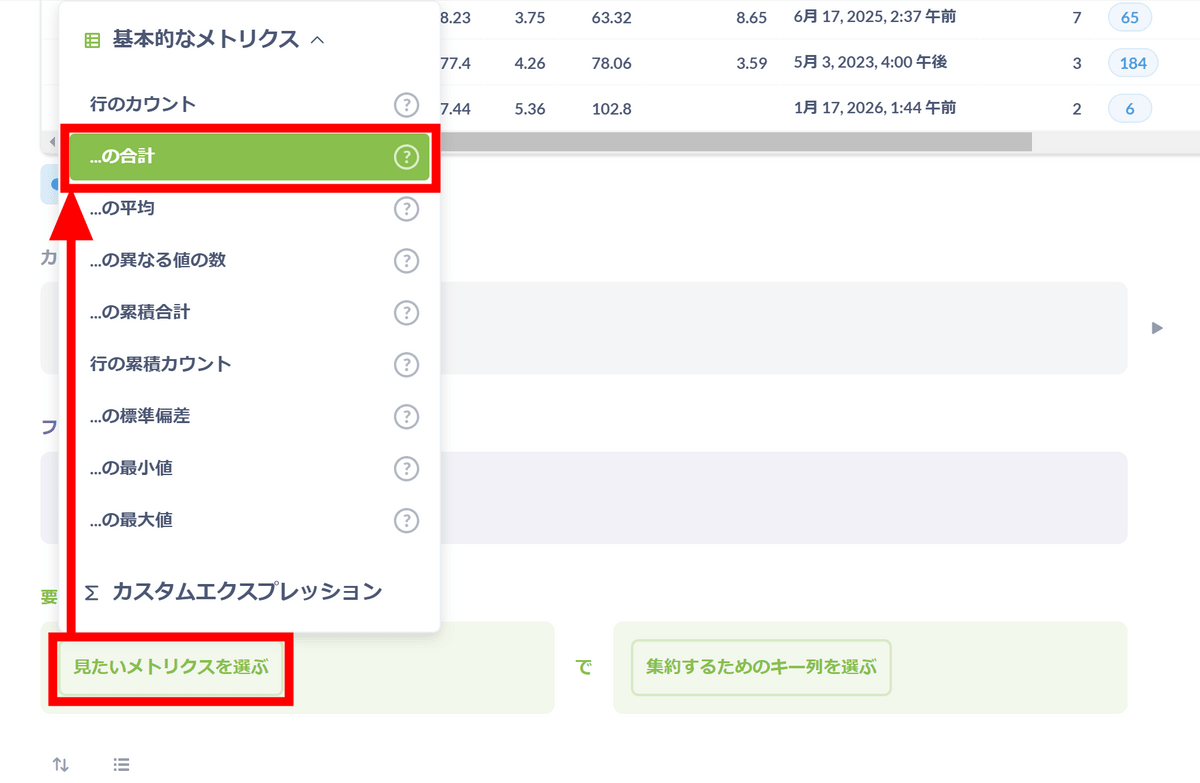
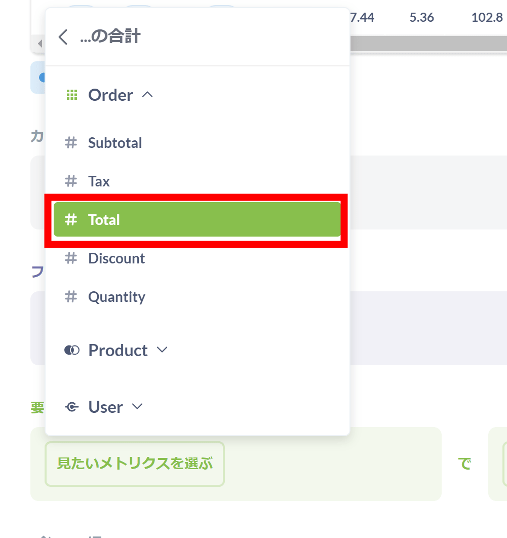
Next, select 'Total (sales amount including tax)'.
I want the horizontal axis to be the date, so click 'Select key column for aggregation' and click 'Created At'.
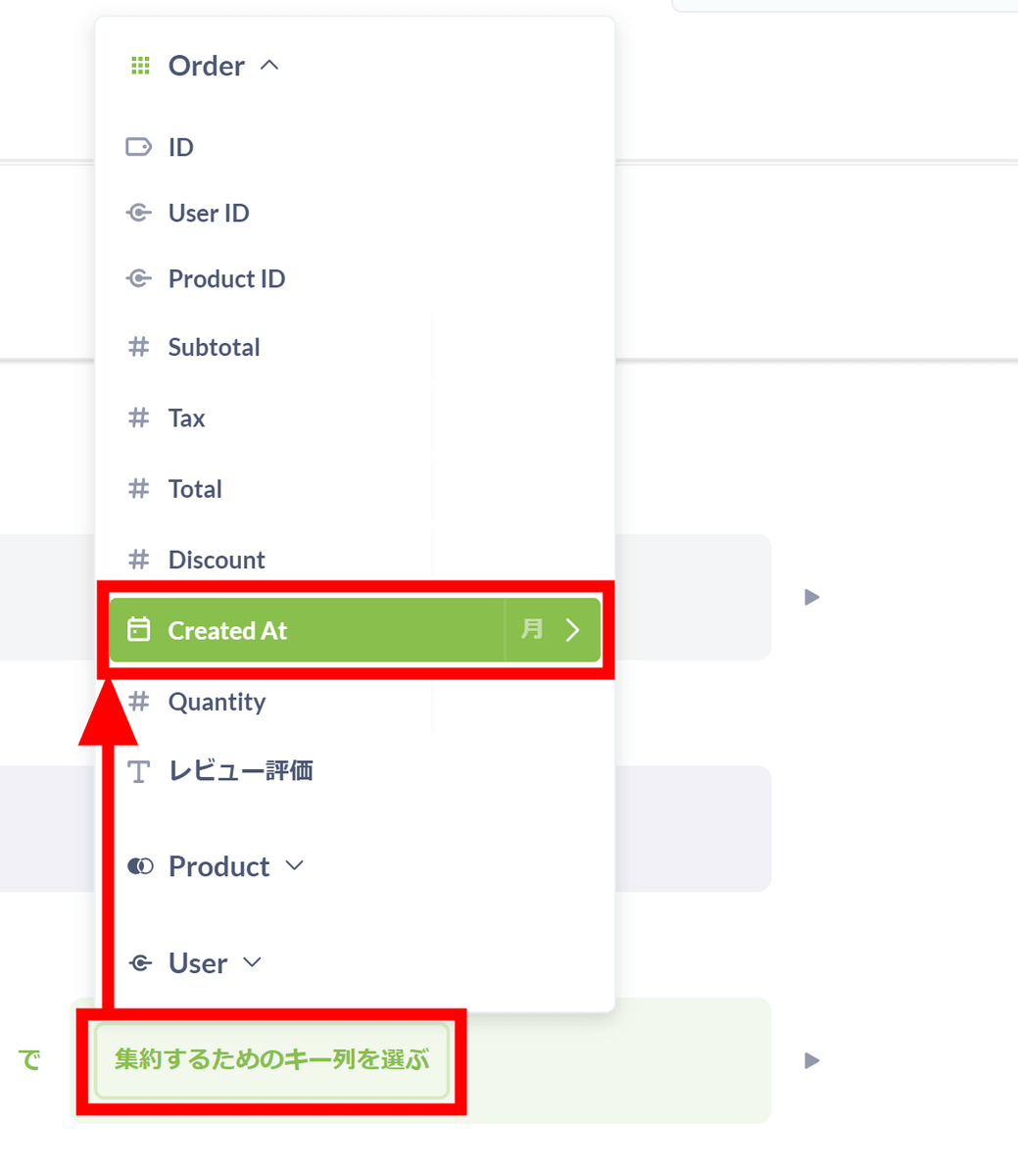
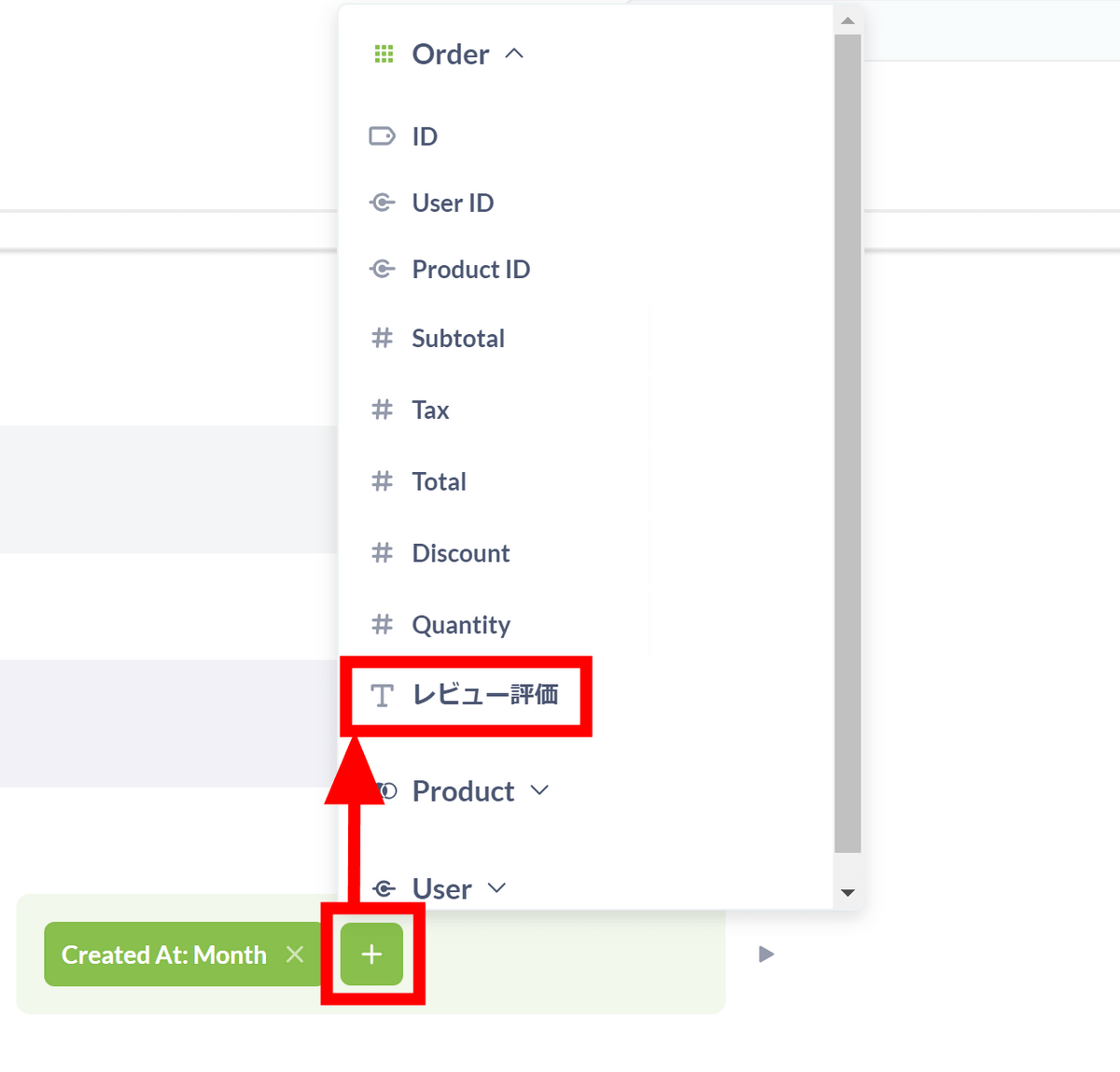
Furthermore, I wanted to separate the data by high and low review ratings, so I clicked the '+' mark button and clicked 'Review rating.'
Once the settings are complete, click 'Visualize'.
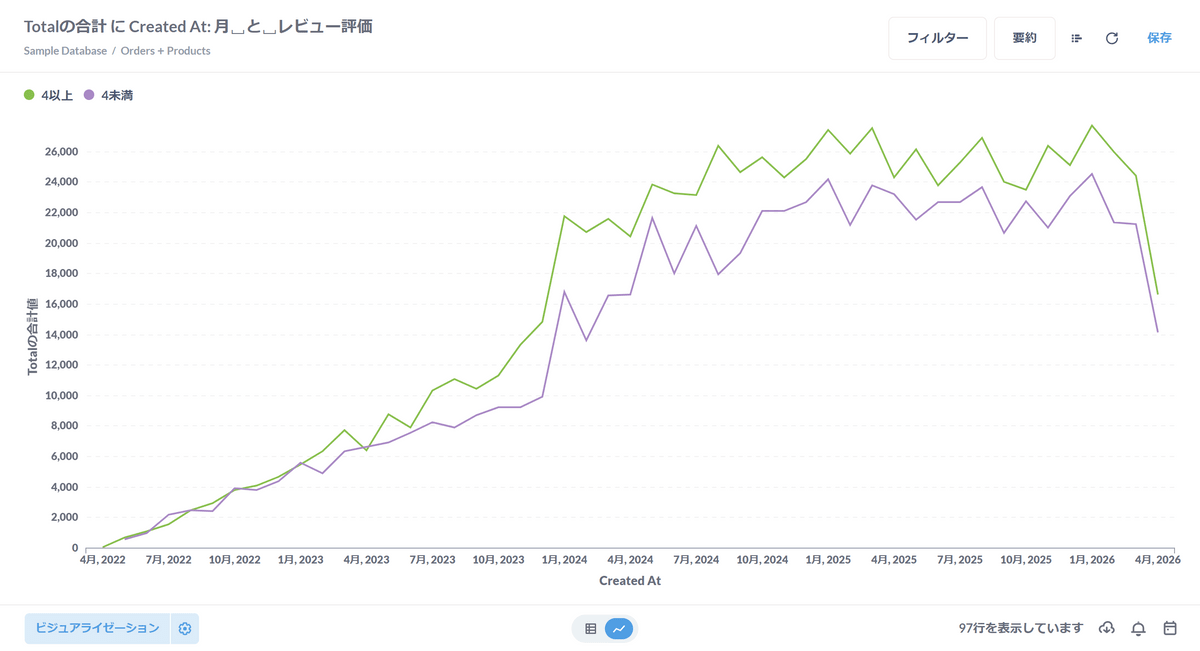
A graph has been generated. You can see that the total sales amount for products with a review rating of 4 or higher is slightly higher than for products with a review rating of less than 4.
Click 'Visualization' to change the graph type. I clicked 'Range' and then 'Finish'.
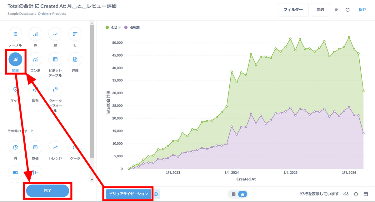
You can also narrow down the display to only that part by clicking and dragging a part of the graph to select the range.
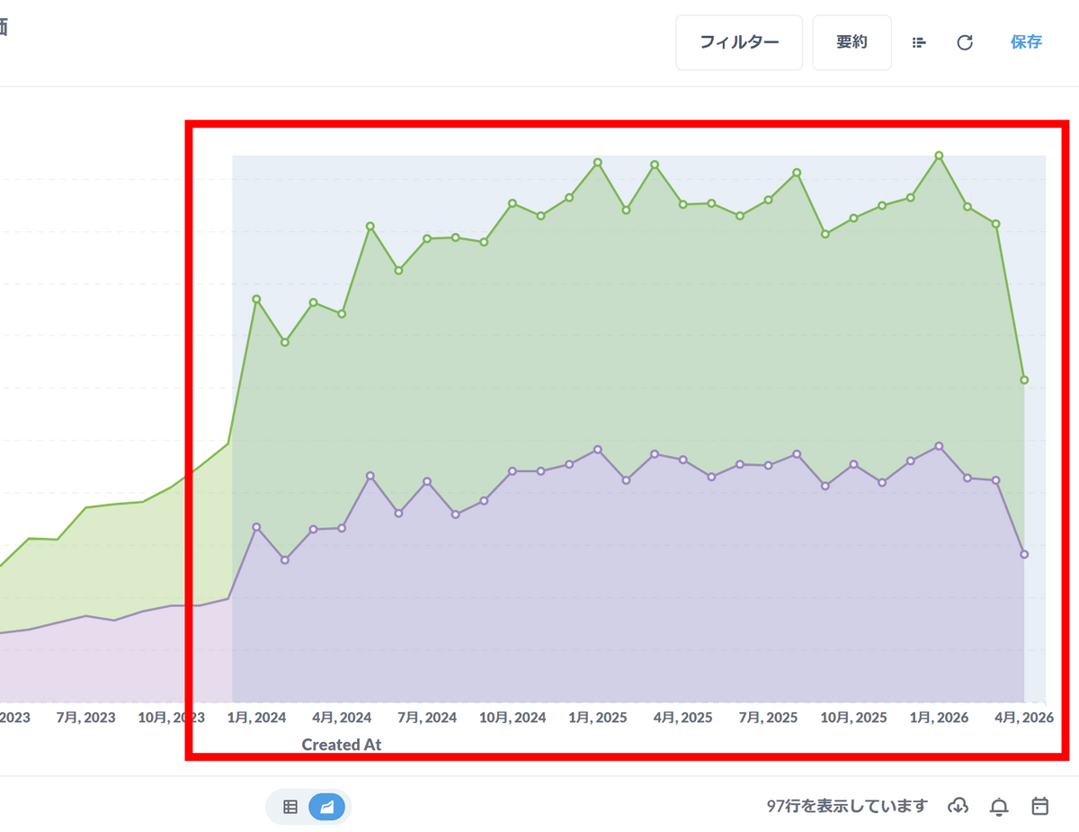
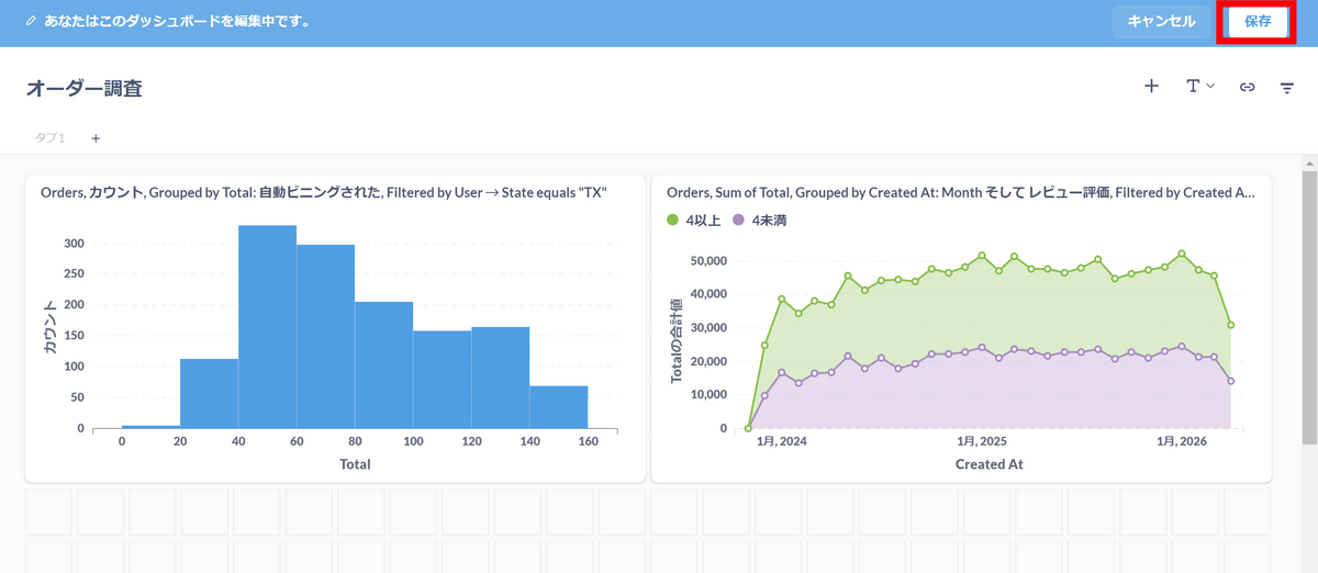
Filter information is displayed in the upper left corner. Click Save.
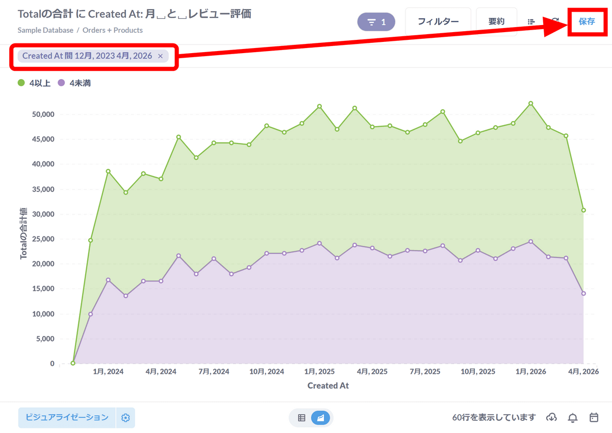
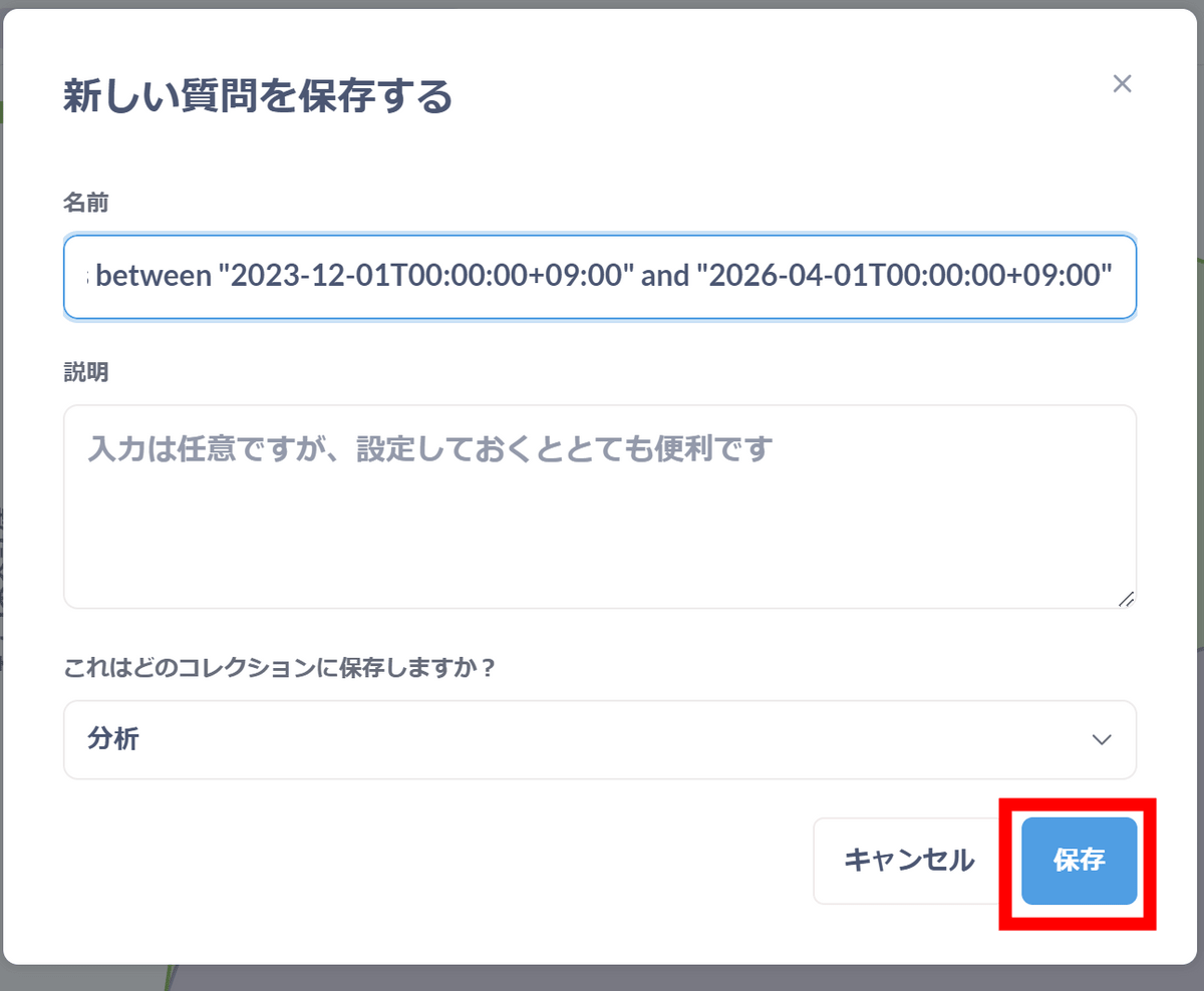
Click 'Save'.
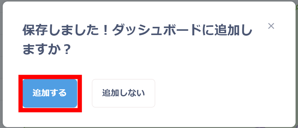
Click Add.
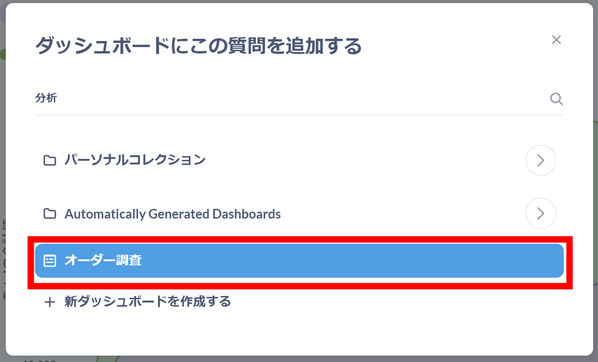
Click “Order Survey”.
I was able to add a new graph to the dashboard. Click Save.
Note that there is an item called 'SQL Query' in the menu of the '+ New' button.
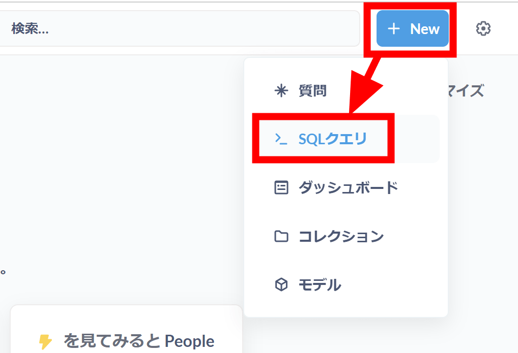
People who are confident in constructing SQL or who have already prepared SQL statements can extract and visualize data in the same way by executing SQL.
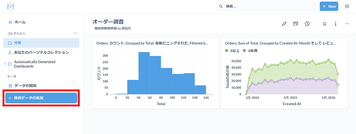
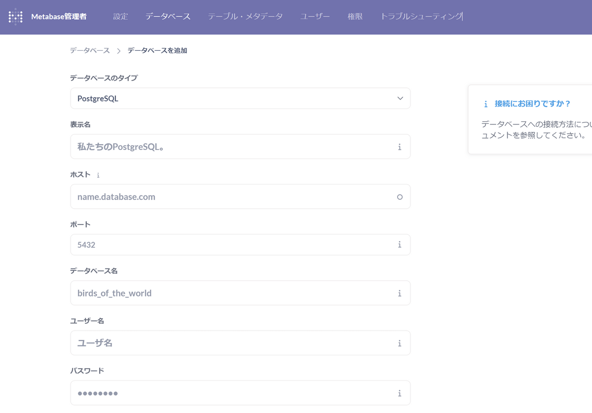
To use actual data, click 'Add your own data' from the left menu.
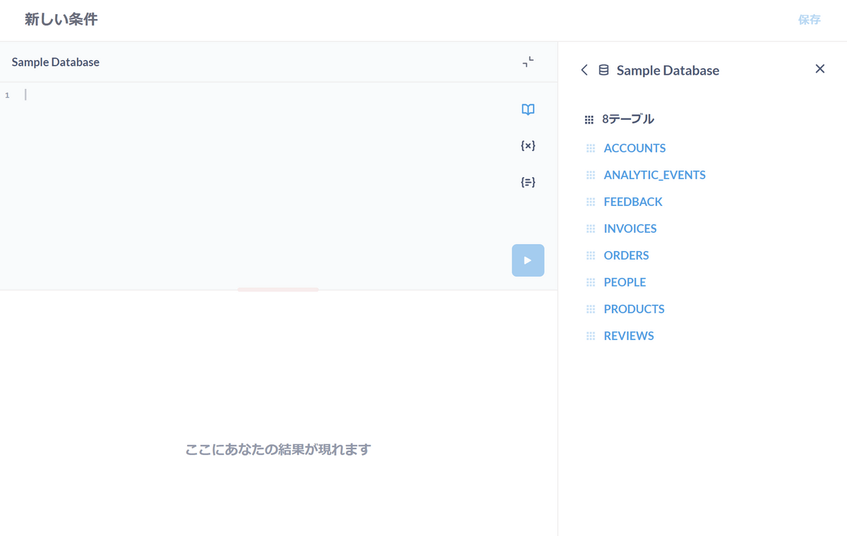
The screen shown below will then appear, so all you have to do is enter the connection information to the database here.
Now that we know how to use Metabase, next time we will use Metabase to analyze the results of the survey we received from readers during the GIGAZINE summer gift release project . looking forward to!
Related Posts:

in Review, Software, Web Application, Posted by log1d_ts