Website 'How I Experience Web Today' which is the most ironic website of the modern Internet full of waste
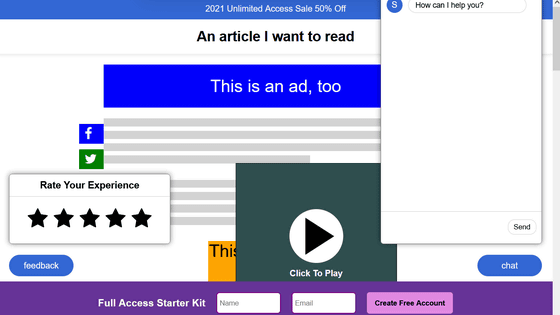
As technology continues to advance with the flow of time, we think that everything will become more convenient, but there is an opinion that websites on the Internet continue to go against the times and continue to become inconvenient. . ' How I Experience Web Today ' is a website where you can realize 'how inconvenient it has become' by embodying the way of the modern Internet.
how-i-experience-web-today.com/
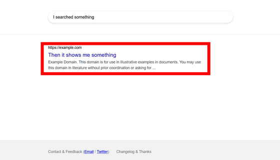
When you access 'How I Experience Web Today', a Google search-like screen called 'I searched something' is displayed. To display the following page, click 'Then it shows me something'.
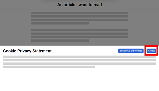
On the following screen, a banner 'Cookie Privacy Statement' appears. In response to the EU's '
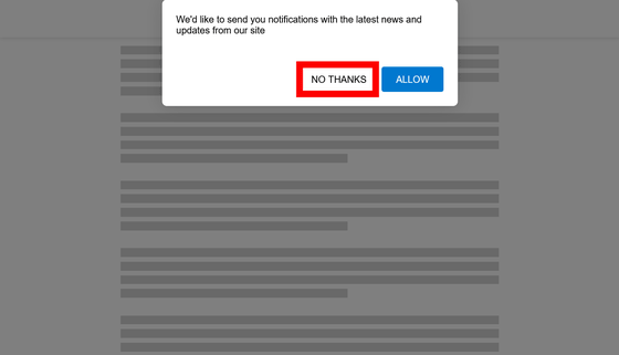
Then the next screen is displayed... Before that, a new popup appears from the top. This popup asks for permission for
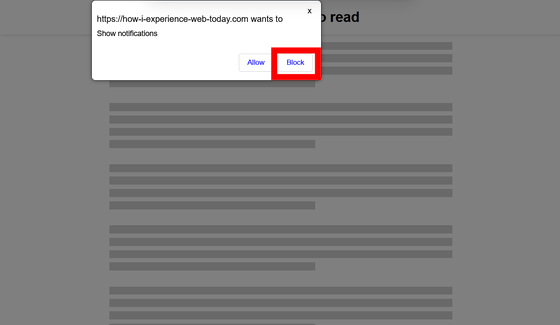
This time, 'https://how-i-experience-web-today.com wants to Show notifications (https://how-i-experience-web-today.com wants permission to display notifications)' , A pop-up asking for notification permission different from the previous one appeared. Press 'Block (block notifications)' while thinking 'You chose it earlier!' At this time, it was a button arrangement of 'No / Yes' earlier, but this time it is a button arrangement of 'Yes / No' that is reversed left and right as if it were a hook problem.
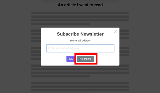
Finally, I thought that the target website ... ... and then a pop-up about subscription to the newsletter came out. Next with 'No, thanks'.
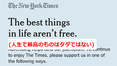
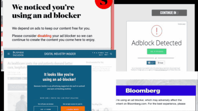
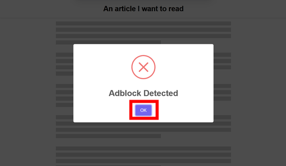
Next, a popup called 'Adblock Detected' appears with an x mark. Since many websites use advertisements displayed on the page as their main source of income, there are websites that require Adblock to be disabled in this way. Press 'OK' to next.
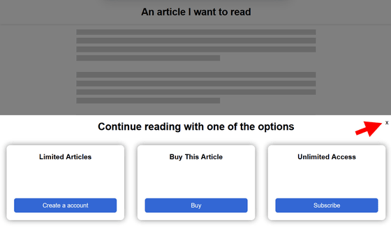
Then, at the bottom of the screen, the options 'Limited Access (limited plan for user registration only)', 'Buy This Article (purchase and read this article)', and 'Unlimited Access (flat-rate subscription plan)' appear. Since I want to read it for free this time, click the x mark in the upper right corner of the option.
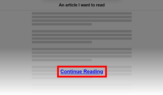
This time, an effect appeared that hides the page you want to browse halfway. Next with 'Continue Reading'.
Then, the target page was finally displayed, but banners such as `` 50% off annual subscription is possible! The whole page is very cluttered.
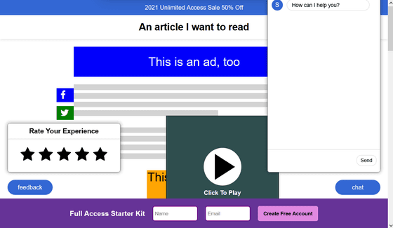
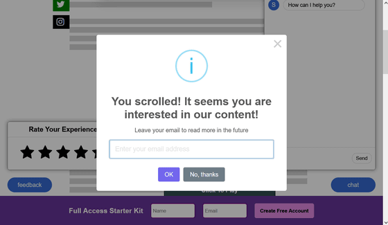
Still, when I scrolled the screen to read the text part somehow, I got the following message 'You scrolled! It seems you are interested in our content!' It is!)” A pop-up prompting for registration appears. It makes me feel like, 'Even though it's hard to read, it's this treatment ...'.
In this way, 'How I Experience Web Today' is a website that sarcastically asks, 'How difficult is it to read modern websites?' In the Hacker News thread about this site, there were voices saying, 'Sad but this is the reality' and 'I want it to load slower and make it more realistic because it loads too quickly.'
Related Posts:
