What You Need to Understand to Distinguish Website Design 'Dark Patterns'

Many websites and apps that exist on the Internet, such as shopping sites and online services, use a ' dark pattern ' that deliberately fools the user. Dark patterns are used to promote consumption and collect personal information, but why dark patterns have become a big problem in recent years, what is behind dark patterns, what to understand etc. Has been spelled out by computer scientist Arvind Narayanan and others.
Dark Patterns: Past, Present, and Future-ACM Queue
The 'dark pattern' design is often used on various websites, such as shopping sites and search engines, to deliberately fool users. There are various patterns in the dark pattern, such as 'Decoy business method' in which 'Like' is pressed when a movie should have been played, and 'Camouflage advertisement' in which an ad is disguised as content and invites clicks. You can read it below.
Various designs `` dark patterns '' intended to trick users-GIGAZINE

by Thomas Guignard
The dark pattern is widely used on websites such as shopping sites, and a survey published in 2019 reported that 140 shopping sites had a countdown timer to deceive users. Also, it has been found that 95% of Android applications include (PDF files) dark patterns and are also used in US tax payment software ' TurboTax ', and users can operate their actions without their knowledge. I am.
In the background of why the dark pattern has spread so far in the world of the web, there are three elements of 'fraud of retail industry', the emergence of 'nudge theory' of behavioral economics, and ' growth hack '. It exists.
◆ Fraudulent practices in the retail industry
In the first place, there are practices in the retail industry that try to manipulate the psychology and behavior of consumers. This is '' The price that has been displayed in a fraction of 1980 yen 'show cheap goods,' such as method and, after the discount front and discount parallel price illegal, such as beginning from legitimate psychological operations such as, 'Notice of false closed.' However, the content varies, including practices that are rarely punished.
◆ The advent of nudge theory
Since the 1970s, researchers have been trying to understand why people make irrational decisions. An irrational decision here means, for example, that even though a car has a higher accident risk per mile (about 1.6 km) than a plane, many people say that 'a plane is more dangerous than a car'. It is included in the judgment.
In a past study, I showed multiple wines with a random last two digits of my social security number, and then asked how much I could pay for the wine, the higher the number, the greater the maximum payment I would offer. The result is. This is called the anchoring effect, and it is believed that without knowledge of market value, one would make a skewed estimate based on an arbitrary reference value.

This early theory of human cognition was developed in the 2000s by the behavior economist Richard Sailor and legal scholar Cass Susteen, who called the idea of 'nudge.' Nudge means “lightly poke with your elbow” and refers to a method that encourages consumer behavior.
Examples of nudges include 'displaying' recommendations 'only on specific menus in restaurants' and 'displaying footprints on the floor in front of the cashier so that consumers can stand there'. Due to its high effectiveness, it is used not only to encourage consumer behavior, but also in public policy.
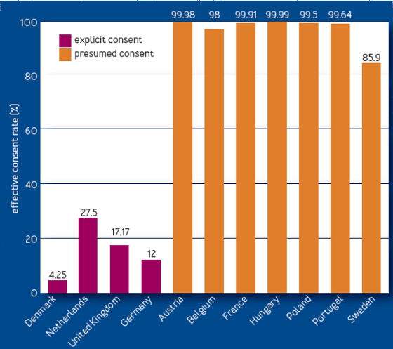
The graph showing the consent rate of intention presentation of organ donation is a famous graph showing the effect of Nudge theory. In the graph below, consent rates for organ donation in countries such as Denmark, the Netherlands, the United Kingdom, and Germany, which are shown in red, are low, and those in Austria, Belgium, France, and Hungary, which are shown in orange, are high. This is because the countries shown in the red graph must clearly indicate their willingness to provide, while the countries shown in the orange graph take a presumed form of consent.

Many accept the default state and try not to make changes. As a result, orange countries will have a higher consent rate.
Nudge was originally advocated as 'to support what is in a strong position, but what is in a weak position.' However, the use of nudge in business in recent years is not so. Nudges that have come to be used as dark patterns are called 'Sludges' by Sailor and Sustain.
◆ Growth Hack
Growth hack is a marketing concept focused on “growth”. A typical example is performed by Hotmail. Hotmail is not a method of 'advertising' as in the past, but instead of the method of 'putting free mail with Hotmail' automatically in the mail sent by users. At that time, it was a novel method. This method has greatly expanded Hotmail.
Growth hacks aren't fraudulent in nature, but startups such as vacation rentals often face the question of 'chicken or egg.' In other words, at first there is no 'host' to rent out the inn, and no 'traveler' to rent out the inn. For this reason, in order to grow the service, it is customary to post fake lodging places and 'seeding' at the beginning.
Because of being caught by the growth hacks, some startups often use methods such as 'secretly access the user's contact book,' which can lead to legal issues. LinkdeIn of business-focused SNS is installed on the button 'to your contacts send the invitation' of similar design as 'proceeding' at the time of registration, as was misled the user

Online services have the advantage that changes in consumer behavior are easier to collect and analyze as data, compared to offline retailers. Also, because it is an environment where A / B tests are easy to carry out, the good compatibility between the growth hack and the dark pattern is one of the factors contributing to the increase in dark patterns in recent years.
◆ Purpose of dark pattern
The purpose of the online dark pattern is, first of all, to 'encourage consumers to spend more,' as when they are offline.
In addition, one of the purposes is to 'violate the privacy of users'. The EU passed the General Data Protection Regulation ( GDPR ) in 2018, which required explicit consent for user tracking, but dark patterns are also used to bypass such regulations. Many of the designs for the cookie consent dialog are also based on the dark pattern.
And 'making the service highly addictive' is one of the purposes of the dark pattern. Dark patterns are also used to help users stay in the app for longer periods of time, collect more personal information, and display more ads.
The dark pattern itself has existed for more than 10 years, but in recent years the number of companies using the dark pattern has increased, and it is a problem that websites can adopt them with a few lines of JavaScript. It is said that it has been done.
What designers can do to avoid falling into dark patterns
Actually, even if you do not intend to use the dark pattern, if you are conducting A / B testing, the dark pattern may be adopted as 'you can see an increase in revenue'. It is said that the changes in the advertising label added to the display of the Google search results correspond to it. Google got a lot of criticism and immediately reverted this change.
Google changed specifications so that search results and advertisements could not be distinguished at a glance, criticism from various places-GIGAZINE

It has been pointed out that at least one or more “A / B tests to measure long-term effects” should be performed in order to avoid falling into such traps. Measuring click-through rate and user retention is another way to avoid dark patterns. If users complain, these numbers are likely to change.
Also, when the dark pattern is born, there should be a disagreement in the values between society and companies, so it is important to incorporate an ethical perspective into the design, such as 'when fun becomes addicting?' In addition, recognizing that the dark pattern is “abuse of the power of the designer”, it is also called for self-regulation in the industry, such as creating guidelines for ethical design.
Related Posts:
in Design, Posted by darkhorse_log


