Pointing out that `` dark pattern '' fools users intentionally is used more widely than expected on shopping sites

by
“ Dark pattern ” is a web design that uses a psychological mechanism to trick users into intentionally inducing behavior in the direction of profit for the company. A study conducted by the Princeton University research team revealed that dark patterns are being used in a wide range of online shopping sites.
Dark Patterns at Scale
https://dl.acm.org/citation.cfm?doid=3371885.3359183
Dark Patterns at Scale: Findings from a Crawl of 11K Shopping Websites
https://webtransparency.cs.princeton.edu/dark-patterns/
'Dark patterns' trick you into spending more online-Futurity
https://www.futurity.org/online-shopping-dark-patterns-2230962/
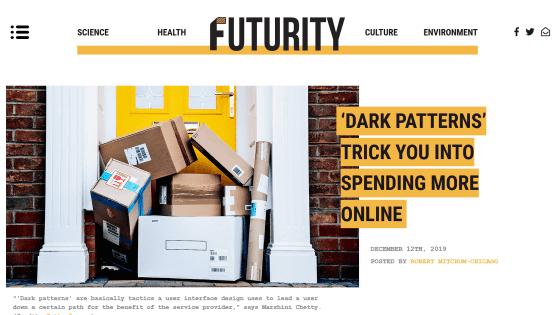
The dark pattern was named by London designer Harry Brignull for a web design that would engage and benefit users. Web designers are said
A research team from Princeton University graduate student Arunesh Mathur conducted a crawling survey of more than 50,000 items on 11,000 shopping sites to find known or new dark patterns. As a result, it was found that over 1800 dark patterns were detected on 1254 websites, and it was found that more than 10% of the targeted sites use dark patterns.
The research team explains the various dark pattern techniques that were encountered during this survey, based on the situation that occurred on the actual website.
◆ 1: Secretly increase user payments
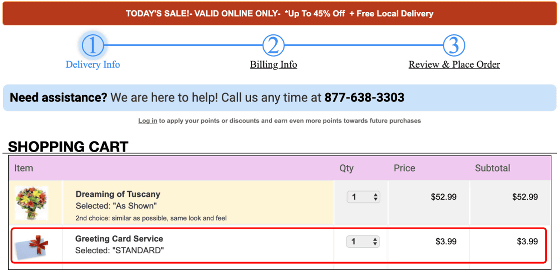
An example of a dark pattern that secretly increases the amount paid by the user is “If you purchase a flower, a greeting card is added to the purchase cart without permission”…
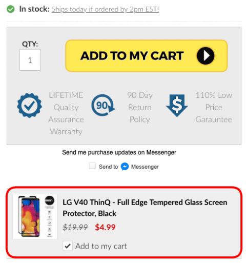
There are patterns such as “When you buy a smartphone, a screen protection film is added without permission”.
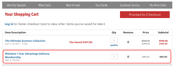
Also, if you place an order by checking the “Free wine delivery option” ...
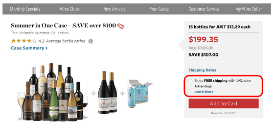
There are also patterns that are arbitrarily subscribing to subscription options.
◆ 2: Hurry users
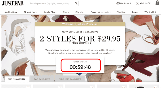
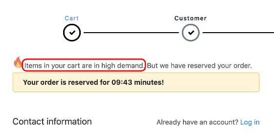
When purchasing a product, you should carefully judge by comparing various information, but there is also a technique that displays a `` fake countdown '' in the dark pattern and makes the user think `` I should buy it early '' To do. Some of the countdowns on the shopping site are really selling for a limited time, but in the case using the dark pattern, it can be purchased without problems even if the display time expires .
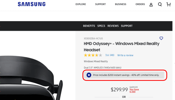
Even if the countdown is not displayed, a message such as “This discount is for a limited time” is displayed, and there is a trick to urge the user.
◆ 3: Let users choose a specific option
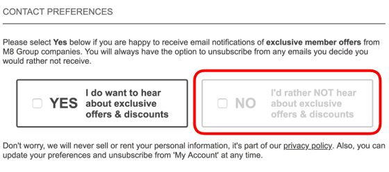
In pop-ups that prompt users to purchase products, the options for closing pop-ups can be reduced ....
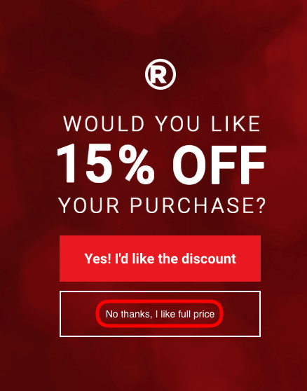
It is a kind of dark pattern to display the choices in light gray and to make it appear as if it cannot be selected.
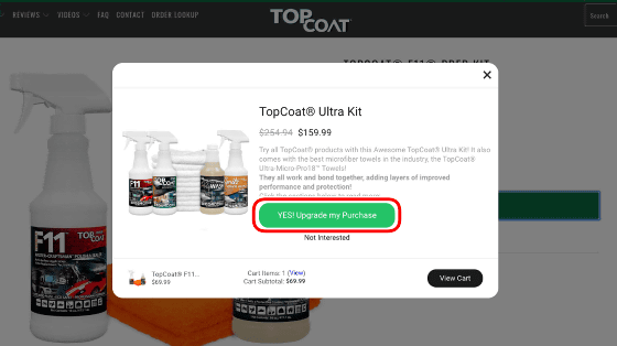
In some cases, after adding a product to the cart, a pop-up “Let's upgrade the product” will appear and you will be able to buy a higher priced product.
◆ 4: Flicker the presence of other users
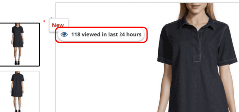
On the product screen, there is also a dark pattern of tricks that put pressure on the user by displaying “Other people are paying attention to this product”.
In addition, cases where user ratings of unknown origin are displayed on the product screen were also confirmed on several websites.

As a similar example, there was a case where the message “○ people are checking this boarding pass” displayed on the travel reservation site turned out to be completely false.

◆ 5: Misleading product is rare
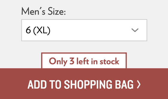
Some of the dark patterns that are widely used, such as “there are only 3 items left,” make it appear as if there are only a few items left.
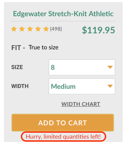
Some of them seem to have a shopping site where the text “Please hurry, the remaining quantity is limited!” Is displayed for all products.
There is also a dark pattern that puts pressure on users with the phrase “the products you put in the cart are in high demand” and urges the purchase.
◆ 6: Make certain actions difficult
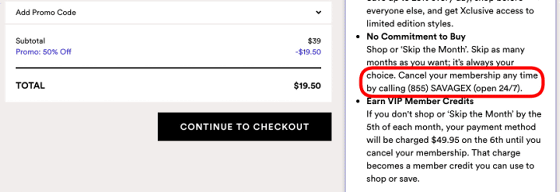
Membership membership is possible online, while the only way to cancel a contract is to “call customer support”, making it difficult to cancel a contract on purpose.
◆ 7: Force specific operation
Encourage user registration to display product details ...
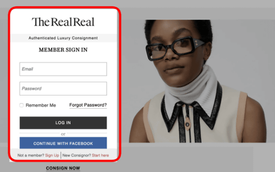
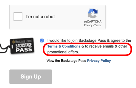
There is also a dark pattern that forces certain operations, such as automatically accepting promotional emails at the same time as 'agreeing to the terms of use'.
The survey also confirmed the existence of third-party plug-ins to introduce dark patterns, and Mathur pointed out that dark patterns are likely to be used in a wider range than previously thought. The research team is also sharing the results of this survey with the sponsor of the “Draft Prohibition on Dark Patterns” submitted to the US Congress .
Related Posts:
in Web Service, Design, Posted by log1h_ik

