Design aimed to deceive users "Dark Pattern" Various

ByThomas Guignard
When using the Internet, it is occasionally confusing because unexpected operation which is not intended by you is done, but it may be a design aiming to trick people in the first place. The user interface aiming to cheat such people is "Dark pattern"The method is summarized.
Dark Patterns - User Interfaces Designed to Trick People
http://darkpatterns.org/
The dark pattern is a user interface created for the purpose of deceiving people, it is never a mistake design. Though they are carefully prepared with a good understanding of human psychology, the benefits of users are not thought at all.
Harry Brignull, London 's designer, made a site that summarized the dark pattern and released it. The aim is to realize a better net world by seeking broad understanding about dark patterns, naming companies that use it, and humiliation. The existence of this site, for users, "no grief if prepared", for companies it is afraid to be stamped by offenders, triggered to discourage the use of dark patterns, and for the designers clients and bosses It is said to be a material that refuses immoral demands of using a dark pattern from.
An example of a specific dark pattern is as follows.
◆ 01: Bait and Switch (Bait Commercial Law)
What you do not want happens when the user performs certain operations.
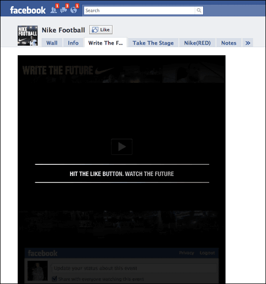
On May 5, 2010 Nike's site was a malicious specification that if you click on the screen to see football World Cup video, Facebook's "Like" is pushed.
◆ 02: Disguised Ads (Impersonation Advertisement)
An advertisement that invites clicks by disguising other kinds of contents or guidance.
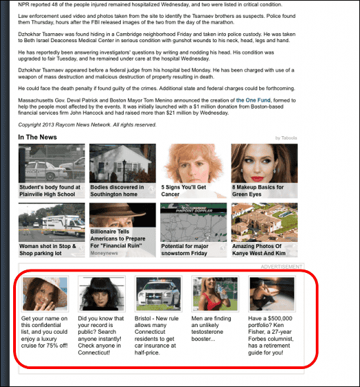
On April 2013 WFSB.com displayed ads that looked like news under news articles.
◆ 03: Forced Continuity (forced continuation)
Request to enter credit card information when you use the website for free trial, and automatically continue as paid service when the trial period ends. Also, it is difficult to suspend the use of services that started using.
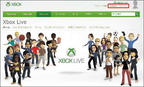
You can easily sign up for Xbox Live with either a web browser or Xbox. However, cancellation of registration can not be done by Xbox or online, and it is necessary to call each time.
◆ 04: Forced Disclosure (compulsory disclosure)
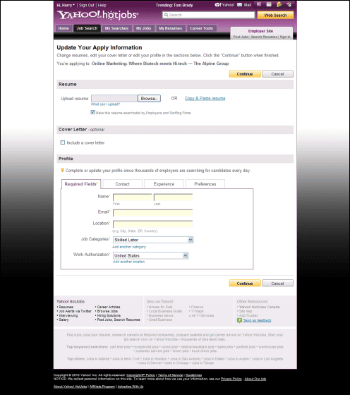
In return for a free (or inexpensive) service, seek disclosure of personal information which should not be necessary originally.
At the recruitment site called Yahoo! HotJobs (currently closed service) on July 27, 2010, we asked for profile information such as name, e-mail address, address, occupation etc. However, since these information are included in the resume and the attachment letter, originally, the service provider Yahoo! There was no need to disclose to the information.
◆ 05: Hidden Costs (hidden fee)
Unexpected supplementary charges such as delivery fees and taxes suddenly appear on the final stage accounting screen.
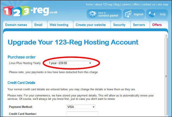
For 123-reg.co.uk, when you click "Upgrade today!" Option fee of 3.75 pounds (about 580 yen) per month ... ...

It changed to 59.88 pounds (about 9300 yen) a year. This is 4.99 pounds per month (about 770 yen) and the amount is higher than before.
◆ 06: Misdirection (erroneous induction)
Distract the user's attention to others.
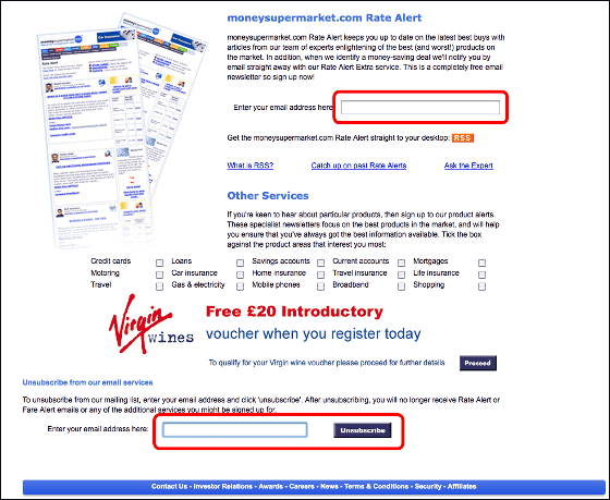
On October 2010's MoneySupermarket.com, there is clearly a separate text box on the newsletter subscription application on the link page that is skipped when trying to unsubscribe to the MoneySupermarket newsletter. A real cancellation can be done from the text box below.
◆ 07: Sneak into Basket (Add it secretly)
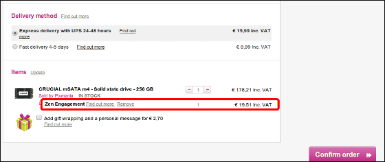
When a user tries to purchase a certain item, the additional item is put in a basket and the option is turned on unnoticed.
In Pixmania in June 2013, when you put items into the basket, a mysterious option of "ZEN Engagement" of 19.51 euro (about 2550 yen) has been added, and you can not cancel from this screen.
Typical methods of dark pattern are introduced elsewhere, none of them are clever things that seem to overlook if this is also inadvertent. Since the site is also recruiting new dark pattern information, Rakuten's signature that the extraordinarily large amount of mail can be sent unless careful at the time of purchase may be registered in the dark pattern not.
Related Posts:
in Design, Posted by darkhorse_log


