A summary of 'dark patterns' that trick users with misleading site designs

A malicious website design that deceives users and leads them to make incorrect decisions is called a 'dark pattern.' Dark patterns are considered problematic because they violate users' privacy and try to get users to spend more money. A website called ' Dark Patterns Hall of Shame (HOS)' has been published that compiles various cases that fall under such dark patterns.
Collection of Dark Patterns and Unethical Design
◆ Persistent demands
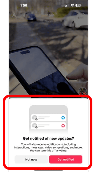
“Persistent prompting” occurs when an app or website repeatedly asks the user for permission to access notifications or contacts, often leading to repeated denials by the user until they eventually give in and allow the request.
HOS cites TikTok as an example, pointing out that the app's persistent appeal that 'turning on notifications for updates and additional information is beneficial to users' and the repeated request for permission until users allow contact integration are typical examples of this 'persistent request.'
Instilling a sense of shame
'Shame-mongering' is a technique used to make users feel guilty or embarrassed if they don't sign up for a particular product or service.
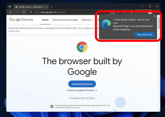
Microsoft has made Microsoft Edge the default browser for Windows 11, but when you try to download Google Chrome with Microsoft Edge, a pop-up window appears saying, 'Microsoft Edge is the best browser for online shopping.' This misleads users into thinking that they are making the wrong choice, making them feel as if they are acting foolishly, HOS points out.
◆ Privacy Zuckerling
Privacy Zuckerling is a term named after Facebook founder Mark Zuckerberg, who describes when a service or website tries to trick users into sharing more information than they actually want to.
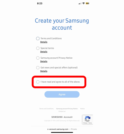
HOS gives the example of creating an account on Samsung.com as an example of privacy hacking. When you try to create an account on Samsung.com, you are presented with four checkboxes. The fourth of these, 'Get news and special offers,' is an optional item that you can choose whether or not to select it. However, if you check the last item that says 'I have read and agree to all of the above,' the fourth checkbox is automatically selected.
Bait-and-switch tactics
A 'bait-and-switch' scam involves luring users with attractive terms, then suddenly changing them. The new terms are written discreetly in small letters on the original page, but most users don't notice them, so the aim is to trick users into signing an agreement they did not intend.
◆Roach Motel
A roach motel is a sticky cockroach trap, and in dark patterns it refers to a subscription service where signing up is easy but cancelling is extremely difficult.
The most famous Roachmortel case is Adobe's Creative Cloud, in which the Federal Trade Commission sued Adobe for violating the Restoring Consumer Confidence in Online Shopping Act (ROSCA).
FTC sues Adobe for misleading its users about its difficult to cancel subscriptions - GIGAZINE

◆ False advertising
Deceptive advertising is a technique in which an advertisement on a website is disguised as if it were the UI of the website, and users who click on it are transferred to another website. HOS criticizes Microsoft Edge, which was cited as an example in 'instilling shame,' for also using this 'deceptive advertising.'
Hidden costs
Another dark pattern is 'hidden costs,' which occur when you buy something online or sign up for a new paid service, and then when you get to the final bill, you are presented with a different amount than what was shown at the beginning.
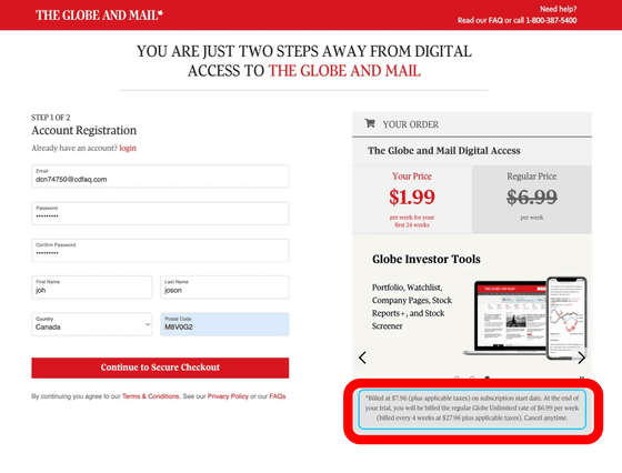
News site The Globe and Mail lists the price of its paid plan on its website as '$1.99 (about 310 yen) per week for 24 weeks.'

However, when you move to the plan registration screen and look closely, it says, 'You will be charged $7.96 (about 1,250 yen) on the subscription start date.' The amount shown is the amount per week, but the actual amount charged is for four weeks, that is, the amount for one month, so this is a 'hidden cost' trick.
◆ Secretly put it in the basket
'Sneak Cart' is exactly what it sounds like: when you buy something and pay for it, the website adds some extra items to your cart and then lets you remove them from the cart.
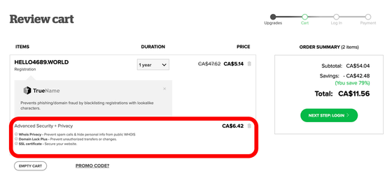
When you purchase a domain from domain reseller name.com, the item 'Advanced Security + Privacy' is added to your cart by default. If you proceed with the purchase without realizing it, you will end up paying extra for the 'Advanced Security + Privacy' option.
Trick questions
Here's the screen you see when you buy a game on Green Man Gaming, a game sales platform. Below the purchase button that says 'PLACE ORDER,' there is an empty checkbox. It says, 'Check this box if you don't want to receive wishlist offers and other deals via email.'
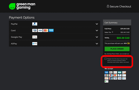
HOS points out that this is a typical example of a 'trick question.' Normally, if you want to receive emails, you check the box, and if you don't, you leave it unchecked. However, Green Man Gaming is designed to do the opposite: 'If you want to receive emails, leave the check box unchecked, and if you don't, check it.' 'Trick questions' are dark patterns that exploit users' habits and assumptions.
◆Misdirection
'Misdirection' is a technique used to divert the user's attention from the intended action.
Below is the ticket purchase screen for London Zoo. Ticket prices are listed as ADULT, CHILD, UNDER 3 (ages 3 and under), and you can purchase tickets by entering the number of tickets on the far right and clicking the 'Add to basket' button. However, if you look closely at the page, you will see that there are two 'Add to basket' buttons, the darker button on the right is 'with donation' and the lighter button on the left is 'without donation'.
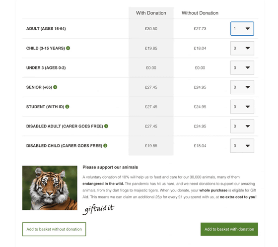
If you select 'Donation', the donation amount will be added to the admission fee, making the price of one ticket higher, but if you proceed without noticing anything, you are more likely to press the 'Donation' button, which is located on the right side where your eyes flow and has a more noticeable color. HOS criticized the use of this dark pattern as 'deceptive and manipulative.'
Related Posts:
in Design, Posted by log1i_yk


