4 points to keep in mind when designing apps and websites
“Intuitively understanding the operation” is extremely important for increasing the number of repeaters and buyers when designing apps and websites. UX/UI designer
4 Rules for Intuitive UX – Learn UI Design
https://learnui.design/blog/4-rules-intuitive-ux.html
◆1: Put the button near the related element
When you put something in your interface, it's important to place it close to what it affects.
For example, in the music playback application, if the playlists are arranged as follows, ask where to put the 'Add song' button...
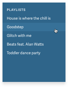
There must be someone who answers 'Menu'.

You might also think of an extra button at the bottom right of the screen, following the 'technique that technology companies have begun to think about without much thought.'
However, the above placement isn't tied to the related behavior, which results in the button being placed in a location that the user doesn't look for. According to Kennedy, the answer is very simple, right under the menu list. Of course, some people will say that it is “obvious”, but it should be remembered that there is a temptation to place a button in the menu field or in the lower right corner of the screen.
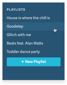
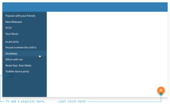
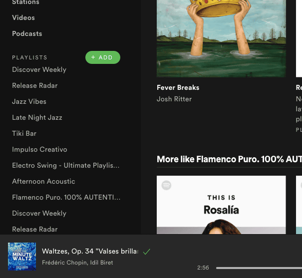
However, if there are only 5 songs in the playlist, there is no problem, but if there are 1000 songs, placing the button directly below the list will cause the button to disappear from the screen. For this reason, it is important to place buttons at the 'bottom of the list' with 'always displayed'. In UX design, it is necessary to consider 'how the screen changes when the situation changes.'
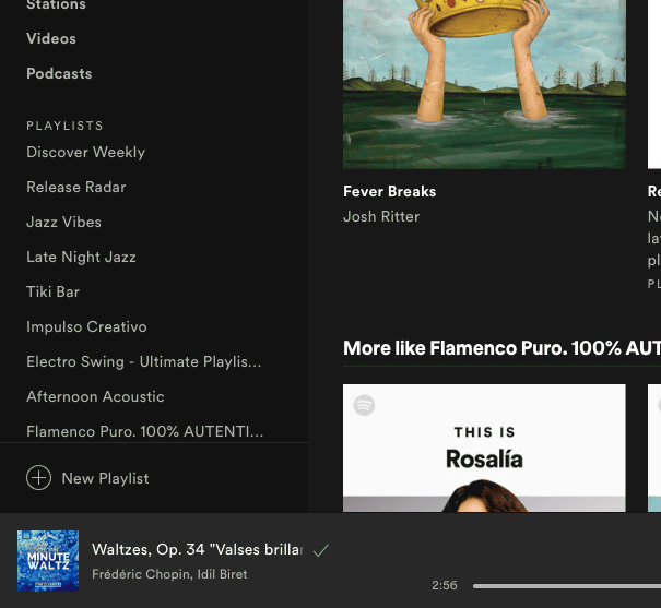
Also, as an answer that can be derived by similar thinking, there is also a method of placing a button next to the character of 'Playlist' so that it is easy to see.
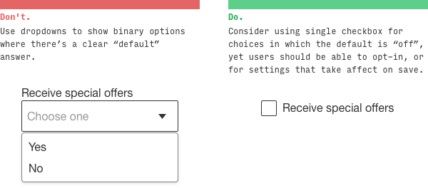
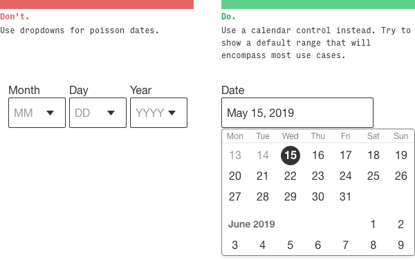
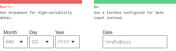
◆2: Dropdown is the worst option
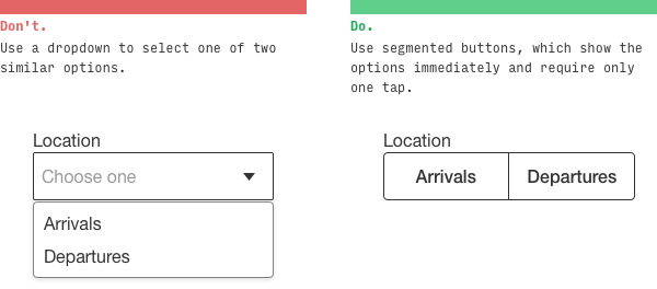
Dropdowns are not 'always' the worst, but they are a rather problematic option. Dropdowns require the user to do many actions such as clicking and tapping, and without doing so the user cannot see the choices. In particular, there is a problem that the list of 'Select your own country from 195 countries' is too long and it takes time to select.
Below is an example of how to avoid the dropdown. The left is a bad example using a dropdown and the right is a good example. If there are only a few choices, you can display the selection buttons that are divided into segments side by side...
Instead of letting you select “Yes/No”, you can also display a check button “Yes, I will receive it”.
If you have more choices, you can also arrange buttons with vertical segments.

Also, radio buttons have room for consideration in the same sense.
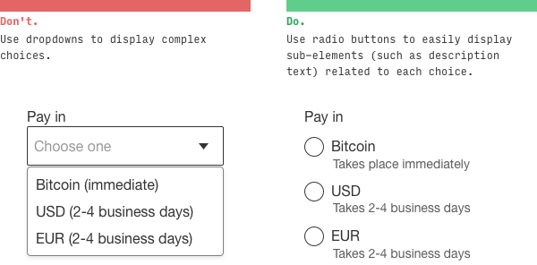
Another advantage is that it is easier to understand when displayed on a card.

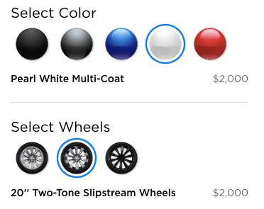
The following visual options are also useful when choosing the color of a product.
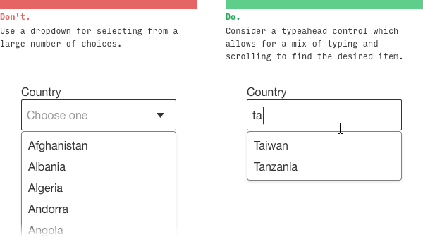
If you want to choose your own country from 195 countries, just type in the text box and the options will be displayed.
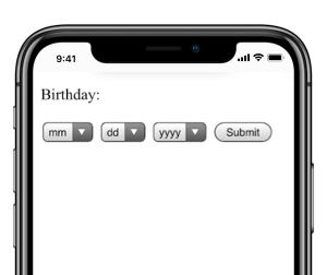
It is necessary to devise when selecting the date and time. As for the selection of date and time, it is likely that the selected date is close to the selected time, such as when making a reservation at a restaurant, and the case that the selected date and the selected date are likely to be separated, such as when selecting a birthday. It is divided into two.
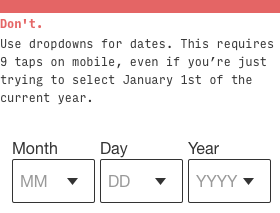
Calendar selection is effective for restaurant reservations, but it is easy to imagine that calendar selection is difficult for birthday selection.
Therefore, when selecting a birthday, it is better to enter text.
◆ 3: Be able to understand intuitively when blurring
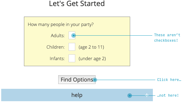
A good design is that you can intuitively understand which button has which function when viewed with the UX blurred. For example, if you look at the image below, you can expect that there are some options in the yellow part and a button such as 'Next' in the blue part.
…But in reality, the blue button was “help” and the “Next” “Find Options” was on it. In terms of color and size, the buttons that should have been noticeable were not noticeable.
There are many improvements in the above design, but if you redesign in 30 seconds with a wire frame it looks like this. The “Purchase Tickets” that the user will surely press are large, represented by a button that contrasts with the background, and the less important Help is only letters.
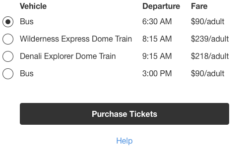
Even if you blur it, it is obvious where the important buttons are.
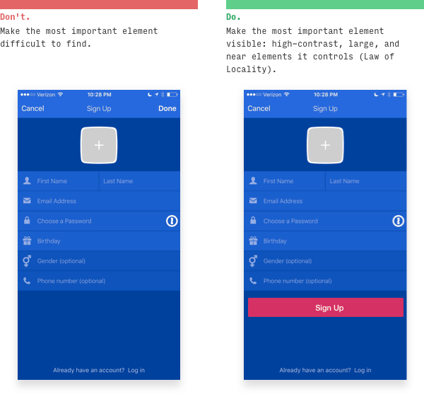
With the same idea, on the sign-up screen, the most important 'sign-up' for the user is not shown with the 'Done' in the upper right corner blended into the background as in the image on the left, but the contrast as in the image on the right. It must be clearly displayed in the prominent shade that is applied.
◆ 4: Tell by 'example'
Just as there is the phrase 'a picture is worth a thousand words,' it is clearer to 'show' as an example than to explain something in words.
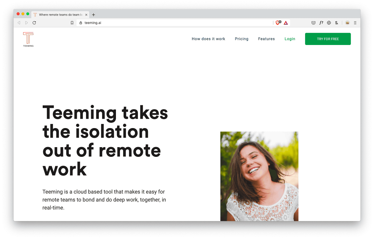
For example, on the website of the startup 'Teeming.ai', the words 'Teaming removes the loneliness of remote work' 'Teaming helps remote team building, learning, problem solving, motivation' are written. However, I don't know at a glance, 'What does teaming actually do? What can we do?'
On the other hand, on the
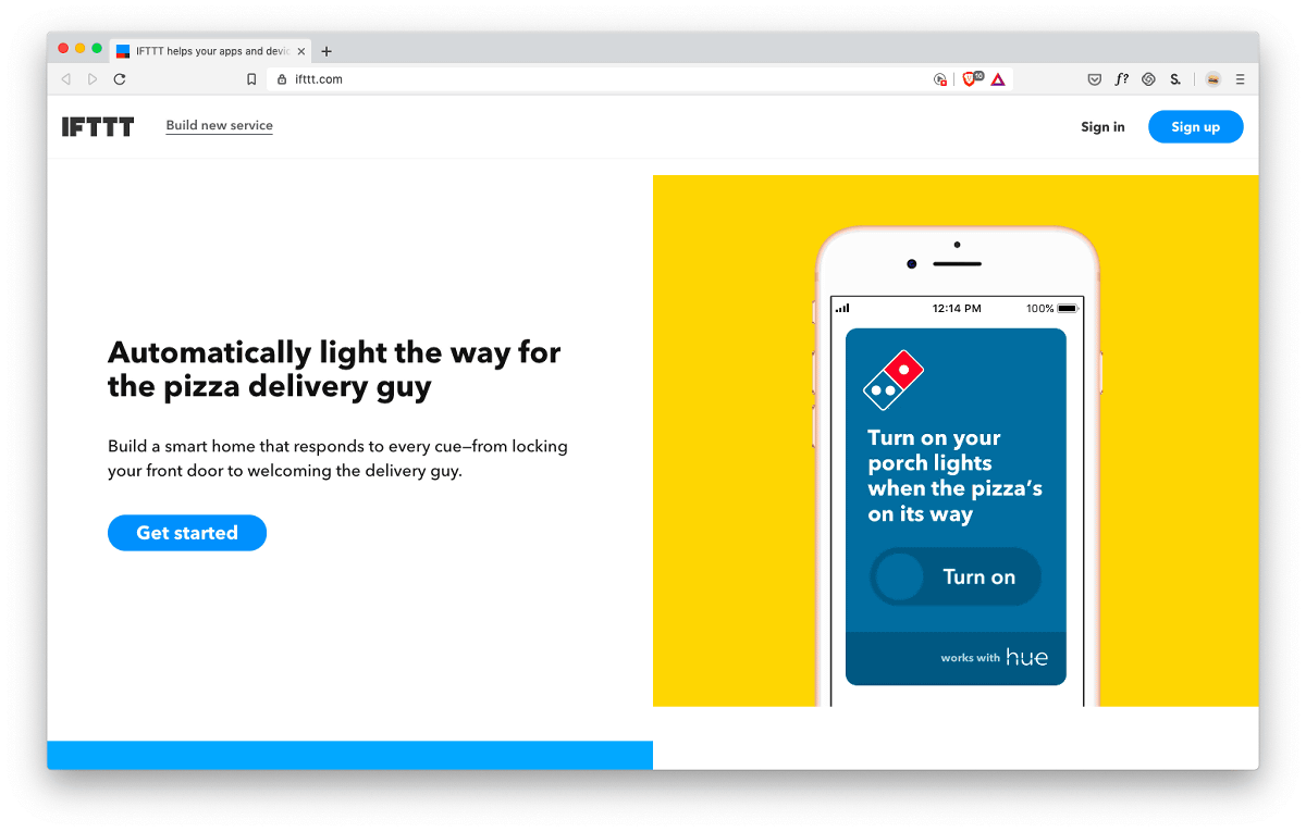
The Google Assistant logo and iOS calendar are displayed with the words 'Make your voice assistant more personal'. As a result, you can imagine what you can do with just a quick glance.

The complex features of the app give clarity and persuasiveness when shown clearly as an example.

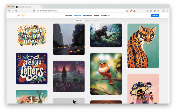
It is also effective to display 'what can be done' as a showcase like
Related Posts:


in Design, Posted by darkhorse_log